A store designed around the moment someone decides.
someone decides
Beautiful ecommerce websites are common; stores that make buying obvious are not. We design online shops around the few screens that decide the sale — the collection, the product page, the cart, the checkout — then build them fast, test them on real phones, and hand over a design system your team can extend. Measured against orders with our analytics team.






Tell us a little about your brand and we'll be in touch within 24 hours to lock in a time.



FOUR WORKSTREAMS
Four workstreams behind a store that converts.
a store that converts
Ecommerce web design is four jobs running together: understand how people already shop your range, design the screens that decide the sale, build it fast on a platform you can live with, and keep improving it after launch.
Research & merchandising
Design of the deciding screens
Build & platform
Launch & continuous improvement
Design starts in the session recordings.
Before a single screen is drawn we look at how people actually move through the current site: where they filter, what they compare, which question sends them to a search engine, and where the funnel quietly leaks. That evidence sets the navigation, the filter set and the way the range is merchandised, which matters more to sales than any visual decision.
The stakes are well documented: documented cart abandonment averages 70.22% across 50 studies, and most of the causes are design decisions rather than pricing ones.
- Session recordings and funnel data read before design
- Navigation and filters built from real shopping behaviour
- Merchandising rules for new and seasonal ranges
- The leak points named and prioritised
70.22%
average documented cart abandonment (Baymard, 50 studies)
Four screens carry the business.
Collection, product, cart and checkout. We design those first and in detail — imagery that answers questions, delivery cost and timing stated before the cart, sizing and returns where the doubt happens, a checkout with no surprises — and only then style the pages around them.
Phones set the standard. Contentsquare's 2026 benchmark puts desktop conversion at 3.4% against 2% on mobile, with mobile at 70% of sessions, so a design reviewed on a laptop is being reviewed in the minority case.
- Collection, product, cart and checkout designed first
- Delivery, returns and sizing surfaced before the cart
- Every screen reviewed on real devices, not a preview
- Accessible contrast, tap targets and form design
2%
average mobile conversion rate against 3.4% on desktop
70%
of ecommerce sessions happen on mobile
Fast, stable, and yours to edit.
We build on the platform that fits your operation — Shopify most often, Webflow where content leads, BigCommerce or headless where the catalog demands it — and we keep the app stack small, because every add-on is another script between a shopper and the buy button.
Broken beats ugly every time: JavaScript errors disrupted 17.8% of retail sessions in 2025, slow page loads 11.6% and API errors 8.9%, which is revenue lost without a single design critique.
- Platform chosen for your operation, not our convenience
- Lean app stack with the performance cost measured
- Core Web Vitals held on real mobile connections
- Editable templates your team can change without a developer
17.8%
of retail sessions disrupted by JavaScript errors (2025)
Launch is the halfway point.
A migration is protected the boring way: redirects mapped before launch, search rankings watched daily for a fortnight, tracking verified against real orders rather than assumed. Then the improvement work starts, because the first version is a hypothesis with a nice visual identity attached.
We run a monthly cycle of small, evidenced changes to the deciding screens, each with a before and after read on add-to-cart and checkout completion rather than an opinion.
- Redirect map and ranking watch through the migration
- Tracking verified against real orders after launch
- Monthly improvements to the deciding screens
- Every change read on add-to-cart and completion
11.6%
of retail sessions disrupted by slow page loads
Design files, code and accounts stay in your name
A written read on what changed and what it moved
Working session with the people doing it
Long-term lock-ins
We made the difference for those brands

Retail & commerce

Home essentials, appliances, kitchen & pet

Creative, content, arts & culture

B2B software, fintech, insurance

B2B software, fintech, insurance
Travel & mobility

Apparel and lifestyle

Food & beverage

Apparel and lifestyle

B2B software, fintech, insurance

Retail & commerce

Food & beverage

Beauty, personal care & wellness

Healthcare & regulated services

Healthcare & regulated services

B2B software, fintech, insurance

B2B software, fintech, insurance

B2B software, fintech, insurance

Apparel and lifestyle

Retail & commerce

Retail & commerce

Healthcare & regulated services

Home essentials, appliances, kitchen & pet

Travel & mobility

Retail & commerce

Healthcare & regulated services

B2B software, fintech, insurance

Travel & mobility

B2B software, fintech, insurance

Consumer tech and platforms

B2B software, fintech, insurance
01 — The challenge
It looks great. It sells like the old one.
A redesign ships, the brand finally looks like itself, and three months later the sales are exactly where they were. Nobody misbehaved — the project was scoped as a visual refresh, so the screens that decide the sale were restyled rather than rethought.
“The new site is gorgeous. Our numbers did not notice.”
The difference is where the effort lands. With mobile at 70% of ecommerce sessions and converting at 2% against 3.4% on desktop, an hour spent on the mobile product page and checkout is worth a day spent on the homepage hero — and that is a scoping decision, not a talent one.
02 — Our approach
Evidence, then the deciding screens, then a build you can edit.
We begin with how people already shop your range: session recordings, funnel drop off, on-site search, support questions and the returns log. That evidence sets navigation, filters and merchandising before any visual work, because those decisions move more revenue than a typeface. Design then starts with the four screens that carry the business — collection, product, cart and checkout — worked in detail on a phone first, with delivery cost, timing, sizing and returns surfaced where the doubt actually happens. The build follows on the platform that fits your operation, with a deliberately lean app stack and performance measured on real mobile connections rather than a lab score. Launch is protected with a redirect map, a ranking watch and tracking verified against real orders. After that we keep going: monthly evidenced improvements, each read on add-to-cart and checkout completion.
03 — What we did
From evidence to launch, then a monthly improvement cycle.
Research, design, build and launch — in sequence, with your team in the review at the end of each stage.
Weeks 1-2 / Evidence
How people shop the current store
Recordings, funnel data, on-site search and the returns log read together, so the brief names real problems rather than tastes.

Weeks 3-4 / Structure
Navigation, filters and the range
Categories, filter sets and merchandising rules agreed on paper before anyone opens a design tool.

Weeks 5-9 / Design and build
The deciding screens, then everything else
Collection, product, cart and checkout designed on a phone first, then built into editable templates with the app stack kept lean.

Launch and onward
A launch nobody has to survive
Redirects mapped, rankings watched daily, tracking checked against real orders, then monthly improvements with a measured read.

WHAT YOU GET
Deliverables your team can pick up and run.
pick up and run
Everything below is delivered in working files and accounts that stay yours if you ever leave.

Research and structure plan
What the behaviour data says, the leak points ranked, and the navigation, filters and merchandising that follow from it.

Designs for the deciding screens
Collection, product, cart and checkout designed mobile first, in the detail a developer can build from.

Design system and components
Type, colour, imagery rules and components documented in your design tool so new pages stay consistent.

Store build
The site built on your chosen platform with editable templates, a lean app stack and performance measured on real devices.

Migration and launch plan
Redirect map, ranking watch, tracking verification and a rollback plan, so launch week is uneventful.

Post-launch improvement plan
A ranked queue of evidenced changes to the deciding screens, each with the number it is meant to move.
HOW WE WORK
Operating standards, not promises.
Operating standards


















Built on trust. Proven by results.
We partner with SMBs and Fortune 500 companies to deliver more than reach — we bring clarity, execution, and measurable outcomes. Every successful partnership starts with a strong culture fit and a shared drive to grow.






CASE STUDIES
Case studies
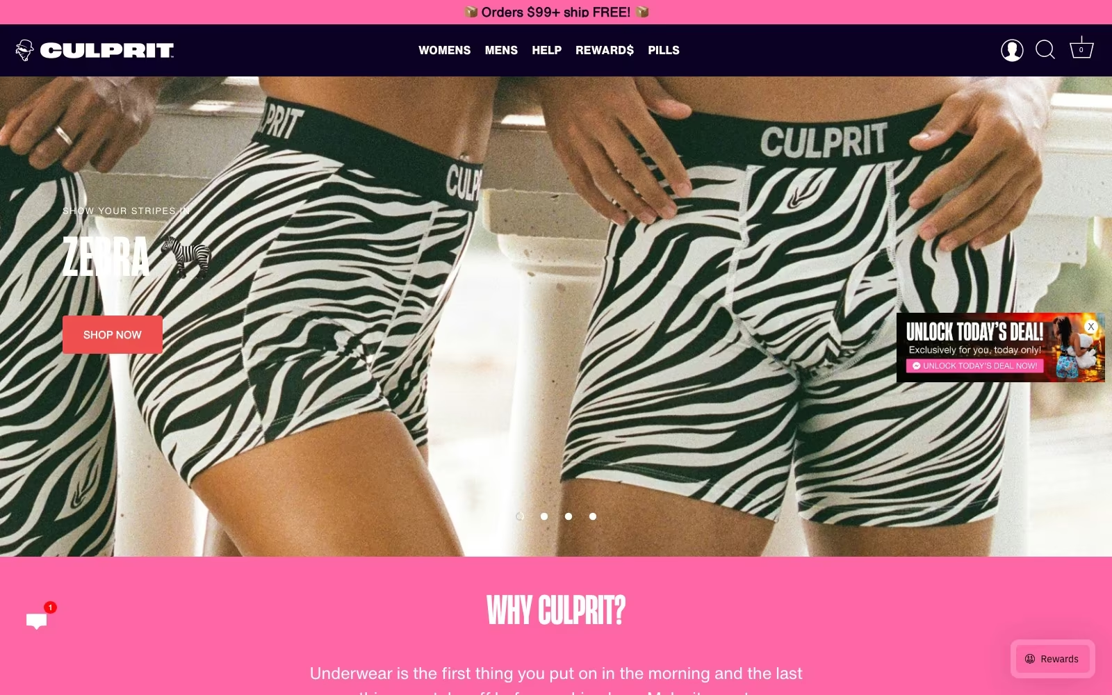
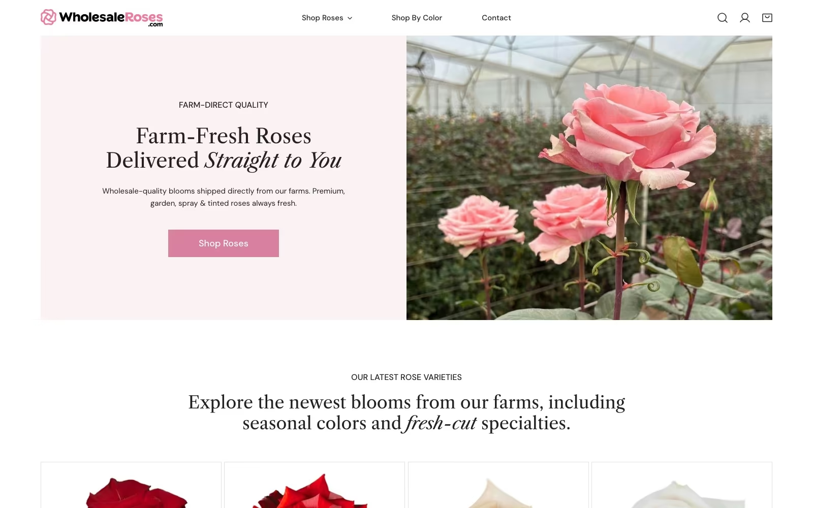
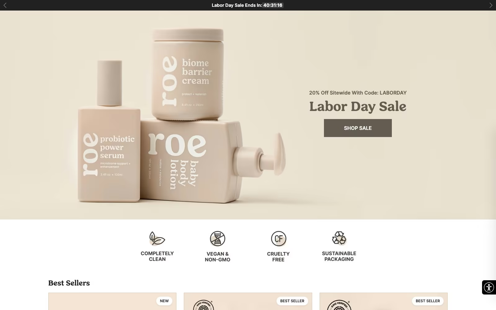
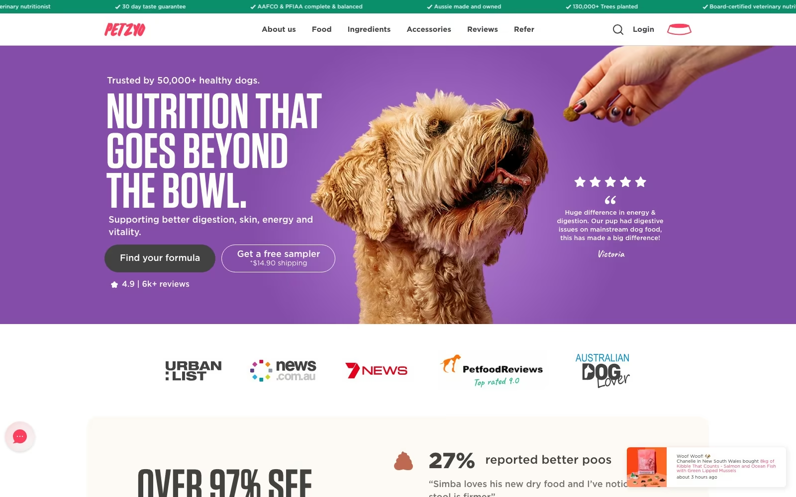
Website Portfolio
Video Ads
Static Ads























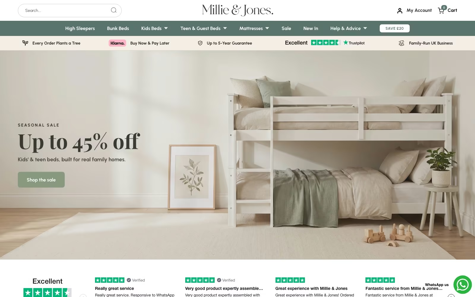

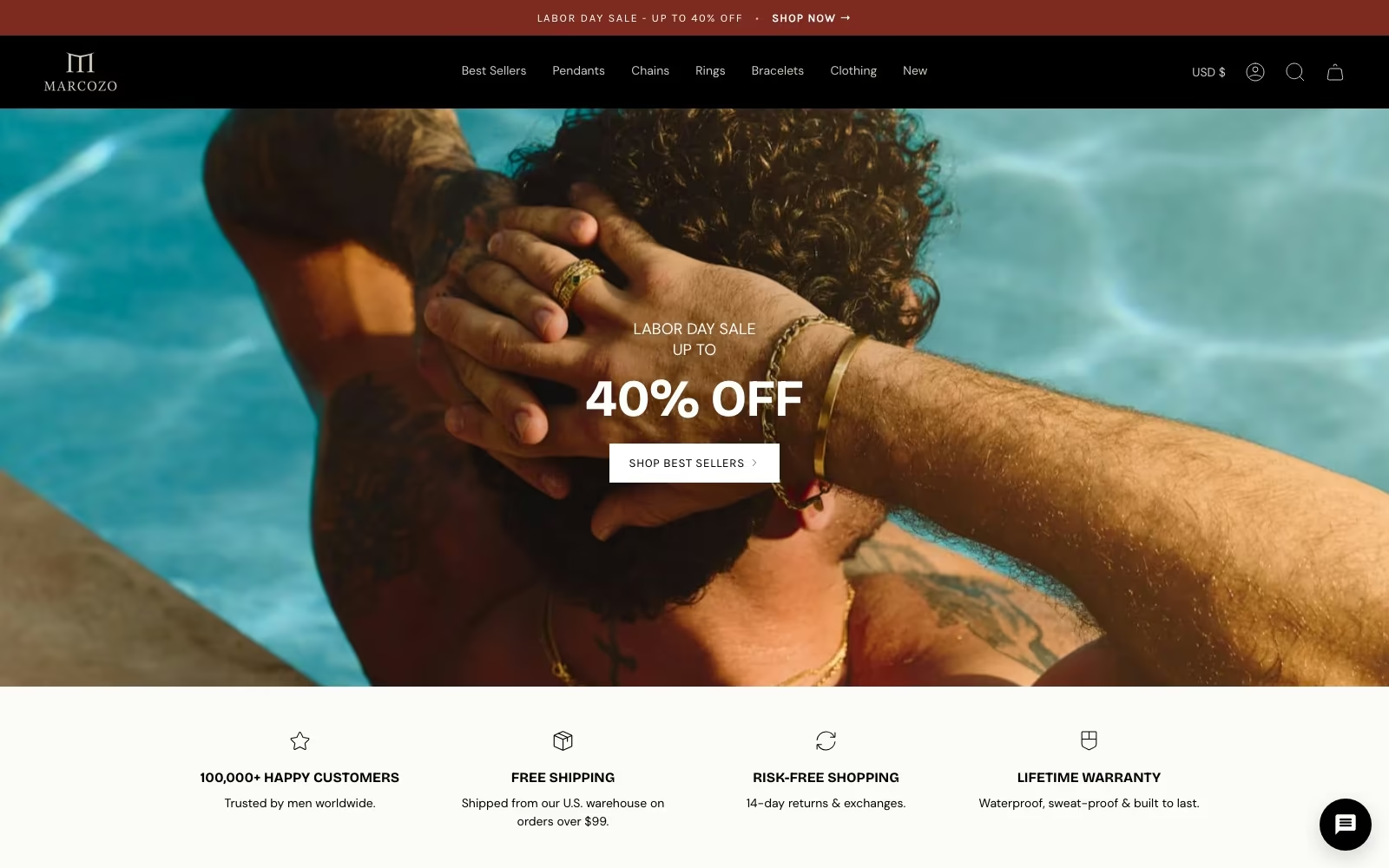

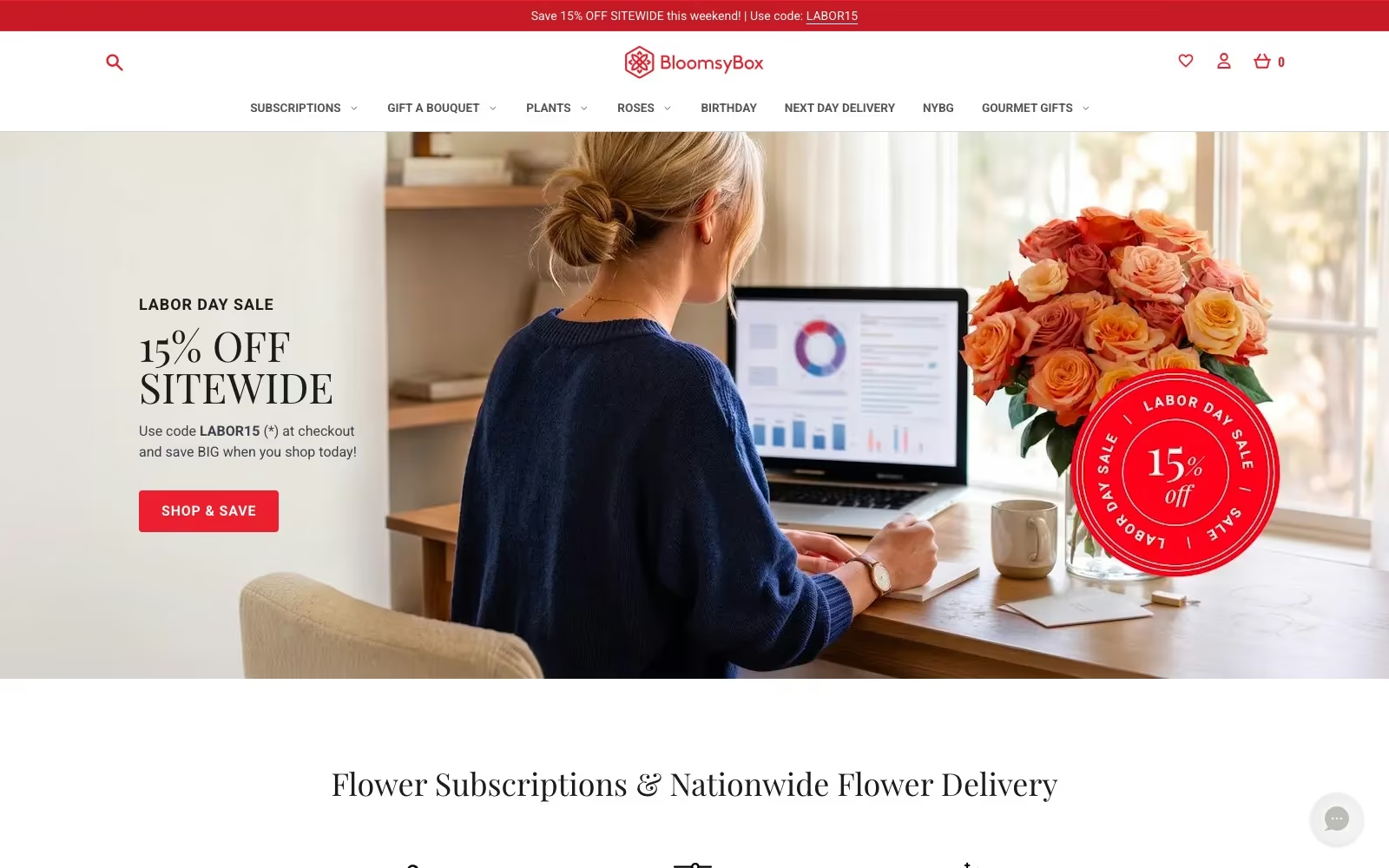

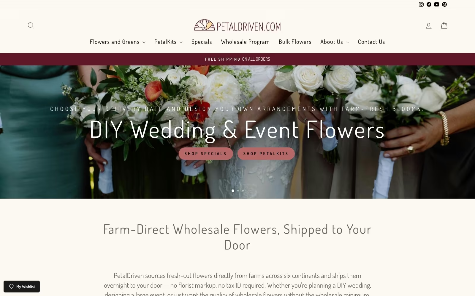




































FAQ
What store owners ask us first.
How long does an ecommerce website redesign take?
Nine to twelve weeks is typical for a store of moderate size: two weeks of evidence gathering, two on structure, four or five on design and build, then launch preparation. Deep catalogs, custom integrations or a platform migration add time, and we will say which of those apply before quoting. Where the site is fundamentally sound we often recommend a targeted rebuild of the deciding screens instead, which takes a few weeks and usually returns more than a full redesign would.
What does ecommerce web design cost?
A fixed project fee quoted after a scoping conversation, with the assumptions written down so the number does not move for reasons you did not choose. Cost tracks catalog complexity, how many templates are needed, integrations with your warehouse or ERP, and whether content and photography are in scope. We will tell you plainly when a redesign is not the best use of the budget — several stores that asked for one left with a improvement plan and kept their site.
Which platform should we build on?
Shopify suits most stores, and we say so rather than pretending every project deserves something exotic: the hosting, checkout and app ecosystem solve problems you would otherwise pay to rebuild. Webflow makes sense when content and campaign pages lead and the catalog is small. BigCommerce or a headless build earn their complexity with very large catalogs, unusual pricing logic or multi-region operations. The right question is what your operation needs to do daily, not which platform is fashionable.
Will a redesign hurt our search rankings?
It can, and the protection is unglamorous: a redirect map written before launch covering every old URL, page titles and structured data carried over, internal links rebuilt, and rankings watched daily for a fortnight afterwards. We involve the ecommerce SEO team during design rather than after, because most ranking damage is decided when someone quietly deletes a category page. Expect a small dip in the first weeks; expect it to recover, and expect us to say so if it does not.
Should we design for mobile or desktop first?
Mobile, without much debate. Mobile is about 70% of ecommerce sessions and converts at 2% against 3.4% on desktop, so the phone is both the majority of your traffic and the weakest part of the funnel. Designing there first forces the hard choices — what the first screen must say, how many fields the checkout really needs — and the desktop version benefits from them. We review on real handsets on real connections, because a browser preview flatters everything.
Can we keep our current site and just improve sales?
Often the better investment, and we scope it as its own engagement. We read the behaviour data, rank the leak points, and rebuild the collection, product, cart and checkout screens in place rather than replacing the store. With cart abandonment averaging 70.22% across 50 studies, the checkout alone usually holds more upside than a new visual identity. If the platform genuinely cannot support what the evidence asks for, we will say that too.
How do you make an online store fast?
Mostly by removing things. Image weight, third-party scripts and app embeds cause the majority of the damage, and each app added over the years was worth it to somebody, so we measure the cost of each in real load time before proposing a cut. Then it is the usual craft: modern image formats, lazy loading, minimal blocking scripts, a theme that is not fighting itself. It matters more than a lab score suggests — slow loads disrupted 11.6% of retail sessions and JavaScript errors 17.8%.
What makes a good product page?
It answers the questions that stop a purchase, in the order a shopper asks them. Imagery that shows scale, texture and the thing in use; the variant choice made obvious; delivery cost and date stated on the page rather than discovered in the cart; sizing, materials and compatibility where the doubt is; returns explained in a sentence; reviews that mention the specifics. Most underperforming product pages are not ugly, they are silent — and the missing sentence is usually one your support inbox has already written.
Do you handle photography and content?
We can, and we will tell you when your existing library is good enough. Where imagery is the bottleneck — inconsistent backgrounds, no detail shots, nothing showing scale — our creative studio shoots product and lifestyle sets designed to work on both the store and in ads, which avoids paying twice. Category and product copy can be written with the SEO plan so the pages are built once. If you have a strong in-house creative capability, we art-direct and stay out of the way.
How do you handle a platform migration?
As a data project with a design attached, in that order. Products, variants, customers, orders and reviews are mapped and test-migrated to a staging store first, so surprises happen where they are cheap. URLs get a redirect map, integrations are rebuilt and tested against real orders, and we agree a rollback plan and a quiet launch window with your operations side. Launch day should be boring; every dramatic migration we have inherited skipped the staging step.
Can our team edit the site afterwards?
That is a requirement, not a bonus. Templates are built so merchandising changes, campaign pages, new collections and seasonal banners can be made by your team without a developer, and the design system is handed over in your design tool with components documented. We run a training session, record it, and leave a short written guide for the things people forget. If you need us afterwards it should be for new capability, not to change a headline.
How do you measure whether the new design worked?
Against the numbers agreed before it was built: add-to-cart rate, checkout completion, revenue per session and sales split by device, compared year over year rather than against the launch week. We verify tracking against real orders after launch, because a redesign that appears to have halved conversion has usually just broken a tag. Where a change did not work we say so and revert it; the monthly improvement cycle exists precisely because no first version is right everywhere.
What about accessibility?
It is designed in rather than audited at the end. Contrast, focus states, tap target sizes, keyboard navigation, form labels and alt text are part of the component work, and we test with a screen reader on the deciding screens before launch. Beyond being right, it is commercially sensible: the same choices that help a screen reader also help someone shopping one-handed on a bright street. Where full compliance requires changes to third-party apps we will document exactly what remains and why.
How do you use examples and inspiration in the process?
As a shared vocabulary, never as a template. Early on we look at stores you admire and, more usefully, stores in adjacent categories that solve a structural problem like yours — a deep catalog, a configurable product, a subscription. We pull out the specific mechanic worth borrowing rather than the look, because copying the visual identity of a brand with different customers is how stores end up feeling generic. The reference list goes into the brief with a note on what each example is for.

.webp)
.webp)