Charts that settle the argument.
settle the argument
We are the data visualization agency for teams whose numbers are fine and whose reporting still gets ignored. We design the view around the decision, label it so a new hire can read it, and build it on your own analytics stack — from board-level dashboards to the one chart that explains a quarter. Clear, honest, documented, and yours to keep.






Tell us a little about your brand and we'll be in touch within 24 hours to lock in a time.



HOW WE DESIGN
Design starts with the decision.
the decision
Question, then data model, then chart, then adoption. Visual polish applied to an unclear question produces a beautiful page nobody acts on, so we work in that order and cut anything that answers nothing.
The question
The data behind it
The craft
Adoption & handover
Every view earns its place.
We begin with a short list of the decisions your team actually makes: where to move budget, which market is slowing, whether a launch worked, what to tell the board. Each one becomes a view with an owner and a moment it is read. Anything that survives only because it looks impressive gets cut.
That discipline matters because the failure mode is well documented. In BARC's survey of 1,000 business intelligence users, the benefits were emphatic — 97% reported faster reporting or planning and 94% better decisions — and yet average employee use sat at just 25%. IBM's measurement is similar, with active use around 29% of employees and almost no growth in seven years. Beautiful reporting that answers no question is the single most common cause.
So we would rather deliver five charts your team argues with than fifty nobody opens.
- Decisions listed before any design work starts
- Each view has a named owner and a moment it is read
- Anything answering no question is cut, not shrunk
- Success measured by use, not by page count
94%
of BI users report better decisions from good reporting
25%
average share of employees who actually use the tools
A chart cannot fix a broken join.
Most visual confusion is a modelling problem wearing a design costume: two sources counting the same conversion, currencies mixed in one total, a channel named four ways, revenue that never comes back from the CRM. We reconcile the underlying tables against your sales or billing system first, then pre-aggregate so the view renders in seconds instead of doing arithmetic across five live connections while someone waits in a meeting.
It is also why we automate the feed. NinjaCat's 2026 research found 72% of marketing teams still describe their reporting as highly manual, with a five-day average turnaround — and a chart rebuilt by hand each month will drift from its own definition within a quarter.
Every figure carries a written definition, a freshness stamp and a note on what is excluded, so the number can be defended without a phone call.
- Tables reconciled against the sales or billing system
- Duplicate events and mixed currencies resolved before design
- Pre-aggregated so pages load in seconds
- Definition, freshness stamp and exclusions shown on the view
72%
of marketing teams still report manually
Honest defaults, no decoration.
Then the design work proper: the right chart for the comparison rather than the most interesting one, axes that start at zero when a proportion is at stake, absolute change shown next to percentages, colour used to mean one thing consistently, and annotations on the events that explain a spike. Rank and small multiples instead of a spaghetti line chart. Uncertainty shown where it exists rather than smoothed away.
Accessibility is part of craft, not an extra: palettes that survive colour-blindness, contrast that holds on a projector, labels that do not rely on hover, and titles written as the finding rather than the field name. “Paid social CPA up 18% since the June creative change” teaches more in one line than a chart called “CPA by channel” teaches in a minute.
We build to your brand system so the output looks like your company, and we keep the component library so the next chart matches without a debate.
- Chart chosen for the comparison, not for novelty
- Titles written as findings, not field names
- Colour-blind-safe palettes and projector-safe contrast
- Annotations for launches, outages and budget changes
- Reusable component library in your brand system
1
meaning per colour, applied consistently across every view
Built into a routine, then handed over.
A view enters a meeting or it dies. We run the first few sessions from the finished reporting ourselves, record short walkthroughs for people who join later, and prune whatever nobody opened after a month. Alerting covers the silent breakages — a feed that stopped, a tag removed on deploy, spend running without conversions.
Fundamentals still decide these projects. BARC's Trend Monitor for 2026, drawn from 1,579 data and analytics professionals, found that data quality and governance stayed at the top of the priority list even as automation dominated the conversation. Visualisation inherits that: trust first, then interpretation.
You keep the files, the models, the component library and the documentation. We would rather leave a team that can build its own next chart than a dependency that has to ask.
- First review meetings run from the finished views
- Walkthroughs recorded and documentation handed over
- Alerting on stalled feeds and broken tracking
- Files, models and component library owned by you
1,579
professionals in BARC's 2026 trend survey ranking data quality first
benchmark price per user per month (IBISWorld)
of dashboard use sits with executives (Mordor)
Every chart titled with the insight, not the field name
Source files, models and component library
We made the difference for those brands

Consumer tech and platforms

Travel & mobility

Apparel and lifestyle

Retail & commerce

Home essentials, appliances, kitchen & pet

Food & beverage

Travel & mobility

B2B software, fintech, insurance

Healthcare & regulated services

B2B software, fintech, insurance

Home essentials, appliances, kitchen & pet

B2B software, fintech, insurance

Consumer tech and platforms

Food & beverage

Beauty, personal care & wellness

B2B software, fintech, insurance

Travel & mobility

Creative, content, arts & culture

B2B software, fintech, insurance

Consumer tech and platforms

Consumer tech and platforms
Retail & commerce

Consumer tech and platforms

B2B software, fintech, insurance

Retail & commerce

B2B software, fintech, insurance

Consumer tech and platforms

Home essentials, appliances, kitchen & pet

Retail & commerce

Beauty, personal care & wellness

Beauty, personal care & wellness
01 — The challenge
Nobody disputes the data. Nobody uses it either.
The warehouse is built, the numbers reconcile, and the reporting still does not change decisions. Forty tabs, three colours meaning three different things depending on the page, titles naming fields instead of findings, and a chart the board politely skips because the axis starts somewhere convenient.
“It is all in the dashboard. That is exactly the problem.”
The pattern is measured, not anecdotal: BARC's users report 94% better decisions from business intelligence while only 25% of employees actually use it, and IBM puts active use at about 29%. Coverage is not the constraint; comprehension is. We design fewer views, each aimed at one decision, labelled so the finding reads in three seconds — and we hand over the component library so the standard survives us.
02 — Our approach
One decision, one view, one honest scale.
We list the decisions your team makes, then design one view for each and cut the rest. Before any design work we reconcile the underlying tables against your sales or billing system, resolve duplicated events and mixed currencies, and pre-aggregate so pages render in seconds. The craft follows honest defaults: the chart that fits the comparison, axes that do not flatter, absolute change beside percentages, colour meaning one thing throughout, titles written as findings, palettes that survive colour-blindness and a projector. Annotations explain the spikes; freshness stamps and written definitions travel with every figure. Then we build the reporting into a routine — owners, standing meetings run from the views, recorded walkthroughs, alerting on stalled feeds — and hand over the files, models, component library and documentation in full.
03 — What we did
Four steps from spreadsheet to standard.
Frame, reconcile, design, embed — roughly four to six weeks, with a weekly working session and every asset handed over as we go.
Week 1 / Frame
List the decisions, kill the rest
Interviews with the people who act on the numbers, a short list of real decisions, and a view mapped to each with a named owner.

Weeks 1-2 / Reconcile
Fix the model under the chart
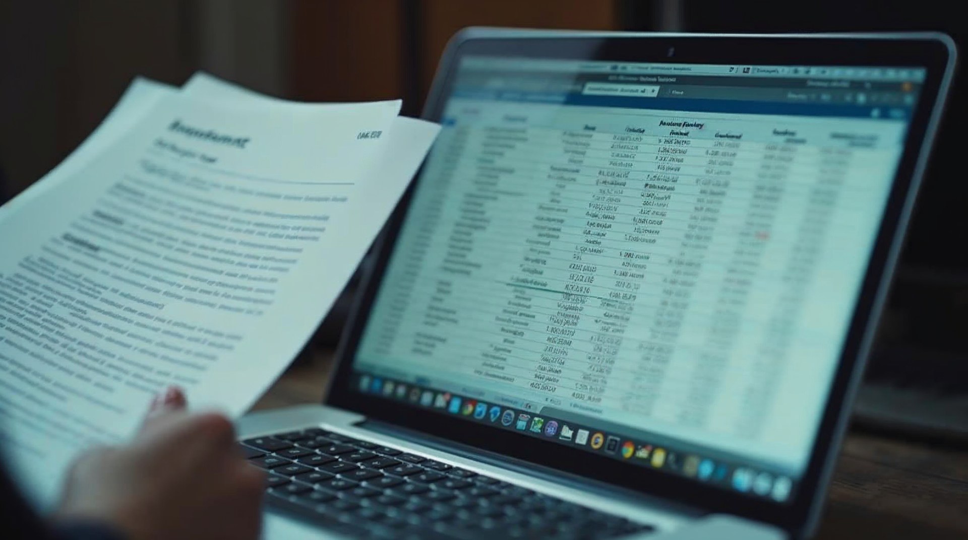
Duplicate events, mixed currencies and inconsistent channel names resolved, totals reconciled against the sales system, tables pre-aggregated.
Weeks 2-4 / Design
Honest scales, findings as titles
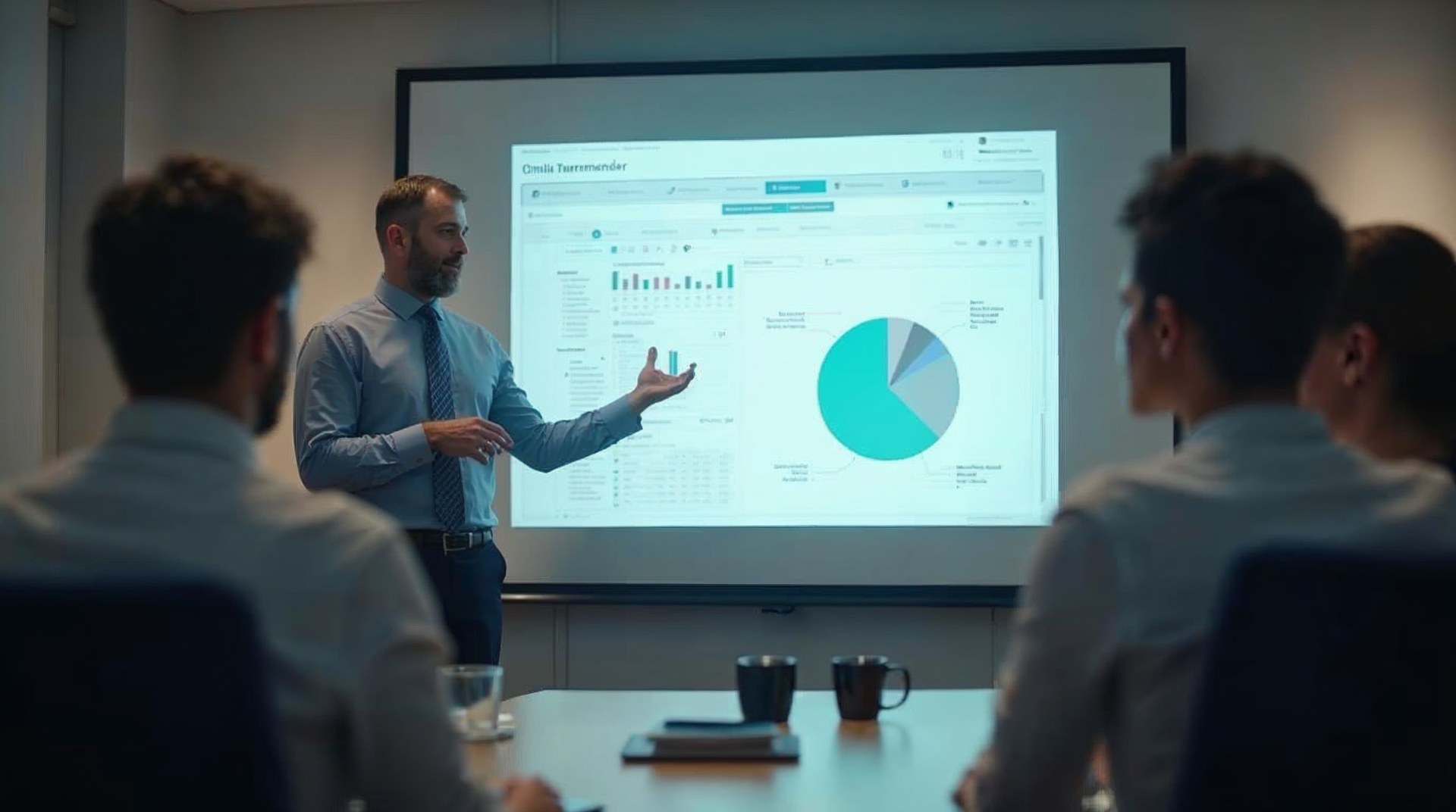
The right chart for each comparison, colour-blind-safe palettes, annotations for the events that explain movement, and a reusable component library.

Weeks 4-6 / Embed
Into the meeting, then handed over
First reviews run from the finished views, walkthroughs recorded, alerting configured, files and documentation transferred to your team.
WHAT YOU GET
Deliverables your team can extend.
can extend
Everything below is built in your own tools, documented as we go, and handed over with the source files.

Reporting design review
A read of your current views against the decisions they are meant to serve, with a prioritised list of what to cut, fix or rebuild.

Visual design system
Chart types, colour meanings, typography, spacing and labelling rules in your brand, so every future view matches without debate.

Executive and working views
The board page and the weekly working report, each designed around one decision, with honest scales and findings as titles.

Interactive and embedded charts
Filterable views, embeds for your intranet or client portals, and static exports built for decks and printed reports.

Alerting and freshness
Warnings when a feed stops, a tag disappears or spend runs without conversions, plus a freshness stamp on every page.

Documentation and training
Written definitions, model documentation, recorded walkthroughs and a session with the team who will own the reporting next.
HOW WE WORK
Operating standards, not promises.
Operating standards



















Built on trust. Proven by results.
We partner with SMBs and Fortune 500 companies to deliver more than reach — we bring clarity, execution, and measurable outcomes. Every successful partnership starts with a strong culture fit and a shared drive to grow.






CASE STUDIES
Case studies
Website Portfolio
Video Ads
Static Ads






























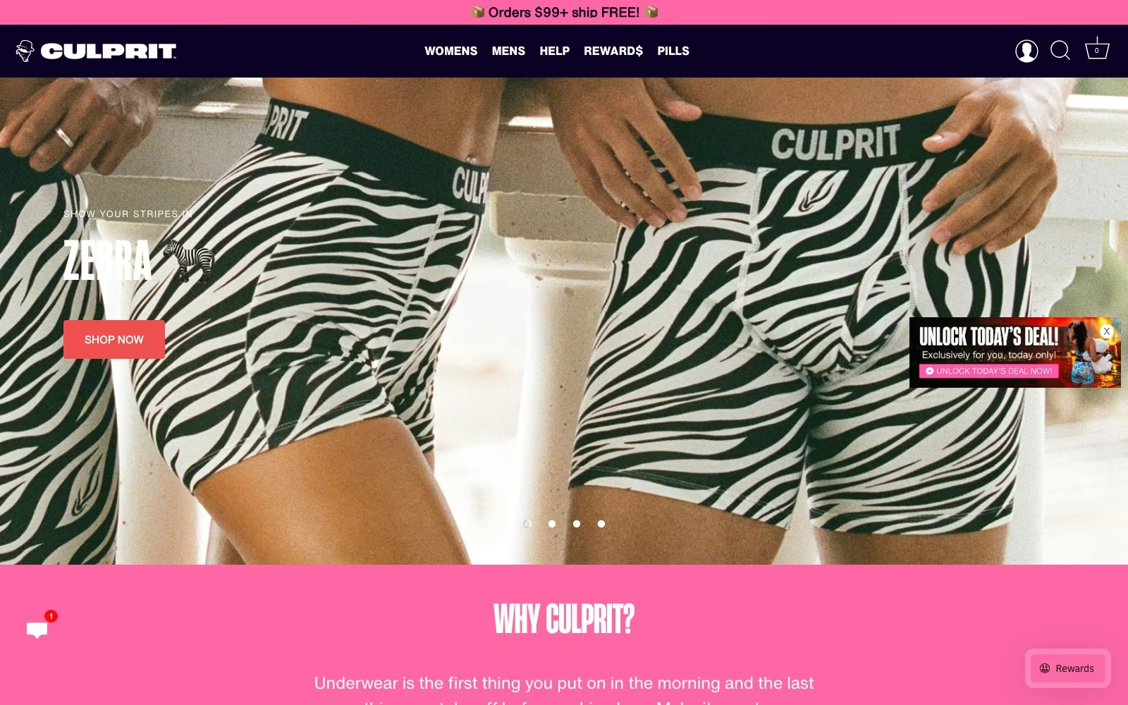





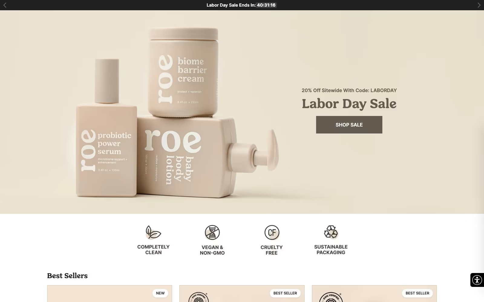



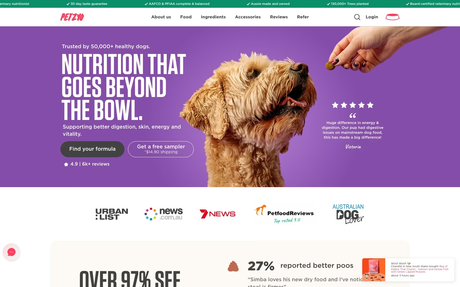



















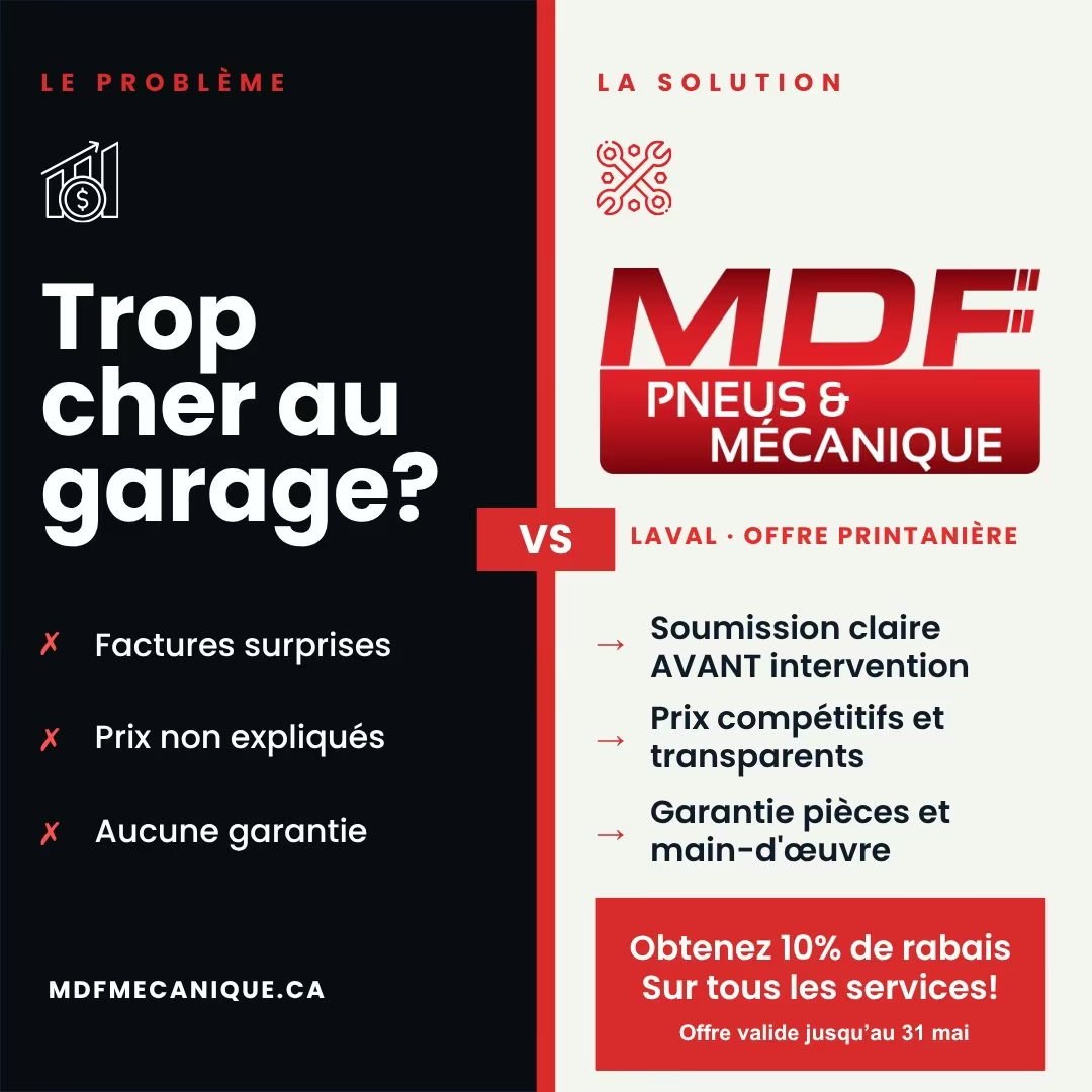







FAQ
What teams ask us first.
What does a data visualization agency actually do?
We turn data that already exists into views people act on. In practice that means framing the decisions worth supporting, checking the model underneath so the chart is defensible, choosing the right comparison and scale, designing to your brand, and then making the reporting part of a routine so it survives past launch week. It is a design discipline resting on an engineering one: honest visuals on a broken join are still wrong, and a perfect model nobody can read changes nothing.
How is this different from building dashboards?
There is deliberate overlap, and plenty of clients buy both. Dashboard work is mostly about plumbing and structure: connecting sources, agreeing definitions, standing up the executive, channel and diagnostic layers, keeping them fresh. Visualisation work is about comprehension: which comparison, which scale, which colour, what the title says, whether the finding lands in three seconds. When reporting exists but goes unread, the problem is usually this one, and it can be fixed without rebuilding the stack.
Our data is messy. Do we need to fix that first?
Not before you talk to us, but it does get fixed as part of the work. We reconcile the tables behind each view against your sales or billing system, resolve duplicated events, mixed currencies and inconsistent channel names, and state exclusions on the view itself. Where the underlying collection is genuinely unreliable we say so and scope that repair separately through our analytics team, because designing a confident chart on numbers we cannot defend would be the worst thing we could hand you.
Which tools do you work in, and can you use ours?
Yours, wherever possible. We work daily in Looker Studio, Power BI, Tableau and Metabase, model in BigQuery or Snowflake, and use D3 or Observable Plot when a bespoke visual genuinely earns the extra build. The design system is delivered in Figma alongside the live components. We deliberately keep implementations conventional so your team can extend them, and we will recommend the simpler tool whenever it does the job — there is no advantage to us in a heavier stack.
Why do good-looking reports still get ignored?
Because attention follows routine, not aesthetics. BARC's research with 1,000 users found 97% reporting faster planning and 94% better decisions, while average employee use stayed at 25%, and IBM measures active use at roughly 29%. The reports that survive are the ones with a named owner, a standing meeting, a title that states the finding and few enough pages that nobody has to hunt. We build all four of those in deliberately, and prune what nobody opened after a month rather than maintaining it out of politeness.
Can you make our charts accessible and brand-consistent?
Yes, and both come as standard rather than as an upgrade. Palettes are chosen to survive the common forms of colour-blindness and to hold contrast on a projector or a printed page; labels never depend on hover alone; type sizes are set for the room the chart is read in. Brand consistency comes from the component library we hand over — chart types, colour meanings, typography and spacing codified — so the next chart your team builds matches without anyone having to relitigate the palette. Related: our accessibility team handles the wider site standard.
Do you do one-off visuals for reports, decks and PR?
Regularly. Annual reviews, investor decks, original research write-ups and data-led PR pieces all need charts that stand alone without a live filter, and they are some of the most enjoyable work we do. We deliver them as vector and high-resolution exports plus editable source files, in your brand, with the underlying calculation documented so a journalist or analyst asking “where does this number come from” gets a straight answer.
How do you charge?
Fixed-scope projects, quoted after the reporting review, so you approve a number before anything starts: the design system, the agreed set of views, documentation and training. Ongoing work — new views, seasonal reporting, quarterly reviews — is a small monthly retainer or ad hoc, whichever suits, and it is genuinely optional because the component library is designed for your team to extend. We do not price design as a share of media spend.
How quickly will we see something?
Within the first two weeks you will see the decision map and the first designed views on real data, not mock-ups. A full set of views typically takes four to six weeks, and we work in weekly sessions so nothing is a surprise at the end. If we hit a modelling problem that changes the timeline, you hear about it the week we find it, along with what we recommend doing about it.
Can you work with our in-house data team?
Yes, and it is a common arrangement. Your data team owns the warehouse and governance; we own the marketing measurement layer and the presentation layer, with the transformation code shared and reviewed like any other. Everything is documented and version-controlled so it survives handover and staff changes. Where there is no in-house data function, we run the whole layer and train whoever will inherit it — the same reason we keep the stack conventional rather than clever.

.webp)
.webp)