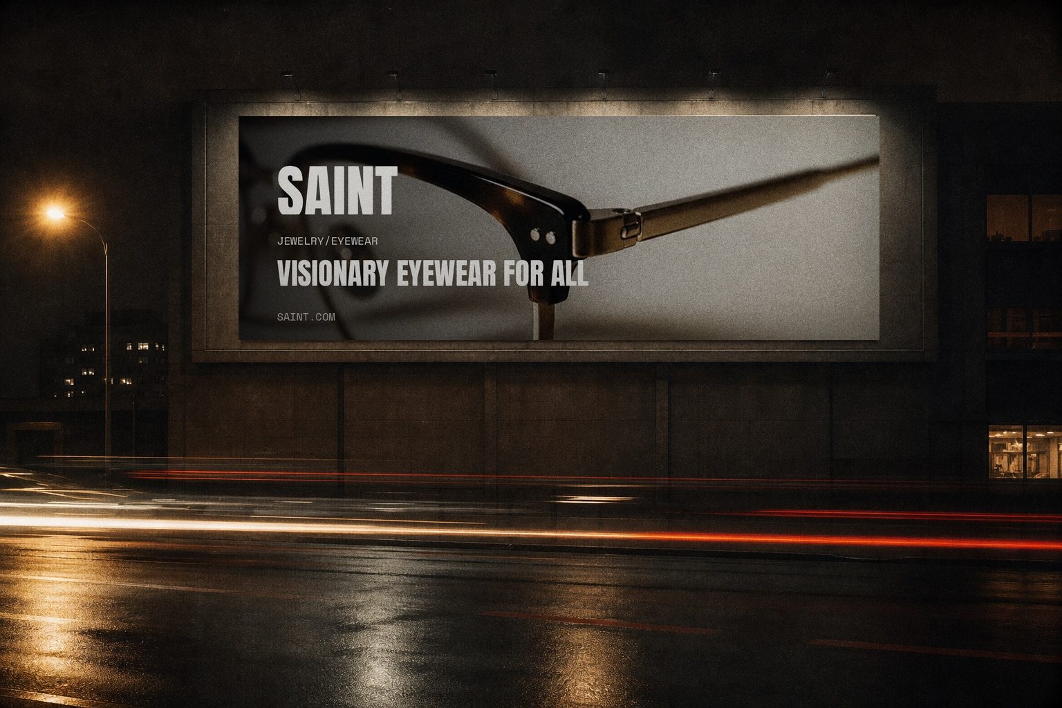
SAINT
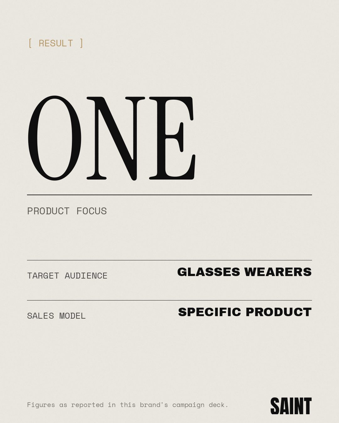
One product, one offer, one page
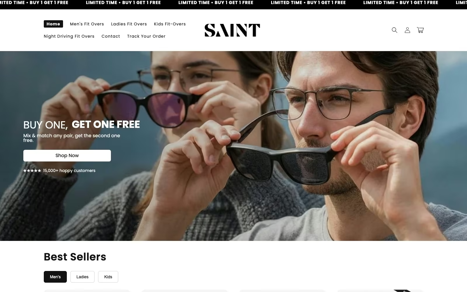
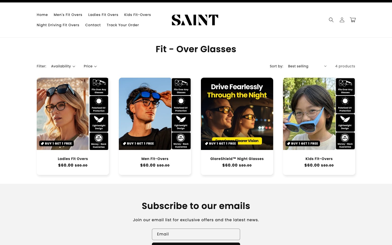
SAINT sells polarised fit-over sunglasses that slide straight over prescription frames. The audience is narrow and self-aware, the objection list is short, and almost all of the revenue rests on one product page and one offer.
01 — The challenge
A single product page carrying the whole business.
Fit-overs are bought by people who already own glasses and have been disappointed by bulky, cheap-looking alternatives. That means the page has to answer the same three questions every time — will they actually fit over my frames, will they look ridiculous, and what happens if they do not work out — before any offer matters.
The store's traffic converged on one product page and one paid landing page, so every gap in that sequence was a gap in revenue.
When one page carries the brand, the page has to argue like a salesperson, not sit there like a catalogue entry.
*
1
Product page carrying the majority of store revenue
*
3
Core objections the page had to close: fit, look, risk
*
2
Offer surfaces rebuilt — product page and paid landing page

02 — Our approach
Build the page around the offer, then prove it with real customers.
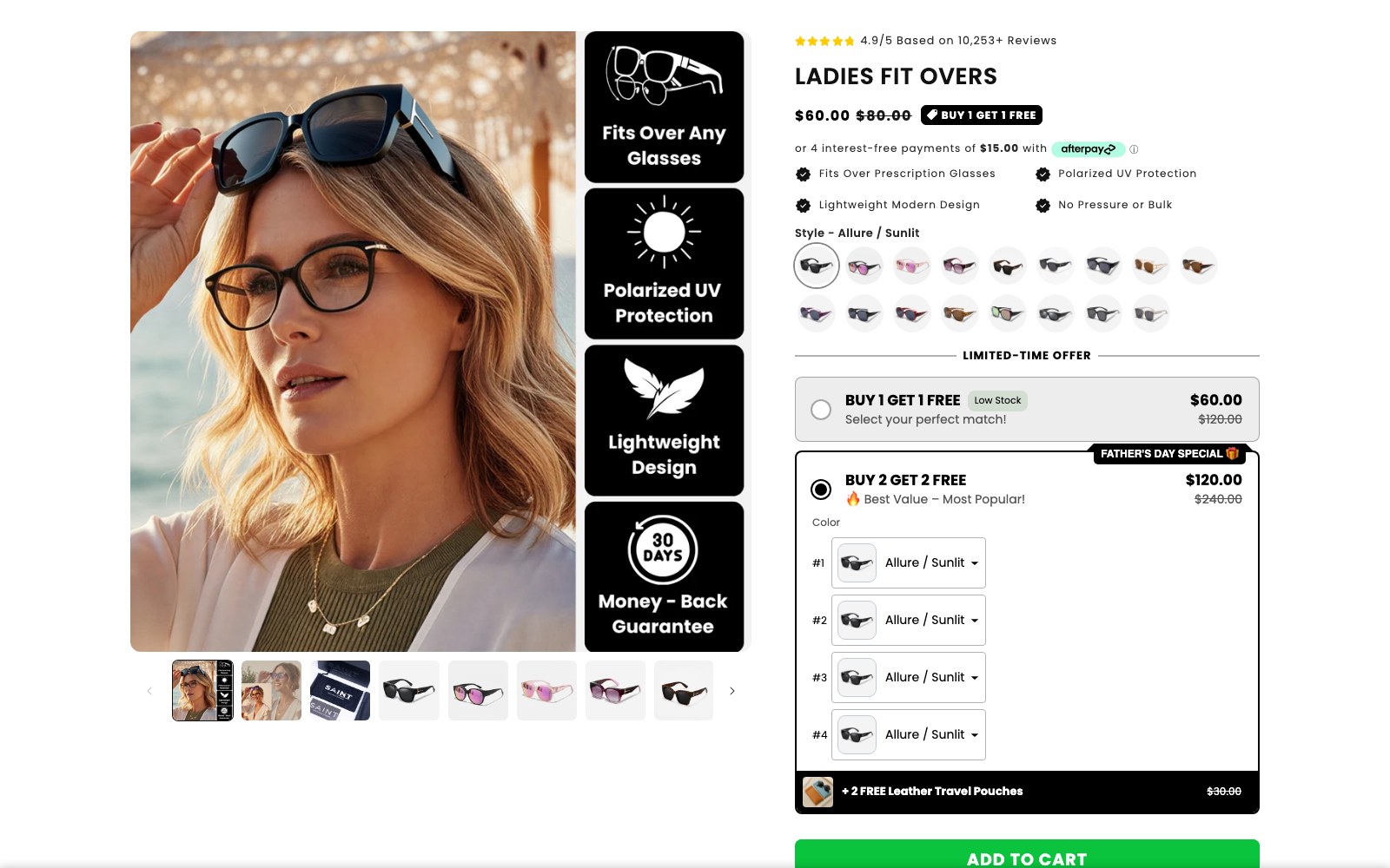
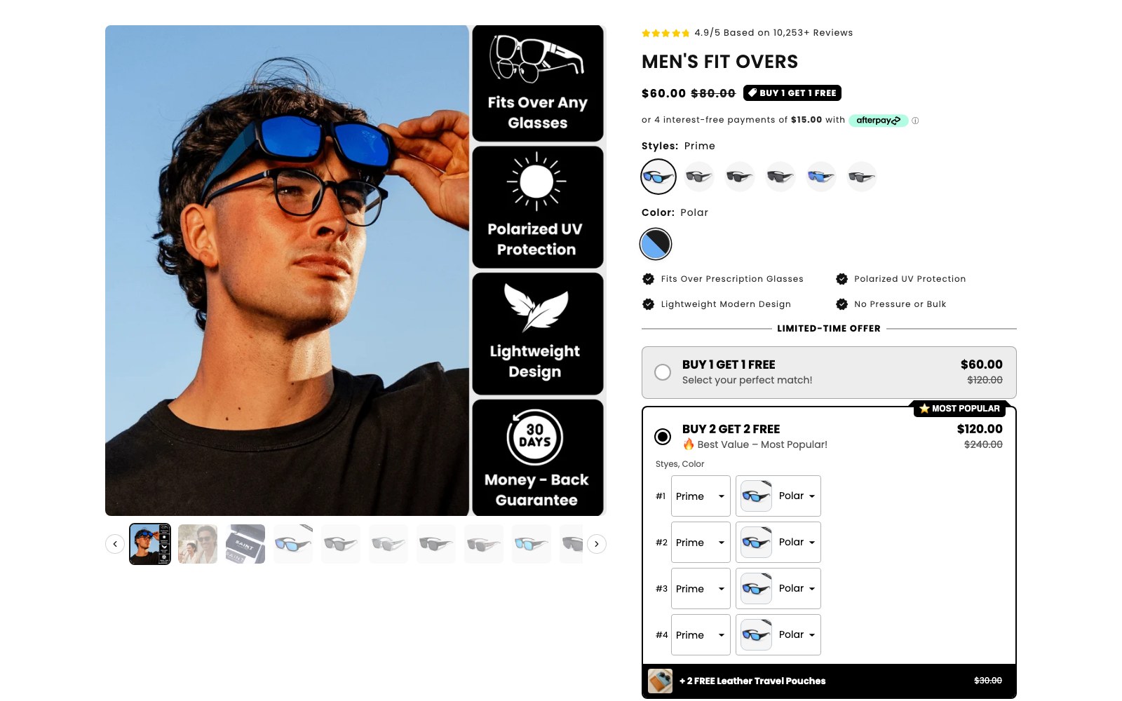
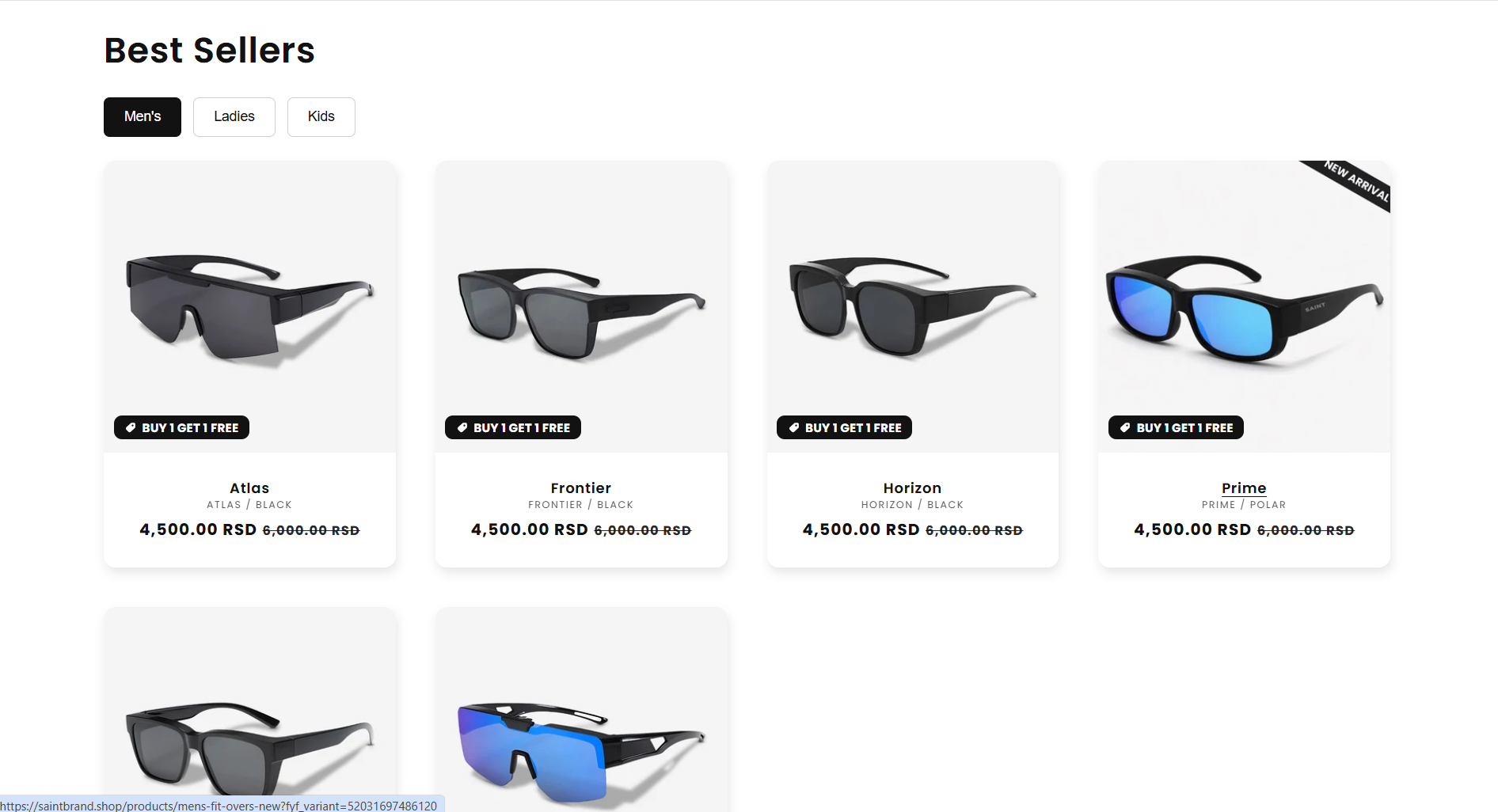
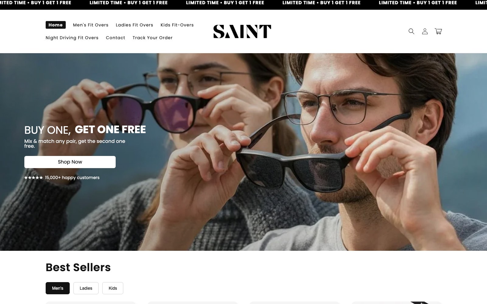
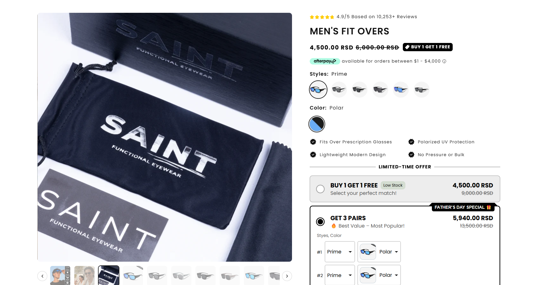
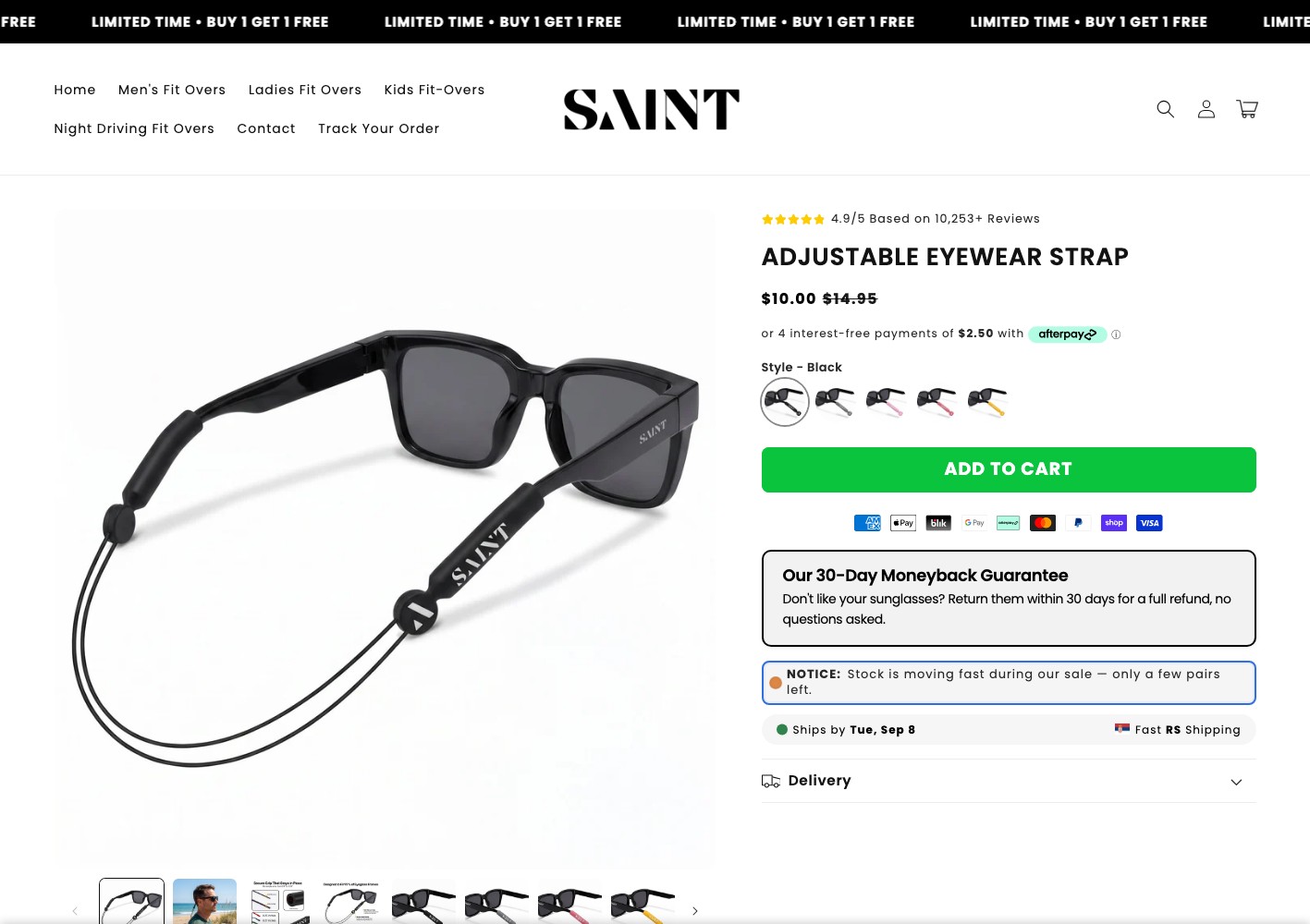
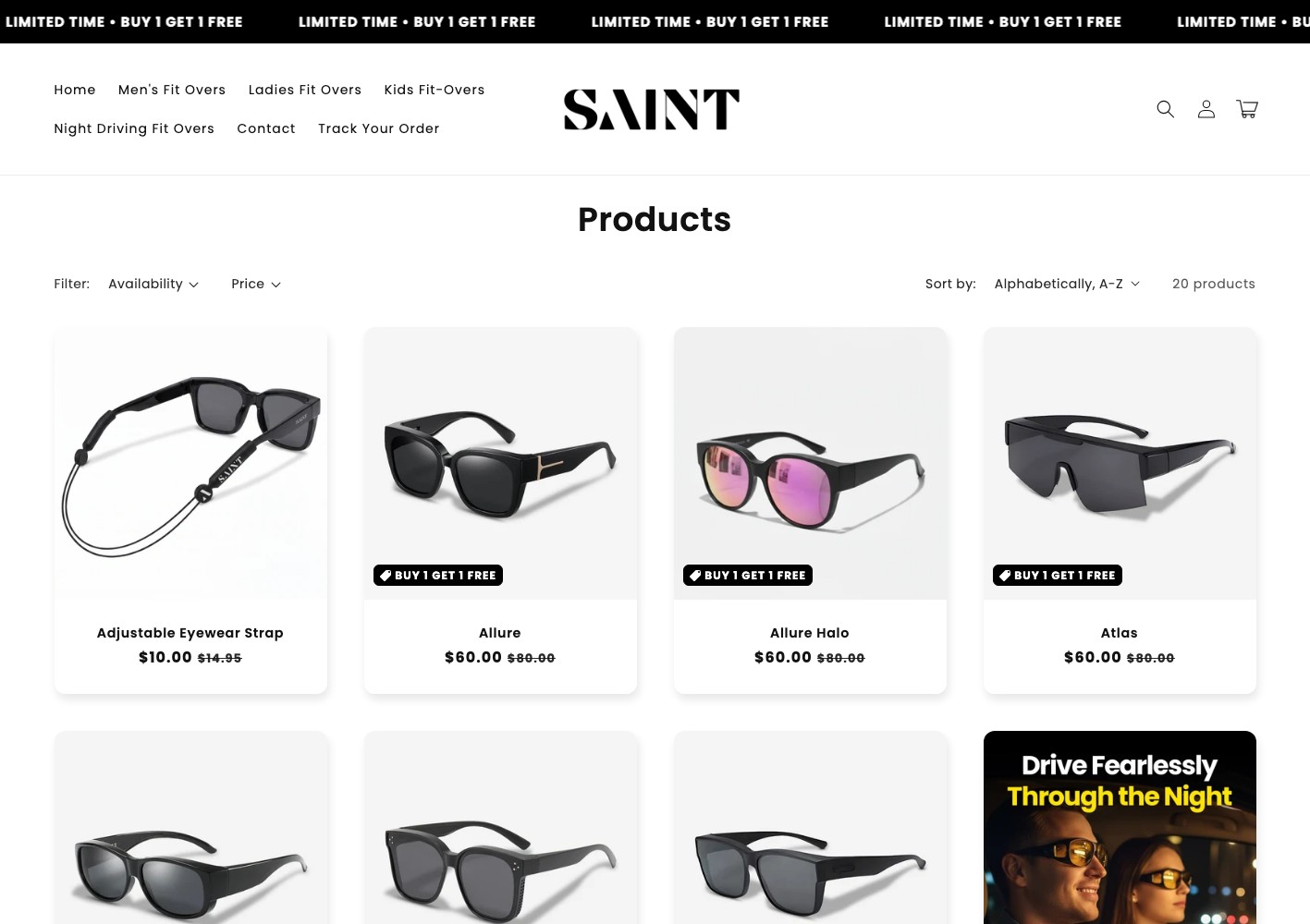
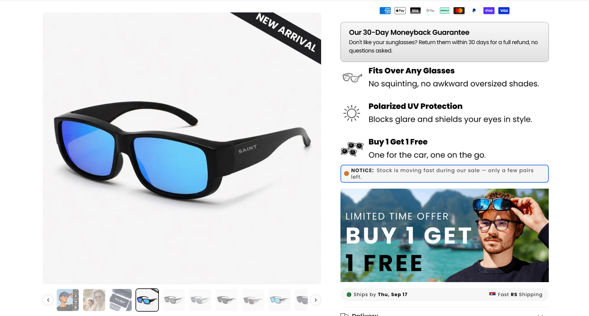
We rebuilt the fit-over product page so the buy-one-get-one offer is the structure of the page rather than a badge on it: the variant picker and the bundle choice sit together above the fold, with the guarantee, polarisation and lightweight-design claims stacked as a benefit rail beside the imagery.
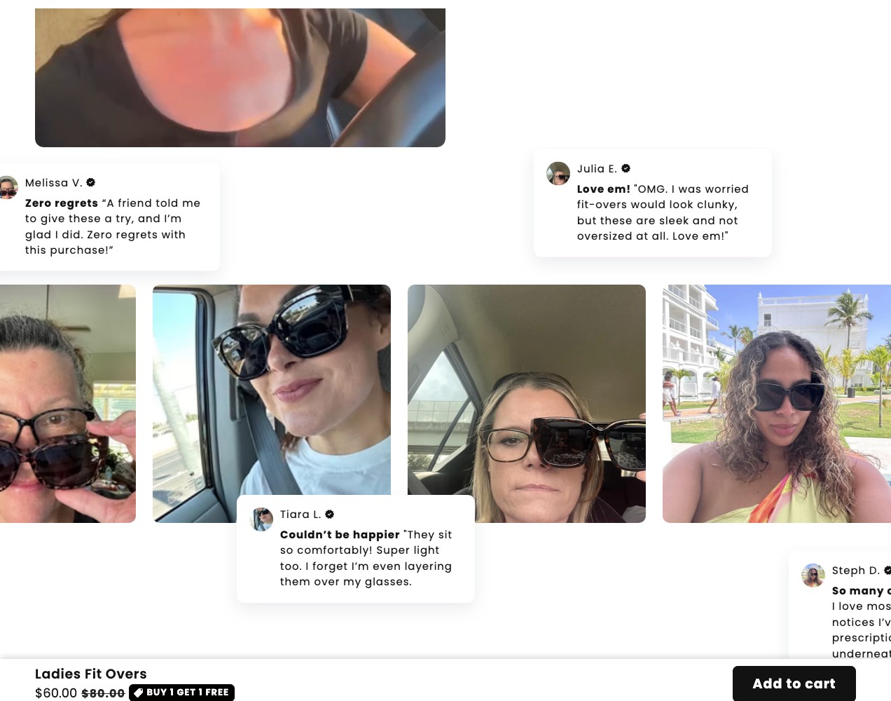
Below that, the page stops selling and starts proving — a plain comparison table against generic fit-overs, then a wall of verified customer photos of people actually wearing them over their prescription frames. That evidence block is the part shoppers scroll for, so it sits before the FAQ instead of after it.
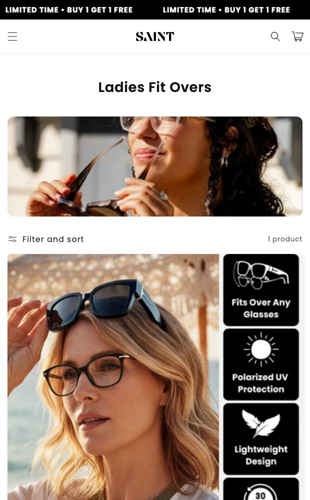
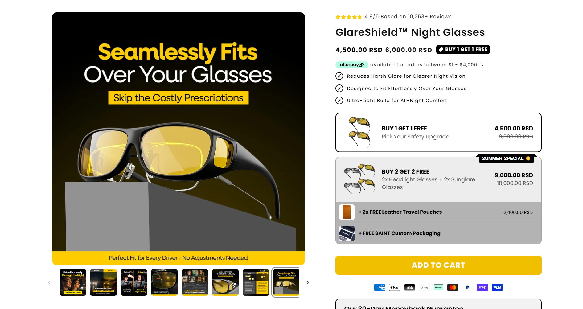
The same logic drives the paid landing page: a pick-any-two offer explained in three steps, one grid, one review section, one comparison, one CTA repeated down the page. Analytics and event tracking were wired across both so the offer, the variants and the add-to-cart path can be read separately instead of as one blended number.
More on this work: Shopify Development · Web Design.
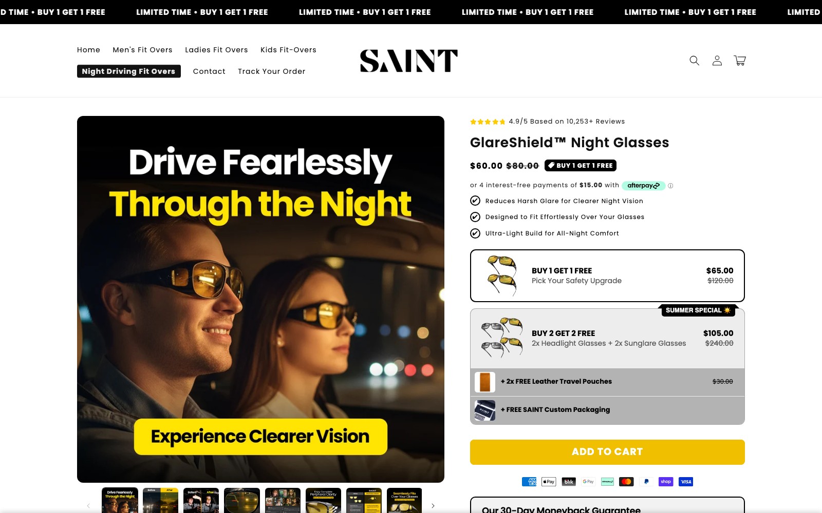
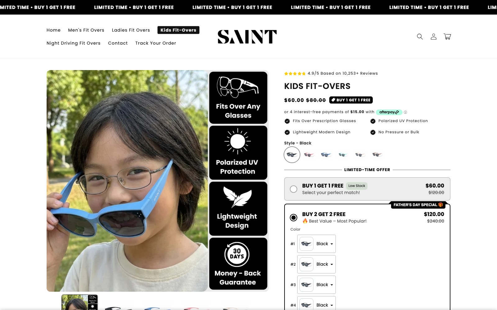
One product, two surfaces
The bundle offer became the
page structure.
We rebuilt the fit-over product page so the buy-one-get-one offer sits above the fold with the variant picker, not buried in a banner. The guarantee, polarisation spec and lightweight build run as a benefit rail beside the product imagery, then the page shifts to proof: a comparison table against generic fit-overs and a wall of verified customer photos showing real prescription frames underneath.


03 — The results
Two pages now answer the same three objections in the same order.
The product page and the paid landing page both lead with the pick-any-two offer, isolate fit and look and risk as the three objections to close, then stack evidence before the FAQ. Analytics and event tracking now separate the offer surface, the variant choice and the add-to-cart path instead of blending them into one number.
The customer photo grid does the work the copy used to attempt — showing someone that the fit-overs will sit over their frames without looking like safety goggles. That block sits before the FAQ because it is what shoppers scroll to find.
CASE STUDIES
Case studies
Website Portfolio
Video Ads
Static Ads




























































.webp)
.webp)