mindbodygreen
Media-grade content, store-grade conversion
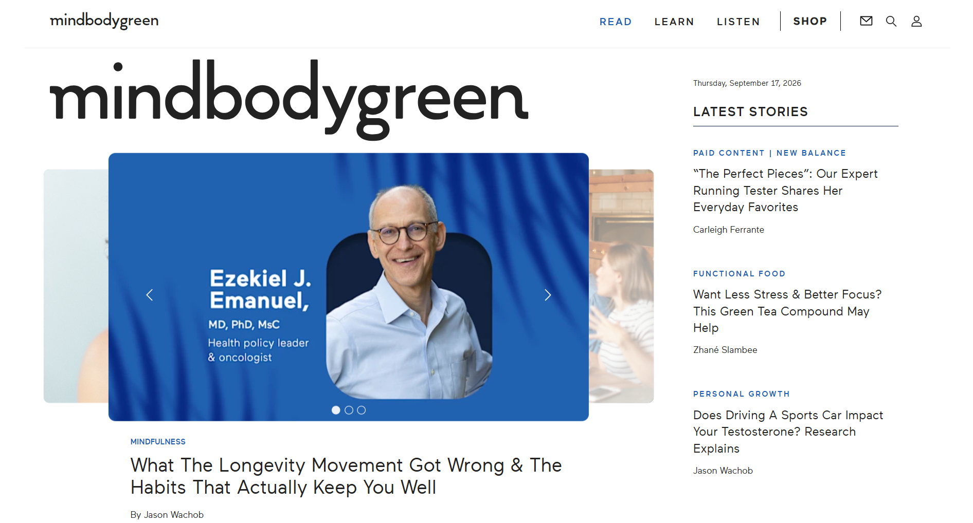
mindbodygreen is a US wellness brand with an audience built on research-led content, and a supplement line that has to hold up to the same scrutiny. The shop had to feel like the editorial brand and still behave like a high-volume DTC store.

01 — The challenge
An educated audience will not buy from a plain product grid.
Supplement buyers coming from an editorial audience arrive with questions a grid cannot answer: what is in the formula, who formulated it, what testing it went through, what the study behind the claim actually said, and why this costs what it costs. Answer none of that and you lose the sale to a comparison tab. Answer all of it on the product page and the page collapses under its own weight.
The brand's advantage was its credibility. The store had to sell with it, not around it.
*
4
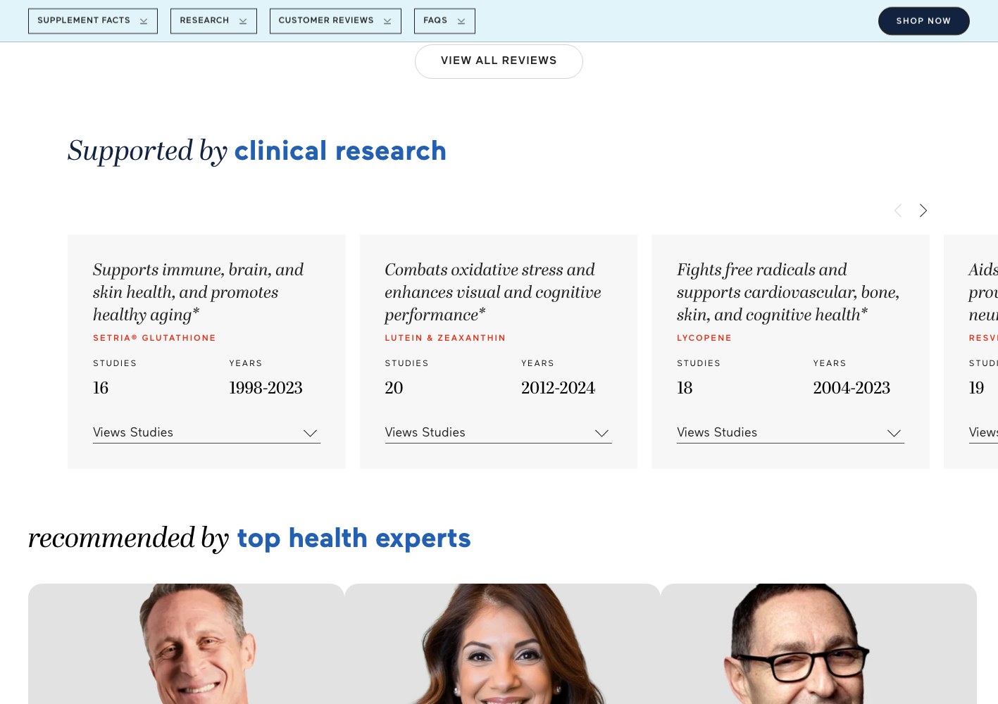
Rounds of ISO-certified testing surfaced as an on-site conversion argument
*
2
Dedicated long-form product landing pages built alongside the catalogue
*
6
Health categories used to organise the supplement range

02 — Our approach
Sell the range from the shop, and sell the hero SKUs from their own pages.
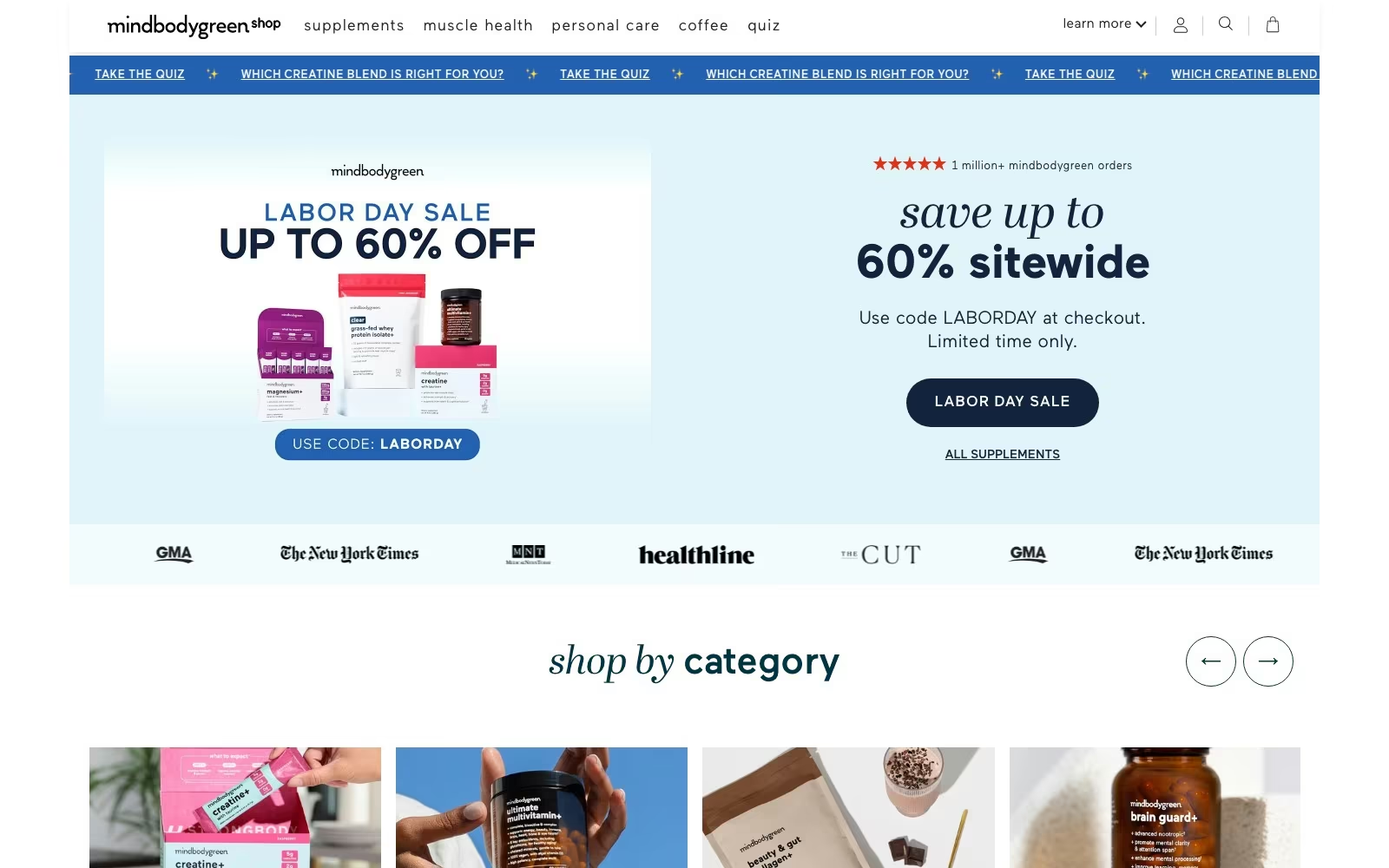
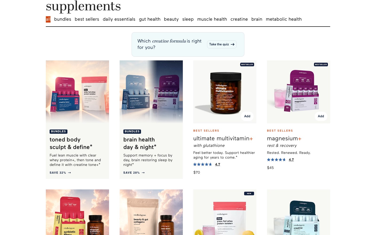
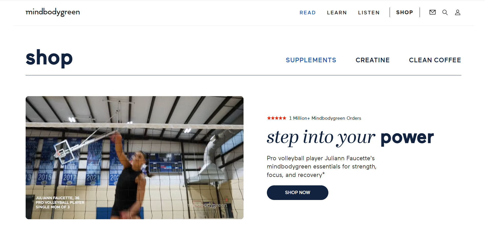
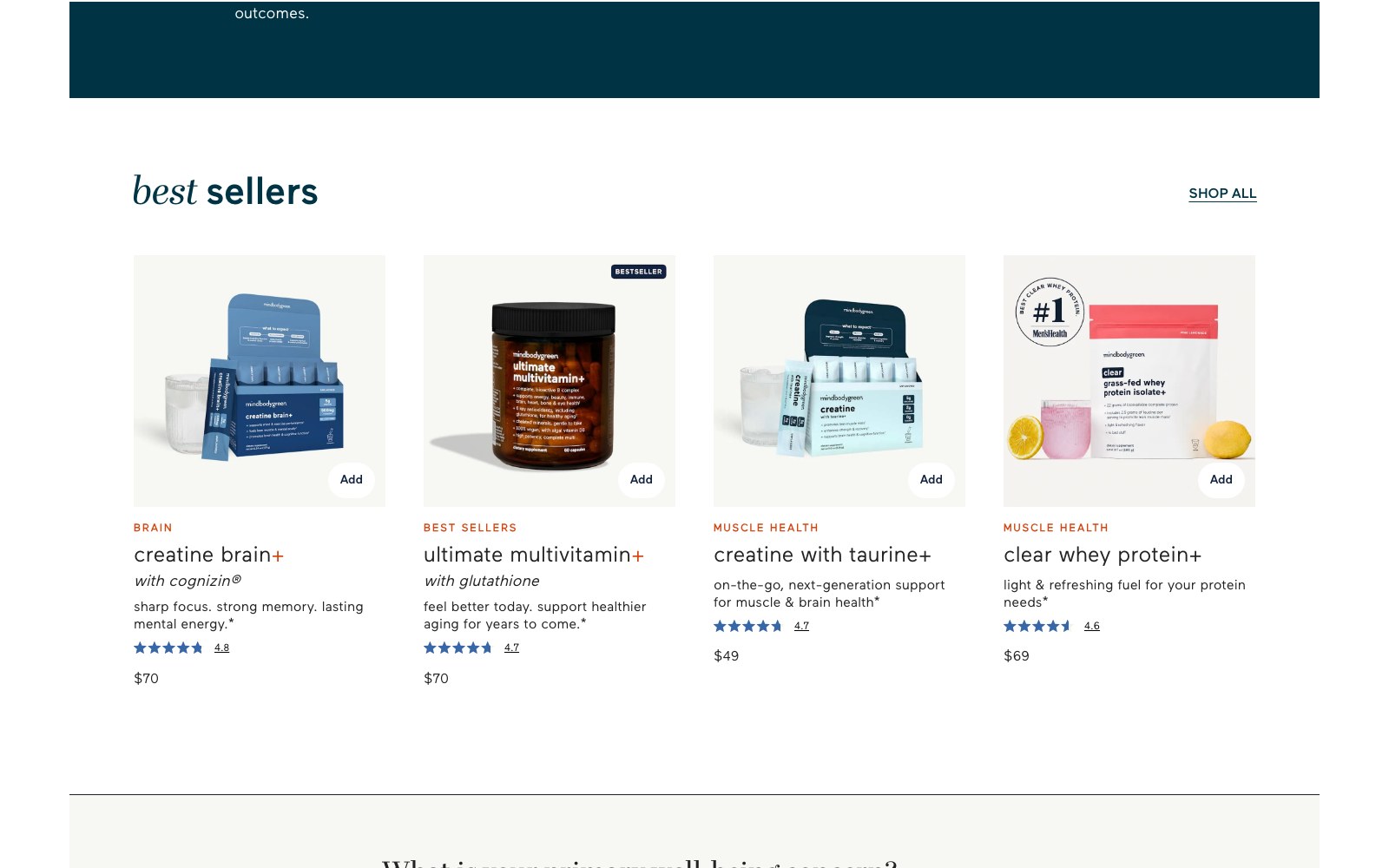
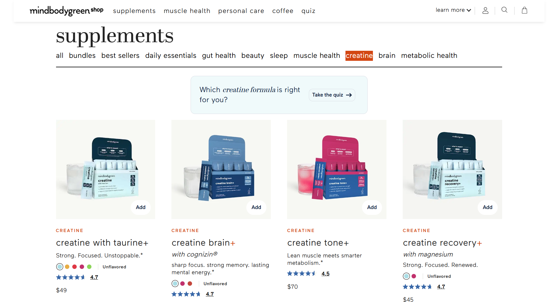
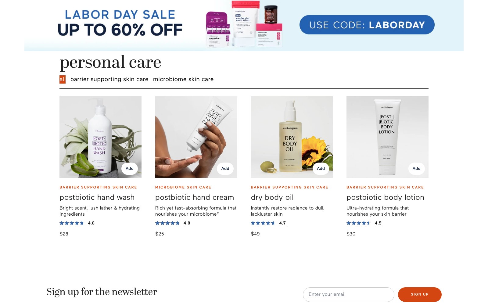
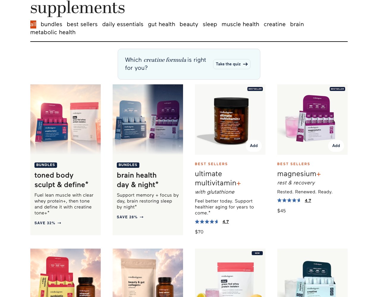
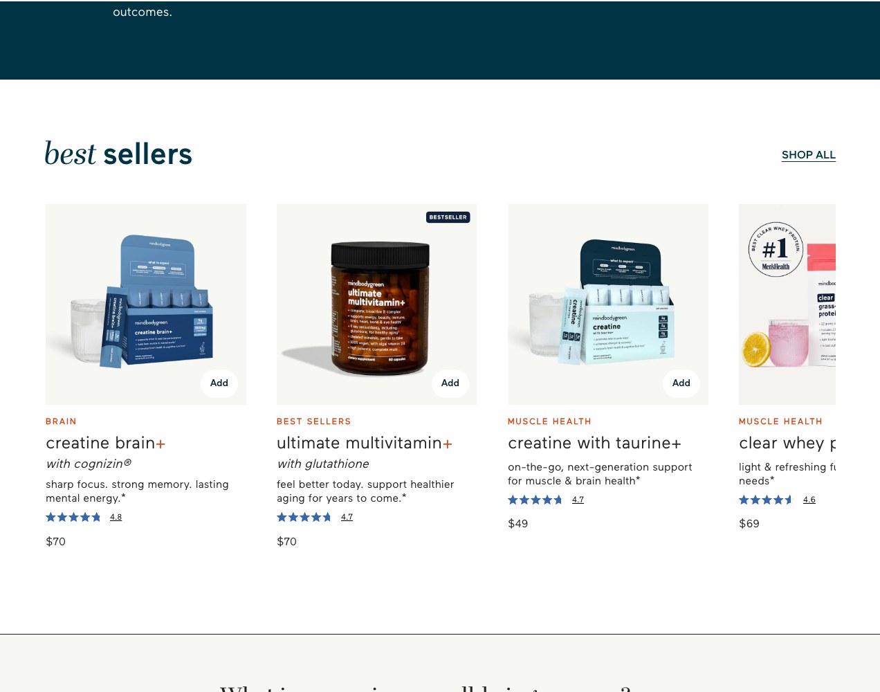
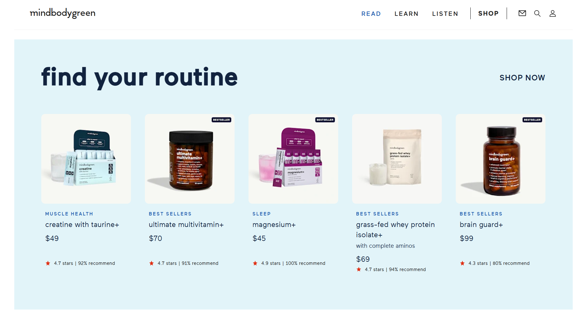
We split the job in two. The store side — homepage, category navigation and the supplements catalogue — is organised by the outcome people shop for: muscle health, gut health, brain, beauty, sleep, daily essentials. Products carry benefit-first naming, ratings and a bundle path, so browsing feels like a recommendation rather than a spreadsheet.
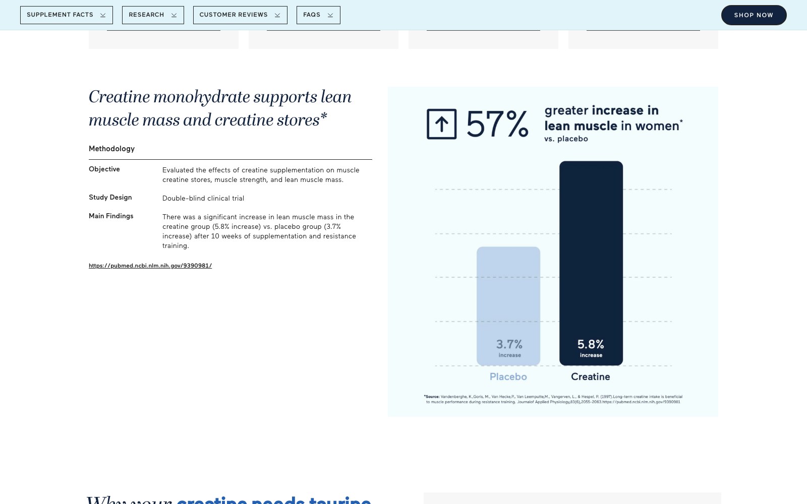
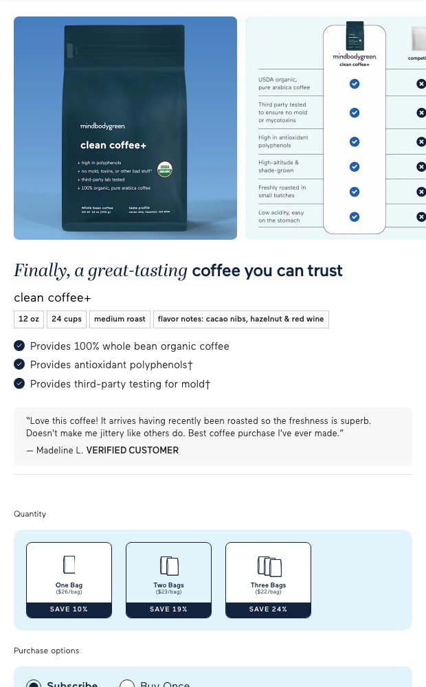
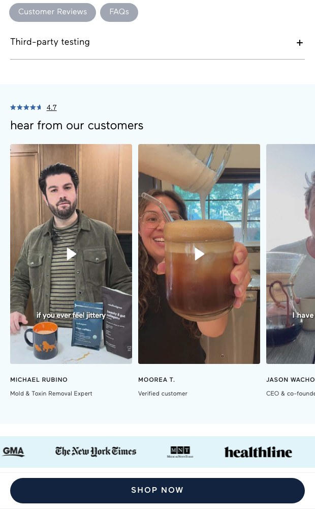
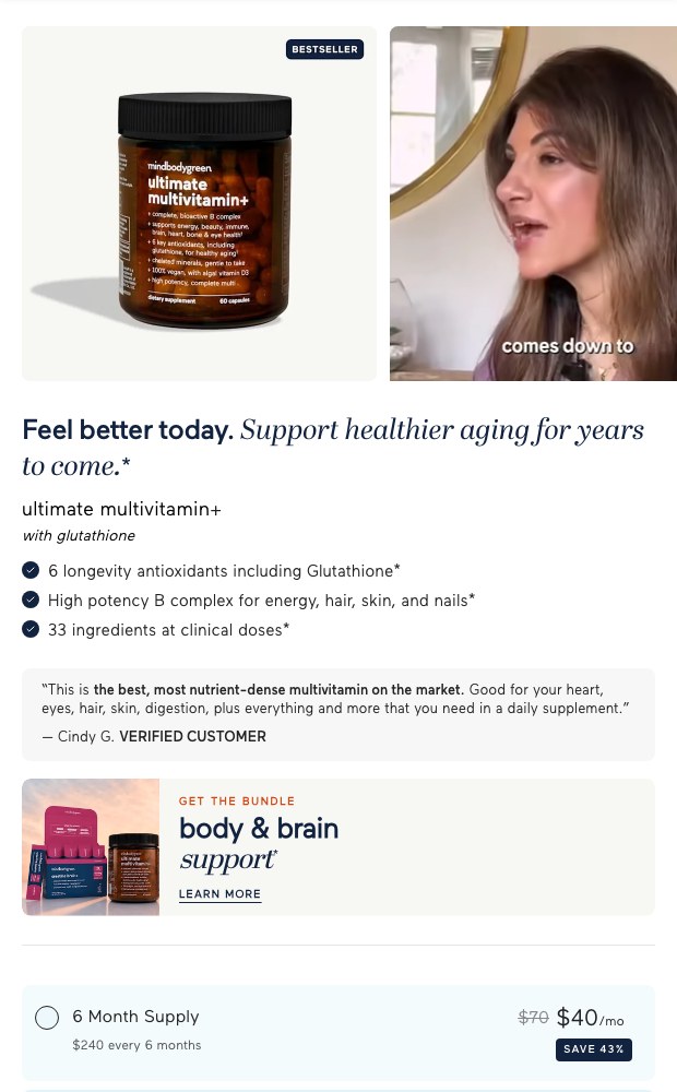
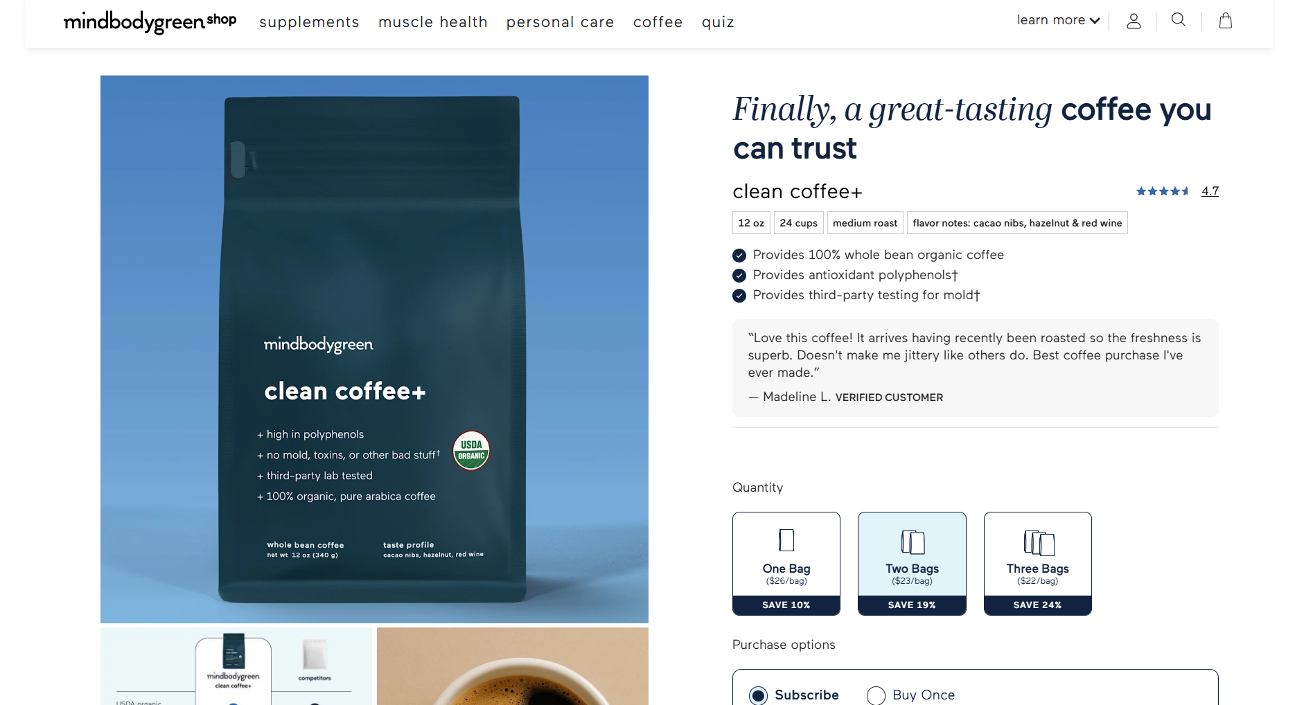
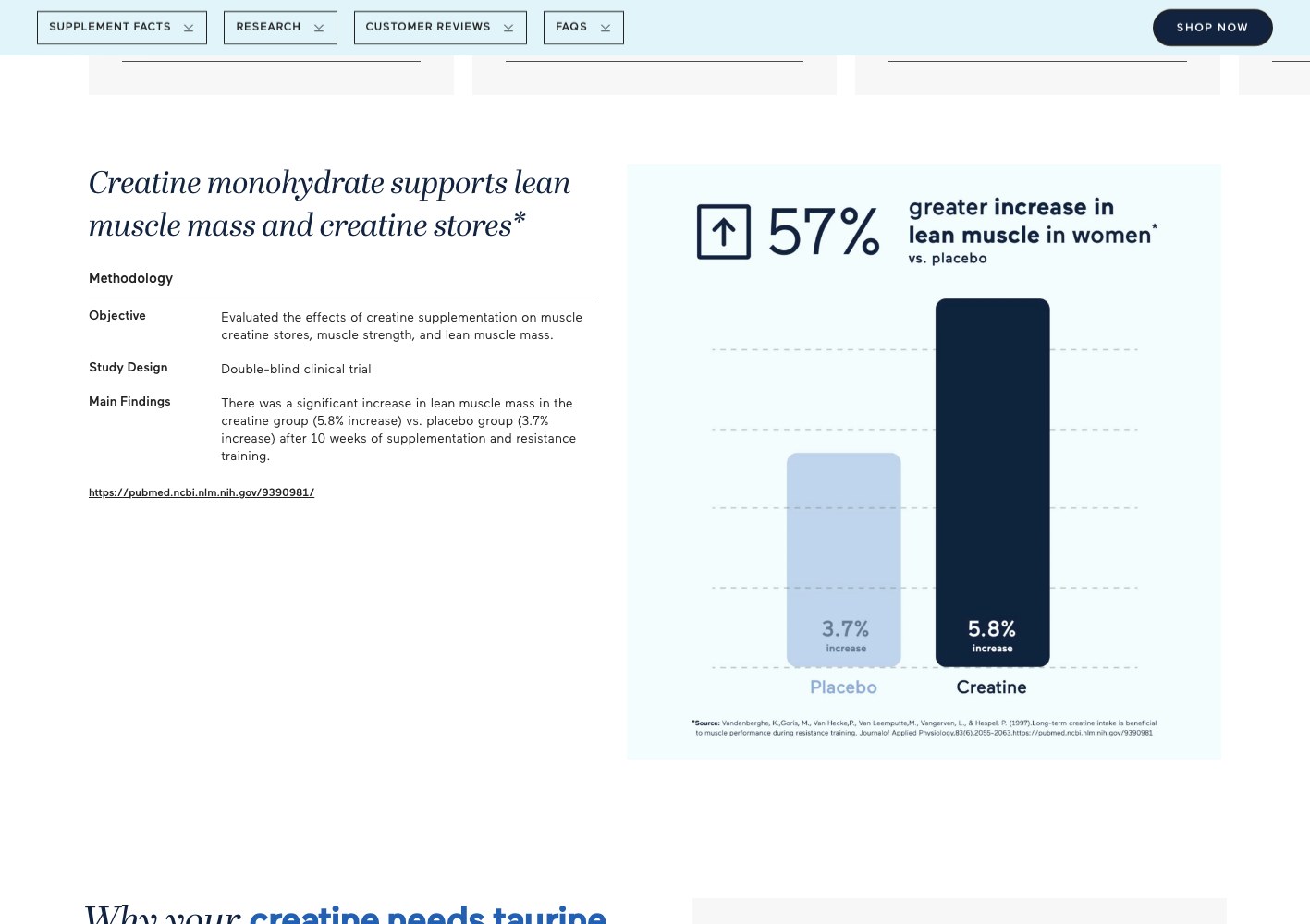
The conversion side lives on dedicated landing pages for the hero formulas. Those pages run long on purpose: the formula and dose, the press credibility strip, the benefit stack, the objections stated plainly, a comparison against competing products, the supplement facts panel, then subscription and one-off pricing tiers with the saving shown.
Everything above is built in Shopify so the merchandising, offers and pricing tiers stay editable by the brand team without a developer.

Two conversion surfaces
The catalogue browses by outcome,
the hero SKUs get their own pages.
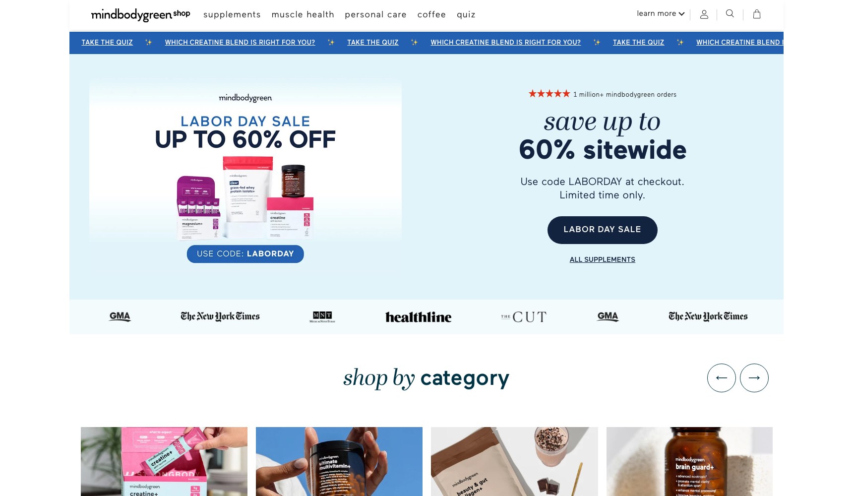
Store homepage and category navigation organise supplements by the health goal someone arrived with — muscle, gut, brain, beauty, sleep, daily essentials. Hero formulas live on dedicated landing pages that run long: formula and dose detail, press credibility strip, benefit stack, objections addressed plainly, competitor comparison, supplement facts panel, then subscription and one-off pricing with the saving shown.
.jpg)




03 — The results
The store now answers the questions an editorial audience brings.
A Shopify shop revamp shipped with a homepage, supplement catalogue organised by health outcome, and dedicated long-form product pages for the signature formulas. Products carry benefit-first names, ratings and bundle paths so browsing feels like guidance instead of a grid.
Formula detail, ISO-certified testing rounds and competitor comparison now sit on the page as conversion arguments instead of living in FAQ collapse or not appearing at all. Merchandising, offers and pricing tiers stay editable by the brand team without developer dependency.
CASE STUDIES
Case studies
Website Portfolio
Video Ads
Static Ads


































































.webp)
.webp)