Mack Weldon
Named fabrics, merchandised properly
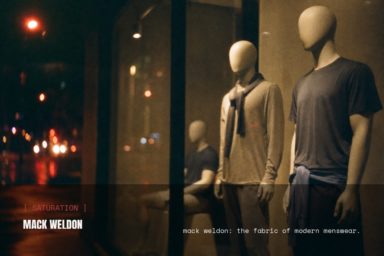
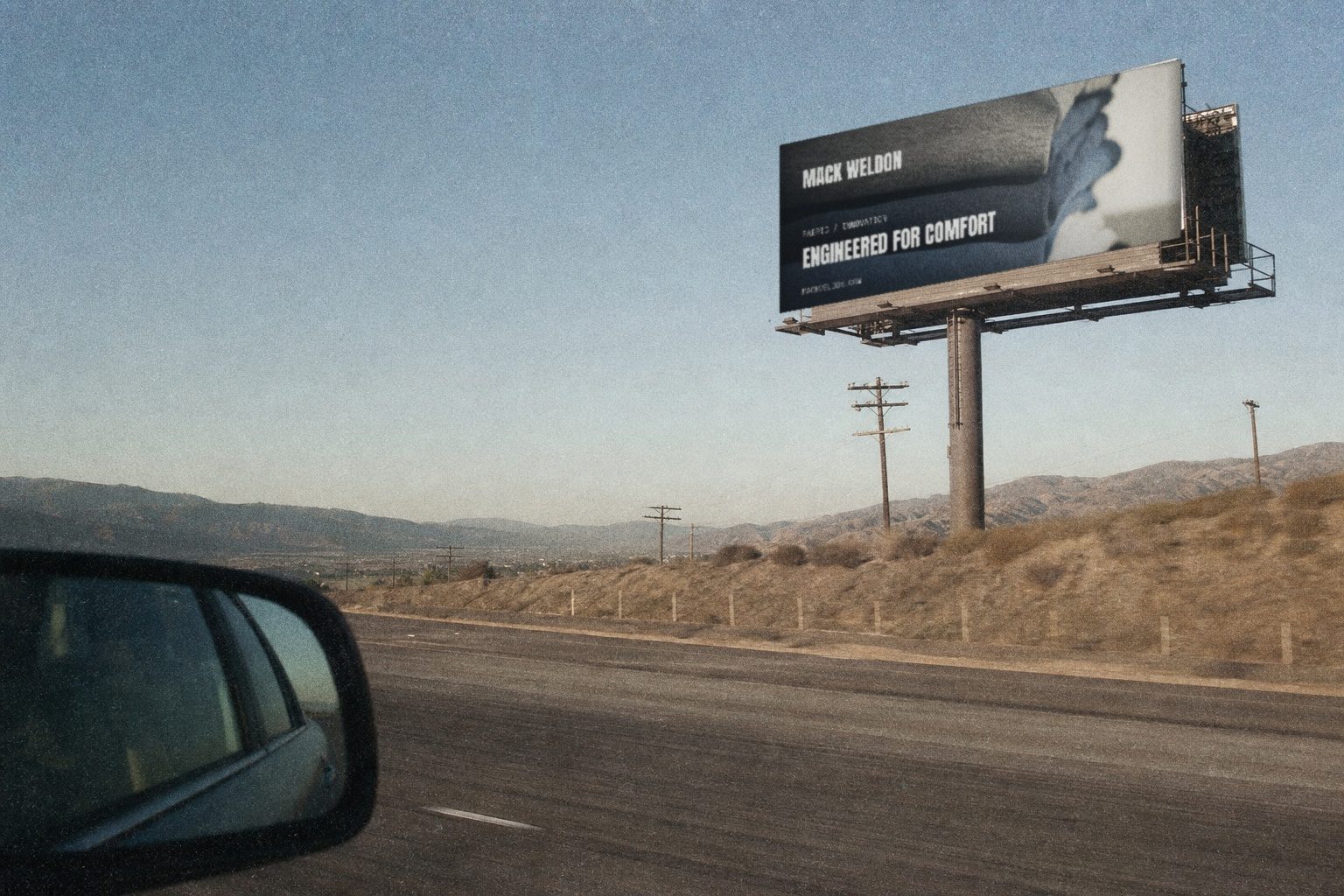
Mack Weldon is a New York men's essentials brand: underwear, tees, loungewear and travel-ready basics, organised around engineered fabric platforms rather than seasonal fashion drops.
01 — The challenge
A boxer brief looks like every other boxer brief in a product grid.
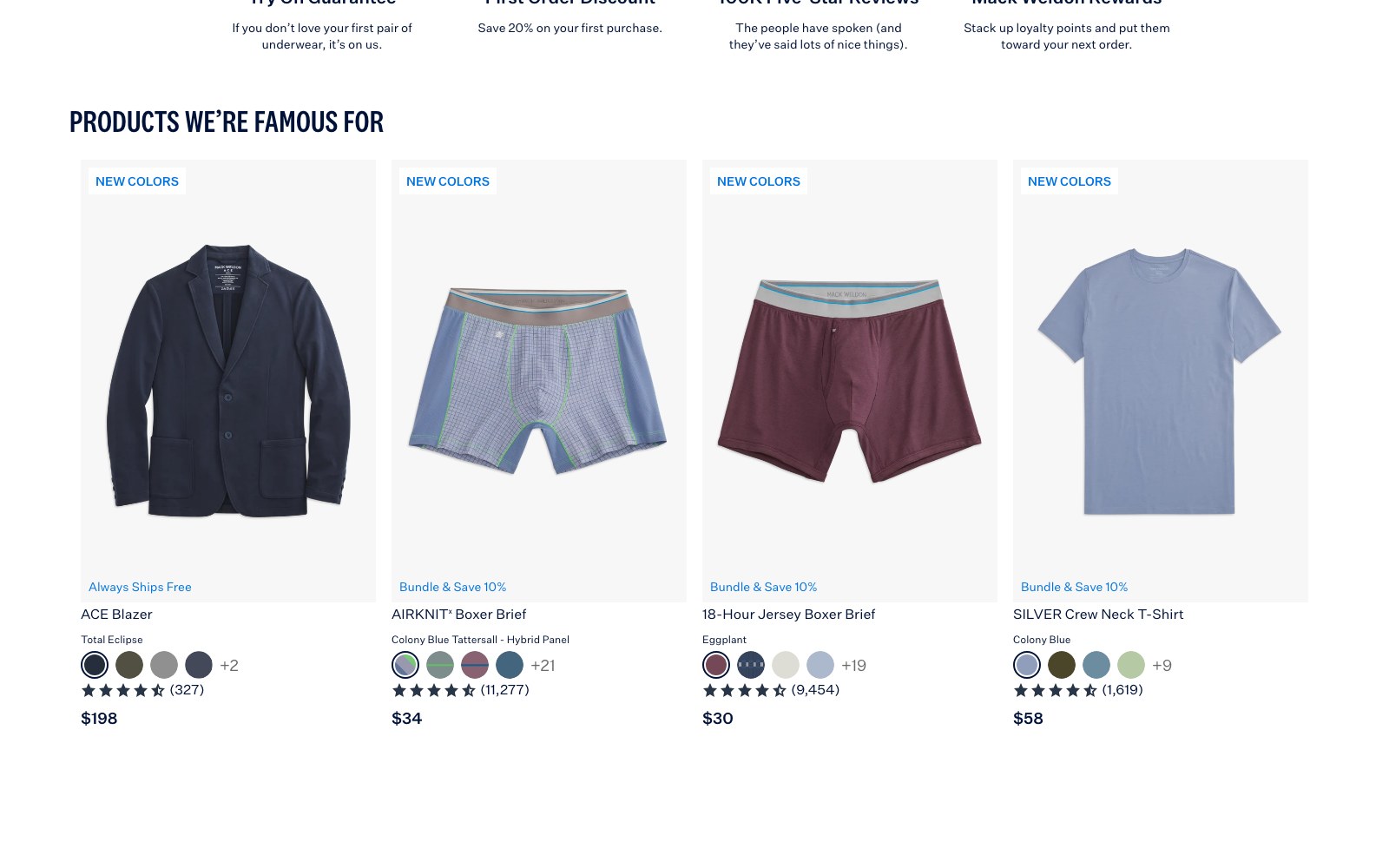
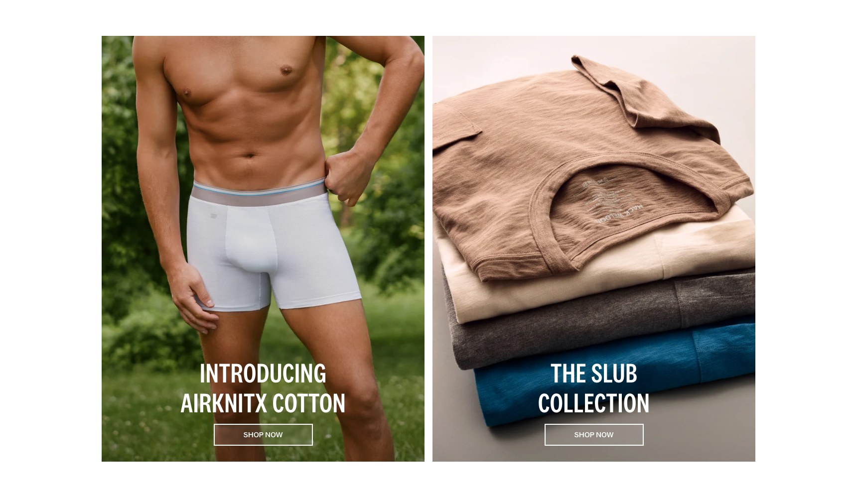
Mack Weldon's premium is technical: silver-ion anti-odour yarn, micro-brushed French terry, an ultra-light cotton knit built for New York humidity. None of that survives a plain Shopify collection grid, where a $40 boxer brief sits next to a $20 one and looks identical.
The store also has to serve two very different shoppers at once — a first-timer who needs the fabric explained, and a repeat customer who wants to reorder ACE sweatpants in a tall size in three clicks.
Technical apparel loses in a grid and wins on a page that explains it.
*
3
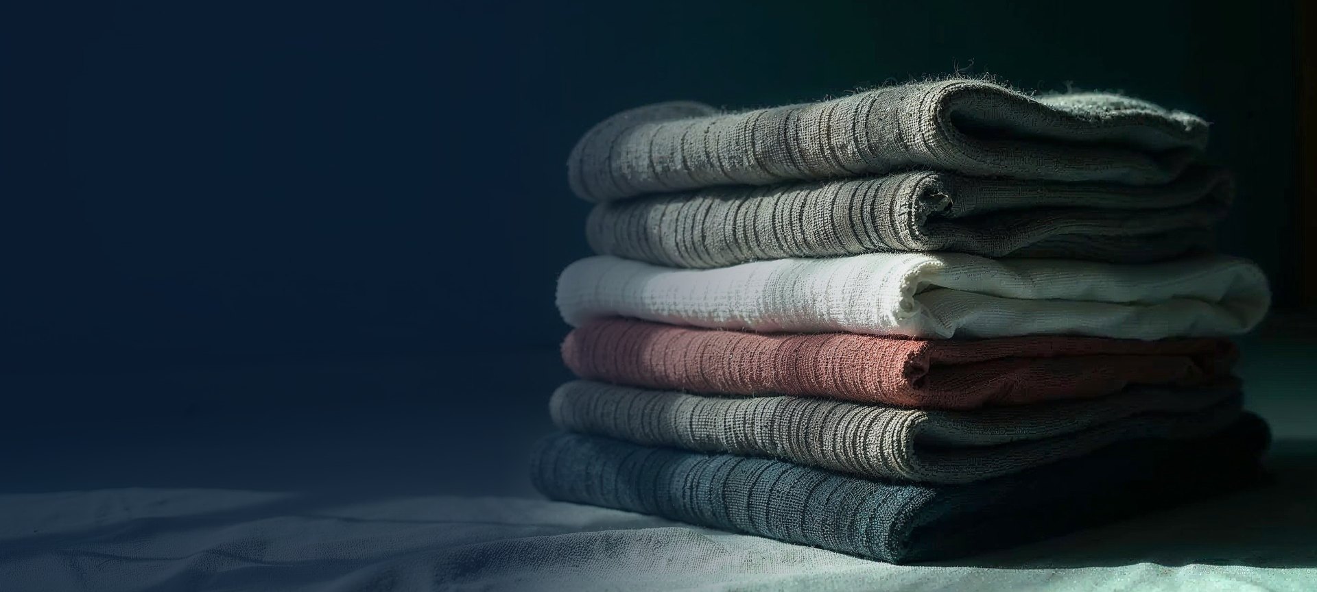
Named fabric platforms given their own story pages — ACE, SILVER, AIRKNITx
*
2
Shopper paths served in parallel: educate the first-timer, speed up the repeat buyer
*
4.5
Customer review score displayed site-wide as social proof
02 — Our approach
Story pages for the fabrics, clean grids for the reorder.
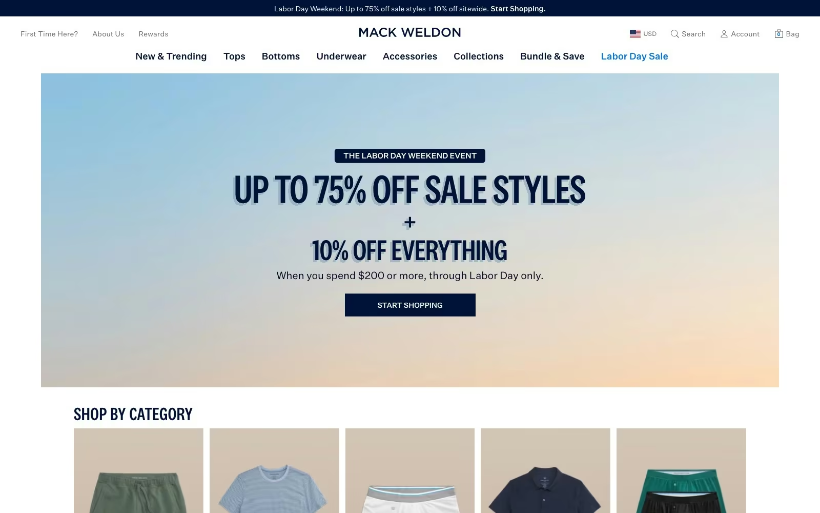
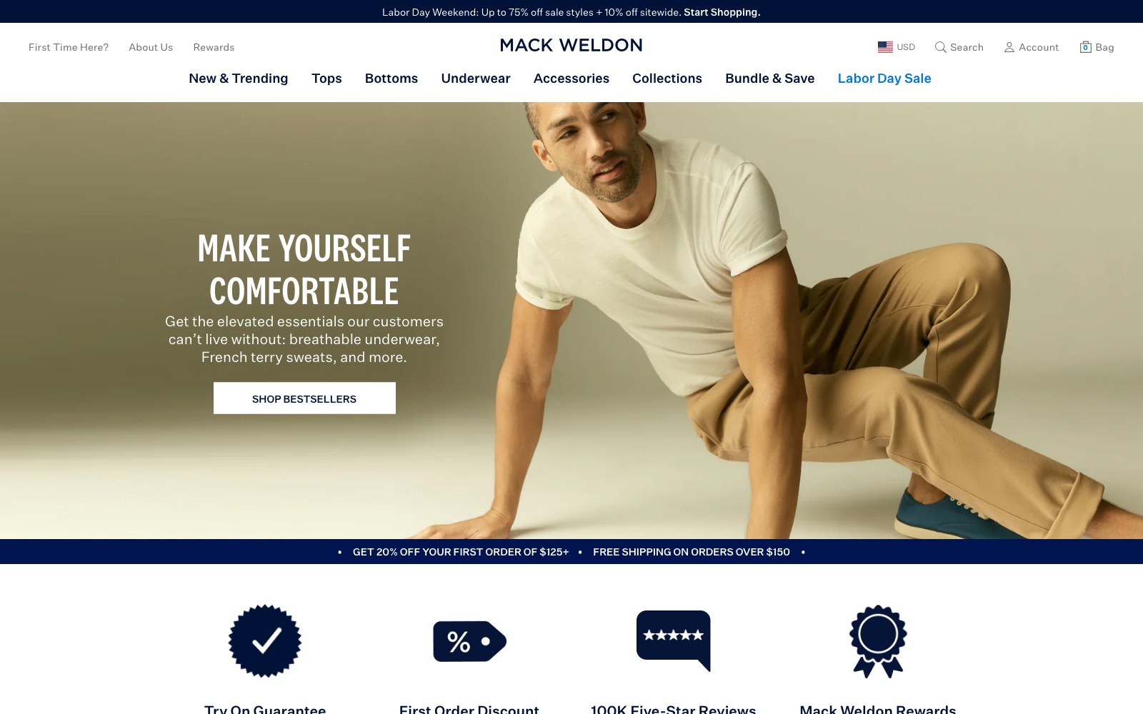
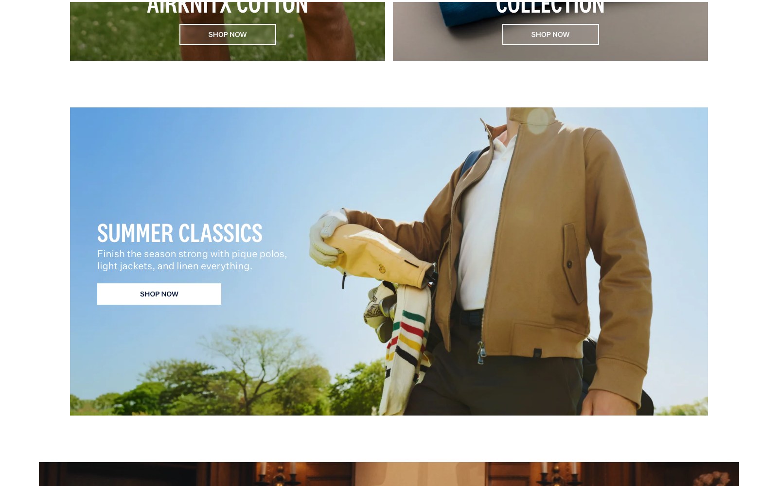
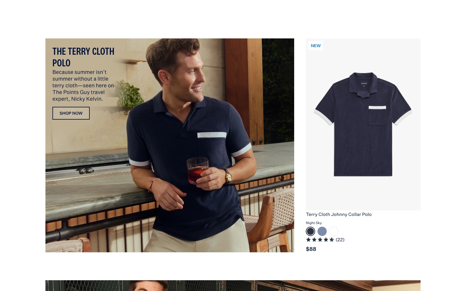
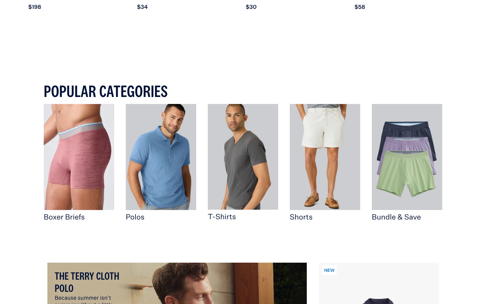
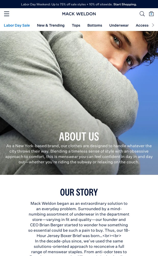
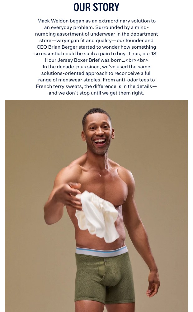
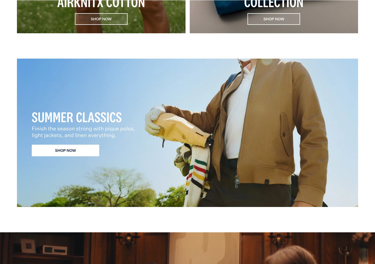
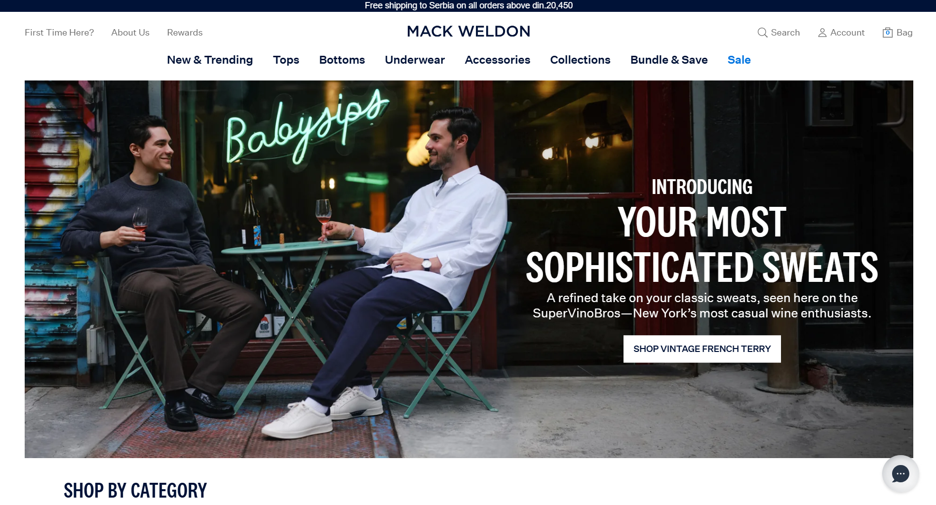
Each fabric platform gets a landing page that behaves like an editorial: a campaign hero, the reason the material exists, a how-it-works module in plain language, then a product rail with ratings and pricing right there. ACE sells comfort, SILVER sells the science of anti-odour, and the seasonal page uses real people and their packing lists rather than studio flats.
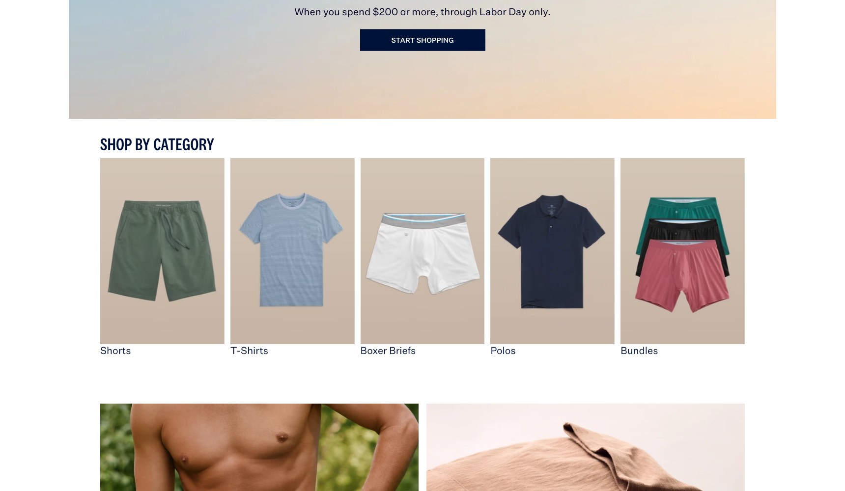
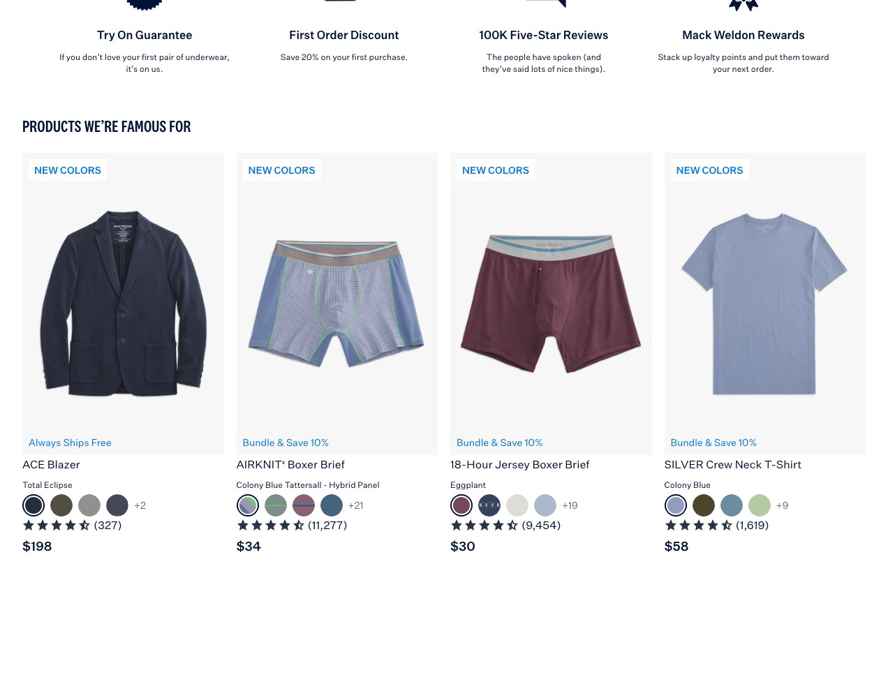
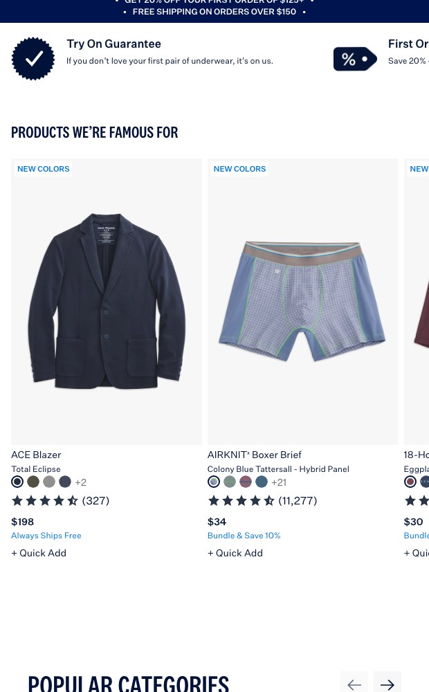
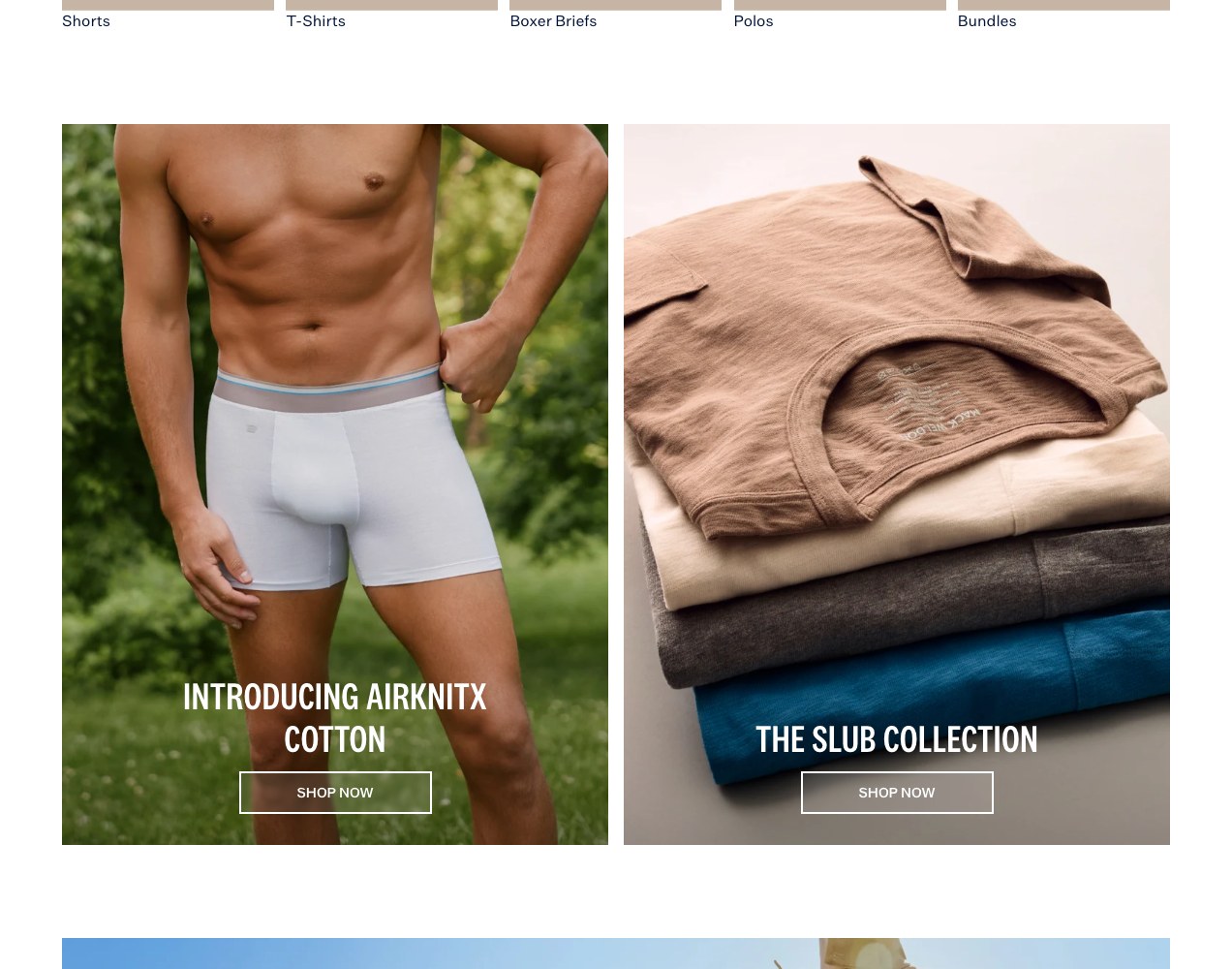
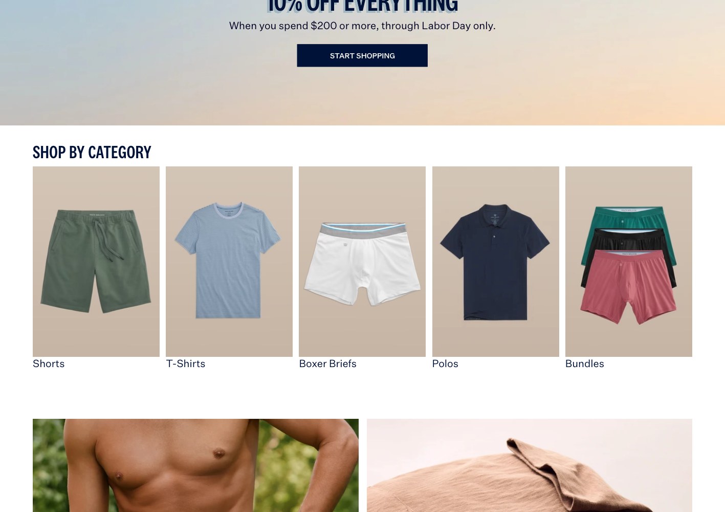
Underneath that, the collection templates are built for speed: filters and sort on every listing, tall-size and bundle badges, colour swatches in the card, star ratings and review counts pulled onto the tile, and low-stock and new-colour flags so a repeat buyer never has to open a product page to decide.
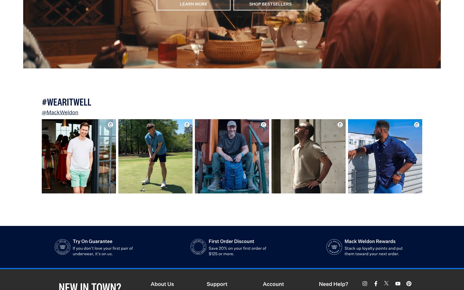
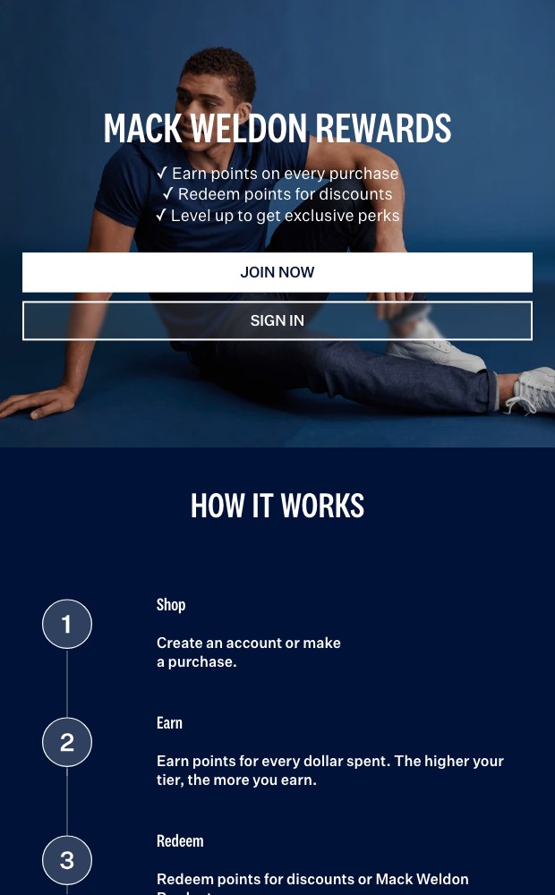
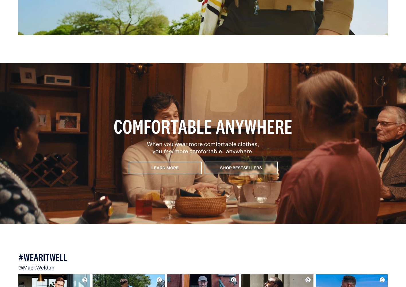
The conversion scaffolding runs across the whole store — try-on guarantee, first-order discount and rewards reassurance repeated at the point of doubt, bundle-and-save merchandising, a UGC wall, and an email capture placed after the shopper has been given a reason to care.
More on this work: Web Design.
fabric gets the page
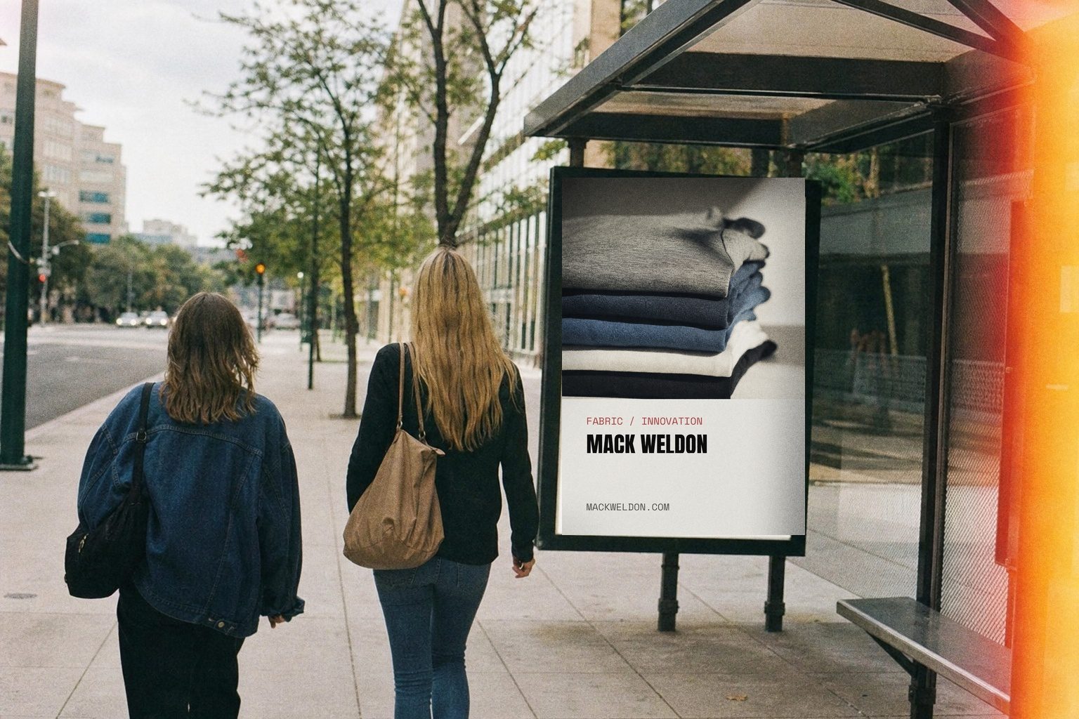
ACE, SILVER and AIRKNITx each
get editorial treatment.
Each fabric platform lands on its own page with a campaign hero, plain-language how-it-works module and a product rail carrying ratings and pricing inline. ACE argues comfort, SILVER explains the silver-ion science, the seasonal page shows real people and their packing lists instead of studio shots.


03 — The results
The store now splits education from reorder speed.
Three named fabric platforms got story pages that behave like editorial before they sell. Collection templates underneath run filters, sort, tall-size and bundle badges, colour swatches in the card, star ratings on the tile and low-stock flags so repeat buyers never open a product page to decide.
Try-on guarantee, first-order discount, rewards messaging, bundle-and-save merchandising and a UGC wall now repeat at the point of doubt. The site serves the first-timer who needs fabric explained and the regular who wants ACE sweatpants in tall in three clicks.
CASE STUDIES
Case studies
Website Portfolio
Video Ads
Static Ads





















































.webp)
.webp)