Fracture
Custom, curated, and configurable
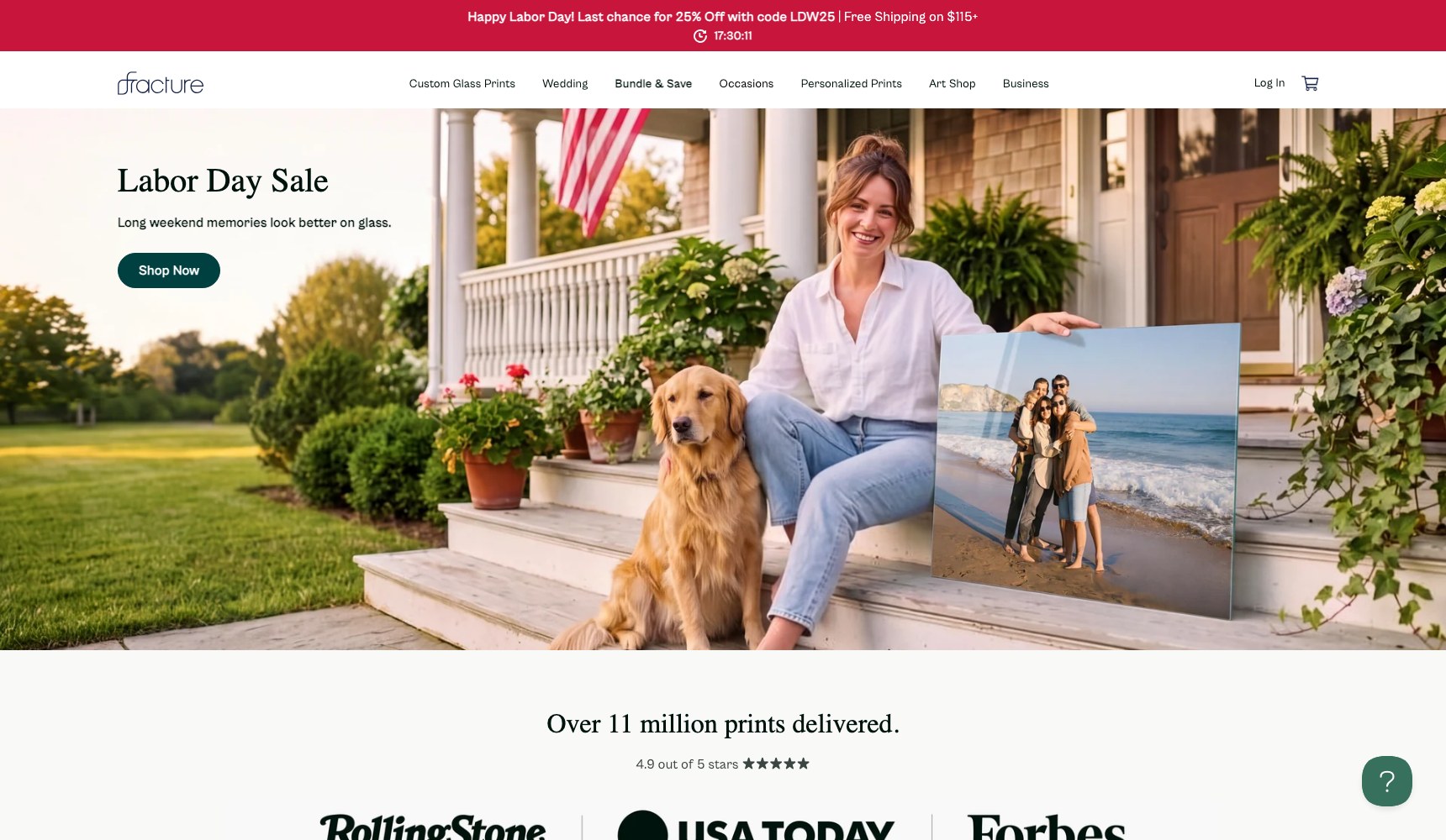
Fracture prints photographs directly onto glass in the United States and has delivered over eleven million prints. That single product line splits into three completely different shopping journeys, and the storefront has to make all three feel obvious.

01 — The challenge
Three shopping journeys competing for one navigation bar.
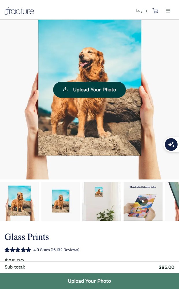
A customer uploading a phone photo of their dog needs a size, a border and a stand. Someone furnishing a hallway needs a multi-piece layout that already looks like a finished wall. Someone buying art wants to filter by medium, orientation, artist and subject. Same factory, same product, three unrelated mental models — and a licensed-collection line on top of it.
The catalogue was never the hard part. Choosing which of the three doors a visitor should walk through was.
*
3
Distinct buying paths built into one storefront: custom prints, gallery walls, art shop
*
11M+
Prints delivered by the brand, used as on-site proof
*
4
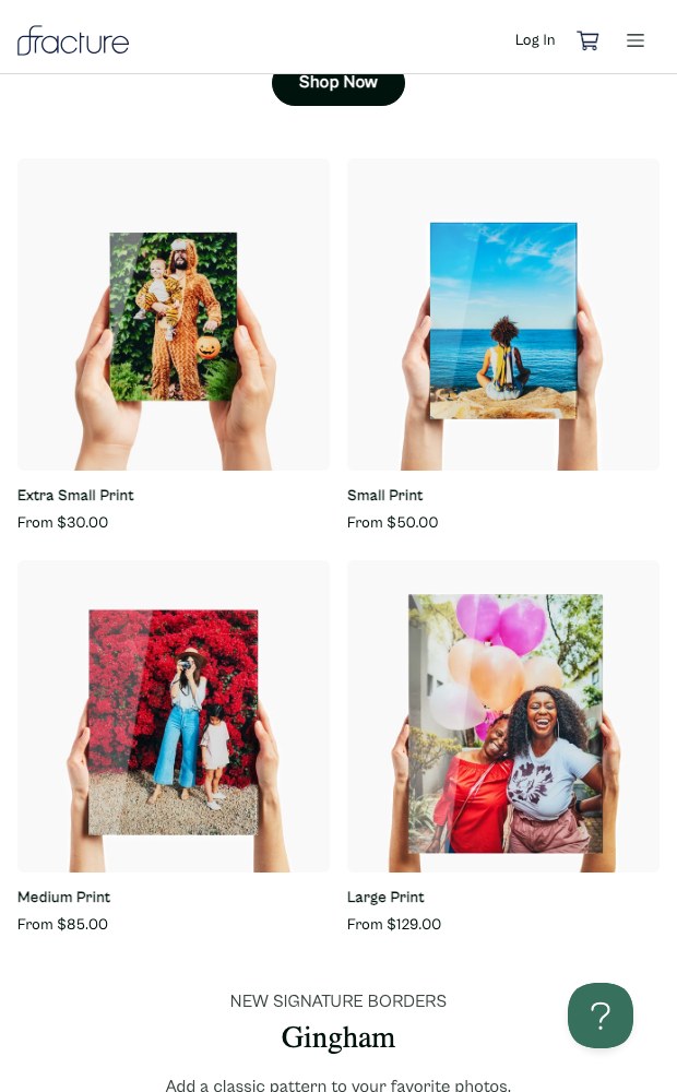
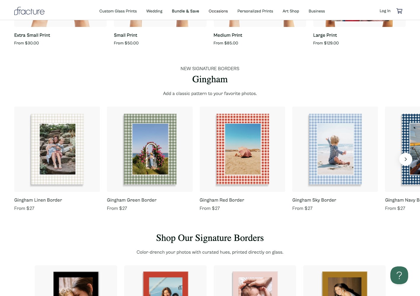
Print sizes and configurable options exposed per product
.jpeg)

02 — Our approach
Give every buying path its own front door, then let them cross-sell each other.
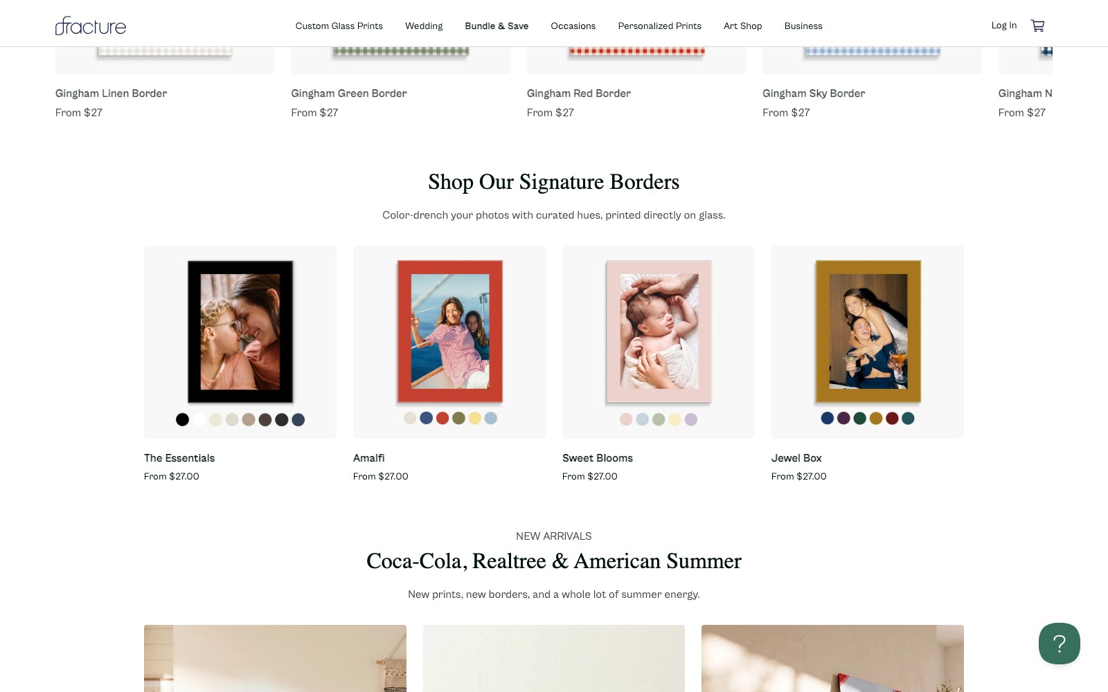
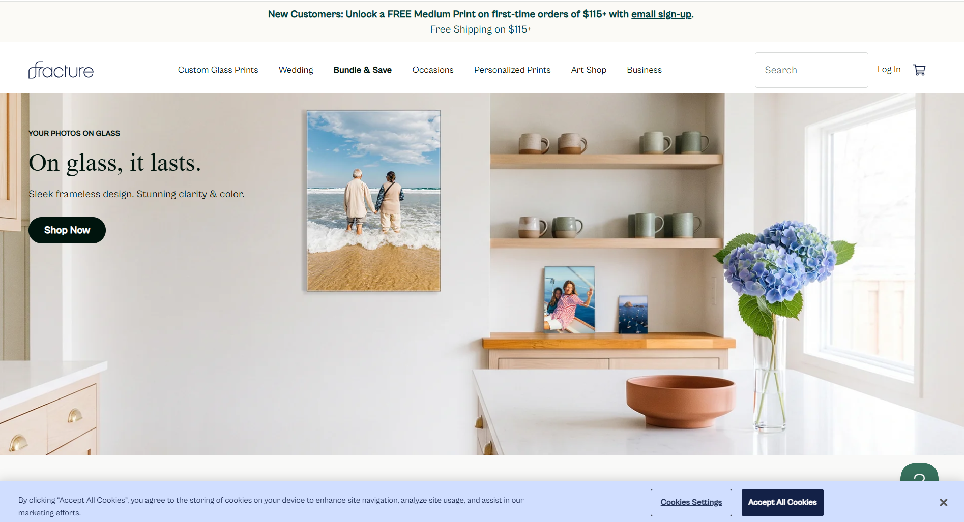
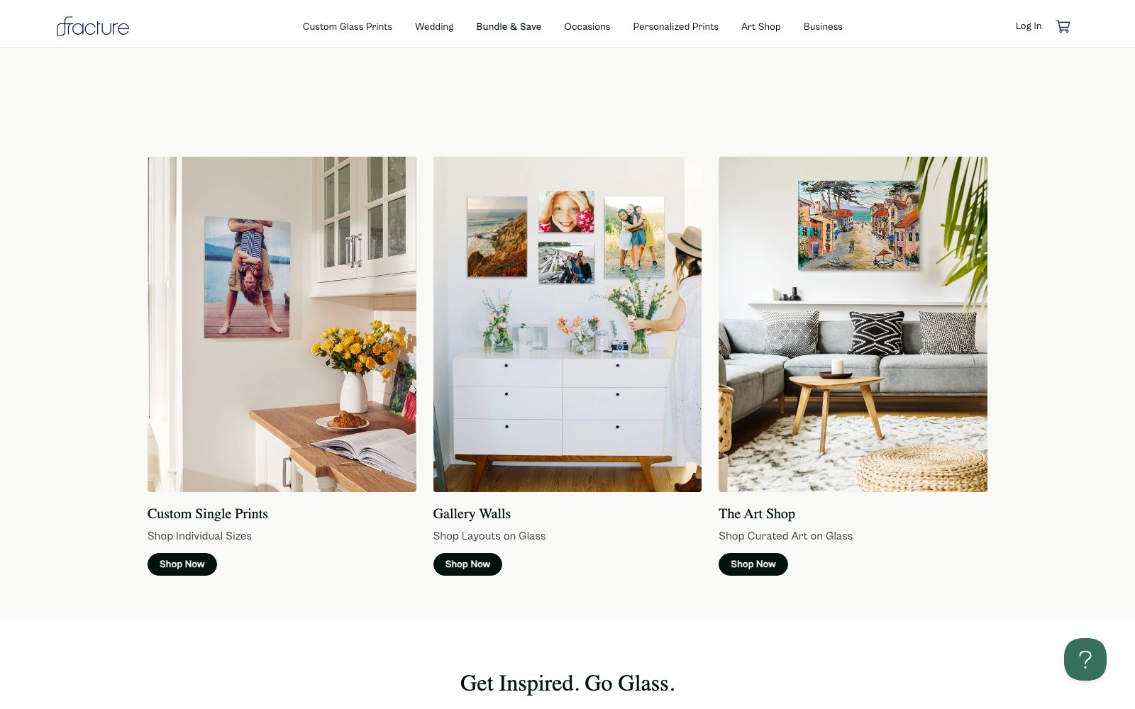
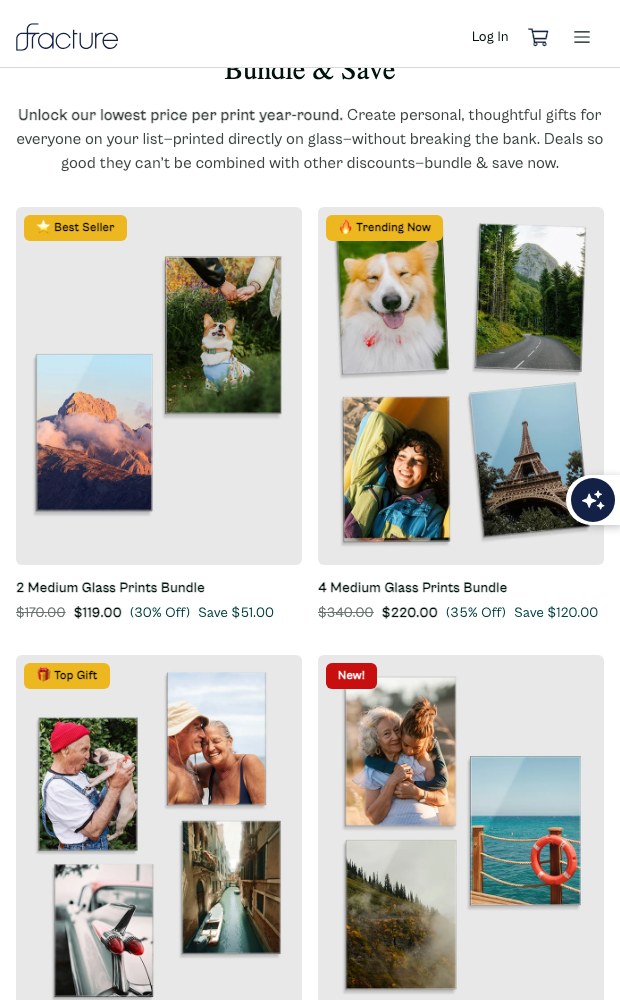
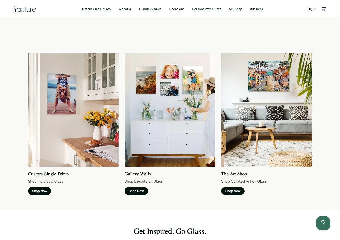
We built the storefront so the three journeys are separated at the top level and reconnected further down. Custom prints lead with size and format selection. Gallery Walls is a browse-a-finished-room experience: pre-designed layouts shot in real interiors, priced as a set, so nobody has to imagine the arrangement. The Art Shop behaves like a proper catalogue with filters for medium, orientation, featured artist, subject, collection and feature size, plus sets and diptychs as their own category.
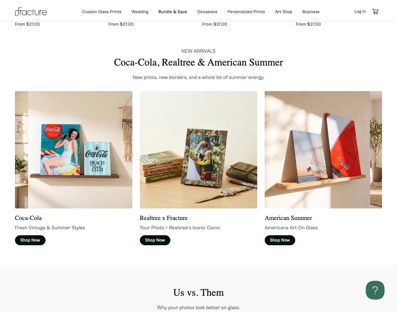
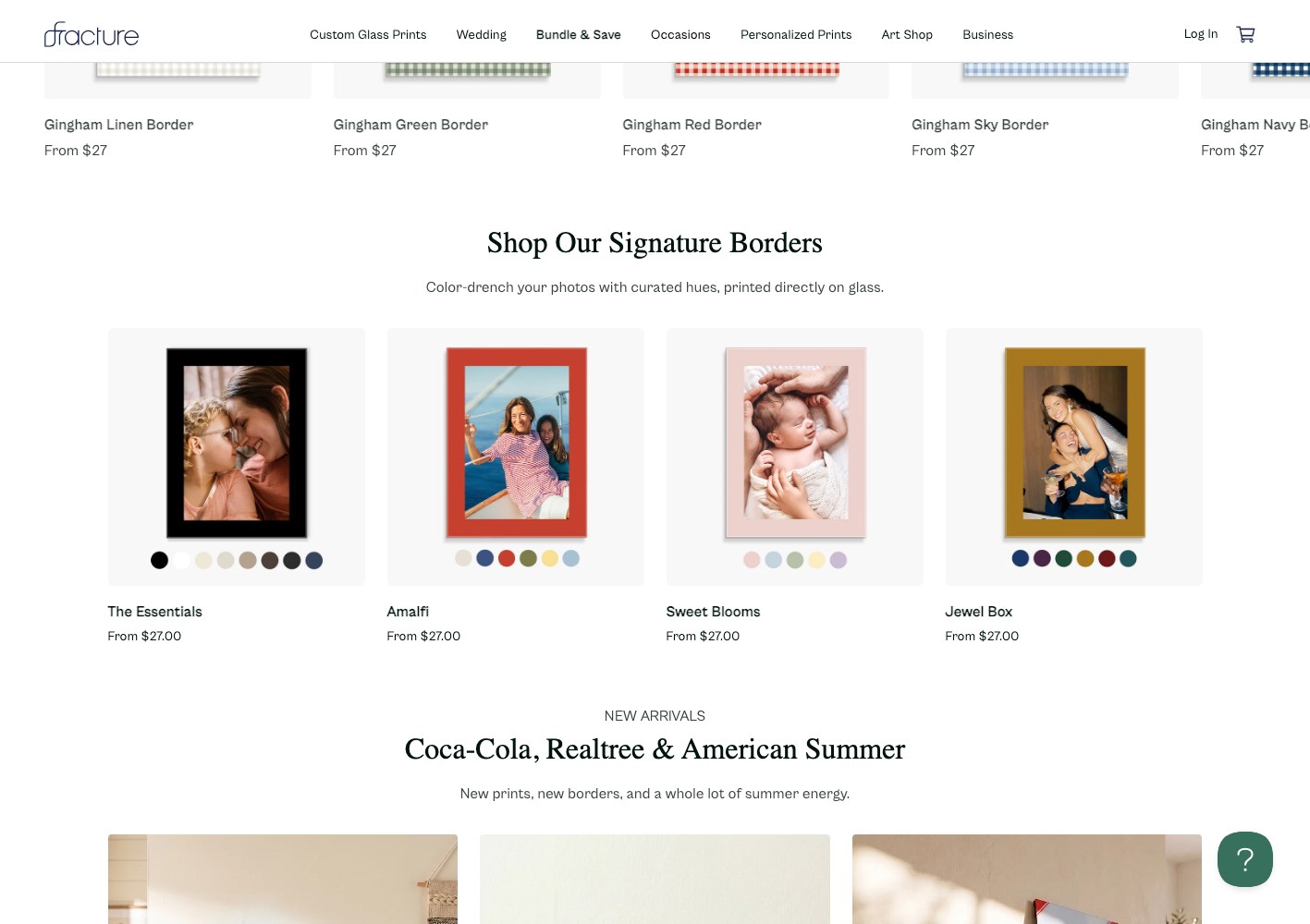
Product and accessory pages carry the configurable options inline — size, material, mount — with the shipping, returns and support content attached instead of buried, and licensed collections merchandised as seasonal rails on the homepage.
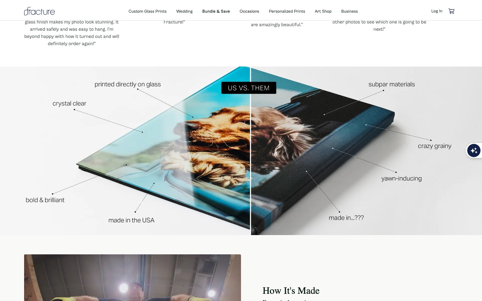
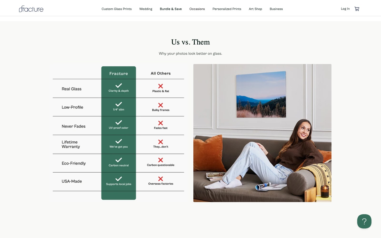
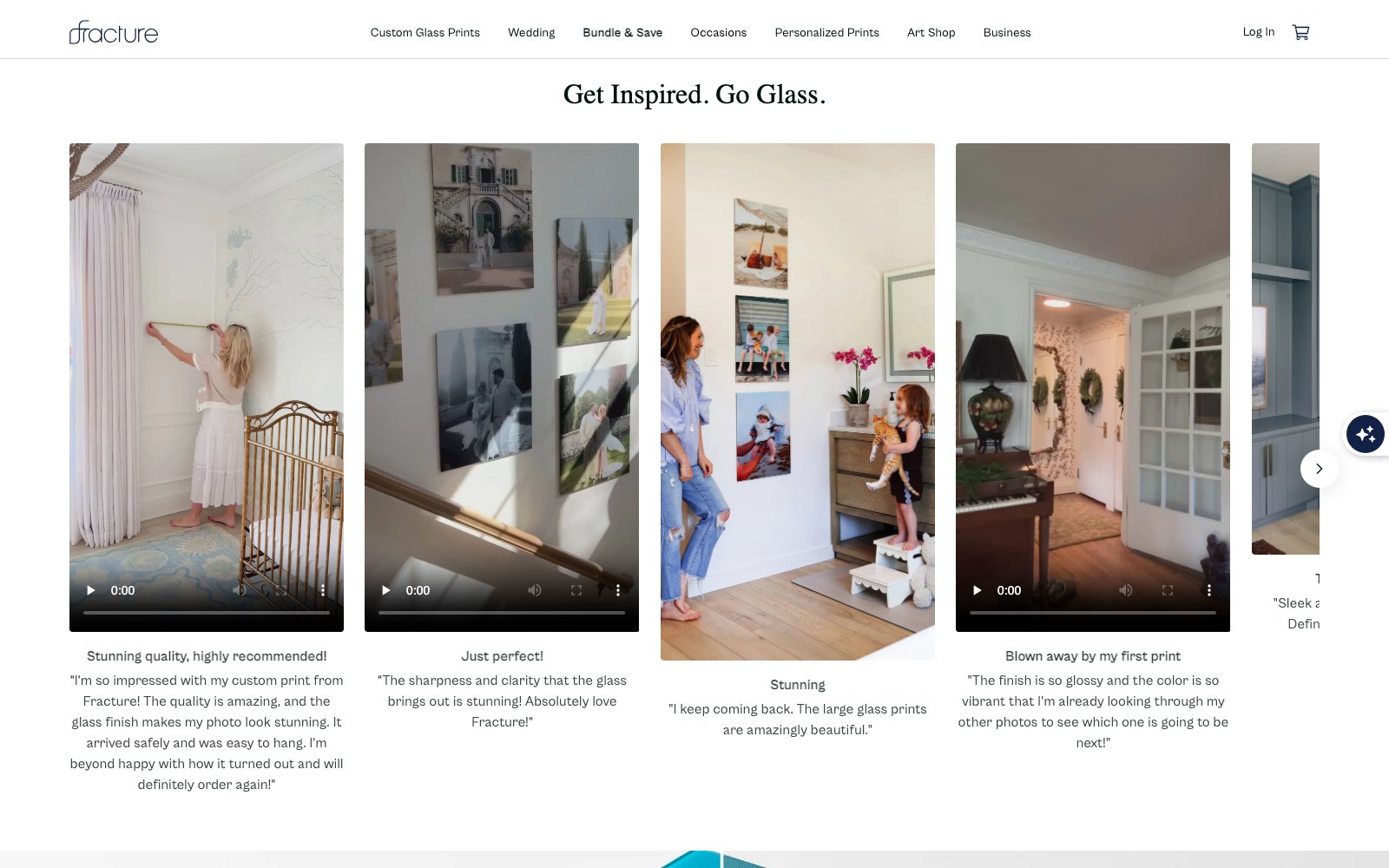
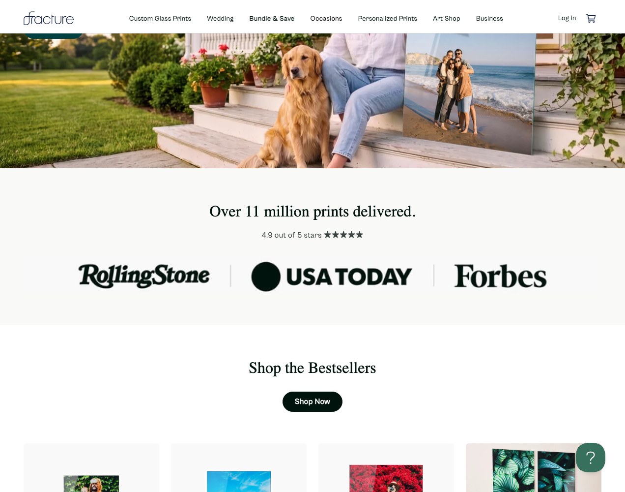
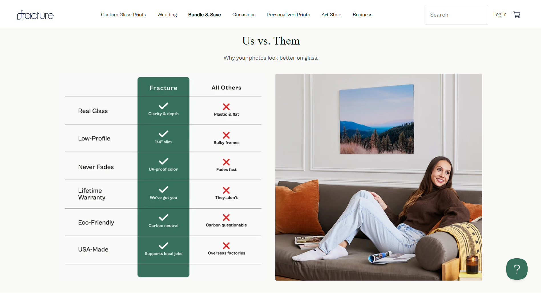
Trust does the closing: prints delivered, the star rating, the lifetime warranty, the direct-to-glass comparison against plastic and framed alternatives, and the made-in-USA claim, all placed where the hesitation actually happens.
More on this work: Shopify Development · Web Design · Web Development.
.jpeg)
three journeys, one nav
Custom uploads, pre-designed walls and
an artist catalogue.
The site splits at the top level into three entry points. Custom prints start with size and format. Gallery Walls opens into a room-by-room browse of finished sets, shot in real interiors and priced as a unit. The Art Shop runs catalogue filters — medium, orientation, artist, subject, collection — with sets and diptychs pulled out as their own category.




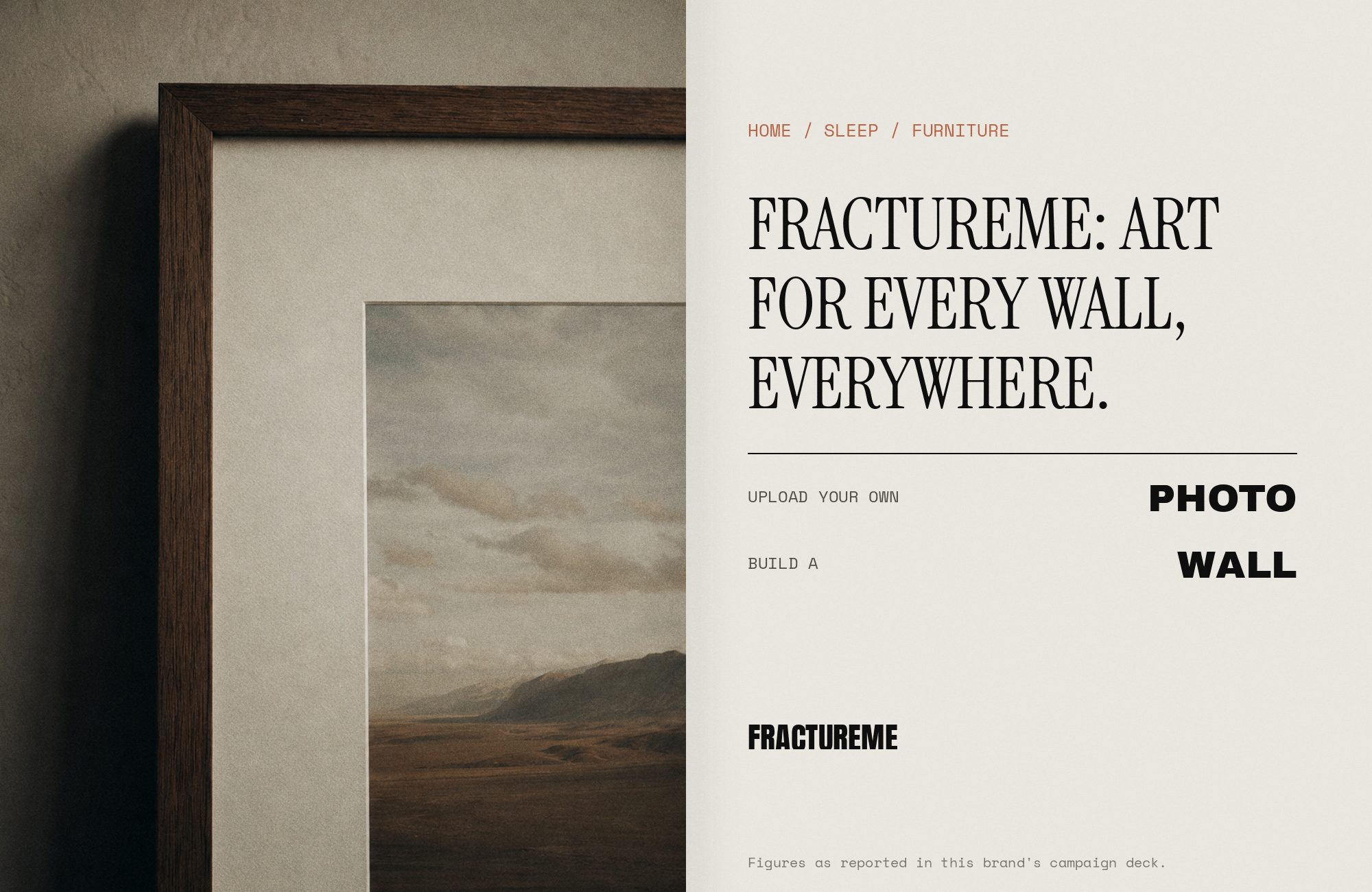
03 — The results
Three buying paths that no longer compete for attention.
The storefront now gives a phone-photo uploader, a hallway decorator and an art buyer three separate doors, then cross-sells between them once someone has committed to a path. Product pages carry configurable options inline — size, material, mount — with shipping and warranty content attached where hesitation happens.
Trust markers do the closing work: eleven million prints delivered, star rating, lifetime warranty, the direct-to-glass comparison against framed alternatives, and the made-in-USA claim, all positioned at decision points instead of buried in footer copy.
CASE STUDIES
Case studies
Website Portfolio
Video Ads
Static Ads




























































.webp)
.webp)