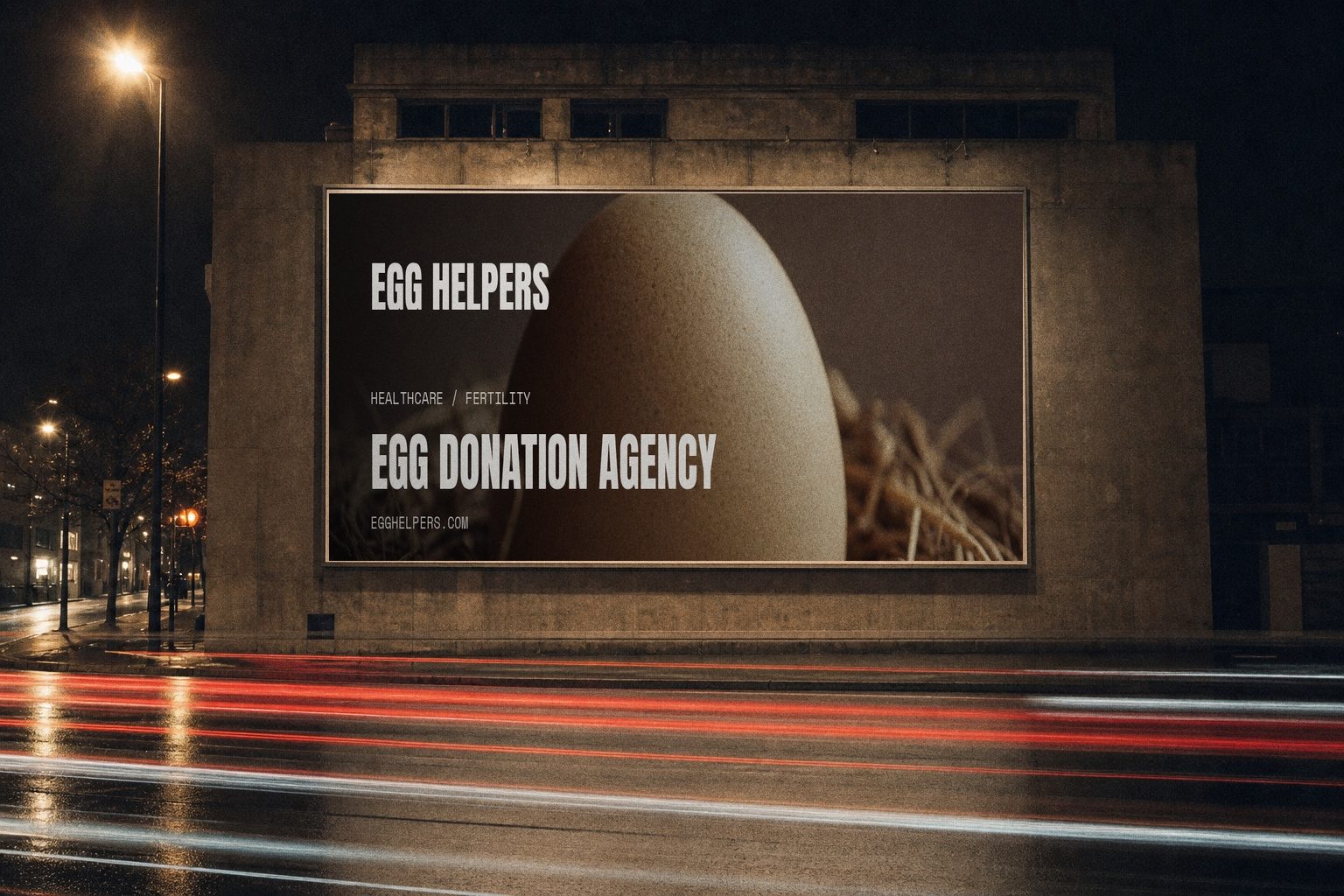
Egg Helpers
Two audiences, one site
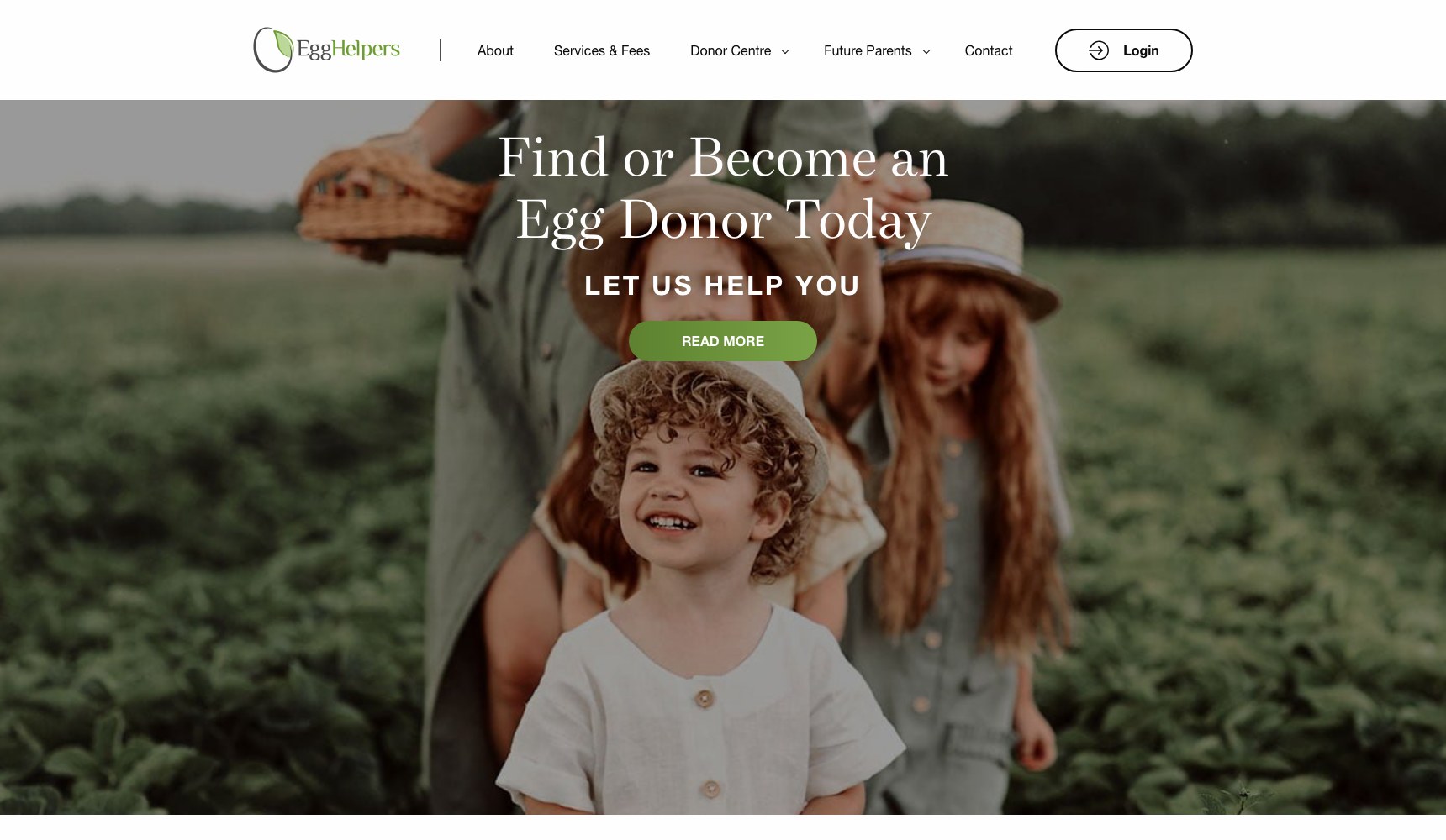
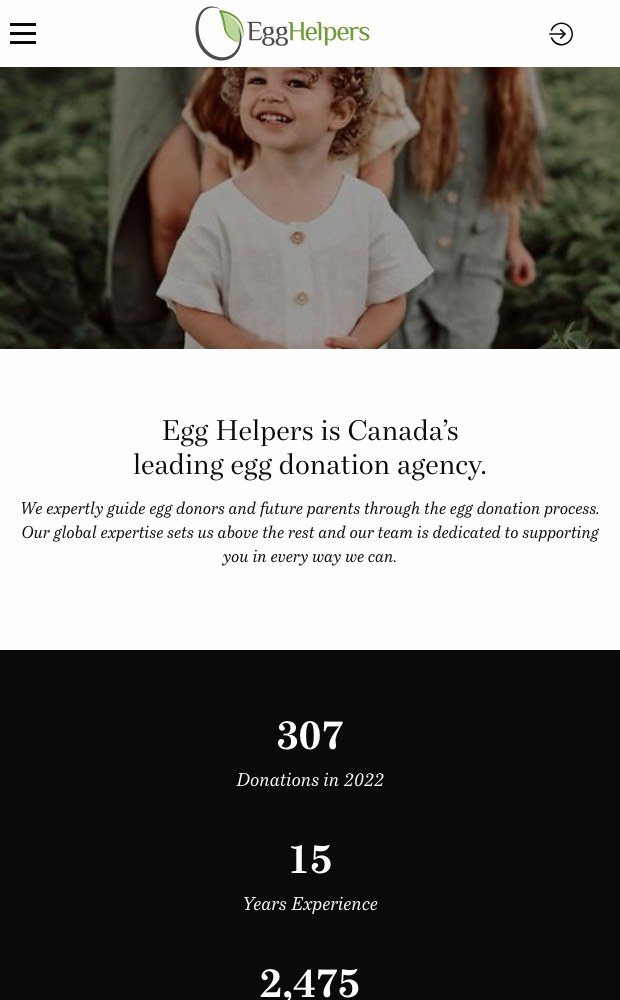
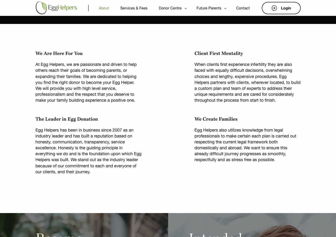
Egg Helpers has guided egg donors and intended parents through the donation process since 2007 — 2,475 families made, 307 donations in 2022 alone. The website has to recruit donors and reassure future parents at the same time, without either group feeling like they landed on someone else's page.
01 — The challenge
Recruitment and reassurance pull a website in opposite directions.
A woman considering becoming an egg donor wants to know if she qualifies, what the process asks of her, and what is reimbursed. An intended parent wants to know the agency is honest about costs, has real experience, and will not surprise them mid-process. Serve both from one generic page and you convince neither.
On top of that, the strongest thing the agency owns — a fixed-price guarantee with every third-party cost disclosed up front — is the kind of claim that only lands when the page actually shows the breakdown.
The same homepage had to make one visitor feel recruited and another feel protected.
*
2,475
Families created through the agency
*
15+
Years of egg donation experience
*
2
Distinct audience tracks built into one site

02 — Our approach
Split the site into two journeys, then build a funnel for the harder one.
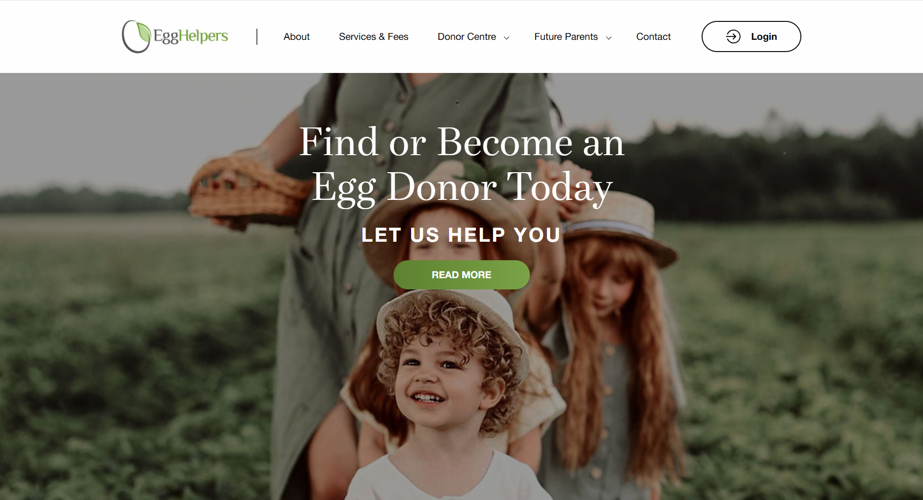
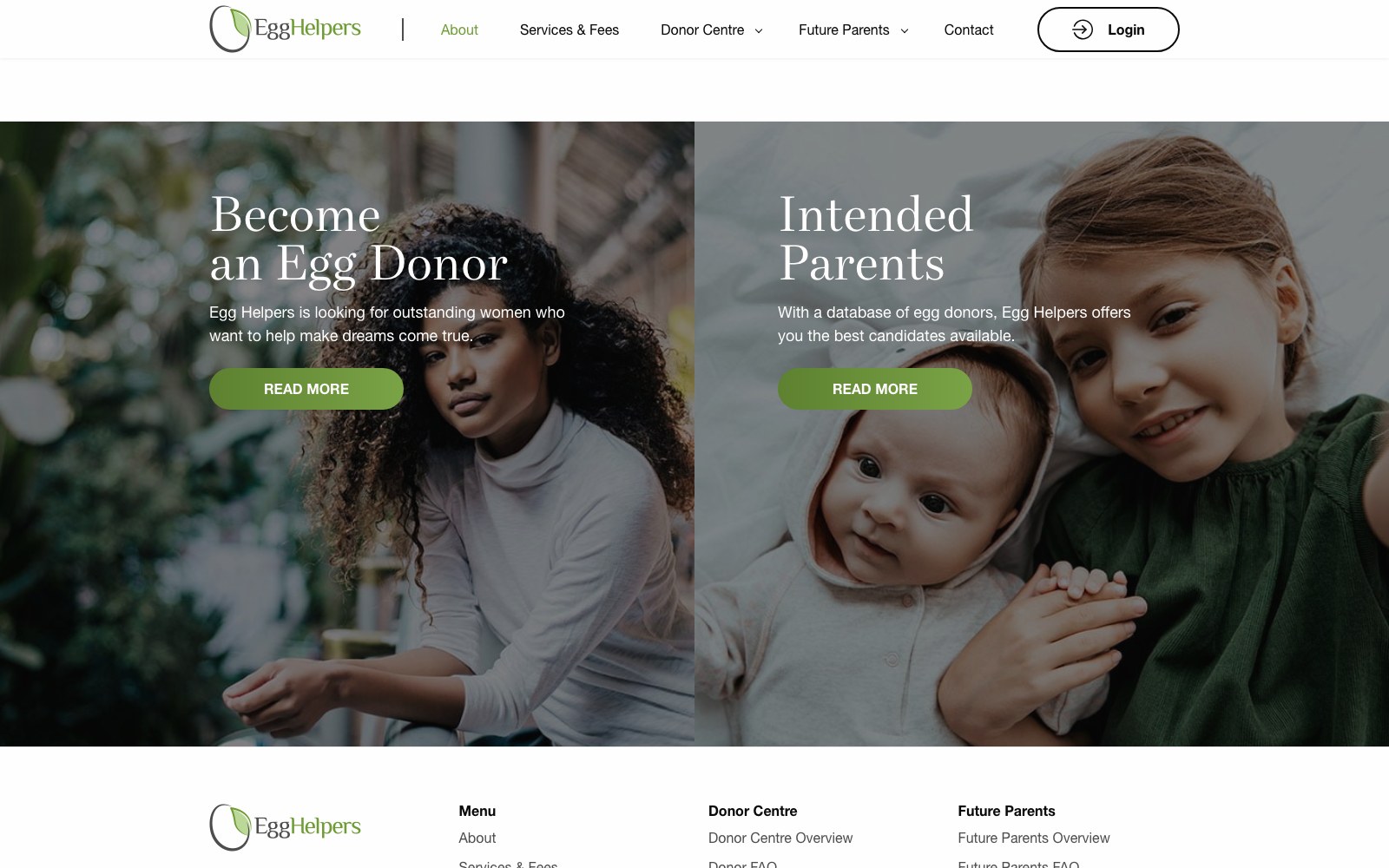
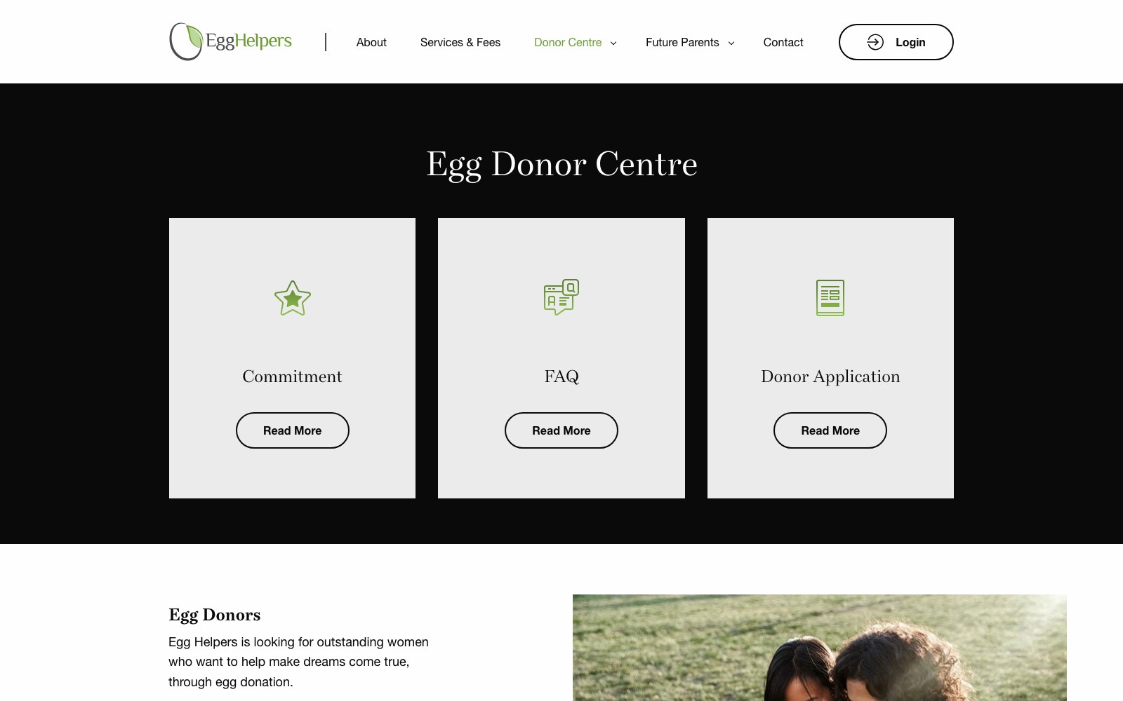
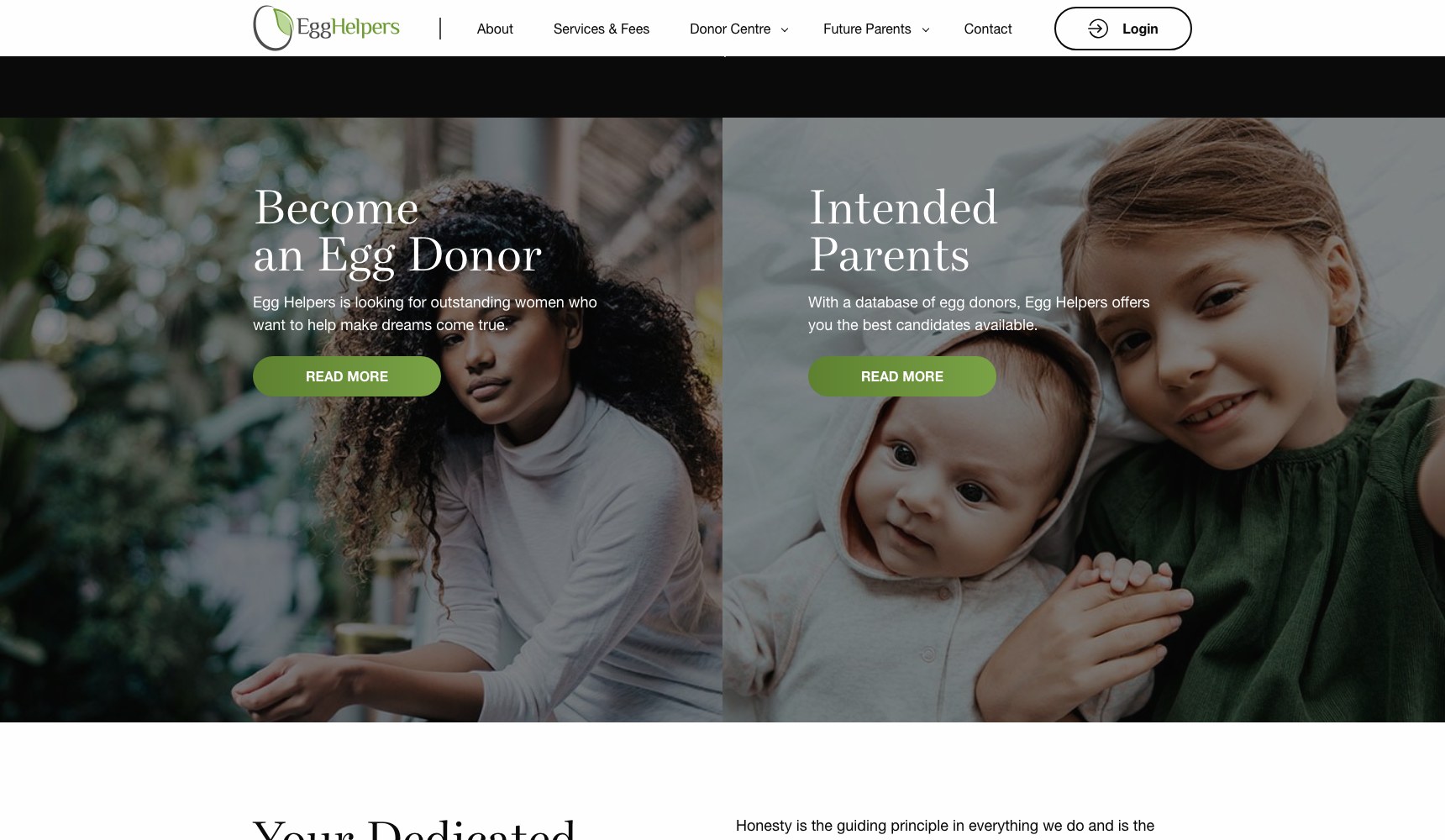
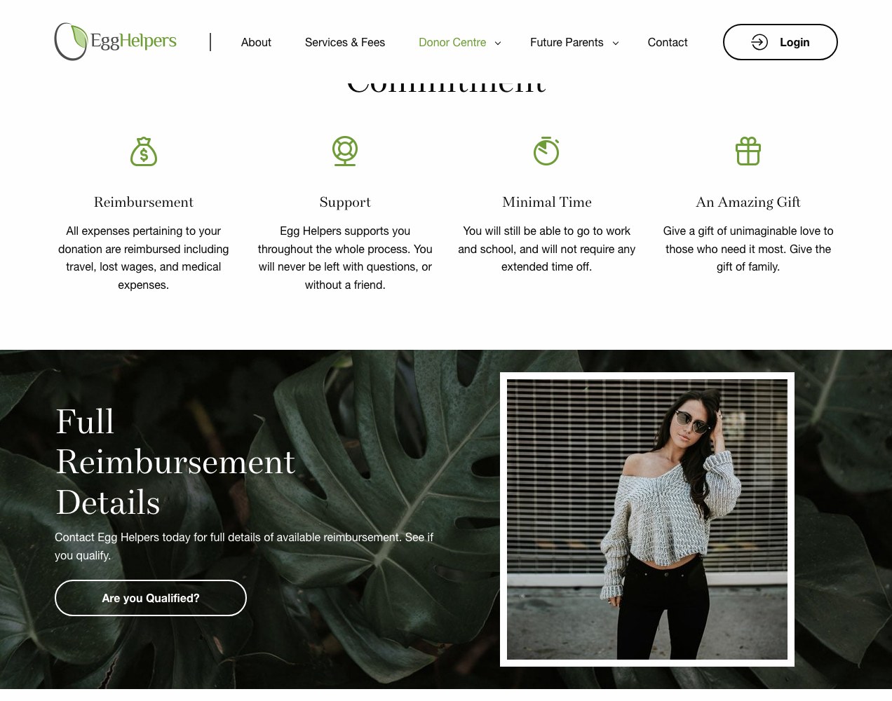
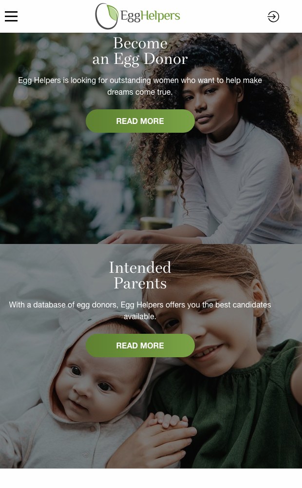
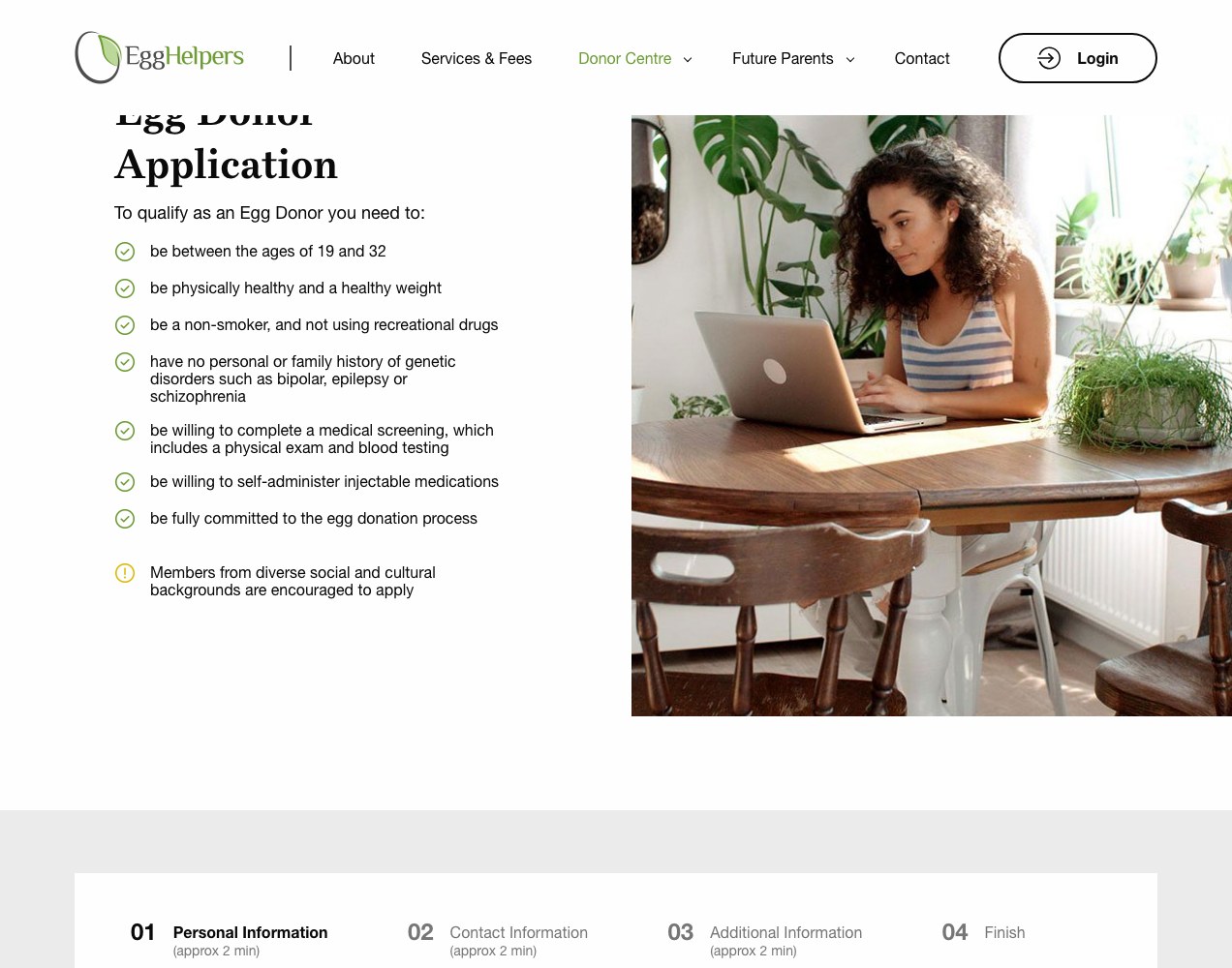
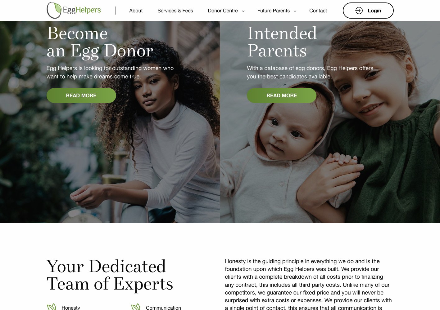
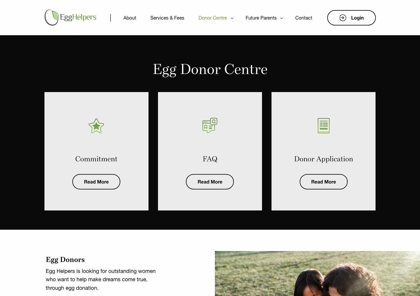
The site forks immediately: a Donor Centre with the overview, the eligibility criteria, the commitment, the reimbursement detail and the application, and a Future Parents track with the process, the database and its own FAQ and application. From the homepage on, every visitor is one click from the version of the story written for them.
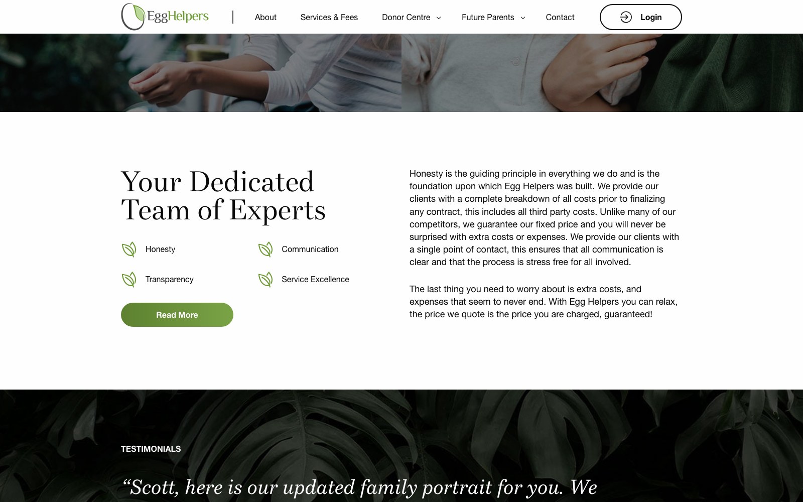
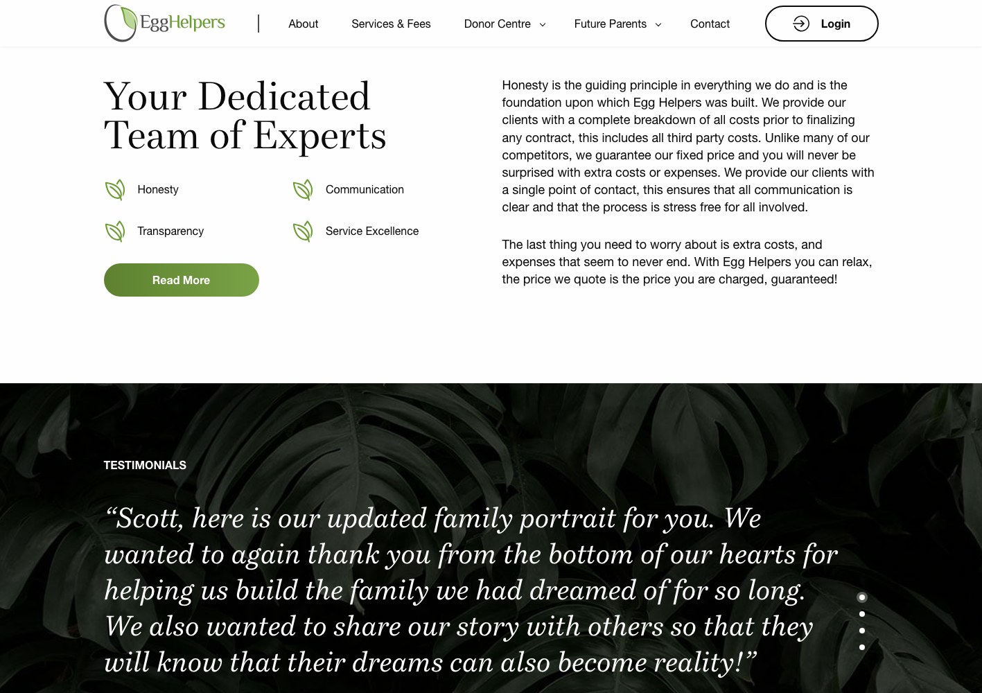
The Services & Fees page carries the fixed-price argument in full — the four principles, the complete cost breakdown, the financing option — because that is the objection intended parents actually raise.
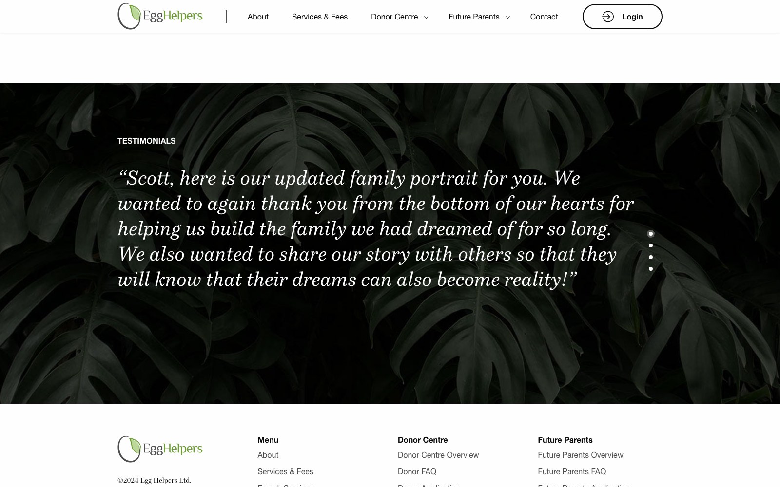
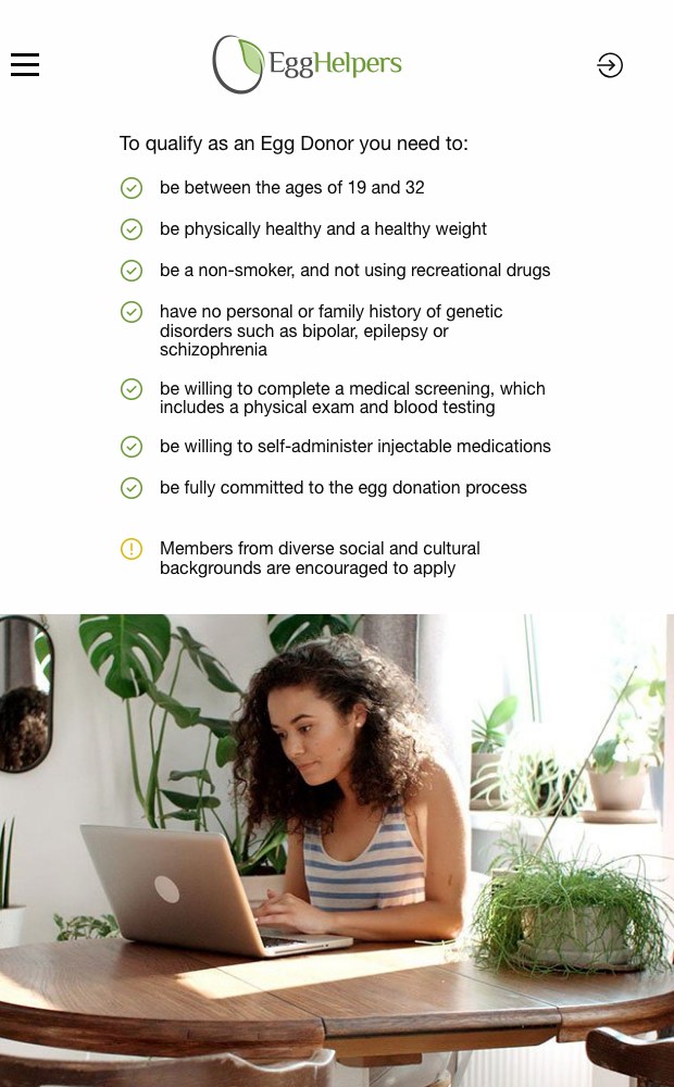
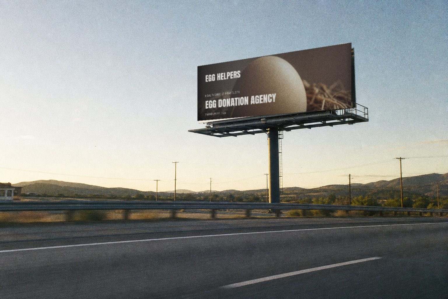
Donor recruitment gets its own dedicated landing page rather than a shared one: reimbursement stated up front, the reasons donors choose this agency, press coverage, real Google reviews, the eligibility checklist, an application form, and an FAQ that answers the questions people are too shy to ask. It is a single-purpose page whose only job is to turn interest into a submitted application.
More on this work: Web Design · Web Development.
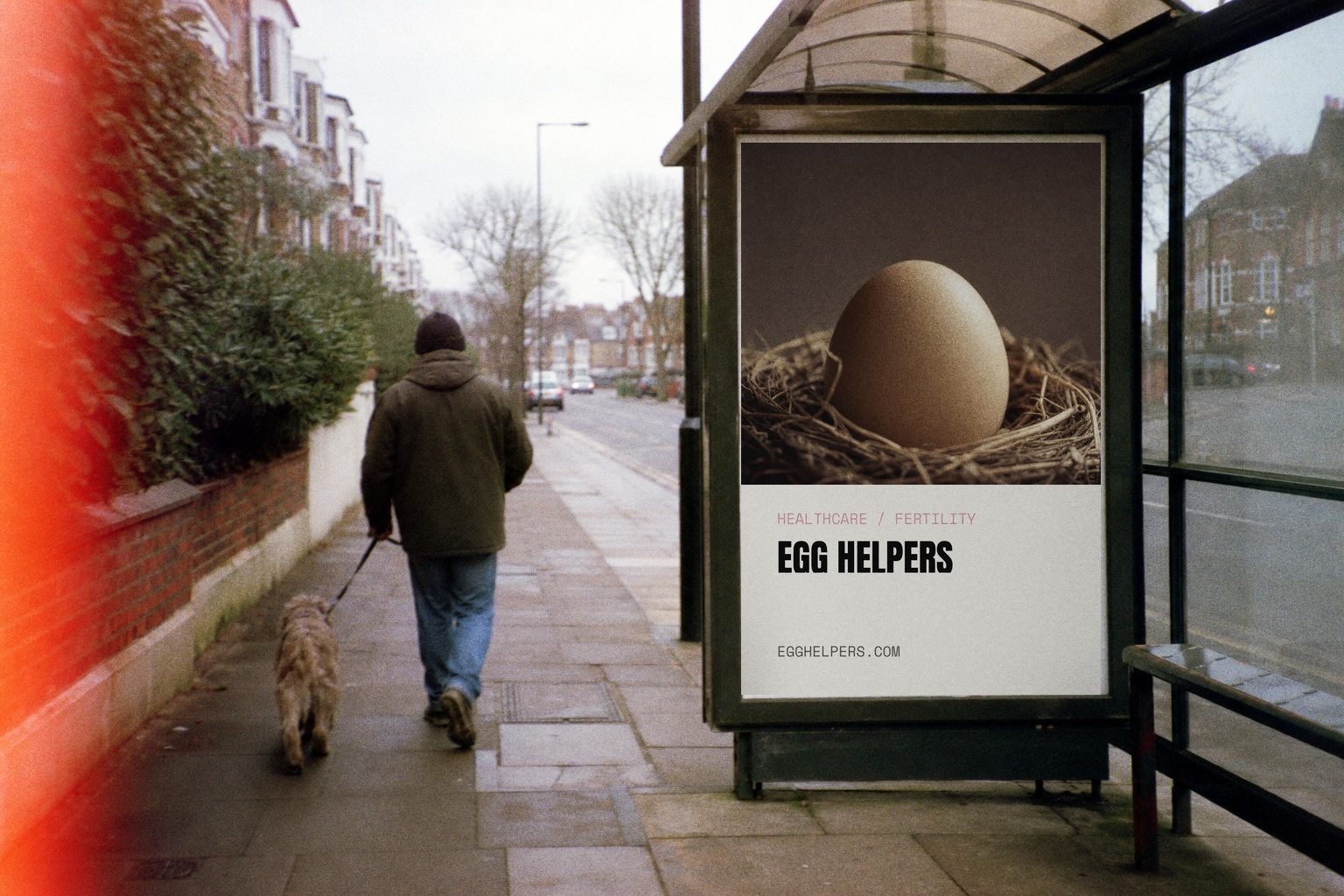
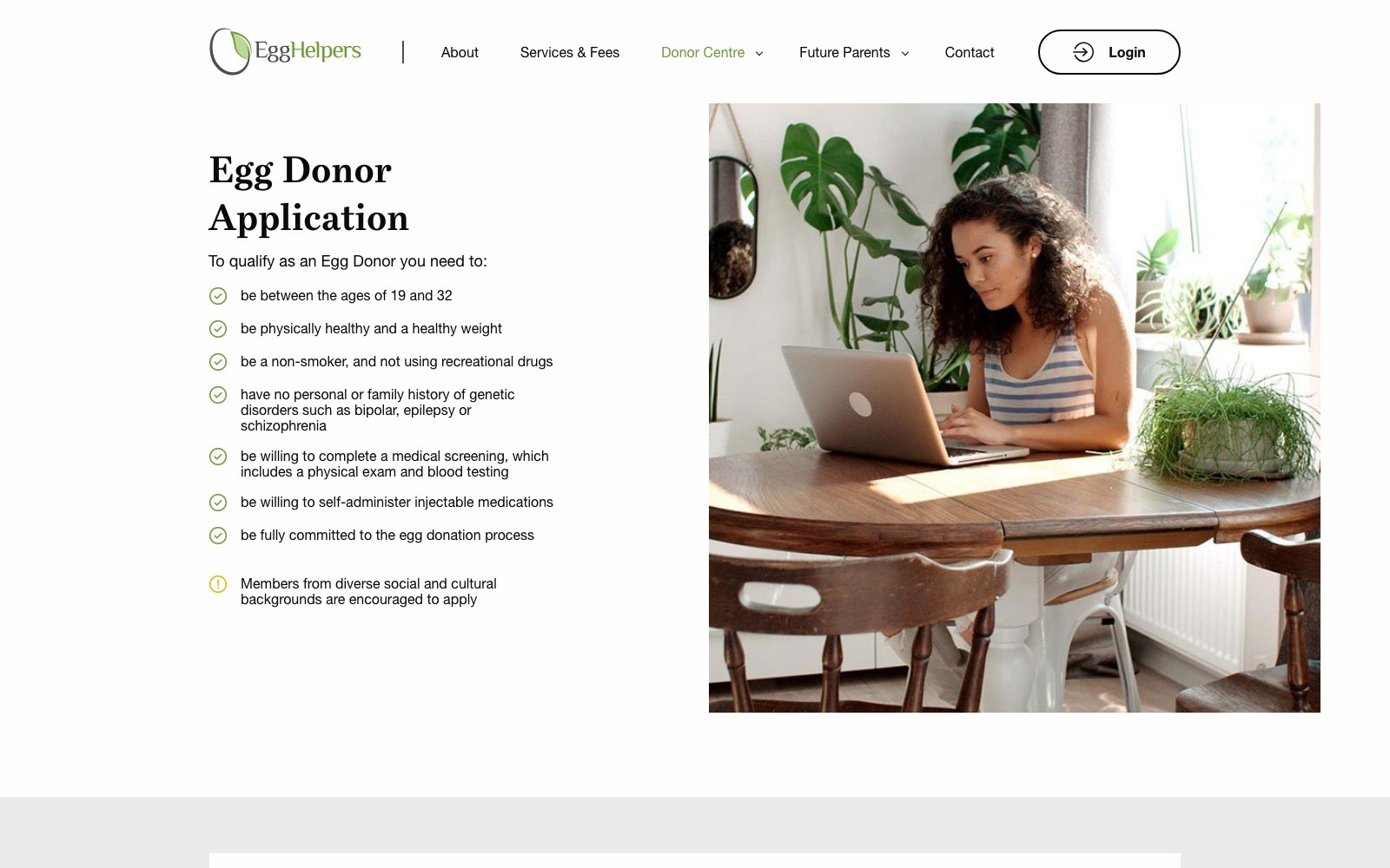
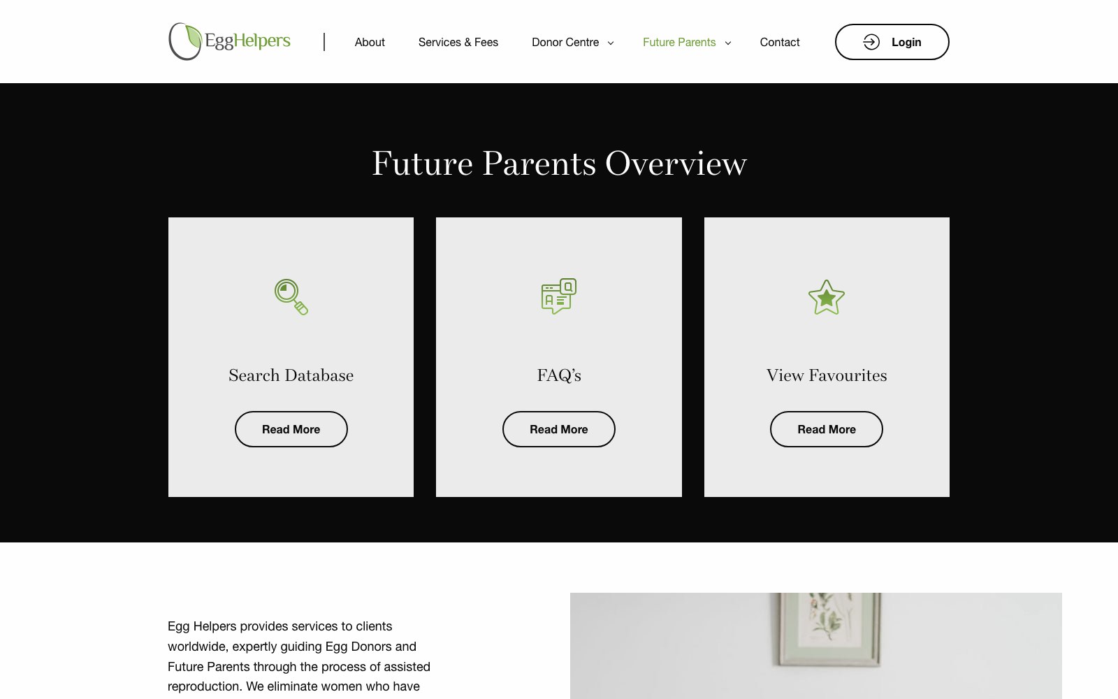
two tracks, one build
The site forks at the
homepage.
One button leads to the Donor Centre: eligibility, reimbursement detail, the commitment timeline and the application. The other opens the Future Parents track: the process, database access, the full Services & Fees breakdown with the fixed-price guarantee shown line by line, and a separate FAQ. Both paths get their own navigation, their own pages, their own application forms.
.jpg)


03 — The results
Donors and intended parents now land on pages written for them.
The Donor Centre carries the recruitment case from end to end: reimbursement stated up front, press mentions, real Google reviews, the eligibility checklist and a single-purpose application form. Future Parents see the four pricing principles, the complete cost table, the financing option and the objection-handling FAQ all on one Services & Fees page.
A dedicated donor landing page now does one job: turn search traffic into submitted applications. No shared homepage, no apologies, no compromise between the two groups.
CASE STUDIES
Case studies
Website Portfolio
Video Ads
Static Ads




















































.webp)
.webp)