Table of contents

Google stopped treating your desktop site as the reference version of your content years ago. Since the completion of mobile-first indexing, the mobile version of a site is what Google actually crawls, evaluates, and ranks, for mobile and desktop searchers alike. A site that looks great on a monitor but hides content, buries navigation, or loads slowly on a phone is being judged on that weaker mobile site experience, not the polished desktop one. Mobile SEO best practices, the practical side of search engine optimization for phones and tablets, exist to close that gap. High quality images, complete content, and fast load times all need to survive the move from desktop to mobile intact.
Key Takeaways
- Mobile-first indexing is complete. Google confirmed in October 2023 that it now uses the mobile version of every site as the primary basis for crawling, indexing, and ranking — for desktop searches too.
- Responsive design, the setup where one URL serves the same HTML to every device, is Google's recommended configuration over dynamic serving or separate mobile URLs.
- Mobile devices account for roughly 50 to 60 percent of global web traffic on average — the exact figure shifts by month and methodology — but it swings enormously by market: around 72 percent in India, 54 percent in the UK, and the mid-40s in the United States (43 percent) and Japan (47 percent).
- Google's good threshold for mobile LCP is under 2.5 seconds, for INP under 200 milliseconds, and for CLS under 0.1, each measured at the 75th percentile of real Chrome users.
- A 48x48px touch target and 16px body text are widely cited practical minimums for mobile usability, not official Google ranking thresholds.
- If your site uses separate URLs or dynamic serving, structured data, metadata, and content must match between the mobile and desktop versions, or Google will only see what exists on mobile.
What is mobile SEO, and why does it matter?
Mobile SEO is the practice of optimizing a website so it performs well for mobile users and satisfies the technical requirements of mobile-first indexing, the system Google uses to crawl and rank the web. It sits at the intersection of user experience, content parity across mobile desktop versions of a site, and page speed. Mobile usability matters across search engines broadly, though mobile-first indexing as a specific architecture is Google's system.
The stakes are higher than a simple usability nice-to-have. Since mobile-first indexing is how Google evaluates every site, a mobile version that's missing content, structured data, or internal links compared to its desktop counterpart is effectively invisible to Google in exactly those ways, regardless of how complete the desktop site is.
Mobile-first indexing: what actually changed
Google's Search Central blog confirmed in October 2023 that the transition to mobile-first indexing was complete, closing out a rollout that began in 2016. Google now uses the mobile version of a site's content, crawled with a smartphone user agent, as the primary input for indexing and ranking, across both mobile and desktop search results. There's a common misconception worth clearing up: mobile-first indexing does not mean Google maintains two separate indexes, one mobile and one desktop. There's a single index, and the mobile version of your site is simply what feeds into it.
This creates a specific risk for sites that were built desktop-first. If a mobile menu only surfaces some of the site's navigation, or a mobile template strips out product descriptions, FAQ content, or internal links that exist on desktop, Google evaluates the site based on that thinner mobile version. A site can pass every mobile friendly check and still lose rankings this way, because a mobile friendly site and a mobile-first-indexing-ready site are not automatically the same thing. Checking site mobile performance and desktop mobile parity side by side, page by page, is the only reliable way to catch the gap.
Choosing a mobile configuration: responsive, dynamic serving, or separate URLs
Google's own documentation on mobile-first indexing lays out three supported configurations for serving mobile users, each with different technical tradeoffs.
Responsive design serves identical HTML on a single URL to every device, adjusting the layout with CSS based on screen size. Content and metadata stay automatically in sync between mobile and desktop, since there's only one version to begin with. This is why Google recommends responsive design as the easiest configuration to implement and maintain.
Dynamic serving uses a single URL as well, but the server inspects the user agent and returns different HTML depending on the requesting device, signaled with a Vary: User-Agent HTTP header. This allows more device-specific control than responsive design, at the cost of extra server-side complexity.
Separate URLs, the classic m.example.com pattern, serves genuinely different HTML on different URLs for mobile and desktop. Conductor's guide to the mobile rel=alternate attribute lays out the bidirectional annotation this setup requires to avoid duplicate content problems: the mobile page needs a rel=canonical pointing to the desktop URL, and the desktop page needs a rel=alternate pointing to the mobile URL. It's more work to maintain long-term, but some large sites still use it deliberately for granular control over mobile page weight.
Mobile configuration comparison
| Configuration | URL structure | Setup complexity | Google's stance |
|---|---|---|---|
| Responsive design | Single URL, same HTML | Low — one codebase | Recommended |
| Dynamic serving | Single URL, different HTML by device | Medium — needs Vary header | Supported |
| Separate URLs | Different URLs (e.g. m.example.com) | High — needs rel=canonical/alternate pairing | Supported, not preferred |
Core Web Vitals on mobile: the thresholds that matter
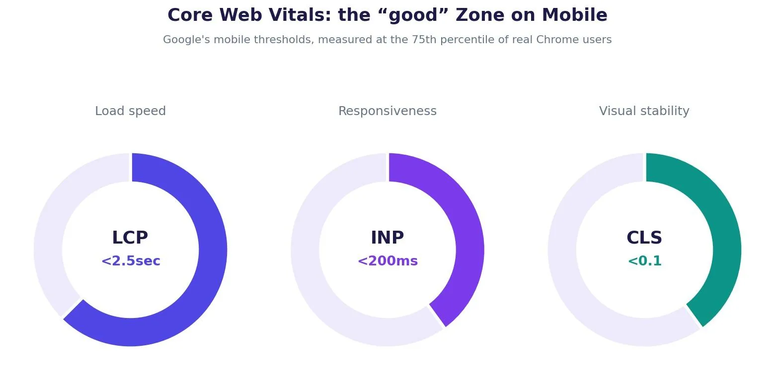
Mobile performance is measured against the same three Core Web Vitals used everywhere else, but mobile devices and mobile networks make them harder to pass. Google's web.dev threshold documentation puts the "good" bar at Largest Contentful Paint under 2.5 seconds, Interaction to Next Paint under 200 milliseconds, and Cumulative Layout Shift under 0.1, each evaluated at the 75th percentile of real Chrome user sessions rather than a single lab test.
Mobile LCP in particular tends to run slower than desktop LCP for the same page, since mobile networks and processors are typically less capable than the desktop hardware a site might have been tested on. A hero image or web font that loads acceptably fast on an office broadband connection can easily blow past the 2.5 second threshold on a mid-range phone over 4G.
Mobile user experience signals Google treats as ranking-adjacent
Touch target and font size
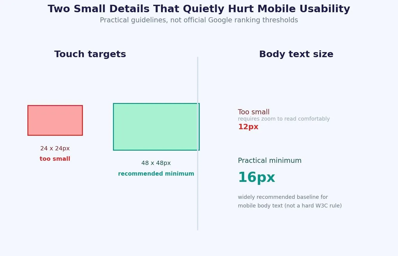
A tap target that's too small, or body text that forces users to zoom to read it, creates friction that shows up in engagement metrics even if it never appears as an explicit ranking penalty. Google's own Android accessibility guidance and the W3C's mobile accessibility task force both point to 48x48px as the practical minimum touch target size, and 16px is the commonly cited practical baseline for mobile body text — though neither figure is an official Google ranking rule specifically for search. Treat them as strong defaults rather than hard requirements.
Horizontal scrolling and viewport configuration
A page that requires horizontal scrolling on a phone almost always traces back to a missing or misconfigured viewport meta tag, or a fixed-width element that doesn't shrink to fit smaller screens. This is one of the more common issues flagged in Google Search Console's mobile usability reports.
Blocked resources
If a site's robots.txt blocks Googlebot from loading CSS or JavaScript, Googlebot smartphone sees a broken, unstyled page and may fail to understand the layout, content, or internal links correctly. Use the URL Inspection tool in Google Search Console to view the rendered HTML and a screenshot of exactly what Googlebot sees.
Try it: tap target and font size checker
The tool below checks a button size and body text size against the practical guidelines described above, rendered at true pixel scale next to a fixed 48x48px reference square.
[Insert Interactive Widget: tap_target_checker.html]
Local mobile SEO and voice search
Mobile usability tool
Tap target & font size checker
Enter a button size and body text size to see how they hold up against widely used mobile usability guidelines.
reference
Shown at true pixel scale (1px = 1px), next to a fixed 48x48px reference square
Mobile SEO and local SEO overlap heavily, since most local searches happen on a phone, often with immediate intent. A complete Google Business Profile, consistent name-address-phone data, and mobile-friendly location pages all feed into local pack visibility. As the chart above shows, mobile's share of traffic varies enormously by market — a reminder that "mobile-first" priorities should be weighted against your own analytics, not a single global average. Long tail keywords and natural, conversational phrasing also matter more here, since spoken queries through voice search tend to be longer and more question-shaped than typed ones.
Common mobile SEO mistakes to avoid
Treating "mobile-friendly" and "mobile-first indexing ready" as the same thing is the most common and most expensive mistake, since a responsive site can still hide content or navigation on mobile without anyone noticing until rankings slip.
Blocking CSS or JavaScript in robots.txt is a close second, since it directly breaks Google's ability to render and understand the page as a mobile user would see it.
Mismatched structured data between mobile and desktop versions, common on sites still using separate URLs or dynamic serving, is a quieter mistake that only surfaces in Google Search Console's coverage and rich results reports.
Ignoring mobile Core Web Vitals because desktop scores look fine is another common gap, since mobile LCP and INP are measured and evaluated independently of desktop performance.
Tools to test and monitor mobile SEO
Google Search Console is the starting point for almost every mobile SEO check: the Core Web Vitals report, the mobile usability report, and the URL Inspection tool all live there. Google Analytics complements this by showing how mobile visitors actually behave once they land, including bounce rate and conversion differences against desktop traffic.
Frequently asked questions
What is mobile-first indexing?
Mobile-first indexing means Google uses the mobile version of a website as the primary basis for crawling, indexing, and ranking, for both mobile and desktop search results. Google confirmed the transition was complete in October 2023.
Is mobile-first indexing the same as having a mobile-friendly site?
No. A site can be responsive and pass every mobile-friendliness check while still hiding content, navigation, or structured data on its mobile version compared to desktop. That gap directly affects what Google can see and rank.
Which mobile configuration does Google recommend?
Responsive design. It serves the same HTML and URL to every device, so content and metadata stay automatically in sync between mobile and desktop without extra technical work.
What are Google's Core Web Vitals thresholds for mobile?
Largest Contentful Paint under 2.5 seconds, Interaction to Next Paint under 200 milliseconds, and Cumulative Layout Shift under 0.1, each measured at the 75th percentile of real Chrome user sessions.
Do touch target size and font size affect SEO rankings directly?
Not as a documented, standalone ranking factor. They affect the user experience signals Google's page experience systems consider, and poor usability tends to show up indirectly through engagement metrics and mobile usability reports.
Getting mobile SEO right in a mobile-first world
Mobile SEO stopped being a separate specialty a while ago. It's simply SEO, evaluated through the version of the site that Google actually uses to decide where you rank. Getting it right means treating the mobile experience as the primary one, not a stripped-down companion to the desktop site, and checking content parity, structured data, and Core Web Vitals on mobile with the same rigor most teams still reserve for desktop.
Ready to fix your site's mobile SEO at scale?
Auditing content parity, mobile Core Web Vitals, and technical configuration across an entire site is exactly the kind of work that's easy to underinvest in until rankings slip. Web Tonic's growth marketing team folds mobile and technical SEO into a broader strategy that also covers content and paid acquisition, so mobile performance becomes part of an ongoing system rather than a one-time fix.
More from Web Tonic: growth marketing services, data & analytics.
Sources: developers.google.com · conductor.com · web.dev · support.google.com · w3.org