

Table of contents

Measuring a scorecard engagement is a strange exercise: the thing you bought is a measurement system, so the temptation is to grade it on the numbers it reports. Wrong axis. You grade it on whether the numbers are trusted, produced without heroics, and used to make decisions.
Key Takeaways
- Measure in four layers — trust, production, usage, outcome. They move on different clocks, and only the first two move inside the first month.
- Trust is testable: pick 3 rows, ask three people to produce them from source, and count how many answers you get. One is the target.
- Production cost is the cleanest metric of all. Reporting should fall from 15+ hours a week to under 2, with a weekly report taking 60–90 minutes.
- Usage beats accuracy for early signal. Count decisions per quarter that cite a scorecard row; a scorecard that changes nothing is decoration however precise it is.
- Outcome layers lag two to three quarters. Mature operations functions report 19% faster revenue growth, 15% higher win rates and 23% better forecast accuracy.
- Do not grade on completeness. Row count going down while decisions go up is the healthiest pattern there is.
Layer one: is the number trusted?
Trust is the precondition for everything else, and it is measurable with an uncomfortable exercise. Take three rows from the scorecard, ask three different people to produce each from source without talking to each other, and count distinct answers. Three answers means the definition list is fiction. One answer, three times, means you have something.
Then track the boring hygiene metrics behind those rows: duplicate rate on contacts and accounts, fill rate on the fields your rows depend on, failed syncs per week, records created without an owner. These are cheap to collect and highly predictive of whether the scorecard will still be believed in month six.
The base rate is sobering. The Validity State of CRM Data Management 2026 study of 500 practitioners found 62% lost revenue to data problems, 67% delayed campaigns, only 41% had a named governance owner, 21% called their data AI-ready, and — the number that should worry every leadership team — 38% admitted presenting data they knew had been massaged, with 67% suspecting it happens around them.
So add one governance metric to the scorecard about the scorecard: is there a named data owner, and when was the definition list last reviewed? Both are binary, both are leading indicators of decay.
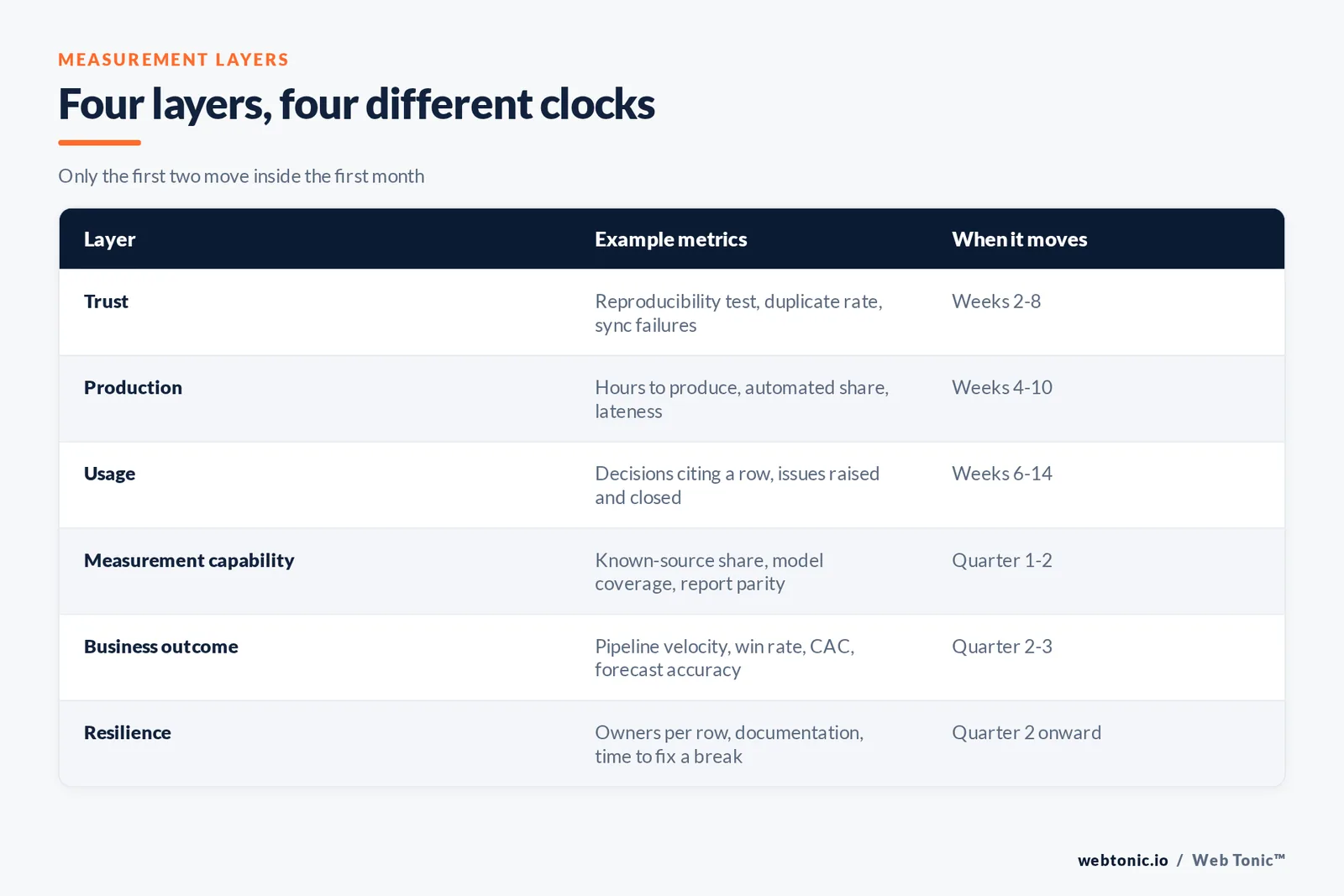
| Layer | Example metrics | When it moves |
|---|---|---|
| Trust | Reproducibility test, duplicate rate, field fill rate, sync failures | Weeks 2–8 |
| Production | Hours to produce, share of automated rows, lateness, blocked rows | Weeks 4–10 |
| Usage | Review attendance, decisions citing a row, issues raised and closed | Weeks 6–14 |
| Measurement capability | Share of pipeline with a known source, model coverage, report parity | Quarter 1–2 |
| Business outcome | Pipeline velocity, win rate, CAC, forecast accuracy | Quarter 2–3 |
| Resilience | Named owners per row, documentation coverage, time to fix a break | Quarter 2 onward |
Layer two: what does it cost to produce?
This is the layer nobody argues about, which makes it the best evidence a scorecard engagement worked. Track four things: total human hours to produce the weekly scorecard, share of rows that refresh without intervention, number of weeks the scorecard was late, and number of blocked rows outstanding.
Benchmarks exist for all of it. One time audit of lean marketing teams found 15% of the working week — roughly 6 hours — going to dashboard assembly, nearly as much as executing the work being reported on. Reporting-load modelling puts manual assembly near 9 hours a week across five accounts and about 34 hours across twenty. And teams that fix the production path commonly move from 15+ hours a week to under 2, per reporting automation case data.
Set the target explicitly at kickoff. A weekly report should land in 60–90 minutes once data is centralised, and practitioner guidance flags 3–5 hours as a signal that something upstream is broken. If hours are not falling by week eight, the engagement is building a presentation layer instead of a system.
Layer three: is anyone using it?
The most underrated metric in this whole discipline is decisions per quarter that cite a scorecard row. Count them. Budget shifts, campaign kills, hiring calls, pricing changes — each should be traceable to a number someone watched move.
Three companions to that count: attendance at the weekly review (if leadership skips it, the scorecard is dead and the numbers are irrelevant), issues raised from off-track rows and closed within a fortnight, and rows deleted for never changing a decision. That last one is a virtue metric. A scorecard that shrinks from 15 rows to 11 while decisions rise is working better, not worse.
The demand-side evidence is clear about why usage matters. The 2026 AgencyAnalytics benchmarks found the top question clients ask is whether marketing performance connects to revenue (55%), 97% rate accurate reporting as important for retention, and 36% now expect proactive insight rather than data delivery. The same study found 47% cannot attribute conversions across multi-session journeys and 44% say traditional models are losing reliability — which is exactly why a small set of trusted, acted-on rows beats a comprehensive report nobody defends.
The EOS convention handles usage structurally: 5–15 numbers reviewed in the first 5 minutes of the weekly meeting, with off-track rows becoming issues to solve. If your review takes twenty minutes to read the numbers, the row count is the problem.
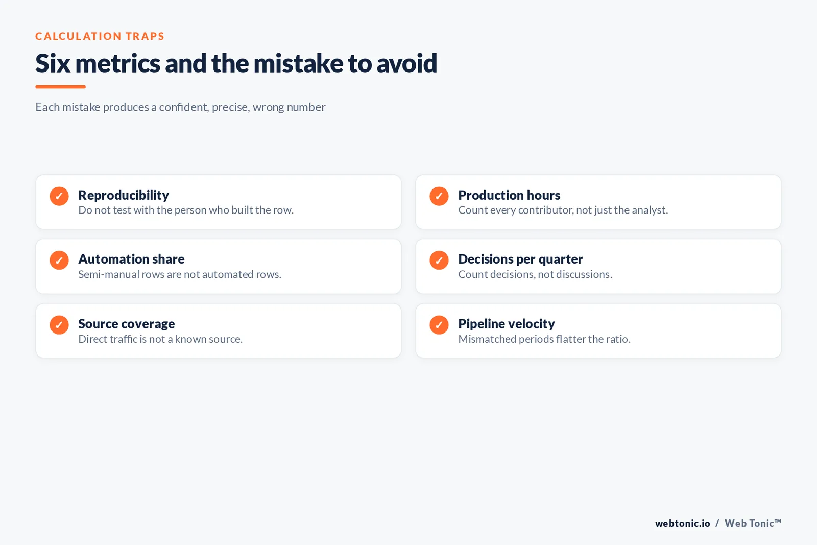
| Metric | How to calculate it | Mistake to avoid |
|---|---|---|
| Reproducibility | Distinct answers when 3 people rebuild a row from source | Testing with the person who built it |
| Production hours | Logged human time per weekly cycle, all contributors | Counting only the analyst's time |
| Automation share | Rows refreshing unattended ÷ total rows | Counting semi-manual rows as automated |
| Decisions per quarter | Logged decisions citing a specific row | Counting discussions instead of decisions |
| Source coverage | Pipeline with a known source ÷ total pipeline | Treating "direct" as a known source |
| Pipeline velocity | Pipeline generated ÷ go-to-market spend, same period | Mismatched periods flattering the ratio |
Layer four: capability and outcome
Measurement capability is itself a metric, and it usually improves before revenue does. Track the share of pipeline with a genuinely known source, whether your models cover more than one touch, and whether two systems now produce the same figure. Published benchmarks give you a place to stand: 2026 attribution research reports roughly 38% signal loss and 22% of teams running windows under 7 days, while multi-touch data puts multi-touch adoption at 47%, marketing mix modelling at 26%, and dark-funnel activity near 38%. Audits routinely find between 45% and 70% of pipeline sitting in unhelpful buckets like direct and unassigned; moving that share down is a real, reportable win.
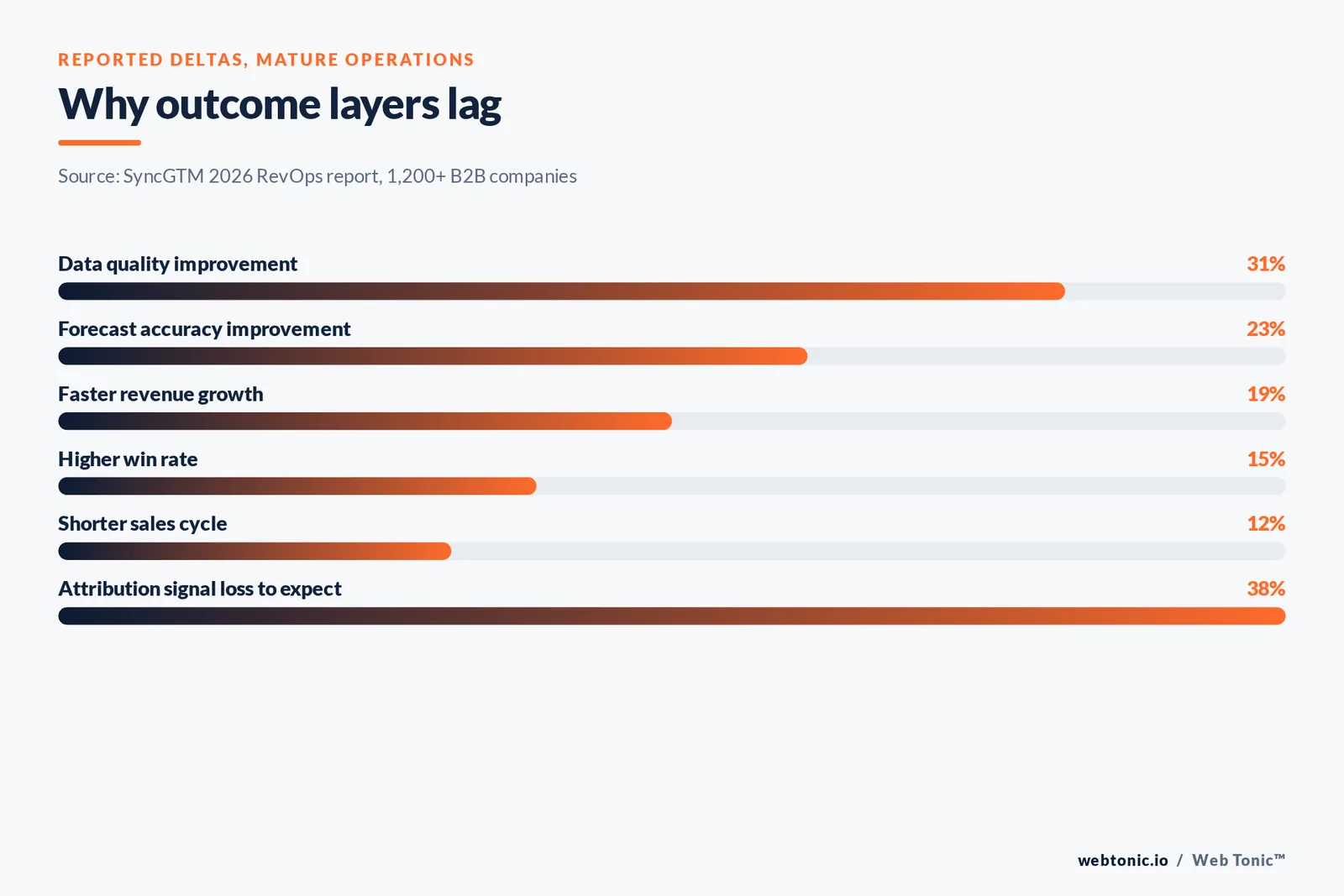
Business outcome is last for a reason. The 2026 RevOps report across 1,200+ B2B companies associates mature operating discipline with 19% faster revenue growth, 15% higher win rates, 12% shorter sales cycles, 23% better forecast accuracy and 31% improvement in data quality — but those are lagging, correlational figures across a large sample, not a 60-day promise for one company. Use them to set expectations, not to grade quarter one.
Pipeline velocity is the best single summary row, because it cannot be produced without both sides of the funnel being clean. It is also the metric that same survey found teams naming most for 2026. If you only carry one outcome number into the weekly review, carry that one and put revenue in the monthly.
Balanced coverage, and the definitions that carry it
A useful cross-check on any scorecard is coverage. Borrowing from the balanced scorecard tradition — the BSC model that asks for financial, customer, internal-process and learning objectives rather than one financial score — run your rows against four buckets and see whether one is empty. Marketing scorecards skew heavily to acquisition: website traffic, social and email performance, average cost per click. Far fewer carry an internal-process row, and almost none carry a learning row such as tests completed or insights documented.
Coverage is only meaningful if the definitions underneath are stable, and the MQL is where most organisations lose that stability. If "qualified lead" means a form fill to marketing and a booked call to sales, every downstream metric — conversion rate, cost per qualified lead, sourced pipeline — is measuring two different funnels at once. Write the MQL definition, get both leaders to sign it, and re-check it whenever the funnel changes. It is the single highest-leverage line in the definition list.
The lagging-versus-leading distinction deserves the same explicitness. Classic performance management separates outcome measures from performance drivers, and a healthy marketing scorecard carries both: a small number of lagging measures for the executive and board view, and a larger set of leading drivers the team can act on this week. When a leadership group complains that the scorecard is "not strategic", the usual diagnosis is that every row is lagging, so the meeting can only discuss history.
Finally, keep an eye on tracking and analytics health as its own row. A brand's average conversion rate is only as trustworthy as the tag that records it, and silent tracking failures are the most common cause of a scorecard that looks stable while the underlying business moves.
How we report on it
One page, monthly, in the same order every time: the four layers, a trend line per row, what changed, what we recommend, and what we need from you. If the page cannot be read in five minutes it has failed at the thing it is measuring.
Two rules we hold ourselves to. We do not report a number we cannot reproduce from source — if a row is blocked, it says blocked. And we prefer fewer defensible rows to more impressive ones, which occasionally makes the first month's page look thin. It gets less thin as the plumbing lands, and it never gets less honest.
If the layer that is actually broken turns out to be the underlying systems rather than the scorecard, the honest next step is operations work rather than more measurement. If the numbers are clean and the results are still weak, the constraint is strategy, and that belongs in a growth advisory conversation. Measurement's job is to tell you which of those you are in — and a scorecard that answers that question in its first quarter has already paid for itself.
Last practical note: re-run the reproducibility test every quarter. Sources get re-plumbed, fields get renamed, integrations fail silently, and a scorecard that was trustworthy in March can quietly stop being trustworthy by September. Fifteen minutes, three rows, three people. It is the cheapest audit in marketing.
Three failure patterns worth naming
The vanity scorecard. Every row is up and to the right, because the rows were chosen after the results. The tell is that no row has ever been red. A scorecard with a zero-miss record over thirteen weeks is not a scorecard, it is a highlight reel — real leading indicators miss regularly, which is precisely what makes them useful. Fix it by re-setting targets against last quarter's actuals rather than against ambition.
The audit scorecard. Thirty-five rows, all technically correct, reviewed by nobody. This happens when the row list was assembled by consensus and nobody had the authority to refuse a request. The cost is real: with reporting already consuming around 6 hours of a lean team's week, every unread row is paid for twice — once in production and once in the attention it takes from the rows that matter.
The orphan scorecard. It refreshes, it is accurate, and no decision has ever cited it. Usually the review slot was never protected, or off-track rows do not become issues with owners and dates. This is the cheapest one to fix and the most often left unfixed, because the artifact looks healthy. Measure decisions per quarter and it stops hiding.
All three are diagnosable in a fifteen-minute conversation with the person who runs the weekly meeting, which is why we start reviews there rather than in the data.

Related reading
- Marketing Team Structure & Hiring Advisory: how to measure it
- AI Marketing Advisory / AI Readiness: how to measure it
- EOS / Scorecard & KPI Advisory: what it costs in 2026
- Marketing Strategy Consulting services at Web Tonic
Frequently Asked Questions
What is the first metric that should improve?
Production cost. Hours spent assembling the weekly numbers should fall inside the first two months, and the share of rows refreshing unattended should rise. Trust metrics move alongside it. Business outcome metrics such as win rate or CAC lag by two to three quarters and should not be used to grade an early engagement.
How do we know the numbers can be trusted?
Run the reproducibility test: three people, three rows, rebuilt independently from source. One consistent answer per row is the standard. Support it with duplicate rate, field fill rate and failed syncs per week — and appoint a named data owner, which only 41% of organisations currently have.
Should the scorecard include revenue?
Usually not weekly. Revenue is a lagging outcome that closes with the period, so it drives commentary rather than action. Pipeline velocity — pipeline generated per dollar of go-to-market spend — is a better weekly summary row, and revenue belongs in the monthly review where the narrative lives.
Is fewer rows really better?
Yes, up to a point. The five to fifteen convention exists because a leadership team can only act on a handful of numbers per week. Deleting a row that has never changed a decision is a sign the system is maturing; adding rows to look thorough is how scorecards become unread reports.
How often should definitions be reviewed?
Quarterly, plus any time a source system, funnel stage or segment changes. Definition drift is the main cause of scorecards silently becoming wrong, and a quarterly review takes under an hour once the definition list exists.
See how our KPI scorecard advisory measures itself, explore data intelligence and our services, read more on the blog, or ask us to review your current reporting.
Sources
Validity State of CRM Data Management 2026 via PR Newswire · Spike AI marketing time audit · Wevion reporting-hours analysis · MarketerHire reporting automation · Hurree weekly reporting guidance · AgencyAnalytics 2026 Agency Benchmarks · EOS Worldwide FAQ · Attrifast 2026 attribution benchmark report · Digital Applied multi-touch attribution statistics 2026 · EOI Digital attribution bucket analysis · SyncGTM 2026 RevOps report.