
Table of contents
A thank you page is the screen visitors see after completing a conversion—submitting a form, making a purchase, or signing up for a newsletter. Most businesses treat it as a dead end. The best use it as a second conversion opportunity that drives upsells, referrals, and deeper engagement.
Key Takeaways
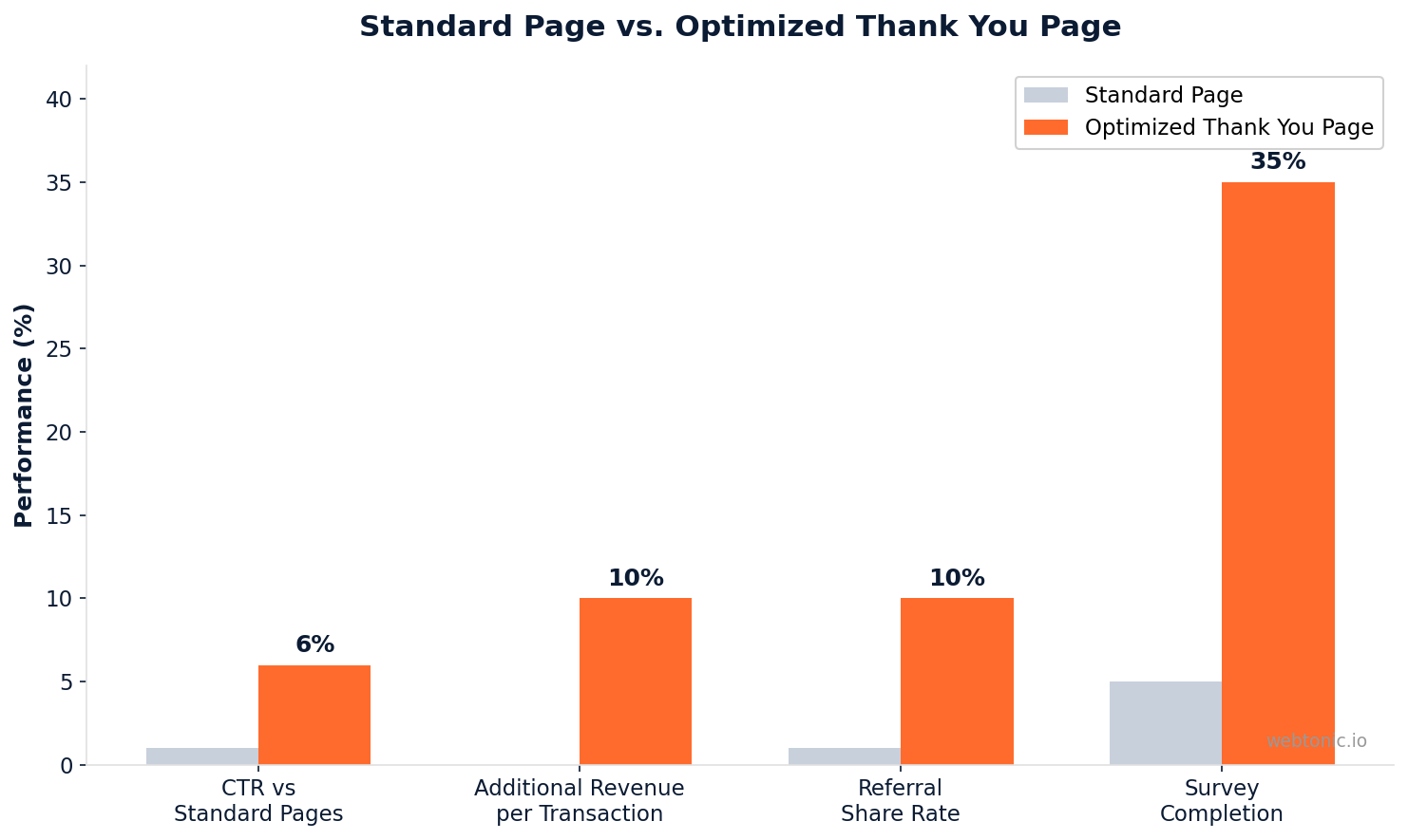
- Thank you pages have a 100% view rate—every single converter sees them (Klaviyo, 2025).
- Optimized thank you pages generate 5–15% additional revenue per transaction through upsells and referrals (HubSpot).
- Post-purchase upsells on thank you pages convert at 5–15%, far above typical landing page benchmarks.
- Referral prompts on thank you pages achieve 8–12% share rates (ReConvert, 2025).
- Post-purchase surveys reach 30–40% completion rates when placed on thank you pages.
- Loyalty program enrollment hits 15–25% signup rates on optimized thank you pages.
- Click-through rates on thank you pages are 4–8× higher than on standard website pages.
- 95% of Shopify stores use their thank you page for nothing beyond a receipt (WebMedic, 2026).
What Is a Thank You Page?
A thank you page is a post-conversion confirmation page that appears after a visitor completes a desired action on your website. That action could be a purchase, a lead form submission, an event registration, a newsletter signup, or a content download.
At its most basic, a thank you page confirms the action was successful ("Your order has been placed" or "Your form has been submitted"). But its real value goes far beyond confirmation. Because the visitor has just demonstrated buying intent or active interest, they are in a uniquely receptive mental state—psychologically committed and paying attention.
This is what makes thank you pages the most underutilized real estate on most websites. The visitor is captive, engaged, and trusting. Every element you add to the page after the confirmation message is an opportunity to deepen the relationship.
Why Thank You Pages Matter for Conversions
The conversion funnel does not end at the form submission or checkout. The thank you page sits at a unique psychological moment: the visitor has already committed. This creates a window of opportunity that no other page on your site can match.
Here is what the data shows about thank you page performance:
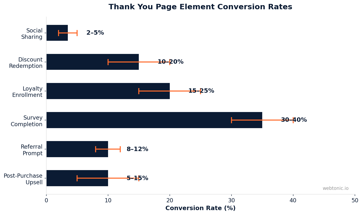
| Element | Average Conversion | Revenue Impact |
|---|---|---|
| Post-purchase upsell | 5–15% take rate | High — direct additional revenue |
| Referral program prompt | 8–12% share rate | High — free customer acquisition |
| Post-purchase survey | 30–40% completion | Medium — data for targeting |
| Social sharing buttons | 2–5% share rate | Medium — organic reach |
| Loyalty enrollment | 15–25% signup rate | Medium — retention lift |
| Next-purchase discount | 10–20% redemption | Medium — repeat purchase |
These numbers make sense when you consider the context. A visitor who just bought a product or submitted their email is in a peak trust state. They are far more likely to take a second action than a cold visitor landing on your homepage.
Essential Elements of an Effective Thank You Page
Not every thank you page needs every element. The right mix depends on whether the conversion was a purchase, a lead form submission, or a content opt-in. Here are the core components ranked by impact:
1. Clear Confirmation Message
This is non-negotiable. The visitor needs immediate confirmation that their action was successful. Without it, anxiety sets in—especially for purchases. "Your order has been placed" or "Thank you — we received your message" eliminates doubt and sets a positive tone for everything that follows.
2. Next Steps Instructions
Tell the visitor exactly what happens next. For lead forms: "We will reply within 24 hours." For purchases: "Your order confirmation email is on its way." For downloads: "Click below to access your guide." Clear next steps reduce support inquiries and build confidence.
3. Upsell or Cross-Sell Offer
Post-purchase upsells convert at 5–15% because the buyer has already committed their payment method. Present a complementary product, an upgrade, or a bundle deal. Keep the offer simple—one product, one price, one click. A skincare brand reported 11% upsell conversion rates on their thank you page (WebMedic).

4. Referral Prompt
The moment after a conversion is the peak referral window. The visitor is excited about their purchase or signup and most likely to share it with friends. A simple "Share with a friend and get 15% off your next order" prompt achieves 8–12% share rates. This creates a self-reinforcing acquisition loop at zero ad cost.
5. Social Proof Collection
Ask for a review, a testimonial, or a social media follow. Post-purchase is the ideal time because the customer's satisfaction is fresh. Loyalty program enrollment on thank you pages achieves 15–25% signup rates — far higher than email-based enrollment campaigns.
6. Survey or Feedback Request
Post-conversion surveys on thank you pages reach 30–40% completion rates. Ask 2–3 questions maximum: "How did you hear about us?", "What almost stopped you from buying?", "What would you like to see next?" This data feeds your marketing intelligence pipeline.
Thank You Page Best Practices
The difference between a thank you page that drives results and one that gets ignored comes down to design discipline and strategic restraint:
- Keep the page clean and focused. The primary mission is confirmation. Every additional element should feel like a natural next step, not a bombardment.
- Use a single, clear call to action. Multiple competing CTAs dilute each other. Choose one primary action (upsell, referral, or survey) and make it prominent.
- Match the design to your brand. The thank you page should feel like a seamless extension of the checkout or form experience, not a jarring transition.
- Personalize where possible. Use the visitor's name, reference their specific purchase or signup topic, and tailor recommendations. Personalized thank you pages see 25–40% higher engagement than generic versions.
- Include a clear navigation path back to your site. Some visitors want to continue browsing. Give them links to popular content, your blog, or product categories.
- Test continuously. A/B test different upsell offers, referral copy, and page layouts. Even small improvements compound across thousands of conversions.
Thank You Page Examples by Use Case
The best thank you page design depends entirely on what the visitor just did. Here are proven approaches for each scenario:
After a Purchase (Ecommerce)
Confirm the order with order number and estimated delivery. Below the confirmation, present a one-click upsell on a complementary product at a discount. Add a referral prompt and social sharing buttons. This is where the 5–15% upsell take rate generates the most direct revenue.
After a Lead Form Submission (B2B / Services)
Confirm receipt and set expectations for response time. Below the confirmation, offer a high-value content download (case study, industry report, or video walkthrough) that moves the lead further down the funnel. Include links to your services pages and a scheduling tool for immediate booking.
After a Newsletter Signup (Content / SaaS)
Thank the subscriber and confirm what they will receive. Prompt them to whitelist your email address to improve deliverability. Offer a bonus piece of content ("Here is an exclusive guide for new subscribers") and social sharing buttons. This is where the social sharing 2–5% share rate builds organic growth.
After an Event Registration (Webinars / Conferences)
Confirm registration and provide calendar invite instructions. Offer early access content or pre-event materials. Include a referral prompt ("Invite a colleague and get a bonus Q&A session"). This leverages the 8–12% referral share rate in a professional context.
Thank You Page Design Mistakes to Avoid
The most common errors turn a high-potential page into a dead end:
| Mistake | Impact | Fix |
|---|---|---|
| Generic "Thanks!" with no next step | Wastes 100% of post-conversion attention | Add at least one CTA — upsell, referral, or content |
| Too many competing CTAs | Paradox of choice reduces action on all offers | Prioritize one primary and one secondary CTA maximum |
| No confirmation message | Creates anxiety, drives support tickets | Lead with clear, specific confirmation text |
| Redirecting to homepage | Loses the captive audience entirely | Keep visitors on a dedicated thank you page with strategic elements |
| Ignoring mobile design | Over 60% of conversions happen on mobile | Test thank you page on mobile devices before launch |
Tracking Thank You Page Performance
Your thank you page is a conversion surface — treat it like one. Track these metrics to measure and improve its effectiveness:
- Upsell take rate — Percentage of thank-you-page visitors who complete a second purchase or upgrade.
- Referral share rate — Percentage of visitors who click the referral/share prompt.
- Survey completion rate — Percentage who answer your post-conversion questions.
- Time on page — Higher time indicates visitors are engaging with your additional content.
- Exit rate to next action — Where do visitors go after the thank you page? Track clicks on next-step CTAs vs. site exit.
Set up event-based tracking in Google Analytics 4 for each CTA on your thank you page. This data tells you which elements drive value and which are taking up space.
Related reading
- Splash Pages: What They Are, When To Use Them, and 8 High-Converting Examples
- Personal Injury Law Landing Pages & CRO Trends: Data-Driven Insights for 2026
- Pest Control Landing Page Statistics: Conversion Benchmarks & Data (2026)
- Custom Web Development services at Web Tonic
FAQ
What is the purpose of a thank you page?
A thank you page confirms a visitor's action (purchase, form submission, signup) and provides an opportunity for continued engagement. Beyond confirmation, it serves as a post-conversion optimization surface where you can drive upsells, collect referrals, gather feedback, and deepen brand loyalty at a moment of peak visitor trust.
How do I create an effective thank you page?
Start with a clear confirmation message and next-step instructions. Then add one primary call to action — an upsell, referral prompt, or content offer. Keep the design clean and aligned with your brand. Personalize the experience based on what the visitor just did. Test different elements using A/B testing tools and track engagement metrics.
Should I use a thank you page or a thank you popup?
A dedicated thank you page is generally more effective than a popup because it provides more space for additional elements (upsells, referrals, surveys) and avoids the dismissive reflex users have with popups. However, a popup thank you message can work for lightweight actions like newsletter signups where you do not want to redirect the visitor away from the current page.
What conversion rate should I expect from thank you page elements?
Benchmarks vary by element: upsells convert at 5–15%, referral prompts at 8–12%, surveys at 30–40% completion, and social sharing at 2–5%. These rates are significantly higher than cold-traffic conversions because the visitor has already demonstrated commitment by completing the initial action.
Can a thank you page hurt conversions?
Yes, if it creates confusion or anxiety. A thank you page that does not clearly confirm the action was successful can cause visitors to re-submit forms or contact support. Similarly, aggressive upselling immediately after a lead form submission can feel opportunistic and damage trust. Always lead with confirmation, then present offers as helpful next steps.
Sources
Unbounce — Thank You Pages Best Practices
OptinMonster — Thank You Page Examples
WebMedic — Ecommerce Thank You Page Tips
Talkable — Thank You Page Referral Best Practices
HubSpot — Thank You Page Examples