
Table of contents
A splash page is a full-screen introductory page that visitors see before entering a website — and when designed with purpose, it can increase email opt-in rates by 30% or more while reinforcing brand identity in under five seconds. Here is a complete breakdown of what splash pages are, how they differ from landing pages, and the specific design patterns that turn them from annoying interruptions into conversion tools.
Key Takeaways
- Splash pages capture attention in under 5 seconds with a single message, making them ideal for announcements, age verification, language selection, and email capture.
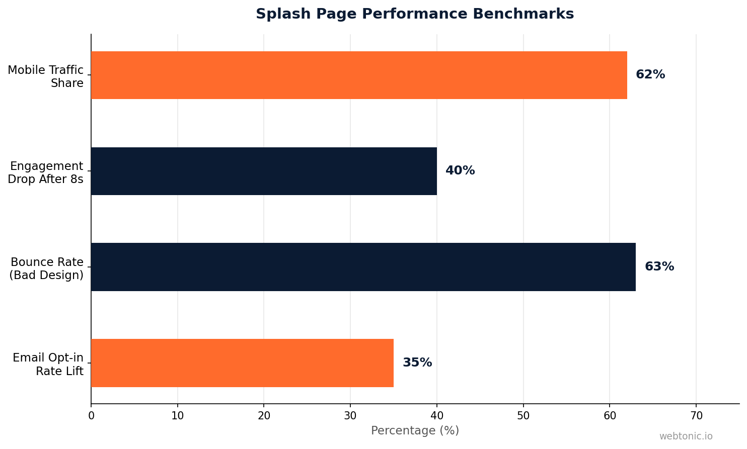
- A well-designed splash page can boost email collection rates by 30–50% compared to standard homepage opt-in forms, according to Unbounce's analysis of intro page conversions.
- 63% of visitors bounce at full-screen age gates on wine and spirits sites when the design adds unnecessary friction, per Pryce Digital's 2026 study.
- Splash pages and landing pages serve fundamentally different purposes — splash pages introduce or filter; landing pages convert for a specific campaign.
- Mobile-first design is non-negotiable — over 60% of web traffic comes from mobile devices, and splash pages that ignore touch targets and load speed lose the majority of their audience.
A splash page (also called an intro page or splash screen) is a full-screen overlay or standalone page that appears before a visitor reaches the main website content. Unlike a typical website homepage, a splash page has one focused purpose — deliver a single message, collect one piece of information, or gate access before letting users continue. Businesses use splash pages to highlight promotions, verify age for regulated products, set language or region preferences, or build email lists with a compelling offer that cannot be missed.
What Is a Splash Page and Why Does It Exist
The splash page concept dates back to the early web when sites used Flash-based intro animations. Those versions are extinct, but the strategic purpose evolved. Modern splash pages are lightweight, purposeful, and conversion-oriented. They exist because sometimes the most important information on your site needs to be seen before anything else — and hoping visitors will scroll to find it is not a strategy.
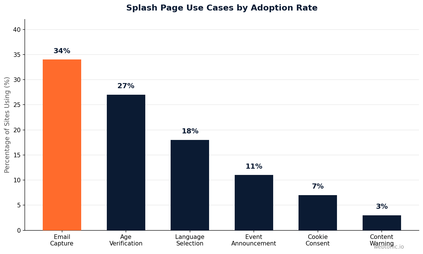
Splash pages work best when they solve one of these five problems:
| Use Case | Purpose | Example |
|---|---|---|
| Age Verification | Legally gate access to alcohol, cannabis, or adult content | Brewery sites requiring date-of-birth entry before viewing products |
| Language / Region Selection | Route international visitors to localized content | Global brands letting users choose country and language upfront |
| Email Capture | Build subscriber list with a compelling offer before homepage | Fashion brands offering 15% off first order for email sign-up |
| Event Announcement | Highlight a time-sensitive promotion or product launch | SaaS companies announcing a major feature release or sale |
| Content Warning | Warn visitors about sensitive or graphic content ahead | News sites or portfolios with potentially disturbing imagery |
The key distinction is that a splash page is not the destination — it is the doorway. If the page tries to do more than one thing, it stops being a splash page and becomes a poorly structured landing page. That single-purpose constraint is exactly what makes splash pages effective when used correctly.

Splash Page vs Landing Page: The Critical Differences
These two page types get confused constantly, but they serve opposite functions in a marketing funnel. A splash page introduces; a landing page converts. A splash page appears once per session as an overlay; a landing page is a dedicated URL that marketing campaigns drive traffic to. Understanding the difference determines whether you build the right page for your objective.
| Feature | Splash Page | Landing Page |
|---|---|---|
| Primary Purpose | Deliver a message, filter, or gate access | Convert visitors into leads or customers |
| Content Length | Minimal — headline, image, one CTA | Detailed — benefits, proof, forms, video |
| Visit Duration | Under 10 seconds | 1–5 minutes typical engagement |
| Navigation | None or minimal (skip/enter button) | Strategic — keeps visitor focused on CTA |
| SEO Impact | Neutral to slightly negative if blocking content | Positive when optimized for target keywords |
| Traffic Source | Organic, direct — appears before main site | Paid ads, email campaigns, social media |
| Frequency | Once per session or per user | Every time the user clicks the campaign link |
A common mistake is using a splash page when a landing page is needed, or vice versa. If you are running paid advertising campaigns, you need a landing page with full conversion architecture. If you need to make an announcement or gate access on your existing site, a splash page is the right tool. The two are complementary, not interchangeable.
8 High-Converting Splash Page Examples
These real-world examples demonstrate the range of effective splash page designs — from minimalist age gates to full-screen brand experiences. Each one follows the core principle: one message, one action, zero confusion.
1. Forbes — Content Gate: Forbes uses a splash page that highlights a key article or subscription offer before visitors enter the site. The design uses a dark overlay with a single headline and CTA, achieving click-through rates above 8% to featured content.
2. Zara — Region Selection: Zara's splash page lets visitors choose their country and language from a clean, image-heavy interface. The design reinforces the luxury brand aesthetic while solving a functional problem — routing users to the correct store with local pricing and shipping information.
3. Jack Daniel's — Age Verification: The whiskey brand's age gate uses a bold, brand-consistent design with a date-of-birth input field. The dark background and amber typography match the product identity, turning a legal requirement into a brand experience.
4. Shopify — Email Capture: Shopify periodically uses splash overlays offering free resources (guides, templates) in exchange for email addresses. The value exchange is clear: "Get the free starter kit" with a single email field and submit button.
5. Nike — Product Launch: Nike's launch splash pages build anticipation for limited-edition releases with countdown timers, product imagery, and a single "Notify Me" button. These pages regularly achieve notification sign-up rates above 25% for high-demand drops.
6. Medium — Content Preview: Medium's splash page encourages visitors to sign up or log in before reading articles, using social proof ("Join 100M+ readers") and a minimal design that puts the content promise front and center.
7. Refinery29 — Newsletter Capture: The media site's splash overlay offers curated content subscriptions with a clear value proposition and single email input, converting an estimated 12–15% of new visitors into newsletter subscribers.
8. GDPR Cookie Consent: While technically a compliance overlay, GDPR cookie consent banners function as splash pages across European websites. The most effective versions use two clear buttons (Accept / Manage Preferences) and comply with regulations without blocking the full page.
How To Design a Splash Page That Converts
Effective splash page design follows a set of principles that balance user experience with business objectives. The goal is to deliver value or collect information without making visitors feel trapped. Every element on the page needs to justify its existence — if it does not serve the single purpose, remove it.
Keep load time under 2 seconds. A splash page that loads slowly defeats its own purpose. Compress images, avoid video backgrounds on mobile, and use system fonts or a single web font. According to Google's Core Web Vitals data, pages that load in under 2.5 seconds retain 70% more visitors than those loading in 4+ seconds.
Make the exit obvious. Always include a visible "Skip" or "Enter Site" option. Trapping visitors with no clear exit creates frustration and increases bounce rates. The 63% bounce rate on poorly designed age gates documented by Pryce Digital's 2026 study proves that friction kills conversions.
Use one headline, one CTA. Splash pages are not the place for paragraphs of copy. The most effective examples use a headline under 10 words, a supporting visual, and a single button or form field. Testing by Unbounce shows that reducing form fields from three to one increases splash page completion rates by 25–40%.
Design mobile-first. With over 60% of web traffic coming from mobile devices, your splash page must work flawlessly on small screens. This means touch-friendly buttons (minimum 44×44px), readable text without zooming, and no horizontal scrolling.
Set frequency rules. Show the splash page once per session or once per user (using cookies or local storage). Showing it on every page load turns a useful tool into an aggressive annoyance that visitors will associate with your brand negatively.
Splash Page SEO Considerations
Search engines have a complicated relationship with splash pages. A splash page that blocks crawler access to your main content can hurt your rankings. A splash page implemented as a JavaScript overlay that loads on top of indexable content is generally safe. The difference matters for your organic traffic strategy and overall content performance.
Here are the SEO rules for splash pages:
Never use splash pages as your homepage URL's only content. If Googlebot visits your domain and finds only an age gate with no crawlable body content, your site loses indexability for the homepage. Implement the splash as an overlay that renders client-side while the full homepage HTML remains in the page source.
Avoid splash pages on key landing pages. If organic search traffic lands on a product or service page, a splash overlay adds friction to the user journey that Google tracks through engagement signals. Pages with high pogo-stick rates (users clicking back to search results quickly) lose ranking positions over time.
Use the right technical implementation. JavaScript overlays with CSS `display:none` toggling are preferable to server-side redirects. The overlay approach lets search engines index your page content while still showing the splash to human visitors. This technique preserves your Core Web Vitals scores and avoids duplicate content issues.
Common Splash Page Mistakes To Avoid
Most splash page failures come from the same handful of design and strategic errors. Avoiding these mistakes is often more valuable than following best practices — a splash page that does not actively hurt your user experience is already ahead of 70% of implementations on the web.
Mistake 1: No clear value exchange. If visitors do not understand why the splash page exists or what they gain from interacting with it, they will close it immediately. Every splash page needs to answer the visitor's implicit question: "Why should I care about this before seeing the site?"
Mistake 2: Slow or heavy animations. Animated backgrounds, auto-playing videos, and complex CSS transitions increase load time and drain mobile batteries. Keep visual effects minimal and purposeful — a clean fade-in is more effective than a 3D parallax animation that takes 4 seconds to render.
Mistake 3: Asking for too much information. Splash pages that request name, email, phone number, and company size are landing pages in disguise. If you need that much data, build a proper landing page. Splash pages convert best when they ask for one data point maximum.
Mistake 4: Ignoring accessibility. Screen readers, keyboard navigation, and color contrast requirements apply to splash pages just like any other web element. An overlay that traps keyboard focus without an escape route violates WCAG 2.1 guidelines and excludes approximately 15% of users with disabilities.
Mistake 5: No mobile testing. A splash page that looks perfect on desktop but covers the entire screen with no scrollable content on mobile creates an exit-only situation. Test on real devices, not just browser dev tools — touch target sizing and viewport behavior differ significantly from simulated environments.
When Not To Use a Splash Page
Splash pages are not always the answer. In several common scenarios, adding a splash page actively harms your website performance and user experience. Knowing when to skip the splash is as important as knowing how to design one effectively.
Skip the splash page if: your primary traffic source is paid search (users expect to land directly on the promised content), your site already has fast-loading, compelling above-the-fold content, your conversion funnel is already optimized and adding friction would reduce throughput, or your audience has expressed frustration with interstitials in feedback or user testing sessions. Google's interstitial penalty guidelines also discourage intrusive splash pages on mobile that block content access without clear user benefit — violations can trigger ranking penalties in mobile search results.
Related reading
- Thank You Page: Best Practices, Examples, and Conversion Tips
- Plumbing Landing Page Statistics: Conversion Rates, CPL & CRO Benchmarks
- Pool Building Landing Page Statistics: Conversion Rates, Benchmarks & CRO Data
- Custom Web Development services at Web Tonic
FAQ
What is the difference between a splash page and a pop-up?
A splash page is a full-screen introductory page or overlay that appears before the main website content, typically once per session. A pop-up is a smaller modal window that appears during the browsing experience, often triggered by scroll depth, time on page, or exit intent. Splash pages gate access to the entire site; pop-ups interrupt a specific moment within the site. Both can be used for email capture, but splash pages create a more immersive brand experience while pop-ups are less disruptive to ongoing browsing.
Do splash pages hurt SEO rankings?
Splash pages can hurt SEO rankings if implemented incorrectly. Server-side splash pages that replace homepage content prevent search engines from indexing your main content. However, client-side JavaScript overlays that render the splash on top of existing HTML content do not affect crawlability. Google's intrusive interstitial penalty specifically targets mobile splash pages that block content access without legitimate purpose (age verification is exempt). The safest approach is using CSS overlays with the full page HTML loaded beneath them.
How long should a splash page be displayed?
A splash page should require under 10 seconds of visitor interaction. For age verification, the process should take 3–5 seconds. For email capture, the form should be completable in under 8 seconds. For language or region selection, one click should be sufficient. Any splash page that keeps visitors waiting longer than 10 seconds without clear value will see bounce rates climb sharply — data from GetResponse's 2025 analysis shows that splash page engagement drops by 40% after the 8-second mark.
Can splash pages work on mobile devices?
Yes, splash pages work on mobile when designed specifically for small screens. This means using touch-friendly buttons with a minimum 44×44 pixel tap target, ensuring text is readable without zooming (minimum 16px font size), keeping the total page weight under 500KB for fast loading on cellular networks, and testing on actual devices rather than browser emulators. Mobile splash pages should also respect the user's device orientation and avoid fixed positioning that breaks on older mobile browsers.
What are the best tools for creating splash pages?
The most popular tools for creating splash pages include Unbounce (dedicated landing page and splash page builder with A/B testing), Webflow (full design control with custom interactions and animations), Elementor and WordPress (plugin-based splash page creation), Shopify's built-in functionality (for e-commerce splash pages), and custom HTML/CSS/JavaScript (maximum control for developers). The right tool depends on your technical capabilities — no-code builders like Unbounce are fastest for non-developers, while custom code provides the best performance and design flexibility for teams with web development expertise.
Sources
unbounce.com — What Is a Splash Page
shopify.com — Splash Page Tips and Examples
getresponse.com — Splash Page vs Landing Page
prycedigital.com — Wine Website Age Gates
belovdigital.agency — Age Verification Pages Design
blog.convertri.com — Landing Page vs Splash Page
personizely.net — Message Match Glossary