

Table of contents

A marketing KPI scorecard advisory is a short engagement that decides which handful of numbers your leadership team will run marketing on every week — and then makes those numbers produce themselves. It is not a dashboard project. It is an argument settled in writing.
Key Takeaways
- A scorecard is deliberately small. The EOS canon puts it at 5–15 weekly numbers, reviewed in the first 5 minutes of the leadership meeting — not a wall of channel metrics.
- The advisory work is definitional before it is technical. Most stalls are caused by two people meaning different things by "qualified lead", not by the reporting tool.
- The demand signal is loud: 55% of agencies say the question they hear most from clients is whether marketing performance can be connected to revenue.
- Reporting is quietly expensive. One time audit found teams spending 15% of the week — about 6 hours — assembling dashboards, and a third of data teams lose 6+ hours a week to reconciliation.
- Scorecards fail on trust, not design. Only 41% of organisations have a named data governance owner, and just 21% call their CRM data AI-ready.
- Two or more of the six signals below at once is the honest threshold for buying help. One signal is usually a training problem.
What the engagement actually produces
Strip away the framework language and a scorecard advisory delivers four things: a definition list, a metric set with owners and targets, a weekly production path for each number, and a meeting in which those numbers are used to make decisions. Anything that does not survive to the meeting was decoration.
The metric set is the visible part, and it is the smallest part. EOS Worldwide describes the Scorecard as a weekly dashboard of 5 to 15 numbers that gives a leadership team a pulse on the business, reviewed in the first five minutes of the weekly Level 10 meeting. The discipline is the constraint. A scorecard with 40 rows is a report, and reports get skimmed.
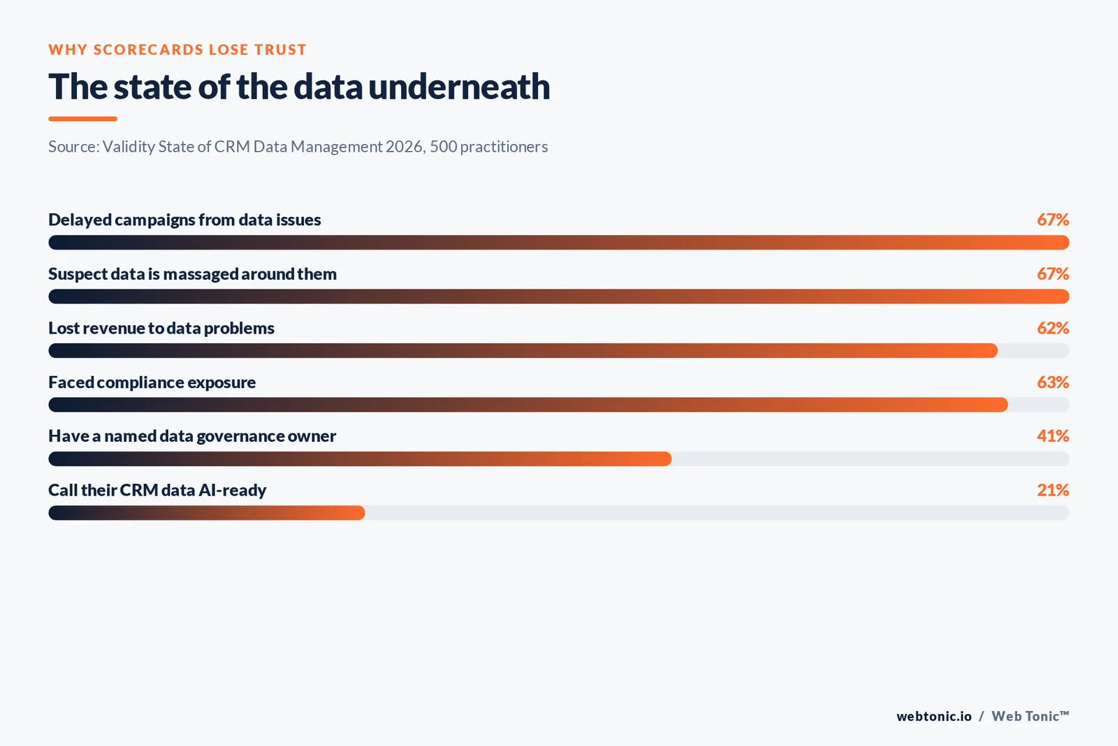
The definition list is where the real work sits. Every metric needs a written source system, a calculation, a segment filter, a refresh time and a named owner. Skip that and you get the classic failure: three departments, three answers, one number. The Validity State of CRM Data Management 2026 study of 500 practitioners found 62% had lost revenue to data problems, 67% had delayed campaigns, and only 41% could name a data governance owner at all.
The production path decides whether the scorecard survives month three. If a number takes a human two hours to assemble, it will be late, then estimated, then abandoned. Every row needs an answer to "who or what produces this by Monday 9am, without asking anyone".
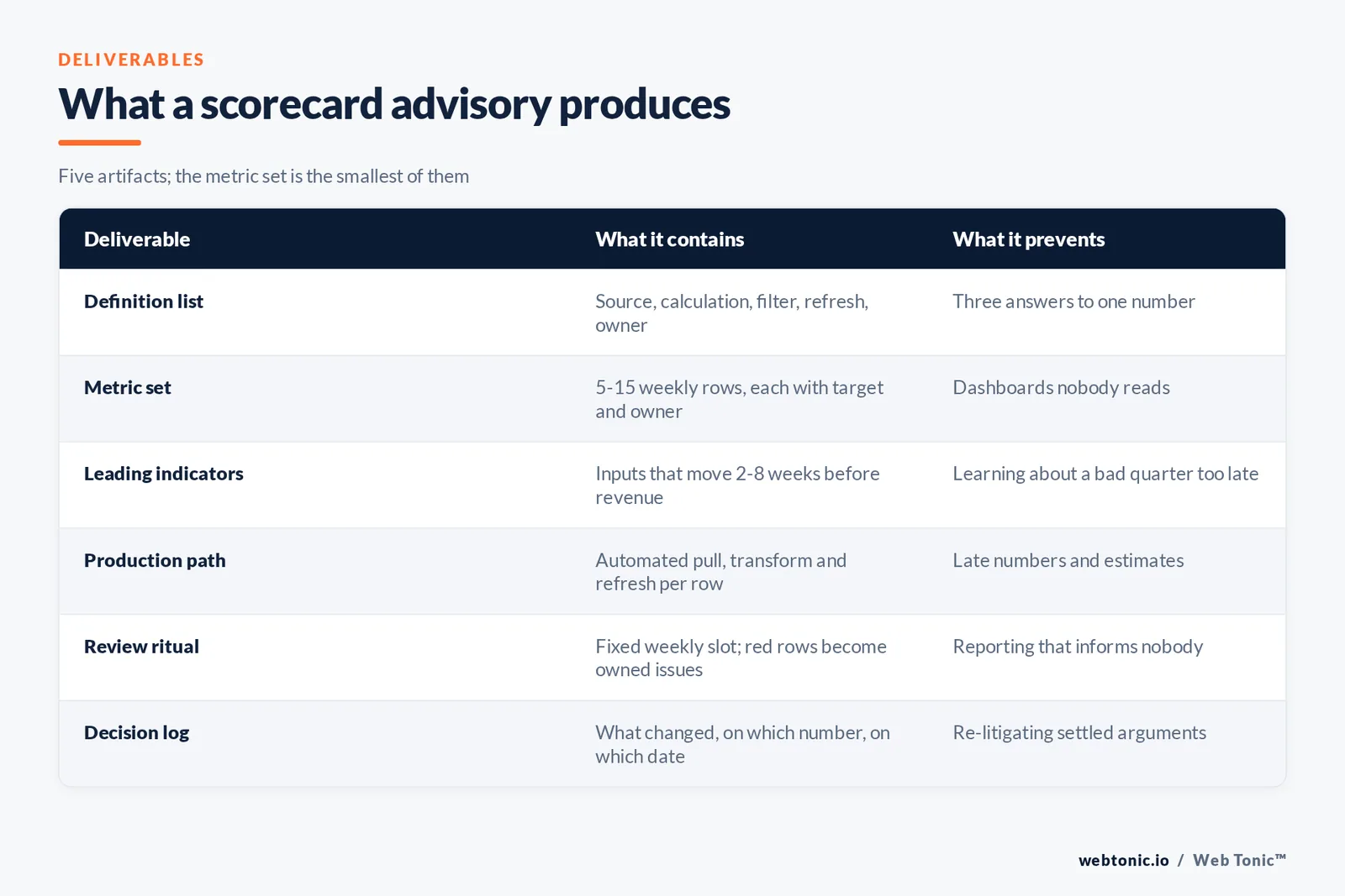
| Deliverable | What it contains | What it prevents |
|---|---|---|
| Definition list | Source system, calculation, filter, refresh time, owner per metric | Three answers to one number |
| Metric set | 5–15 weekly rows, each with a target and an owner | Dashboards nobody reads |
| Leading indicators | Inputs that move 2–8 weeks before revenue does | Finding out about a bad quarter in the quarter |
| Production path | Automated pull, transformation and refresh per row | Manual assembly, late numbers, estimates |
| Review ritual | Fixed weekly slot, off-track rows become issues with owners | Reporting that informs nobody |
| Decision log | What changed, on which number, on which date | Re-litigating settled arguments |
Leading indicators are the whole point
Most marketing reporting is a rear-view mirror: spend, leads, revenue, all describing a period that has closed. A scorecard earns its keep by carrying inputs that move before the outcome does — pipeline created, qualified conversations booked, content published against plan, sales response time, retention signals in the first 30 days.
The test is blunt: if a row goes red, can someone do something about it this week? Revenue fails that test. Response time passes it. This is why the scorecard sits upstream of the monthly report rather than replacing it.
Data from the operations side backs the pattern. The 2026 RevOps report covering 1,200+ B2B companies found pipeline velocity — pipeline generated per dollar of go-to-market spend — is the metric teams named most for 2026, precisely because it cannot be faked without both marketing and sales data being clean. That same survey put dedicated revenue operations adoption at 78%, up from 48% in 2023, and reported deltas of 19% faster revenue growth and 23% better forecast accuracy for mature functions.
Attribution reality is the other reason to favour inputs. Attribution benchmark data for 2026 shows roughly 38% signal loss across typical stacks, and multi-touch attribution research finds only 47% of teams run multi-touch models at all while 38% of buying activity happens in channels they cannot see. Build a scorecard that depends entirely on perfect last-click revenue mapping and it will be wrong in a confident, precise way.
When you actually need one
Not every business needs outside help here. If one person owns marketing, sells, and reports, a spreadsheet and honesty will do. The engagement earns its fee when the number of people who need to agree on the numbers exceeds the number of people who can produce them.
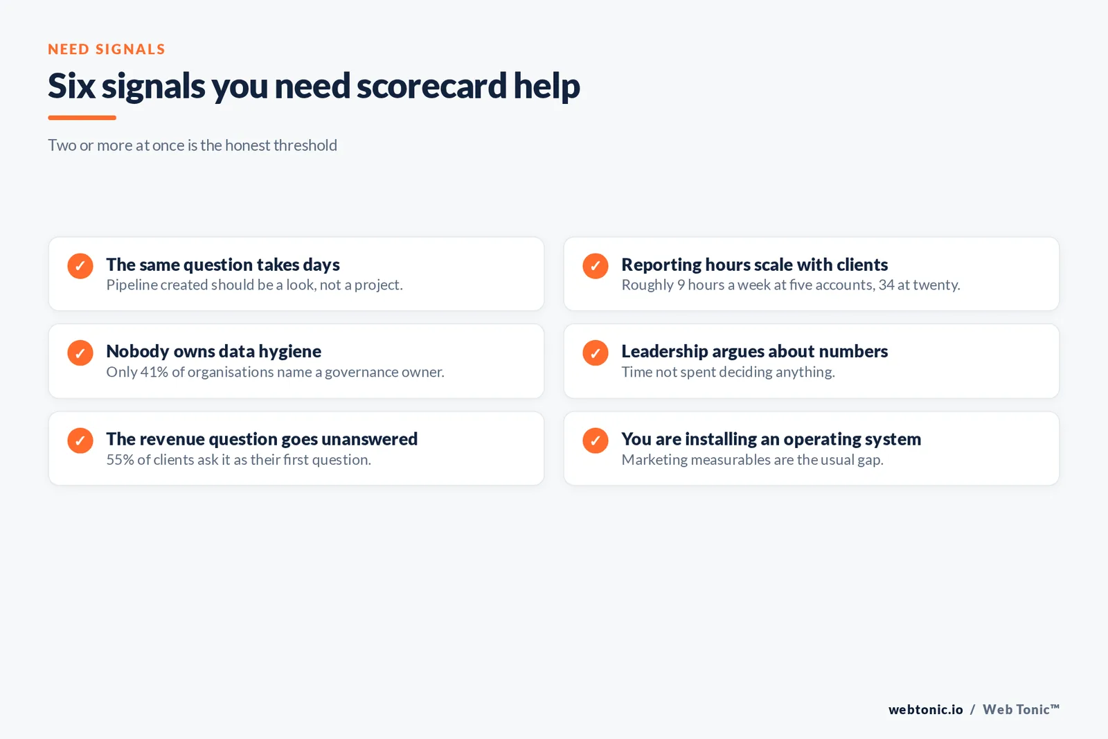
Six signals, and the threshold is two at once:
1. The same question takes days to answer. "How much pipeline did marketing create last month?" should be a look, not a project. One time audit of lean marketing teams found 15% of the working week — near 6 hours — went to exporting CSVs and reconciling models rather than the work being reported on.
2. Reporting time scales with clients or product lines. Modelled loads of roughly 9 hours a week at five accounts and 34 hours at twenty are typical of manual assembly, according to published reporting-hours analysis. Linear growth in reporting hours is a structural defect, not a staffing gap.
3. Nobody owns data hygiene. With only 41% of organisations naming a governance owner and 21% calling their CRM data AI-ready, this is the modal state, not an unusual one.
4. The leadership meeting argues about numbers instead of decisions. Time spent on whose figure is right is time not spent on what to do.
5. Marketing cannot answer the revenue question. The 2026 AgencyAnalytics benchmarks put "can you clearly connect marketing performance to revenue" as the top client question at 55%, with 47% reporting they cannot attribute conversions across multi-session journeys and 44% saying traditional models are losing reliability.
6. You are installing or running an operating system. Over 100,000 companies have adopted EOS tools in some form, per published estimates of EOS adoption, and marketing is usually the component with the thinnest measurables when the scorecard is first built.
Where the balanced scorecard fits
The vocabulary here borrows from the balanced scorecard, and the borrowing is worth understanding. The classic model asks a company to set objectives across four perspectives — financial, customer, internal process, and learning and growth — so that a single financial score cannot hide a rotting operation underneath. Academic reviews of balanced scorecard adoption track it as one of the most widely used strategic management tools of the last three decades, with executive-level usage rising sharply in the early 2020s.
A marketing scorecard is a narrower instrument, but the same logic applies. Balance means each row answers a different question: an acquisition row (website traffic, qualified leads, visitors from the channels you actually invest in), a conversion row (funnel rate at the step you are trying to move), an economic row (cost per qualified lead, or ROI against a goal you agreed in advance), and an operating row (content or campaigns shipped against plan). Four perspectives, a handful of numbers each, and the company can see whether this quarter's result was bought or built.
Two practical rules keep it honest. First, map every row to a written objective — a metric with no objective behind it will be defended on tradition rather than usefulness. Second, keep a worked example of each row: the exact filter, the exact date range, the exact figure from last month. That example is what a new team member uses to reproduce the number, and it is what settles the next argument in ninety seconds instead of an afternoon.
What the model does not do is tell you which customers or objectives matter. That is strategy, and no scorecard invents it. The scorecard's contribution is smaller and more durable: it makes the strategy you already chose measurable, and it makes drifting away from it visible within three weeks.
Why the tool is not the answer
Buying a dashboard platform before settling definitions industrialises the disagreement. The platform will faithfully render two incompatible versions of "lead" side by side, refresh them hourly, and email them to the board.
The market prices this in. Published ranges for a build put a single KPI dashboard at roughly $3,000–$10,000 and a department-level BI implementation at $10,000–$35,000, per 2026 analytics pricing analysis, while agency-side pricing data puts a KPI dashboard at $5,000–$20,000 over 2–6 weeks and a full attribution build at $15,000–$60,000. Those are real numbers for real work — and every one of them is wasted if the underlying definitions are contested.
Sequence matters more than spend. Definitions, then production path, then presentation layer. Teams that get this order right routinely compress reporting from 15+ hours a week to under 2, according to reporting automation case data. A sane benchmark once the plumbing is done: a weekly marketing report should take 60–90 minutes, and practitioner guidance treats 3–5 hours as a symptom worth investigating.
This is also why scorecard work pairs naturally with the plumbing beneath it. If your source data cannot support the metric set, the honest first step is marketing operations work, not a prettier chart. Where the constraint is strategic rather than mechanical, a growth advisory engagement is the better door.
| Situation | What you probably need | Why |
|---|---|---|
| No agreed definitions | Scorecard advisory | The argument is definitional, not technical |
| Definitions fine, data dirty | Marketing ops / RevOps work | The scorecard would report noise faithfully |
| Data clean, numbers ugly | Channel or strategy work | Measurement is not the constraint |
| One person does everything | A spreadsheet and a habit | Coordination cost is near zero |
| Installing EOS or similar | Scorecard advisory | Marketing measurables are the usual gap |
| Board or investor pressure | Scorecard plus reporting rebuild | External audiences need one defensible version |
What a good engagement feels like from the inside
Week one is interviews and access, and it is uncomfortable, because the first output is a list of contradictions. Week two produces the definition list and a draft metric set that someone will object to — which is the point; objections in week two are cheap and objections in month six are expensive.
By week four there should be a scorecard populating itself for at least the rows that already have clean sources, plus an explicit list of rows that cannot be automated yet and what it would take. By week eight the weekly review is running without the advisor in the room. That last part is the actual deliverable: a habit your team owns, not a file they were given.
We take the same view on our own numbers. A metric nobody can reproduce from source is not reported, and a row nobody owns gets deleted rather than carried. That bias toward fewer, defensible numbers is what makes the weekly meeting short.
The scale test is simple. Fifteen rows, five minutes, every week, for thirteen weeks. If that runs without heroics, the engagement worked. If it does not, no amount of visual polish will save it.

Related reading
- AI Marketing Advisory / AI Readiness: what it is and when you actually need one
- Marketing Team Structure & Hiring Advisory: what it is and when you actually need one
- Growth Advisory / Growth Consulting: what it is and when you actually need one
- Marketing Strategy Consulting services at Web Tonic
Frequently Asked Questions
How many metrics should a marketing scorecard have?
Between five and fifteen weekly rows, following the EOS Scorecard convention, with a bias toward the low end when you start. Every row must have one owner, one target and one production path. Monthly and quarterly detail belongs in a separate report, not on the weekly scorecard.
Is a marketing KPI scorecard the same as a marketing dashboard?
No. A dashboard is a presentation layer that can show anything; a scorecard is a governed, deliberately short list of numbers with owners and targets that leadership reviews on a fixed cadence. A dashboard usually renders the scorecard, but you can have a beautiful dashboard and no scorecard at all — that is the common failure mode.
Do we need EOS to run a scorecard?
No. EOS provides a well-tested shape — weekly cadence, 5–15 leading indicators, off-track rows becoming issues with owners — and over 100,000 companies use its tools in some form, but the mechanics work in any operating rhythm. If you already run a weekly leadership meeting, you have the slot you need.
How long before a scorecard changes decisions?
Expect definitions and a first populated version inside four to six weeks, and trend usefulness after about three consecutive weeks of clean data — the point at which a pattern is distinguishable from noise. Business outcome movement lags by a quarter or more, because the scorecard changes what you notice before it changes what you achieve.
What if our data is too messy for a scorecard?
Then the scorecard tells you that in week two, which is valuable on its own. In practice you build the rows you can produce honestly, list the rest as blocked with a named fix, and treat hygiene as the first project. Reporting on dirty data with confidence is worse than reporting on less.
See how our KPI scorecard advisory works, browse more on data intelligence and our services, read further analysis on the blog, or talk to us about your numbers.
Sources
EOS Worldwide FAQ · ScaleUp Exec, EOS adoption estimates · SyncGTM 2026 RevOps report (1,200+ companies) · Validity State of CRM Data Management 2026 via PR Newswire · AgencyAnalytics 2026 Agency Benchmarks · Spike AI marketing time audit · Wevion reporting-hours analysis · MarketerHire reporting automation · Hurree weekly reporting guidance · X-Byte 2026 analytics pricing guide · Attrifast 2026 attribution benchmark report · Digital Applied multi-touch attribution statistics 2026.