
Table of contents
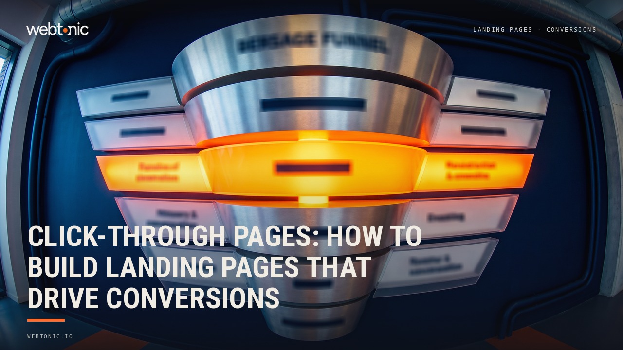
A click-through page is a landing page with one job — warm up the visitor and get them to click a single call-to-action button that moves them to the next step in the conversion funnel. No forms, no distractions, just persuasive content and one clear CTA.
Key Takeaways
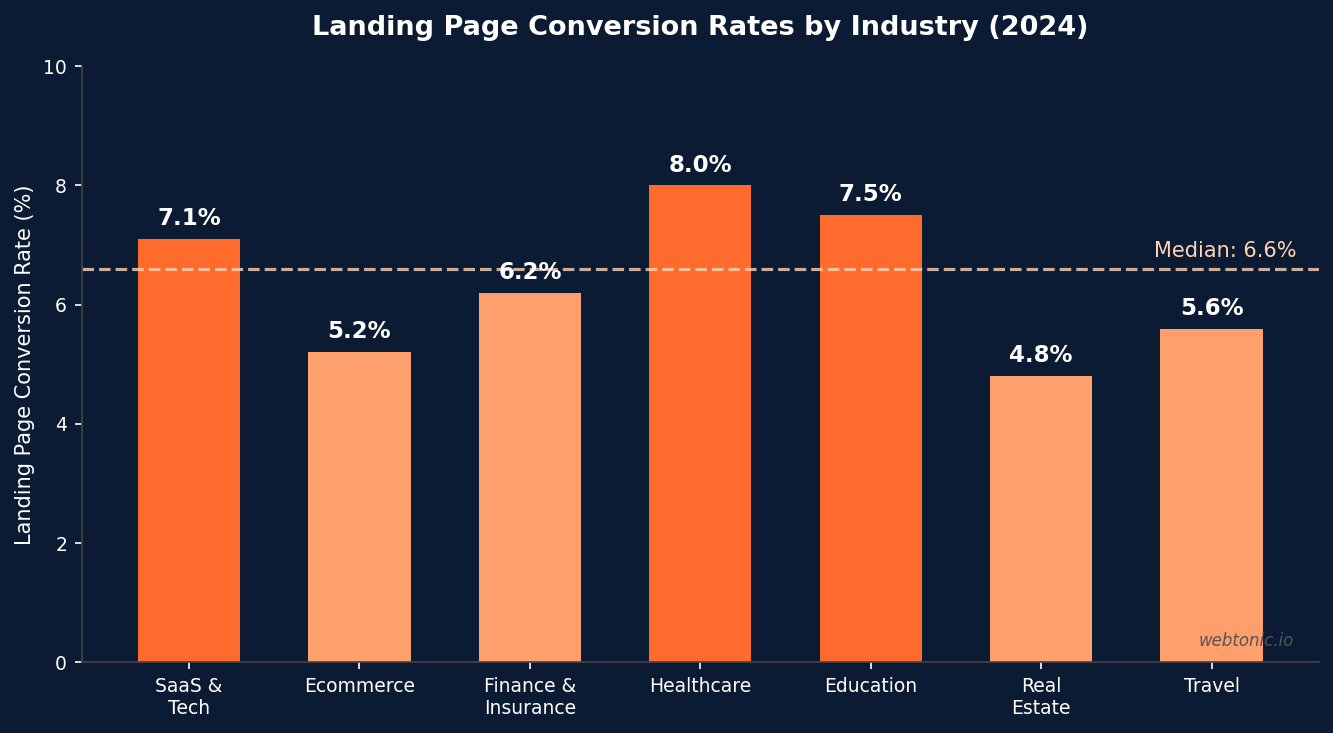
- The median landing page conversion rate across all industries is 6.6% according to Unbounce's 2024 analysis of over 57 million conversions — well-optimized click-through pages consistently beat this benchmark.
- Click-through pages convert 2x to 3x higher than pages with forms for high-consideration purchases because they remove the friction of asking for information before the visitor is ready to commit.
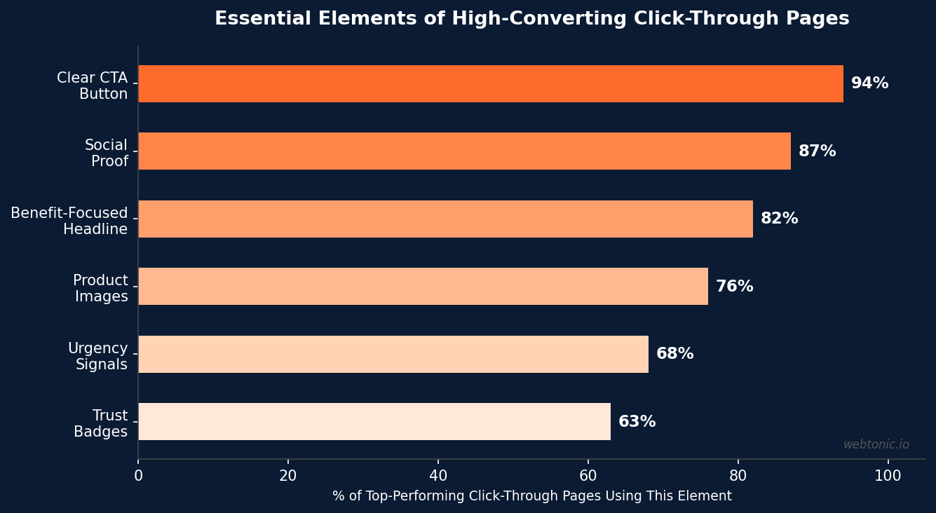
- 94% of top-performing click-through pages feature a single, prominent CTA button — multiple competing calls to action reduce conversions by splitting visitor attention and creating decision paralysis.
- The ideal click-through page length depends on price point: short pages (under 500 words) work for purchases under $50, while longer pages with detailed benefit breakdowns perform better for products above $500.
- Adding social proof to a click-through page increases conversions by 15 to 20% on average, with customer testimonials and trust badges being the two most effective forms of validation.
This guide explains exactly what click-through pages are, how they differ from other landing page types, and the design principles that separate pages that convert from pages that waste your ad spend. Whether you are running paid campaigns or building organic funnels, mastering click-through page design is essential for maximizing your marketing ROI.
What Is a Click-Through Page?
A click-through page is a type of landing page designed to educate and persuade visitors before sending them to a conversion page — typically a checkout page, a pricing page, a signup form, or a product detail page. Unlike lead generation landing pages that capture information directly through a form, click-through pages have no form on the page itself. The only action the visitor can take is clicking a button that moves them forward.
The logic behind this design is simple: some conversions require more context than an ad or email can provide. If you are selling a $2,000 software subscription, sending paid traffic directly to a checkout page produces terrible conversion rates because the visitor has not been given enough information to make a purchase decision. A click-through page bridges this gap — it provides the benefits, social proof, and feature details that the visitor needs to feel confident about clicking "Buy Now" or "Start Free Trial."
In the marketing funnel, click-through pages sit between the traffic source (ad, email, social post, organic search result) and the conversion action (purchase, signup, demo request). They are the persuasion layer — the page that turns a curious click into a committed buyer.
Click-Through Pages vs. Other Landing Page Types
Understanding what makes click-through pages different from other landing page types prevents you from using the wrong page structure for your campaign goals.
| Page Type | Primary Goal | Has a Form? | Best Used For |
|---|---|---|---|
| Click-Through Page | Warm up visitor, drive click to conversion page | No — CTA button only | Ecommerce products, SaaS trials, high-ticket services |
| Lead Capture Page | Collect visitor information (email, phone, name) | Yes — form is the CTA | B2B lead gen, newsletter signups, gated content |
| Squeeze Page | Capture email address with minimal friction | Yes — email field only | Email list building, free resource downloads |
| Sales Page | Sell directly with full-length persuasion copy | Varies — buy button or checkout form | Digital products, courses, high-ticket consulting |
| Splash Page | Present one message before the main site | No — proceed button | Age verification, language selection, promotions |
The key distinction is that click-through pages delay the conversion action to a separate page. This two-step approach works because it separates persuasion from transaction. On the click-through page, the visitor focuses entirely on learning about the product. On the conversion page, they focus entirely on completing the transaction. Neither page tries to do both at once, which reduces cognitive load and increases completion rates.
When to Use Click-Through Pages
Click-through pages are not the right choice for every campaign. They work best in specific scenarios where the visitor needs education or persuasion before committing:
High-consideration purchases. Any product or service priced above $100 benefits from a click-through page because the visitor needs to understand value before parting with significant money. This includes SaaS subscriptions, professional services, online courses, electronics, and luxury goods.
Complex products that need explanation. If your product requires more than a sentence to describe, a click-through page gives you space to explain features, demonstrate use cases, and address objections — all before asking for the commitment of a form fill or checkout.
Ecommerce product launches. When launching a new product, a click-through page lets you build excitement and communicate the value proposition before sending visitors to the product detail page. This is especially effective for paid advertising campaigns where the ad captures attention but cannot communicate the full story.

Free trial and freemium funnels. SaaS companies that offer free trials see 25 to 40% higher trial signups when they use a click-through page to explain the product's value before the registration form, compared to sending traffic directly to a signup page with no context.
Affiliate marketing. Click-through pages are the standard in affiliate marketing because the affiliate needs to pre-sell the product before sending traffic to the merchant's site. The affiliate's click-through page adds their unique perspective, review, and recommendation — context that the merchant's product page does not provide.
The Anatomy of a High-Converting Click-Through Page
Every effective click-through page follows the same structural framework, regardless of industry or product. Here are the essential elements, in the order they should appear on the page:
1. A benefit-focused headline. The headline is the first thing visitors see, and 80% of visitors decide whether to continue reading based on the headline alone. A click-through page headline should communicate the primary benefit — not the product feature, not the brand name, but the outcome the visitor will get. "Save 10 Hours Every Week With Automated Reporting" converts better than "Reporting Software Features."
2. A supporting subheadline. The subheadline expands on the headline with one specific, credible claim. Include a number if possible: "Join 12,000+ marketing teams who cut reporting time by 65%." The subheadline bridges the headline's promise to the detail that follows.
3. A hero image or product visual. Show the product in action. For SaaS, this means a screenshot or demo video. For ecommerce, this means high-quality product photography. For services, this means a relevant lifestyle image or a visual representation of the outcome. Pages with relevant images convert 42% higher than pages with stock photos or no images.
4. Benefit blocks (not feature lists). Break the main value proposition into 3 to 5 benefit blocks, each with a short heading and 1–2 sentences of supporting copy. Frame everything in terms of what the visitor gets, not what the product does. "Never miss a deadline" beats "Task management with calendar integration." Our creative team uses this benefit-first framework across all client landing pages.
5. Social proof. Customer testimonials, case studies, logos of notable clients, review scores, or user count badges. Position social proof immediately after the benefit blocks — this is where the visitor needs validation that the claims are real. 87% of top-performing click-through pages include social proof, and pages with testimonials convert 15 to 20% higher than pages without.
6. A single, clear CTA button. The entire point of the page leads to this moment. The CTA button should be visually dominant (contrasting color, large enough to tap on mobile), use action-oriented text ("Start Your Free Trial" not "Submit"), and appear at least twice on the page — once above the fold and once at the bottom. 94% of top-converting click-through pages use a single CTA rather than competing buttons.
Click-Through Page Design Best Practices
Beyond the essential elements, these design principles separate pages that hit 10%+ conversion rates from pages that stall below industry average:
Remove navigation. A click-through page should not have your site's main navigation menu. Every link that is not your CTA is a potential exit. The most effective click-through pages have zero outbound links other than the CTA button and required legal links (privacy policy, terms).
Match the message to the traffic source. If the ad says "50% Off Premium Plan," the landing page headline must reference that same offer. Message match improves conversion rates by 20 to 30% because it confirms the visitor landed in the right place and delivers on the ad's promise immediately.
Optimize for mobile first. Over 60% of landing page traffic now comes from mobile devices. Design for thumb-friendly CTA buttons (minimum 48px height), single-column layouts, and fast load times. Every additional second of load time reduces conversions by 7% on mobile.
Use directional cues. Arrows, eye gaze in images, and whitespace that directs attention toward the CTA button. These visual cues guide the visitor's eye through the page in the order you intend, ending at the conversion action.
Minimize text, maximize clarity. A click-through page is not a blog post. Every sentence should either communicate a benefit, provide proof, or address an objection. Cut anything that does not directly support the click. Web development best practices show that pages with concise copy and strong visual hierarchy consistently outperform text-heavy pages.
| Best Practice | Why It Works | Impact on Conversion |
|---|---|---|
| Remove Navigation | Eliminates exit paths, keeps visitor focused on CTA | +20–30% conversion lift |
| Message Match | Confirms visitor intent, reduces bounce rate | +20–30% conversion lift |
| Mobile-First Design | 60%+ traffic is mobile; poor UX = instant bounce | -7% per extra second of load time |
| Single CTA | Eliminates decision paralysis, focuses attention | +25–35% vs. multiple CTAs |
| Social Proof | Validates claims with third-party credibility | +15–20% conversion rate |
| Urgency Signals | Creates fear of missing out, motivates immediate action | +10–15% for time-limited offers |
Common Click-Through Page Mistakes That Kill Conversions
Even experienced marketers make these errors that undermine click-through page performance:
Too many CTAs. Every button that competes with your primary CTA dilutes conversion. "Learn More," "Watch Demo," "Read Case Study," and "Start Trial" on the same page forces the visitor to choose — and many choose to leave instead. Pages with a single CTA convert 25 to 35% higher than pages with multiple competing actions.
Feature dumping instead of benefit selling. Nobody cares that your software has 47 features. They care about the three outcomes those features deliver. Lead with the transformation, not the specification. "Close deals 3x faster" sells; "CRM with pipeline management, email tracking, and lead scoring" does not.
No social proof. A click-through page without testimonials, reviews, or trust signals is asking visitors to take your word for everything. 88% of consumers trust online reviews as much as personal recommendations — if your page lacks third-party validation, it lacks credibility.

Slow load times. Page speed is a conversion killer. Research consistently shows that a 1-second delay in page load reduces conversions by 7%. For mobile visitors, which represent the majority of landing page traffic, the impact is even more severe. Optimize images, minimize scripts, and use a CDN.
Ignoring the fold. The above-the-fold area — what visitors see without scrolling — must include the headline, a supporting visual, and the first CTA button. If a visitor has to scroll to understand what the page offers, you have already lost a significant percentage of potential conversions. The fold is not dead; it is where first impressions live.
Click-Through Page Tools and Builders
You do not need a developer to build high-converting click-through pages. These tools make it possible for marketers to design, test, and optimize landing pages independently:
Unbounce is the industry leader for conversion-focused landing page creation. Its drag-and-drop builder, A/B testing, and Smart Traffic AI optimization make it the go-to for teams that build and test pages at scale. Pricing starts at $99/month.
Instapage offers enterprise-grade personalization features, including AdMap (which visually connects ads to landing pages) and experience management tools. It is particularly strong for teams running large-scale PPC campaigns. Pricing starts at $199/month.
Webflow provides full design control with clean code output and built-in hosting. Unlike template-based builders, Webflow gives designers pixel-perfect control — ideal for brands that need custom click-through pages that match their site design exactly. Our web development team builds client landing pages in Webflow for this reason.
Leadpages is the budget-friendly option at $49/month, offering template-based page building with conversion tools like alert bars, pop-ups, and countdown timers. It is best suited for small businesses and solopreneurs who need functional pages without the learning curve of more powerful tools.
Measuring Click-Through Page Performance
The core metric for any click-through page is the click-through rate (CTR) — the percentage of visitors who click the CTA button. Unlike lead generation pages where the conversion happens on the page itself, click-through page conversions happen downstream, so you need to track both the page CTR and the downstream conversion rate.
Click-through rate benchmarks. A well-optimized click-through page should achieve a CTR of 30 to 60%. Below 30% indicates that the page is not compelling enough — the visitor is reading but not clicking. Above 60% is excellent and suggests strong message-audience fit.
Downstream conversion rate. This is the percentage of visitors who click through AND complete the final conversion action (purchase, signup, demo request). Track this as an end-to-end funnel metric using Google Analytics or your landing page tool's built-in analytics.
Bounce rate. A high bounce rate on a click-through page (above 70%) signals a message mismatch between the traffic source and the page content. Check that your headlines, offers, and visuals match the ads or emails driving traffic.
| Metric | What It Measures | Good Benchmark | Action if Below |
|---|---|---|---|
| Page CTR | % of visitors who click the CTA | 30–60% | Improve headline, CTA copy, or social proof |
| Downstream CVR | % of clickers who complete conversion | 10–25% | Optimize conversion page, reduce friction |
| Bounce Rate | % of visitors who leave without interacting | <50% | Fix message match, improve above-fold content |
| Time on Page | How long visitors engage with content | 45–120 seconds | Improve content quality and readability |
| Mobile vs. Desktop CVR | Conversion split by device | <20% gap | Fix mobile UX, button size, page speed |
Related reading
- Unbounce Landing Pages: Features, Pricing & Smart Traffic Review
- The 2026 Family Law Landing Page CRO Report
- Insurance landing page CRO statistics, 2026
- Custom Web Development services at Web Tonic
Frequently Asked Questions
What is a click-through page?
A click-through page is a type of landing page designed to warm up visitors with persuasive content before sending them to a conversion page. Unlike lead capture pages, click-through pages have no forms — the only action is clicking a CTA button that leads to a checkout, signup, or product page. They sit between the traffic source and the final conversion, acting as a persuasion layer that educates visitors about the product's value before asking them to commit.
What is the difference between a click-through page and a landing page?
All click-through pages are landing pages, but not all landing pages are click-through pages. The term "landing page" covers any page a visitor lands on from an ad or link — including lead capture pages, squeeze pages, sales pages, and click-through pages. The distinguishing feature of a click-through page is that it contains no form and only a CTA button that sends visitors to a separate page where the actual conversion happens.
What is a good conversion rate for click-through pages?
A good click-through rate for the page itself is 30 to 60% (percentage of visitors who click the CTA). The downstream conversion rate — visitors who click AND complete the final action — should be 10 to 25% depending on industry and price point. According to the 2024 Unbounce Conversion Benchmark Report, the median landing page conversion rate across all industries is 6.6%, but well-optimized click-through pages paired with strong conversion pages consistently exceed this.
When should I use a click-through page instead of a lead capture page?
Use click-through pages when the conversion requires a transaction or significant commitment (purchase, subscription, free trial signup). Use lead capture pages when you need to collect visitor information first (B2B lead generation, newsletter signups, content downloads). The rule of thumb: if the next step involves money or a product account, use a click-through page to pre-sell. If the next step only involves exchanging information, use a lead capture page.
How long should a click-through page be?
Page length should match the price point and complexity of the offer. For products under $50, short pages (300–500 words) with a hero section, 3 benefits, and one testimonial work well. For products between $50 and $500, medium-length pages (500–1,000 words) with detailed benefit blocks and multiple social proof elements perform best. For products over $500, long-form pages (1,000–2,500 words) with comprehensive feature breakdowns, case studies, FAQs, and multiple CTA placements drive the highest conversions.
Sources
KlientBoost — Click-Through Pages: Definition, Examples, Best Practices
Unbounce — 2024 Conversion Benchmark Report
Search Engine Land — Types of Landing Pages: Examples & When to Use Each
Prose Media — Lead Gen Form vs Landing Page
Google Analytics