
Table of contents

White papers and infographics solve different information jobs: one develops an argument, the other makes a finding easy to grasp and share. The 2024 buyer evidence favors neither as a universal winner; it points to stage, relevance and access as the choices marketers should benchmark.
Key Takeaways
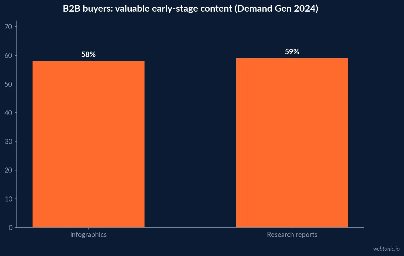
- 58% of B2B buyers in Demand Gen Report’s 2024 survey valued infographics early in the journey.
- 59% valued research reports in the same early-stage content question; that is not identical to white-paper preference.
- Historically popular white papers did not enter that survey’s top five early-stage formats in 2024.
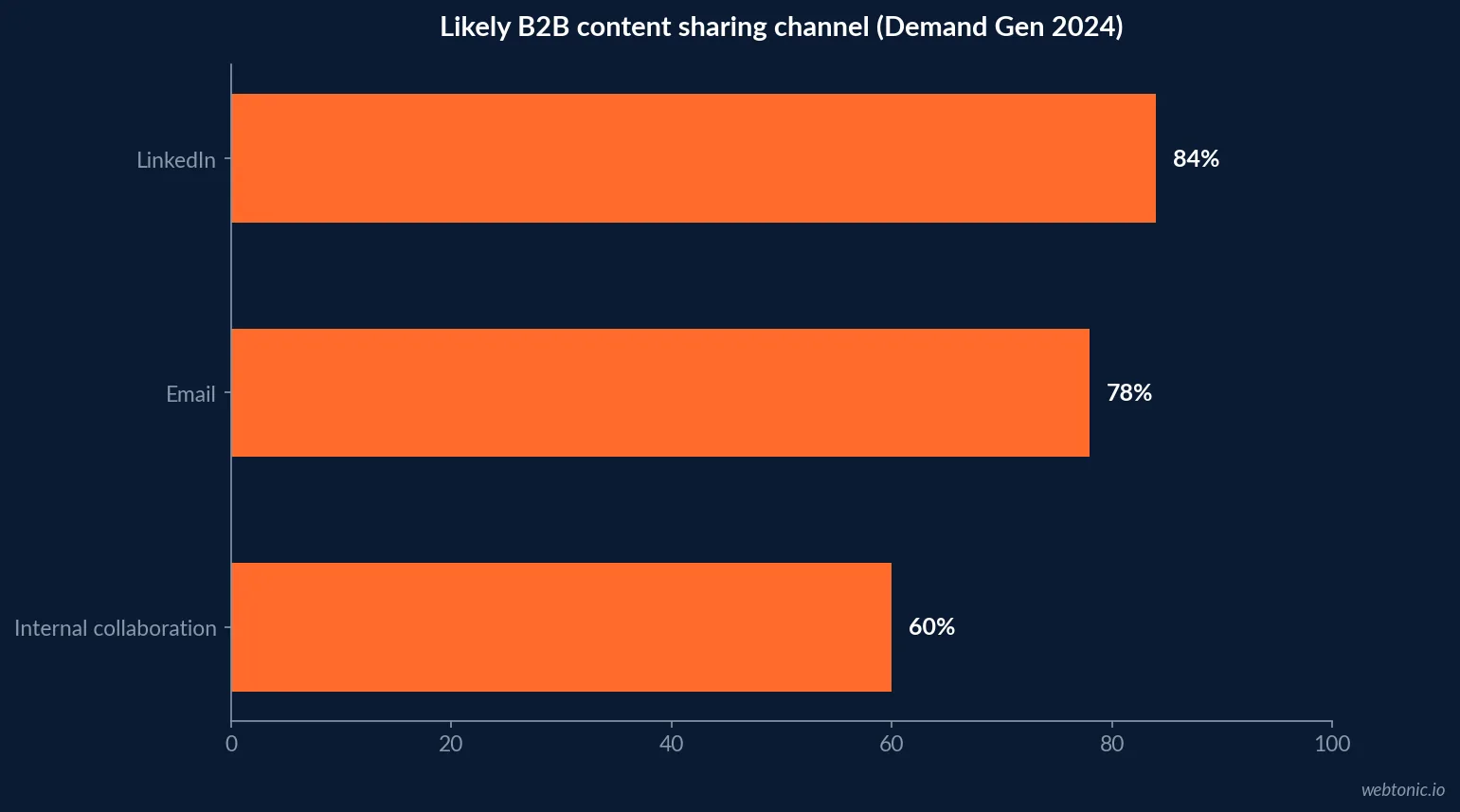
- 84% said they were likely to share useful content on LinkedIn; 78% selected email and 60% internal collaboration platforms.
- 51% said content was too generic or irrelevant, and 51% said too many steps were required to access it.
- CMI’s 2025 B2B survey found 45% used e-books/white papers; 45% also used research reports.
- In CMI’s enterprise subset, 55% used e-books/white papers; 48% said they produced good results.
- Among technology marketers, 73% used e-books/white papers; 50% said they were effective.
- Format adoption, buyer preference, lead capture and revenue impact are different measures.
- Use an infographic for fast comprehension and sharing; use a white paper for depth, evidence and decision support.
- Measure access friction as carefully as downloads: 51% reported too many access steps in Demand Gen’s survey.
- Make one source of truth for each claim, then repurpose without changing its meaning.
What the “vs.” comparison can—and cannot—tell you
A PDF white paper is a container, not a single content format: it can hold research, an argument, a buyer guide or a point of view. An infographic is a visual summary that may be a web page, image or PDF. These categories overlap. For a fair comparison, this article uses white paper/e-book and research report adoption from the Content Marketing Institute, and buyer-reported value for infographics and research reports from Demand Gen Report. The sources asked different questions and sampled different populations, so the percentages are directional signals, not a controlled head-to-head test.
That distinction protects a common reporting mistake: comparing how often marketers create a format with how often buyers say they find it valuable. Neither number directly measures completion, pipeline influence or incremental sales. Use those statistics to shape a test, then track behavior and outcome for your own audience.
Early-stage preference: the infographic’s advantage is legibility
Demand Gen Report’s 2024 Content Preferences Benchmark Survey asked buyers what content was valuable early in the journey. Infographics received 58% of responses and research reports 59%; blog posts or news articles led at 72%, with webinars at 60%. The report noted that white papers, historically a top-three early-stage option, did not reach the top five that year. That shift is not evidence that buyers stopped needing deep information. It suggests that early-stage attention favors accessible formats and clearly useful information.
Demand Gen’s survey also identified shareability. Respondents were likely to share relevant content through LinkedIn (84%), email (78%) and internal collaboration platforms (60%). An infographic can travel well because it compresses an idea, but the share should carry enough context to remain accurate outside the original landing page. Include a headline that states the point, a source note and a path to the full evidence.
The same survey found 51% of buyers felt content was too generic or irrelevant, and 51% said too many steps were involved to access it. Better design cannot rescue a weak proposition or an unnecessarily long form. Write for a named decision and remove friction before concluding the format failed.
| Buyer signal | Demand Gen 2024 value | Question asked | Caution |
|---|---|---|---|
| Infographics, early-stage value | 58% | Content buyers found valuable early in journey | Preference, not conversion |
| Research reports, early-stage value | 59% | Same question | Not synonymous with white papers |
| Blog/news articles | 72% | Same early-stage question | Short-form helps orientation |
| Share on LinkedIn | 84% | Likely sharing channels | Intent to share, not actual reach |
| Access steps too numerous | 51% | Content access criticism | Friction may suppress consumption |
Depth and proof: when a white paper earns its length
A white paper makes sense when the buyer needs an explanation that cannot be reduced to one chart: a methodology, trade-off, implementation path, evidence base or business case. It can clarify a decision among multiple stakeholders and give sales a durable reference. But a long PDF is a cost to the reader. Put the answer and evidence early, use descriptive headings, and show who the information is for.
CMI and MarketingProfs’ 2025 B2B report is based on a survey fielded June–August 2024 with 1,186 global responses, including 980 B2B marketers. In that B2B group, 45% reported using e-books/white papers and 45% research reports. That is a marketer usage measure, not a buyer preference measure. CMI’s enterprise subset reports 55% using e-books/white papers and 48% saying the format produced good results. Technology marketers reported 73% use and 50% effectiveness. The differences demonstrate why segmentation matters.
Use a PDF only if the file adds utility: printable evidence, cited methodology, a complete framework, or a coherent argument. If the same content works better as accessible HTML, the PDF should be an optional download rather than the only way to read it.
Format selection by buyer task
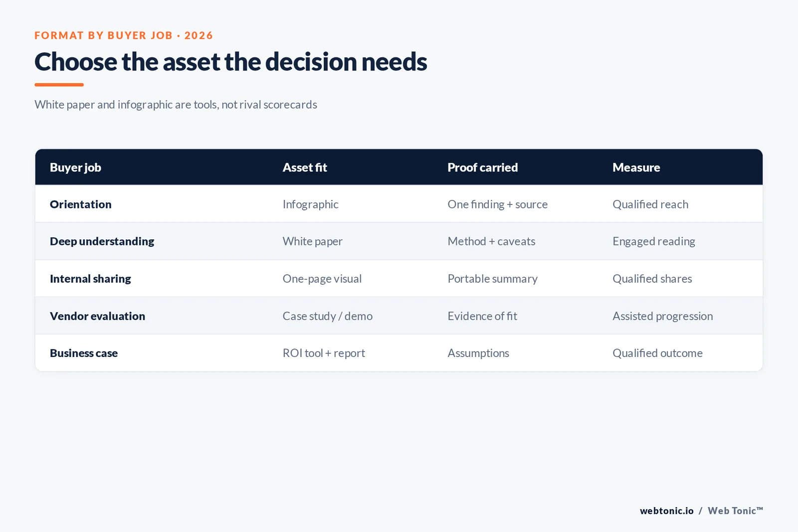
Map the format to the task rather than to a content calendar slot. A buyer who is trying to understand a new problem needs a crisp overview. Someone comparing approaches may need a diagram, annotated checklist or evidence summary. A buyer building internal consensus may value a deeply sourced report that answers procurement, finance or technical questions. One core study can support each need, but each derivative should disclose what it leaves out.
Demand Gen Report’s survey showed content preferences changing across funnel stages: late-stage buyers leaned toward case studies, webinars, analyst reports, user reviews, demos and ROI tools. That is a reminder that format selection is not binary. Neither a white paper nor an infographic should be forced to carry a job that a customer proof point or interactive calculator serves better.
| Buyer task | Better starting format | Evidence or experience to include | Next useful action |
|---|---|---|---|
| Recognize a problem | Short article or infographic | One clear finding and source | Explore the problem |
| Understand a complex issue | White paper or research report | Method, caveats, evidence and examples | Compare approaches |
| Share a point internally | Infographic or one-page brief | Portable summary and source links | Open deeper evidence |
| Evaluate a vendor | Case study, demo or analyst report | Proof, fit and implementation detail | Ask a specific question |
| Build a business case | ROI tool plus referenced report | Assumptions, ranges and sensitivity | Validate with stakeholders |
Access matters: the download is not the outcome
Gating a white paper can capture contact details, but it also inserts friction. Demand Gen Report found 51% of survey respondents said content took too many steps to access. That does not prove a gate caused abandonment, but it puts the burden on marketers to justify each field and step. Ask only for information the team will use, explain what follows, and make the core insight available before the form.
Infographics are often open and embeddable, enabling wider circulation but less direct identification of every reader. Measure reach through referral paths, social interactions and assisted visits, while being careful not to equate platform impressions with unique people. For gated content, capture starts and completion alongside downloads. If consent permits, measure subsequent engagement rather than claiming a download is pipeline.
Keep an ungated accessible web version for useful content whenever possible. A PDF can still serve readers who need to annotate, share internally or preserve a fixed document; provide both the on-page explanation and a file that works with assistive technology.
What the benchmark numbers miss
Surveys ask respondents to recall behavior and opinion, and questions differ. Demand Gen Report’s respondent pool includes B2B buyers; CMI’s sample is marketers reporting organizational practice. CMI’s overall B2B, enterprise and technology subgroups have different composition. Don’t combine those figures into one score or claim that “white papers convert at X%.” The sources do not establish that.
The available statistics also do not tell you design quality, asset credibility, distribution reach, completion rate or buyer fit. A thin infographic will not outperform a rigorous report simply because one survey says buyers like visual content. Likewise, a compelling report can fail if it is generic, hard to access or disconnected from the decision.
Write the exact base and wording next to any reported percentage. Include year, sample and the question’s unit. Avoid comparing annual results unless the wording and population are reasonably stable.
A useful scorecard for both formats
For each asset, measure four layers: exposure, consumption, usefulness and commercial contribution. Exposure includes qualified reach and distribution source. Consumption may include page depth or file opens when reliable. Usefulness can be assessed through feedback, saved/shared behavior or sales-team use. Commercial contribution includes assisted progression and qualified outcomes, with attribution caveats stated. A single lead total cannot show whether the asset helped or simply collected a form.
Compare formats within matched audiences and topics. If the format changes, keep distribution, headline, offer and audience as consistent as possible. A structured experiment can randomize the landing-page asset while holding traffic source constant; a simple observational comparison should be reported as such. Include an accessible “no gate” experience if the goal is broad awareness.
For measurement foundations, our data intelligence service and growth marketing practice support reporting and channel planning. Read our campaign planning guide or paid social ROI analysis for adjacent measurement context.
| Scorecard layer | Example metric | White paper note | Infographic note |
|---|---|---|---|
| Exposure | Qualified reach by channel | Separate gated/ungated distribution | Distinguish impressions from reach |
| Consumption | Completion, time or scroll | PDF tracking may be incomplete | Embed events and outbound clicks |
| Usefulness | Shares, saves, sales usage | Track internal forwarding where possible | Track referral traffic and embed use |
| Progression | Qualified meetings or opportunities | Use cohort and time window | Use assisted-path analysis |
| Efficiency | Cost per qualified outcome | Include production and promotion | Compare reuse value and reach |
Repurpose evidence without diluting it
Start with one source of truth: a research report, verified customer evidence or a well-supported argument. Then create a visual summary with the central finding, a short explanation and a visible source. Keep the full methodology and caveats available behind the link. A graph taken out of context should not imply causality or generalize beyond the sample.
Repurpose a white paper into a carousel, webinar, sales one-pager or FAQ only when the transformed piece retains the same meaning. Have a subject-matter reviewer check the numbers, date and wording. If a figure is a survey response, say so; if it is observed behavior, label the dataset and period.
This discipline also makes content easier to update: the source report is refreshed once, then derivatives are reviewed against it. Dates and version control reduce the risk of an old chart circulating after the underlying claim has changed.
How to make the decision in one planning meeting
Ask the team what decision the buyer is making, what evidence is missing, what format best supports that task, and what action follows. If the information can be stated in one visual with a credible source, make an infographic and link to fuller evidence. If it requires methods, assumptions, caveats and multiple stakeholder questions, invest in a report or white paper. If the real need is proof of results, create a case study instead.
Then define success before production. Choose a target audience, comparable distribution, primary metric, secondary quality indicator and a time window. Decide how access friction is handled. Use the survey statistics as context—not as a forecast—and feed the learning into the next asset rather than repeating the format by habit.
Match the content format to content governance. Long-form assets carry more claims, so they need a source ledger, reviewer and update date. For a white paper, identify the claim owner, research source, method and limitations on the page where the argument appears. For an infographic, keep its data source visible and maintain a text equivalent for accessibility. CMI’s 2025 B2B survey found 38% of respondents had generative-AI usage guidelines, while 47% reported a lack of streamlined marketing data management and reporting. Those workflow constraints are relevant: teams cannot reliably refresh an asset if the evidence has no owner.
Make the report and visual derivatives link to one maintained source. Keep chart values, dates and explanatory notes in a reusable record. Establish an expiration or review date for time-sensitive evidence, and update linked files if a benchmark or claim changes. Content governance is part of the format decision because a downloadable PDF can keep circulating after the web page has been revised.
CMI’s research also found 45% of B2B marketers lack a scalable content-creation model. In the same research, 95% reported having a content marketing strategy, while 29% described that strategy as very or extremely effective. A format that requires bespoke design and review for every update may not be sustainable; design the workflow around the evidence, not merely the deliverable.
| Governance check | White paper / report | Infographic |
|---|---|---|
| Claim source | Inline citations and source notes | Attribution next to the displayed figure |
| Review owner | Subject expert plus editor | Data reviewer plus accessibility check |
| Update process | Version date and change log | Recheck every number and chart label |
| Accessibility | Tagged, searchable PDF plus HTML | Text equivalent and readable contrast |
| Reuse control | Single maintained report source | Derivatives link to current evidence |
| Evidence question | White paper is useful when… | Infographic is useful when… |
|---|---|---|
| How complex is the claim? | Methods and caveats need space | One principal comparison is enough |
| What does the buyer need? | Detailed evaluation or internal case | Fast orientation or shareable summary |
| How will readers use it? | Read, annotate, circulate | Scan, embed, discuss |
| How can it be measured? | Completion and qualified follow-up | Reach, referral and assisted visits |
| What must be preserved? | Full source trail and version | Source beside every displayed figure |
A practical content test for the next quarter
Pick one buyer question and produce a concise visual summary plus a deeper report only if the evidence genuinely requires more room. Route both through comparable audiences and distribution, then measure reach, consumption, useful follow-up and qualified progression. Keep a holdout or matched group if you need to estimate incremental impact. If a format differs by topic, channel or gate, call the result observational rather than causal.
Use the historical statistics to frame a hypothesis: an infographic may help early-stage comprehension; a white paper may support depth and internal evaluation. Then ask buyers and sales teams whether each asset answered the intended question. Combine quantitative behavior with qualitative feedback, since the most-visited asset is not necessarily the one that resolves a decision.
When reporting results, identify whether a number came from a marketer survey, buyer survey, platform event or revenue system. That habit makes comparisons honest and helps a team choose the next format based on evidence.
What marketers say about content performance
CMI’s 2025 B2B survey found 96% of respondents said their organizations measure content performance, yet only 51% agreed their organization measures it effectively. The gap illustrates why counting downloads alone is insufficient. Teams may have dashboards but still struggle to tie consumption to business goals or understand which asset helps a buyer progress.
The report lists difficulty attributing content performance to business outcomes as a measurement challenge for 56% of marketers, and difficulty tracking customer journeys for 46%. These are self-reported constraints, not proof that attribution is impossible. They are reasons to state how each metric is defined and to treat assisted-touch evidence with care.
For white papers and infographics alike, publish the metric’s numerator, denominator and window. Include both the audience response and the follow-on action. That turns the format comparison from a popularity contest into a test of usefulness.
Frequently Asked Questions
Are white papers more effective than infographics?
The evidence does not support a universal winner. Demand Gen Report’s 2024 buyer survey found 58% of respondents valued infographics as early-stage content, while 59% selected research reports. The measures describe preference, not conversion or revenue. Choose a format for the buyer’s question and test its role in your own journey.
Do B2B buyers still use white papers?
Yes, but use and preference vary by audience and stage. CMI’s 2025 B2B research, based on responses collected in 2024, found 45% used e-books or white papers. Technology marketers reported higher adoption: 73% used e-books or white papers. Adoption does not prove that a particular PDF is read or effective.
When should a marketer use an infographic?
Use an infographic when the core value is a short, visual explanation, comparison or finding that can be understood and shared quickly. Demand Gen Report’s 2024 survey placed infographics among early-stage content buyers found valuable and showed LinkedIn and email as common sharing channels. Give the visual a clear takeaway and link back to a source or deeper asset.
How should teams measure these formats?
Separate consumption from business impact: impressions and reach; starts, downloads or engaged reading; completion or scroll depth where measurable; assisted progression; and qualified opportunities or revenue. Report denominators and audience cohorts. A downloaded gated PDF is not automatically a qualified lead, and a share is not automatically a new buying conversation.
Sources
Demand Gen Report, 2024 Content Preferences Benchmark Survey
10Fold, 2025 B2B Content Marketing Survey
NetLine, 2025 State of B2B Content Consumption and Demand Report
Content Marketing Institute and MarketingProfs, 2025 B2B content benchmarks
Content Marketing Institute, 2025 enterprise content findings
LinkedIn, 2025 B2B thought leadership research
Salesforce Research, State of Sales report resource
W3C Web Accessibility Initiative, images tutorial
Microsoft Learn, PDF accessibility documentation