

Table of contents

A marketing dashboard in behavioral health is a financial instrument. Moving a 50-bed facility from 70% to 95% occupancy at a $1,200 average daily rate is worth about $15,000 a day - roughly $450,000 a month - which is why the reporting layer has to predict census, not just describe last month's clicks.
Key Takeaways
- Occupancy is the money metric: 70% to 95% on 50 beds at a $1,200 ADR is a $15,000 daily swing.
- A 10% occupancy increase can mean millions in annual revenue without adding a bed.
- Most programmes need 70% to 80% utilisation to stay viable; below 65% signals a pipeline or discharge problem.
- Length of stay from 25 to 30 days is a 20% occupancy gain with zero extra admissions.
- Referral concentration above 50% of census is a material risk - one pattern change can cut census 30% in weeks.
- Intake no-shows above 30% and session no-shows above 15% are the documented warning thresholds.
- 69% of agencies report monthly; 59% of internal teams prefer live dashboards versus 27% of clients.
- 84% of clients rate clear visual data as what they value most, and 44% name conversions the metric that matters.
- Reporting is the top area where AI has delivered value (42%), and 80% of agencies save 5+ hours a week, 35% save 10+.
- 74% of business users have shipped a wrong AI-generated number; only 23% actually re-derive it.
The occupancy maths every dashboard should start from
Marketing performance only matters here in bed-days. Put the arithmetic on the first screen.
| Scenario (50 licensed beds, $1,200 ADR) | Occupied beds | Daily revenue |
|---|---|---|
| 70% occupancy | 35 | $42,000 |
| 80% occupancy | 40 | $48,000 |
| 95% occupancy | 47.5 | $57,000 |
| Delta 70% to 95% | +12.5 beds | +$15,000 per day (~$450,000 per month) |
| Viability band | 35 - 40 beds | 70% - 80% utilisation |
| Warning threshold | Below ~32.5 beds | Below 65% utilisation |
| LOS 25 to 30 days | Same admissions | +20% occupancy |
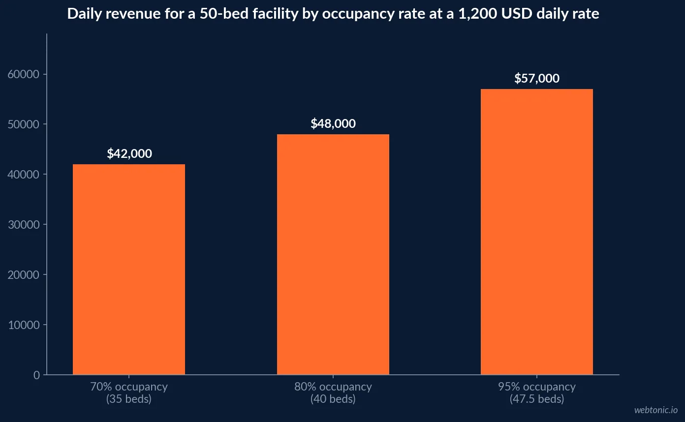
The occupancy model and revenue arithmetic follow behavioral health occupancy analysis, and the utilisation viability bands from programme KPI guidance on census and referral conversion. A dashboard that reports sessions and CPL without translating to beds cannot be used by the person who signs the marketing invoice.
The KPI spine: what belongs on the dashboard
Nine metrics carry almost all of the decision-making load in this category.
| Metric | 2026 benchmark or threshold | Why it earns dashboard space |
|---|---|---|
| Occupancy / utilisation rate | 70% - 80% viable, below 65% warning | Converts marketing to revenue |
| Admissions per month | Tracked against capacity, not last year | The real conversion event |
| Cost per admission | $1,500 - $6,000 | Replaces CPL as the headline number |
| Lead to VOB rate | 25% - 40% healthy | Separates traffic quality from sales |
| Viable to admit (paid / SEO) | 33% - 40% / ~50% | Source quality, not source volume |
| Average length of stay | Drives occupancy as much as admits | 20% occupancy per 5 days |
| Intake no-show rate | Above 30% indicates a process failure | Cheapest census recovered |
| Referral-source concentration | Above 50% from three sources = risk | Early-warning metric |
| Alumni engagement and referral rate | ~28% engaged, ~14% refer | Lowest-cost admission source |
The CRM-side KPI spine is documented in admissions CRM metric guidance, and admissions-KPI selection in 2026 analysis of admissions KPIs that matter. Without CRM-enforced stages a centre cannot distinguish a marketing shortfall from enquiries converting at 20% when they could convert at 40%.
Leading indicators that predict a census drop
These fire four to six weeks before the occupancy line moves. Most dashboards do not carry any of them.
- Referral volume declining week over week for three or more consecutive weeks - the earliest reliable signal.
- Intake conversion rate dropping below 25%, which typically precedes a visible admissions shortfall.
- Average length of stay shortening, suggesting earlier-than-expected discharges.
- Referral-source concentration increasing while total volume softens - dependency and decline arriving together.
- Intake no-show rates above 30%, indicating pre-intake engagement or expectation-setting failures.
- Ongoing session no-shows above 15%, pointing to clinical engagement or logistical barriers.
- Contact rate below 35% on inbound leads - a speed-to-lead failure, since the same lead is often being worked by four other centres.
- A single hospital supplying 40% of census - the documented rule is to spend 60% of referral development time building new sources rather than deepening that one.
Leading-indicator thresholds are set out in census and referral conversion KPI guidance and behavioral health census growth analysis. Note the asymmetry: a census drop takes weeks to appear and months to repair, so the value of a dashboard is almost entirely in its leading indicators.
Reporting cadence and format: what the data says
The delivery format is not a cosmetic decision - it decides whether the numbers get used.
| Reporting question | 2026 benchmark | Application in behavioral health |
|---|---|---|
| Monthly reporting cadence | 69% of agencies (up from 65%) | Ownership and board narrative |
| Weekly reporting | 11% | Census and referral volume |
| Live dashboard only | 5% | Admissions team view |
| Internal preference for live dashboards | 59% (down from 70%) | Marketing and admissions ops |
| Client preference for live dashboards | 27% | Owners still want a story |
| Client preference for static PDFs / meetings | 35% / 35% | Monthly review deck plus a call |
| Clear visual data valued most | 84% of clients | Charts over metric walls |
| Reliable and actionable metrics | 42% | Fewer metrics, defined thresholds |
| Top metric clients care about | Conversions 44%, leads 22%, ROI 12% | Map conversions to admits |
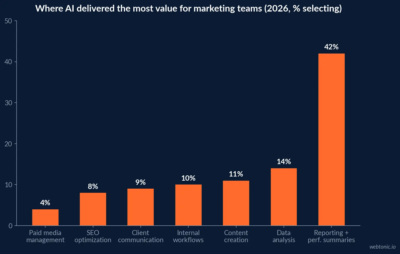
Cadence and format data comes from 2026 agency benchmarks (n=201 leaders), where 97% rate accurate reporting as important for retention and 76% call it extremely important, up from 70%. For a treatment centre the equivalent is internal: the reporting layer is what keeps the admissions and marketing teams from arguing about whose number is right.
Benchmark context: what "good" looks like on the digital screens
Marketing metrics still need external reference points - but wide ones, used carefully.
| Benchmark | 2026 healthcare figure | Dashboard use |
|---|---|---|
| Average website conversion rate | 3.6% | Baseline for enquiry pages |
| Top-decile conversion rate | 12.4% | The realistic ceiling to chase |
| Desktop conversion rate | 4.2% | Referrer and professional traffic |
| Mobile conversion rate | 2.9% | Where 72.4% of treatment traffic lands |
| Service-specific landing page | 6.1% | Programme-level pages beat generic ones |
| Call-only ad conversion rate | 12.5% | Highest-intent surface in the category |
| Appointment no-show rate | 12% with automated reminders | Recovered census, measurable |
| Annual patient retention | 68% | Alumni programme benchmark |
| LinkedIn engagement rate (healthcare) | 1.2% per post | Referrer-facing organic |
Conversion and retention bands come from 2026 healthcare marketing benchmarks. Treat them as sanity checks, not targets: a 3.6% average across all of healthcare says very little about a detox enquiry page at 2am.
Automation and AI in the reporting layer
The efficiency case is proven. The trust case is not.
| Finding | 2026 data | What to do about it |
|---|---|---|
| Where AI delivers most value | Reporting and performance summaries, 42% | Automate the narrative, not the maths |
| Agencies saving 5+ hours a week with AI | 80% | Reinvest hours in referral development |
| Agencies saving 10+ hours a week | 35% | Only after data plumbing is fixed |
| Reports built in under 30 minutes | 46% (73% under an hour) | Sets the internal standard |
| Business users reaching for gen AI on analysis | 86% | Assume it is already happening |
| Users who fully trust AI output | 39% | Verification has to be designed in |
| Users who claim to verify versus re-derive | 86% claim / 23% re-derive | Require a source link per metric |
| Shipped a wrong AI-generated number | 74% | Never let AI produce census or admit figures |
| Caught all three planted errors in a test | 5% (25% caught none) | Human review of anomalies only |
Time-savings data comes from the 2026 agency benchmarks report and the verification findings from research on trust in AI-generated analysis. Broader BI adoption context - including how few organisations act on the data they collect - is compiled in business intelligence statistics.
The blind spots a 2026 dashboard has to admit
- 48% of teams cannot track discovery through AI tools, in a category where 36% of provider research is already AI-influenced.
- 47% cannot attribute multi-session journeys and 45% cannot see content influence - both central to a family researching for weeks.
- 44% say traditional models have become less reliable, which argues for holdout tests over model precision.
- Phone-first funnels break dashboards: calls convert 40% to 60% better than forms here, so a form-only dashboard understates every channel.
- Attribution accuracy caps at 85% to 95% even with good plumbing - anonymous research and family callers are unrecoverable.
- Healthcare conversion benchmarks are wide: a 3.6% average against 12.4% for the top decile, so external benchmarks need local context.
- Payer mix is invisible on most dashboards, which lets cheap leads with poor coverage look like wins.
Blind-spot shares are reported in the 2026 agency benchmarks, and healthcare conversion bands in 2026 healthcare marketing benchmarks. Our rehab branding benchmarks cover the trust signals behind these conversion rates, and data intelligence covers how we build these views.
A dashboard build sequence that survives contact with a census meeting
| Layer | Contents | Owner |
|---|---|---|
| Screen 1 - Census | Occupancy, beds available, LOS, projected census 30 days | Executive team |
| Screen 2 - Admissions funnel | Leads, contact rate, VOB, viable, admits by source | Admissions director |
| Screen 3 - Cost | Cost per lead, per viable, per admission by channel | Marketing lead |
| Screen 4 - Referrals | Volume by source, concentration, new sources added | Referral development |
| Screen 5 - Quality | Payer mix, LOS by source, alumni engagement | Finance and clinical |
| Screen 6 - Leading indicators | The eight early-warning thresholds, red or green | Whole leadership team |
Six screens, each with a named owner and defined thresholds, beats a forty-widget dashboard nobody reads. Demand generation for the funnel those screens measure sits in growth marketing.
Frequently Asked Questions
What should a treatment centre's marketing dashboard actually show?
Bed-days, not clicks. Occupancy rate is the metric that converts marketing activity into money: a 50-bed facility moving from 70% to 95% occupancy at a $1,200 average daily rate adds roughly $15,000 per day, about $450,000 a month. A useful dashboard therefore carries occupancy, admissions, cost per admission, lead-to-VOB and VOB-to-admit rates by source, average length of stay and referral-source concentration - with click and CPL metrics supporting them rather than leading.
Which metrics predict a census drop before it happens?
Four leading indicators show up four to six weeks ahead: referral volume declining week over week for three or more consecutive weeks, intake conversion falling below 25%, average length of stay shortening, and referral-source concentration rising. Concentration is the one most centres ignore - if three sources supply more than 50% of census, a single referral-pattern change can cut census by 30% within weeks. A dashboard that only reports last month's admissions will surface all of this a month too late.
What occupancy rate does a behavioral health programme need?
Most programmes need 70% to 80% average utilisation to stay financially viable, though this depends on payer mix and reimbursement. Below roughly 65% you are looking at either a referral-pipeline problem or a discharge rate outpacing admissions. Chasing 95% is not automatically correct either - turning beds over that fast can compromise clinical outcomes. Length of stay is the quieter lever: moving average LOS from 25 to 30 days is a 20% occupancy increase with no additional admissions.
How often should treatment centre marketing be reported?
Monthly for stakeholders, weekly for census-critical metrics. Agency benchmark data shows 69% of agencies report monthly, 11% weekly and 5% simply give clients a live dashboard. Internally, 59% of teams prefer live dashboards, while only 27% of clients do - 35% still prefer static PDFs and 35% prefer a conversation. In behavioral health the split works well: a live census and referral dashboard for the admissions team, a monthly narrative for ownership.
Can AI be trusted to write the reporting layer?
Only with verification. Research found 86% of business users reach for generative AI for analysis, but just 39% fully trust the output, 86% claim they verify it while only 23% actually re-derive the number, and 74% have already shipped a decision or report based on an AI-generated figure that turned out to be wrong. In an error-detection test, only 5% caught all three planted errors and 25% caught none. AI is excellent for summarising a dashboard and unreliable as the source of the number.
Sources
Behavioral health occupancy rate analysis
Programme KPIs: census and referral conversion
Behavioral health census growth and admissions
Admissions CRM metrics and KPI spine
Admissions KPIs that matter in 2026
2026 agency benchmarks report
Databox: using AI you don't trust
Business intelligence statistics
Healthcare marketing benchmarks 2026