
Table of contents
The job is narrow: show the food, show the menu, and make booking or ordering take fewer than three taps. Design choices that fight those three jobs cost covers, however beautiful they look.
This guide breaks down the design patterns behind the strongest sites, the must-have elements in priority order, layout and photography rules, what the main platforms cost, and the checks to run before launch.
Key Takeaways
- US restaurant industry sales are projected at $1.55T for 2026 with employment reaching 15.8M, so the competition for local attention is intense.
- Mobile accounts for roughly 52.57% of global web traffic — the site is a phone product first and a desktop product second.
- Put 4 things above the fold: a food image, the menu link, the reserve or order button, and the location with hours.
- Never publish it as a PDF. It is unreadable on a phone, invisible to search engines, and the single most common design failure.
- WordPress powers 41.2% of all websites and 59.1% of the CMS market, but Wix at 4.3% and Squarespace at 2.5% are often the faster route for a single location.
- Budget builders start around $17 per month on Wix and $39 per month on Shopify; a custom designed site is a four-figure project, not a subscription.
- Aim for a largest contentful paint under 2.5 seconds — hero video and uncompressed food photography are the usual culprits when it is slower.
- Ordering and reservations should be 2 taps from any page, including the menu page.
- Add LocalBusiness or Restaurant structured data so hours, price range and menu appear correctly in search results.
- Accessibility is not optional: low-contrast text over food photography fails WCAG contrast rules and loses real customers.
What separates the best restaurant website designs
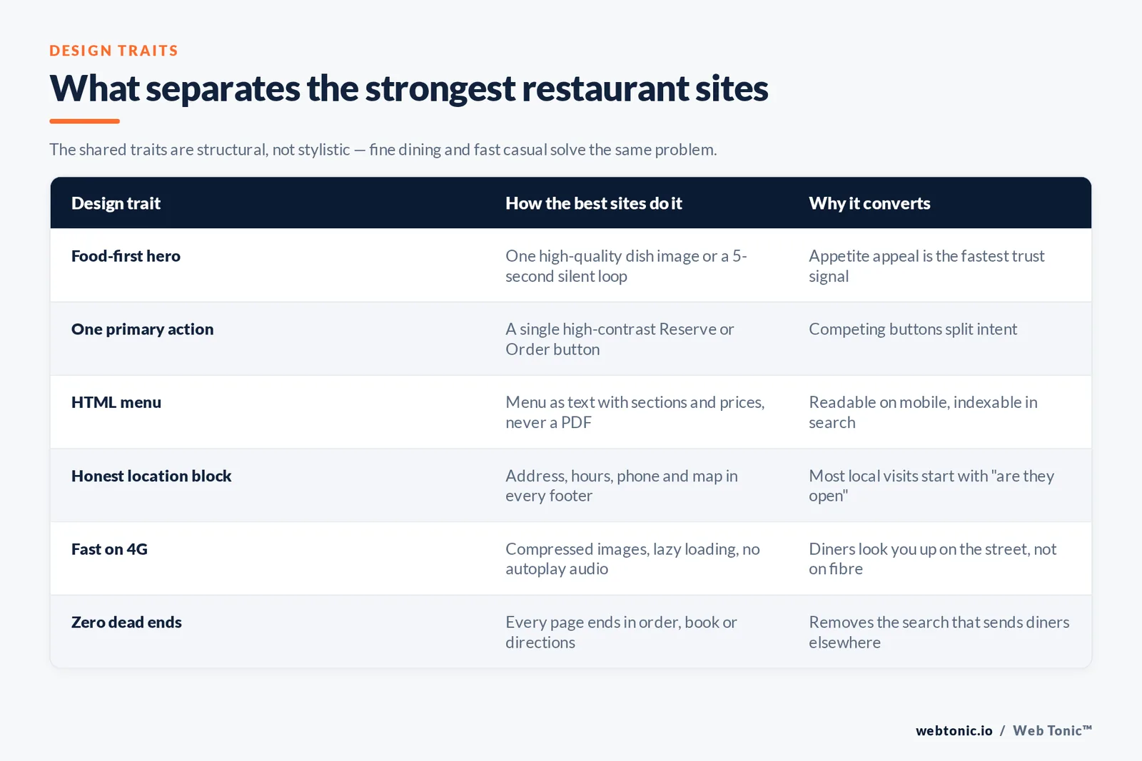
Look at any set of award-winning restaurant sites and the shared traits are structural, not stylistic. Fine dining, fast casual and neighbourhood cafes solve the same problem with different visual volume.
| Design trait | How the best sites do it | Why it converts |
|---|---|---|
| Food-first hero | One high-quality dish image or a 5-second silent loop | Appetite appeal is the fastest trust signal a restaurant has |
| One primary action | A single high-contrast Reserve or Order button | Competing buttons split intent and reduce both |
| HTML menu | Menu as text with sections and prices, not a PDF | Readable on mobile and indexable by search engines |
| Honest location block | Address, hours, phone and map on every page footer | Most local visits start with a "are they open" question |
| Restrained typography | Two typefaces maximum, generous line height | Menus are dense; type does the readability work |
| Fast on 4G | Compressed images, lazy loading, no autoplay audio | Diners look you up on the street, not on fibre |
| Atmosphere proof | Interior and people shots below the fold | Answers "is this the right place for tonight" |
| Zero dead ends | Every page ends in order, book or directions | Removes the second search that sends diners elsewhere |
None of that requires an unusual layout. The reliable structure is hero, menu preview, order and reserve, gallery, story, reviews, location, footer — in that order. Our web development team builds restaurant sites against exactly that skeleton and then spends the design budget on photography and speed instead of novelty navigation.
The must-have elements, in priority order
If a budget or timeline forces cuts, cut from the bottom of this list, never the top.
| Priority | Element | Implementation note |
|---|---|---|
| 1 | Full menu in HTML | Sections, prices, allergens, updated the day the kitchen changes it |
| 2 | Reserve or order button | Sticky on mobile, visible without scrolling |
| 3 | Hours and address | Machine-readable, matching your Google Business Profile exactly |
| 4 | Click-to-call phone number | A tel: link, not an image of a number |
| 5 | Real food photography | At least 12 images of your actual dishes, no stock plates |
| 6 | Directions and parking | Embedded map plus one line of plain-language guidance |
| 7 | Reviews or press | Three short quotes beat a wall of logos |
| 8 | Private events or catering page | Usually the highest-margin enquiry a site produces |
| 9 | Gift cards | Seasonal revenue with almost no design cost |
| 10 | Email or SMS capture | One field, one clear reason to subscribe |
| 11 | Careers page | With 100K jobs being added industry-wide, hiring traffic is real |
| 12 | Story and team | Short. Nobody books a table because of a founder essay |
The National Restaurant Association's 2026 State of the Industry report puts projected sales at $1.55T and flags operator investment in digital ordering and guest-connection technology as a defining trend — which is precisely where the top four elements sit.
Menu design: the page that decides everything
It is the most visited page on almost every site of this kind, and it is the page most often mishandled. Three rules cover most of it.
| Rule | What to do | What it replaces |
|---|---|---|
| Rule 1 — text, not files | Publish each section as HTML with prices in plain text | A downloadable PDF or a photographed printed menu |
| Rule 2 — scannable blocks | Group by course, 5-9 items per group, dish name bold | One long unbroken list of 40 dishes |
| Rule 3 — selective imagery | Photograph 6-8 signature dishes, not all of them | Thumbnails on every line, which slow the page and flatten hierarchy |
| Rule 4 — dietary labels | Short consistent tags for vegan, gluten-free and spice level | Footnotes nobody reads on a phone |
| Rule 5 — one source of truth | Managed in the CMS so staff can edit prices in minutes | A developer ticket every time the kitchen changes a dish |
A text menu also feeds structured data. Google's LocalBusiness structured data documentation covers restaurant-specific properties including price range, serves cuisine and menu URL, and keeping those in sync with your Google Business Profile is the highest-return hour of technical work available to a single-location restaurant.

Layout patterns by restaurant type
The same skeleton flexes for very different concepts. What changes is how much of the page the imagery claims and how early the ordering path appears.
| Restaurant type | Homepage emphasis | Primary action | Design register |
|---|---|---|---|
| Fine dining | Full-bleed interior and plating imagery | Reservation | Restrained, generous whitespace, serif type |
| Neighbourhood bistro | Menu preview plus atmosphere | Reservation or walk-in hours | Warm, photographic, informal copy |
| Fast casual | Order path above everything | Order online or pickup | High-contrast, bold, minimal narrative |
| Cafe or bakery | Daily items and opening hours | Directions and hours | Bright, tactile, seasonal |
| Pizzeria or delivery-led | Ordering widget in the hero | Order for delivery | Utility-first, speed over styling |
| Bar or cocktail lounge | Mood, music and events calendar | Events and bookings | Dark theme, high-contrast accents |
| Food truck | Today's location and schedule | Find us now | Single-page, map-led |
| Multi-location group | Location picker before anything else | Choose a location | Systematic, template-driven |
Food photography rules that carry the design
On a restaurant website, photography is the design. A modest structure with excellent images always beats an inventive one with weak images.
- Rule 1 — Shoot your own food. Stock imagery of dishes you do not serve is the fastest way to lose trust.
- Rule 2 — Use natural side light and shoot near a window; a $0 lighting setup beats a badly used flash.
- Rule 3 — Deliver 3 crops per image — wide hero, square for cards, vertical for social and mobile.
- Rule 4 — Compress to WebP under 200KB per image; that single step usually halves page weight.
- Rule 5 — Write descriptive alt text on every dish image so the gallery is accessible and indexable.
- Rule 6 — Refresh 6 images per season so the site never looks abandoned.
Platforms and what they cost
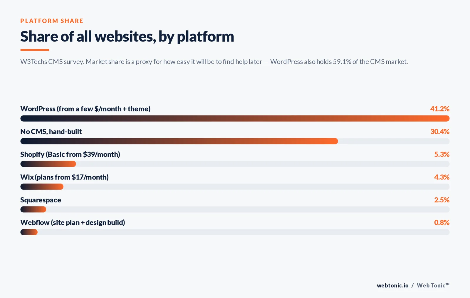
Platform choice matters less than most owners fear, and maintenance matters more. Market share, from W3Techs' CMS survey, is a useful proxy for how easy it will be to find help later.
| Platform | Share of all websites | Entry cost | Best fit |
|---|---|---|---|
| WordPress | 41.2% (59.1% of the CMS market) | Hosting from a few dollars per month plus a theme | Groups that need custom functionality and full control |
| Shopify | 5.3% | Basic from $39 per month | Restaurants selling retail products, kits or gift cards at volume |
| Wix | 4.3% | Plans from $17 per month | Single locations that want to self-manage everything |
| Squarespace | 2.5% | Low monthly subscription | Design-led independents with strong photography |
| Webflow | 0.8% | Site plan plus design build | Custom design with CMS-managed menus and locations |
| No CMS (hand-built) | 30.4% of sites use no CMS | Development time | Rarely worth it unless a group has in-house engineers |
Whatever the platform, the booking and checkout layer is usually a third-party integration. Keep that embedded rather than sending guests to an off-brand subdomain wherever the provider allows it, because every extra hop costs conversions.
Design inspiration by style
Most inspiration hunts end in the same place: a gallery of modern examples with no explanation of which style suits which concept. The table below maps each visual style to the food, the price point and the layout that carries it, so you can borrow the right reference instead of the prettiest.
| Design style | Visual signature | Layout that carries it | Best-fit restaurants |
|---|---|---|---|
| Modern minimal | Clean white space, one accent colour, sans-serif type | Single-column mobile layout with large food photos | Contemporary bistros, poke and salad concepts |
| Luxury fine dining | Dark palette, gold or bone accents, high-quality plating photos | Full-bleed hero, restrained menus, reservation-led | Tasting-menu and hotel restaurants |
| Rustic and artisan | Warm textures, hand-drawn marks, natural light photos | Story sections between menu blocks | Bakeries, farm-to-table, wine bars |
| Bold and vibrant | Saturated colour, oversized type, motion accents | Order-first layout with sticky ordering bar | Fast casual, taquerias, burger shops |
| Editorial magazine | Serif headlines, columned menus, generous margins | Long-scroll homepage with a strong menu landing page | Chef-led independents, seasonal menus |
| Photographic immersive | Photos filling the viewport, minimal text | Gallery-driven site with a clean sticky nav | Destination dining, rooftop and view-led venues |
| Utility delivery-led | Plain, high-contrast, product thumbnails | Online ordering widget in the hero, no narrative | Pizzerias, ghost kitchens, delivery-first brands |
A useful exercise before any build: collect 6 reference sites, then write down for each one what the design does to help you order. Styles that survive that test are the ones worth copying.
Templates: choosing and customising one
A template is a shortcut to a structure, not to a finished site. The strongest ones ship with a proper menus page, an ordering integration and mobile layouts that hold up; the weak ones look impressive on a desktop homepage and collapse on a phone. Judge every template on the five points below before buying.
| What to check | Good sign | Warning sign |
|---|---|---|
| Menus page | A real menu template with sections, prices and dietary tags | A single image placeholder labelled "menu" |
| Mobile layout | Order and reserve buttons pinned and thumb-reachable | Desktop nav shrunk into an unreadable strip |
| Photo handling | Responsive images with modern formats and lazy loading | Full-size photos loaded on every device |
| Ordering and booking | Documented embeds for common ordering systems | Only an external link to a third-party page |
| Editability | Menu items managed as CMS content by staff | Prices hard-coded into the page design |
Customising a template well takes four passes, in this order: replace every stock photo with your own food photography, set the type and colour to match your printed menu, rewrite the placeholder copy in the restaurant's own voice, then delete every section you do not need. That last step is what separates a modern, clean site from a template that still looks like a demo.
Landing pages for promotions and online ordering
The homepage cannot carry every campaign. An operator running a seasonal offer, a set-price event or a delivery promotion converts far better with a dedicated landing page that repeats one offer and one action.
| Campaign | Landing page contents | Single action | Typical traffic source |
|---|---|---|---|
| Seasonal or tasting menu | Menu in full, dates, price per head, 3 dish photos | Reserve for the dates offered | Email list and Instagram bio |
| Online ordering push | Delivery radius, cut-off times, ordering widget | Start an order | Paid social and local search |
| Private events and catering | Capacities, sample menus, price ranges, enquiry form | Send an enquiry | Organic search and referrals |
| New location opening | Address, opening date, opening-week offer | Join the opening list | Local press and paid social |
| Gift cards | Denominations, delivery options, expiry terms | Buy a gift card | Seasonal email and search |
Restaurants and food advertisers average a $0.72 cost per click and a 1.67% click-through rate on paid social, so the difference between a campaign that pays and one that does not is usually the page the click lands on, not the ad.
Speed, mobile and accessibility checks
These are the checks that quietly decide whether a beautiful design earns money. Run all six before launch and again quarterly.
| Check | Target | Most common cause of failure |
|---|---|---|
| Largest contentful paint | Under 2.5 seconds | Uncompressed hero image or autoplay video |
| Cumulative layout shift | Under 0.1 | Images without width and height attributes |
| Mobile tap targets | At least 44px | Desktop-sized menu links squeezed onto a phone |
| Text contrast | WCAG AA minimum | White copy laid over busy food photography |
| Keyboard navigation | Every action reachable | Custom reservation widgets with no focus states |
| Menu page weight | Under 2MB total | A thumbnail on all 40 menu lines |
Google's Core Web Vitals documentation defines those first two thresholds, and the ADA's web accessibility guidance plus the WCAG standard cover the contrast and keyboard requirements. Given that Statcounter puts mobile at 52.57% of global traffic, every one of these checks should be run on a phone first.
Design trends worth adopting in 2026
| Trend | What it looks like | Adopt or skip |
|---|---|---|
| Silent looping hero video | 5-8 second kitchen or plating loop, muted | Adopt, only if under 2MB and paired with a static fallback |
| Editorial menu typography | Print-magazine layout with strong hierarchy | Adopt — it reads well and costs nothing in speed |
| Dark mode dining pages | Dark backgrounds with warm accents | Adopt for bars, skip for daytime cafes |
| Sticky order bar | Persistent bottom bar on mobile | Adopt for anything with delivery or pickup |
| Full-page scroll animation | Heavy parallax and scroll-jacking | Skip — it breaks scanning and hurts speed |
| AI chat ordering widgets | Chat overlay handling bookings | Test only after the basic path converts |
| Location-aware landing | Nearest branch detected on arrival | Adopt for groups with 3+ locations |
Trend coverage in trade press such as Nation's Restaurant News is useful for spotting shifts early, but the filter is always the same: does it help someone see the food, read the menu, or book a table faster?
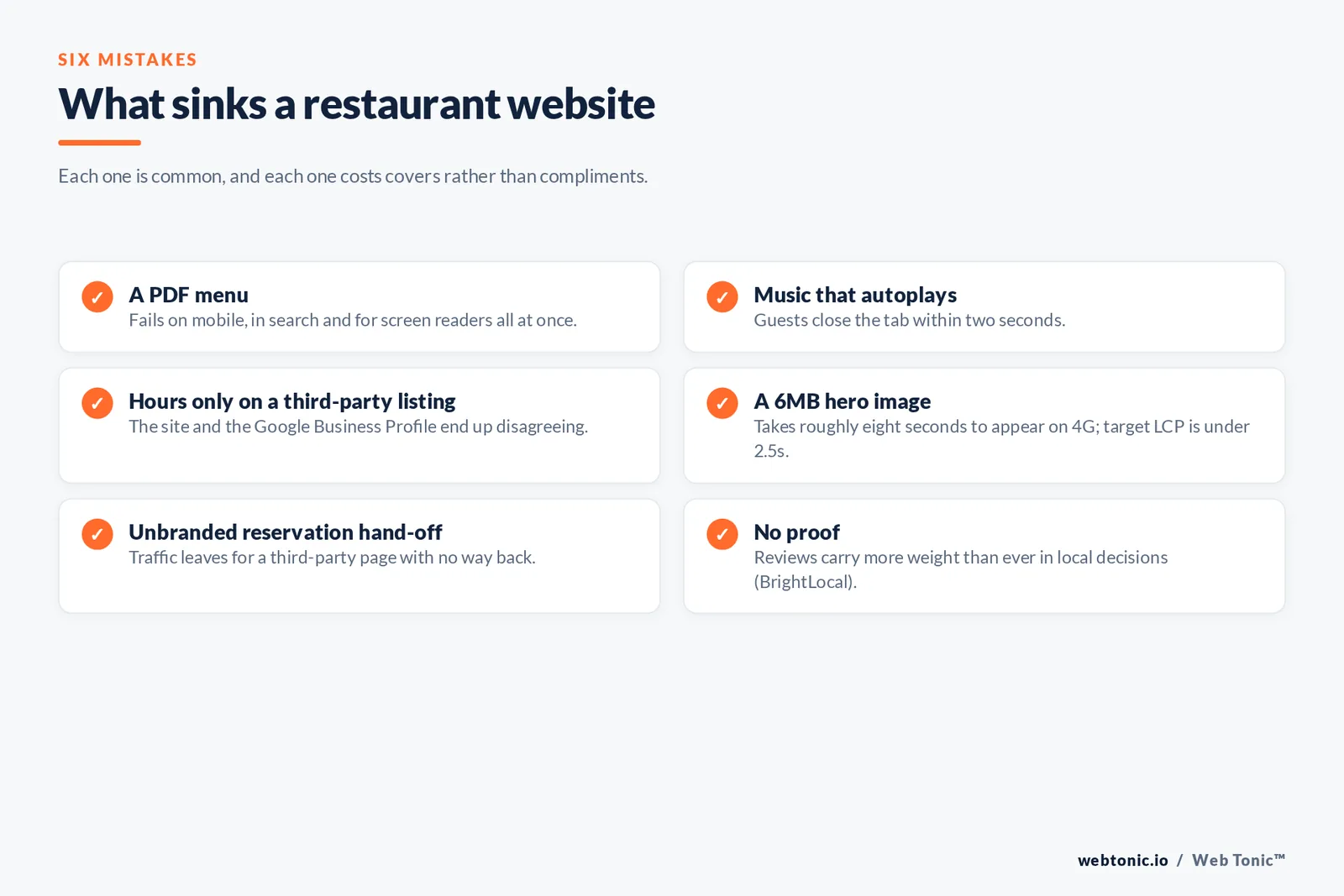
Six mistakes that sink these sites
- Mistake 1: A PDF menu. It fails on mobile, in search, and for screen readers all at once.
- Mistake 2: Music that autoplays. Guests close the tab within 2 seconds.
- Mistake 3: Hours that live only on a third-party listing, so the site and the profile disagree.
- Mistake 4: A 6MB hero image that takes eight seconds to appear on 4G.
- Mistake 5: Sending reservation traffic to an unbranded third-party page with no way back.
- Mistake 6: No proof. BrightLocal's consumer review research shows reviews carry more weight than ever in local decisions, and a site with none is conspicuous.
If you would rather have this audited than guess, our data intelligence team runs the speed, tracking and local-search checks as a fixed-scope review, and you can see the rest of our playbooks on the Web Tonic blog.
FAQ
What are the must-have features of a restaurant website?
An HTML list of dishes with current prices, a visible reserve or order button, accurate hours and address, a click-to-call number, real food photography and directions. Everything else — events, gift cards, story pages, newsletters — is upside once those six are correct and fast on a phone.
How do I make the site mobile-friendly?
Start with the phone layout. Keep the primary action visible without scrolling, use tap targets of at least 44px, set explicit image dimensions to prevent layout shift, compress photography to WebP, and test the menu and booking flow on a real device over mobile data rather than office wifi.
Should the menu be a PDF?
No. PDFs pinch-and-zoom badly on phones, are poorly represented in search results, are awkward for screen readers, and usually go stale because updating them requires a design file. Publish it as HTML managed in your CMS so a manager can change a price in under a minute.
Where can I find restaurant website templates?
Every major platform ships hospitality categories — Wix, Squarespace, Webflow and the WordPress theme directory all have them, and design communities offer editable layout files for wireframing. Choose a template on the strength of its menu and mobile layouts, not its homepage animation, and budget for photography rather than for a more expensive theme.
How much should you budget?
A self-managed builder plan starts at roughly $17 to $39 per month plus a domain. A designed single-location site with professional photography and an ordering integration is typically a low four-figure project, and multi-location groups with custom CMS work run higher. Photography and ongoing menu maintenance are the costs most owners underestimate.
Which trends should be avoided?
Scroll-jacking, heavy parallax, autoplay audio, full-screen intro animations and any pattern that delays the menu. Those choices reliably increase page weight and reduce the number of people who reach the booking step, which is the only outcome the site is measured on.
Sources
National Restaurant Association, 2026 State of the Restaurant Industry · W3Techs, content management system usage survey · Statcounter GlobalStats, platform market share · Google, Core Web Vitals documentation and LocalBusiness structured data guidelines · Google Business Profile help centre · ADA web accessibility guidance and W3C WCAG standards · Wix and Shopify published pricing · BrightLocal, Local Consumer Review Survey · Nation's Restaurant News. Figures current as of August 2026.