

Table of contents

Responsive web design is a single-codebase approach to building a website whose layout, images and typography adapt fluidly to any screen size, using flexible grids, fluid media and CSS media queries instead of separate mobile and desktop sites.
It stopped being a differentiator years ago. In 2026 it is the baseline condition for being crawled, ranked and trusted — and most of the remaining work is performance and accessibility, not layout.
Key Takeaways
- 51.47% of global web traffic came from mobile phones in June 2026 versus 47.17% desktop, so neither device class can be treated as the exception.
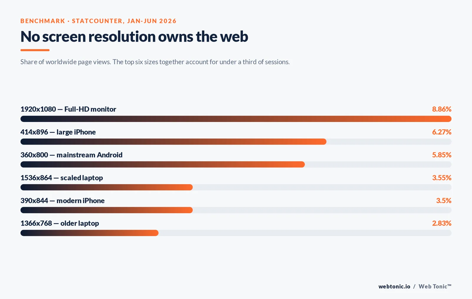
- No single screen resolution owns more than 8.86% of the market — the most common desktop size, 1920x1080 — and the top 20 resolutions together account for under 60% of sessions.
- Three ingredients define responsive web design: a flexible grid, fluid images and media queries, a definition unchanged since Ethan Marcotte named it in 2010.
- Google has indexed the web mobile-first since 2019, so content hidden from the mobile rendering of a site is effectively invisible to search.
- Only about 33% of sites pass all three Core Web Vitals, which is where responsive projects now fail — not at the breakpoint level.
- WCAG 2.2 requires content to reflow at 320 CSS pixels wide and interactive targets to be at least 24x24 pixels, turning two accessibility rules into hard responsive design requirements.
- Container queries are supported in every major browser engine since 2023, letting a component respond to its own container width rather than the viewport.
What responsive web design actually means
Responsive web design (often shortened to RWD) is the practice of building one website, with one HTML document per URL and one CSS codebase, that reshapes itself for every device that requests it. A phone gets a single stacked column; a tablet gets two; a wide desktop monitor gets a three or four column grid, larger type and more generous spacing. The content is identical. Only the presentation layer changes.
The term comes from Ethan Marcotte's 2010 essay in A List Apart, which set out the three technical ingredients that still define the discipline: a flexible grid, flexible images and media, and CSS media queries. Google's own developer guidance now treats responsive design as the default site pattern rather than one option among several.
It is worth being precise about the alternatives, because the vocabulary gets muddled in briefs and proposals.
| Approach | How it works | URLs | Verdict for 2026 |
|---|---|---|---|
| Responsive | One HTML document, CSS adapts the layout to the screen size | One | Default choice for almost every project |
| Adaptive | Server or script picks one of several fixed layouts by device class | One | Occasionally used for heavy apps; brittle with new devices |
| Separate mobile site | A parallel m-dot site with its own templates and content | Two | Legacy; doubles maintenance and risks content parity issues |
| Fluid (pre-RWD) | Percentage widths with no breakpoints | One | Insufficient alone — layouts break at extremes |
Responsive is not merely the most fashionable of these. It is the only approach where a device released next year inherits a sensible layout without anyone shipping new code.
Why the device landscape forces it
The strongest argument for responsive web design is the shape of real traffic. Statcounter's platform data put mobile at 51.47% of worldwide page views in June 2026, desktop at 47.17% and tablets at roughly 1.4%. Mobile leads, but a desktop-hostile site still forfeits nearly half its audience — which is why "mobile-first" describes a build order, not a decision to neglect large screens.
Screen resolution data makes the point harder. Across the first half of 2026, Statcounter recorded no dominant size at all.
| Screen resolution | Share (Jan-Jun 2026) | Typical device |
|---|---|---|
| 1920x1080 | 8.86% | Full-HD desktop monitor |
| 414x896 | 6.27% | Large iPhone |
| 360x800 | 5.85% | Mainstream Android phone |
| 1536x864 | 3.55% | Scaled laptop |
| 390x844 | 3.50% | Modern iPhone |
| 1366x768 | 2.83% | Older laptop |
| Everything else | 40.61% | The long tail: foldables, ultrawides, TVs, in-car screens |
That 40.61% "other" bucket is the entire case for fluid layouts: you cannot design for a device list you do not have. Search adds a second forcing function. Google completed its move to mobile-first indexing so that the smartphone rendering of a page is the version that gets indexed. Content collapsed away or never loaded on a narrow screen is content Google does not see. That single fact ties responsive web design directly to organic visibility, which is why our web development team and growth marketing team review breakpoints and content parity in the same pass.
The viewport meta tag: one line that decides everything
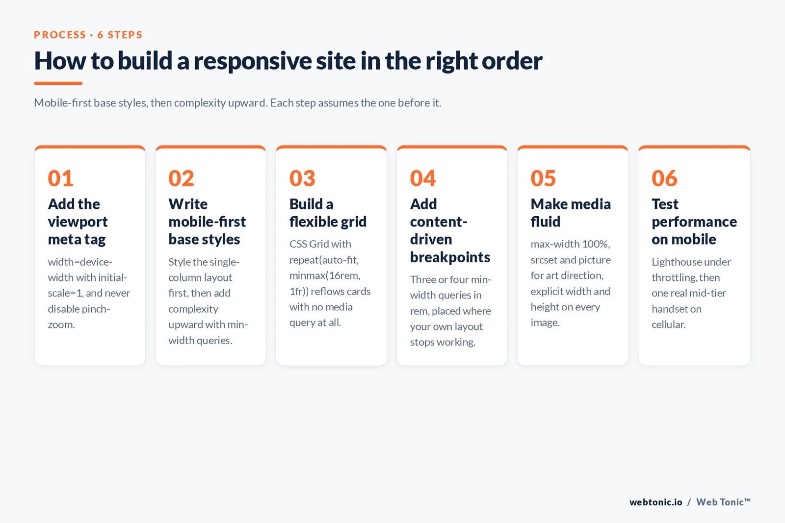
Before any media query fires, the browser needs to be told not to pretend it is a desktop. A mobile browser without a viewport meta tag renders the page at roughly 980 CSS pixels and then zooms out, so every carefully written breakpoint is ignored. One HTML element in the document head fixes it.
<meta name="viewport" content="width=device-width, initial-scale=1">The width=device-width value maps the layout viewport to the device width, and initial-scale=1 sets the starting zoom. Avoid maximum-scale or user-scalable=no: suppressing pinch-zoom breaks accessibility for low-vision users and provides no real benefit. The MDN responsive design guide treats this viewport meta line as prerequisite step zero, and in audits it is still one of the most common single-line defects on older sites.
Flexible grids with CSS Grid and Flexbox
A flexible grid means widths expressed in relative units — percentages, fr, rem, ch, viewport units — rather than fixed pixels. Modern CSS makes this close to free. CSS Grid handles two-dimensional page layout, and Flexbox handles one-dimensional rows of elements such as navigation bars and card footers.
The most useful modern pattern needs no media queries at all. A single grid-template-columns declaration produces a card grid that reflows from four columns to one as the browser window narrows:
.grid {
  display: grid;
  grid-template-columns: repeat(auto-fit, minmax(16rem, 1fr));
  gap: 1.5rem;
}
Legacy framework markup expresses the same idea with explicit column classes — a wrapper div with a row class holding several div class="col" children — but the CSS-native version is shorter, has no dependency, and degrades more gracefully. If you already use a framework, Bootstrap's grid and Tailwind's responsive utilities both wrap these primitives in a breakpoint vocabulary rather than replacing them.
Two habits keep grids from breaking. Set max-width on text containers so lines stay in the readable 45 to 75 character band on wide screens, and use min-width: 0 on flex and grid children so long words and tables cannot force horizontal overflow.
Media queries and choosing breakpoints
CSS media queries apply a block of declarations only when the browsing environment matches a condition. Written mobile-first, the base styles serve the smallest screen and each query adds complexity upward:
.card { padding: 1rem; font-size: 1rem; }

@media (min-width: 48rem) {
  .card { padding: 2rem; font-size: 1.125rem; }
}
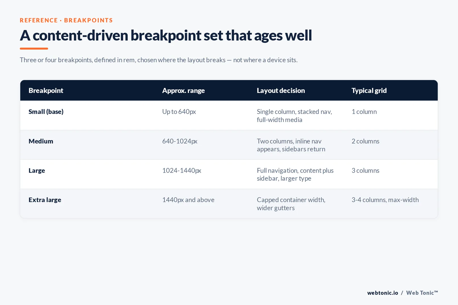
The old advice to target specific devices is obsolete. Pick breakpoints where your content stops looking right — usually three or four of them — and use relative units so a user's browser font-size setting is respected. A rough, widely compatible set:
| Breakpoint | Approximate range | Layout decision | Typical grid |
|---|---|---|---|
| Small (base) | Up to 640px | Single column, stacked nav, full-width media | 1 column |
| Medium | 640-1024px | Two columns, inline nav appears, sidebars return | 2 columns |
| Large | 1024-1440px | Full navigation, content plus sidebar, larger type scale | 3 columns |
| Extra large | 1440px and above | Capped container width, wider gutters, no infinite stretching | 3-4 columns with max-width |
Media queries are no longer limited to width. prefers-reduced-motion, prefers-color-scheme, hover and pointer: coarse let the same stylesheet respond to user preferences and input type — a touch device can get larger tap targets without any width guessing.
Fluid images, video and media
Unconstrained media is the classic cause of horizontal scrollbars. The one-line floor is max-width: 100%; height: auto; on images and embeds. Beyond that, responsive images exist to avoid shipping a 2,400-pixel hero to a 390-pixel phone.
srcsetplussizeslets the browser choose a file by device pixel ratio and layout width — the right tool for the same image at different resolutions.- The picture element handles art direction: a wide crop on desktop, a tighter portrait crop on mobile.
- Modern formats — WebP and AVIF — typically cut file weight by 25% to 50% against comparable JPEG at the same perceived quality.
- Always declare
widthandheight(or anaspect-ratio) so the browser reserves space and the layout does not shift as images arrive. - Use
loading="lazy"below the fold only. Lazy-loading the hero image delays the largest paint and hurts the very metric you are trying to protect.
Video and iframes need the same treatment: wrap them in a container with an aspect-ratio so they scale without letterboxing or overflow.
Container queries: responsive components, not just pages
Media queries ask about the viewport, which is the wrong question for a reusable component. A product card in a narrow sidebar and the same card in a full-width grid see an identical viewport but need different layouts. Container queries fix that by letting an element respond to its own containing box:
.card-wrap { container-type: inline-size; }

@container (min-width: 30rem) {
  .card { display: grid; grid-template-columns: 12rem 1fr; }
}
Support is broad — Can I Use shows above 90% of global users covered since the feature shipped across Chromium, Safari and Firefox in 2023 — so for design-system work container queries can now be the primary tool, with viewport media queries reserved for genuinely page-level decisions such as navigation mode.
Typography, touch targets and accessibility
Responsive design and accessibility overlap more than most teams assume. Two WCAG success criteria are effectively responsive requirements. The reflow criterion demands that content work at 320 CSS pixels wide — equivalent to a 1280px page zoomed to 400% — without two-dimensional scrolling. The target size minimum asks for interactive elements of at least 24x24 CSS pixels, and mainstream design systems go further at around 44px for primary touch controls.
For type, size in rem rather than px so a user's browser preference scales the page, keep body copy at roughly 16px minimum on mobile, and consider clamp() for headline sizes that flex between a floor and a ceiling:
h2 { font-size: clamp(1.5rem, 1.1rem + 2vw, 2.5rem); }One more rule that gets forgotten: a responsive site must remain usable with the keyboard at every breakpoint. Hamburger menus that trap focus, or off-canvas panels that stay in the tab order when closed, are the most frequent responsive accessibility defect we find in audits.
Performance is where responsive projects now fail
Layouts stopped being the hard part. Weight did. A phone on a mid-tier connection has to parse the same CSS and JavaScript a desktop does, and hiding elements with display: none does not stop their assets from downloading. Google's page experience guidance ties this to search through Core Web Vitals, and only about 33% of sites pass all three thresholds.
| Metric | What it measures | Good threshold | Most common responsive cause |
|---|---|---|---|
| LCP | Time to render the largest visible element | 2.5 seconds or less | Oversized hero image, lazy-loaded hero, render-blocking CSS |
| CLS | Unexpected layout movement during load | 0.1 or less | Images without dimensions, late-loading fonts, injected banners |
| INP | Responsiveness to user interaction | 200 milliseconds or less | Heavy JavaScript on menus, carousels and sliders |
Google's mobile research found that 53% of mobile visits are abandoned when a page takes longer than three seconds to load, and its speed benchmark work shows conversion damage well below that. Practical wins, in order of usual impact: serve correctly sized images through srcset, preload the hero and the font it sits on, defer non-critical JavaScript, and delete the carousel. Detailed remedies for each metric are documented in the web.dev LCP guide. When performance work needs to be justified commercially, our data intelligence team models it against revenue rather than lab scores.
How to test a responsive site properly
Resizing your own browser window is a smoke test, not a test. A defensible QA pass covers four layers.
| Layer | Tool | What it catches |
|---|---|---|
| Layout | Chrome DevTools device mode, plus slow dragging of the window edge | Overflow, broken breakpoints, clipped content |
| Performance | Lighthouse and PageSpeed Insights on mobile throttling | Oversized assets, layout shift, blocking scripts |
| Accessibility | Keyboard-only run-through and 400% browser zoom | Focus traps, reflow failures, tap targets that are too small |
| Real devices | One low-end Android and one iPhone, on cellular | Font rendering, sticky-header bugs, real network behaviour |
Lighthouse is the fastest entry point, and device mode should be driven at continuous widths rather than only the named presets — most overflow bugs live between breakpoints, not on them. Check your own analytics for the resolutions and devices that actually matter to your traffic before you spend a day on an edge case worth 0.3% of sessions.
Common responsive design mistakes
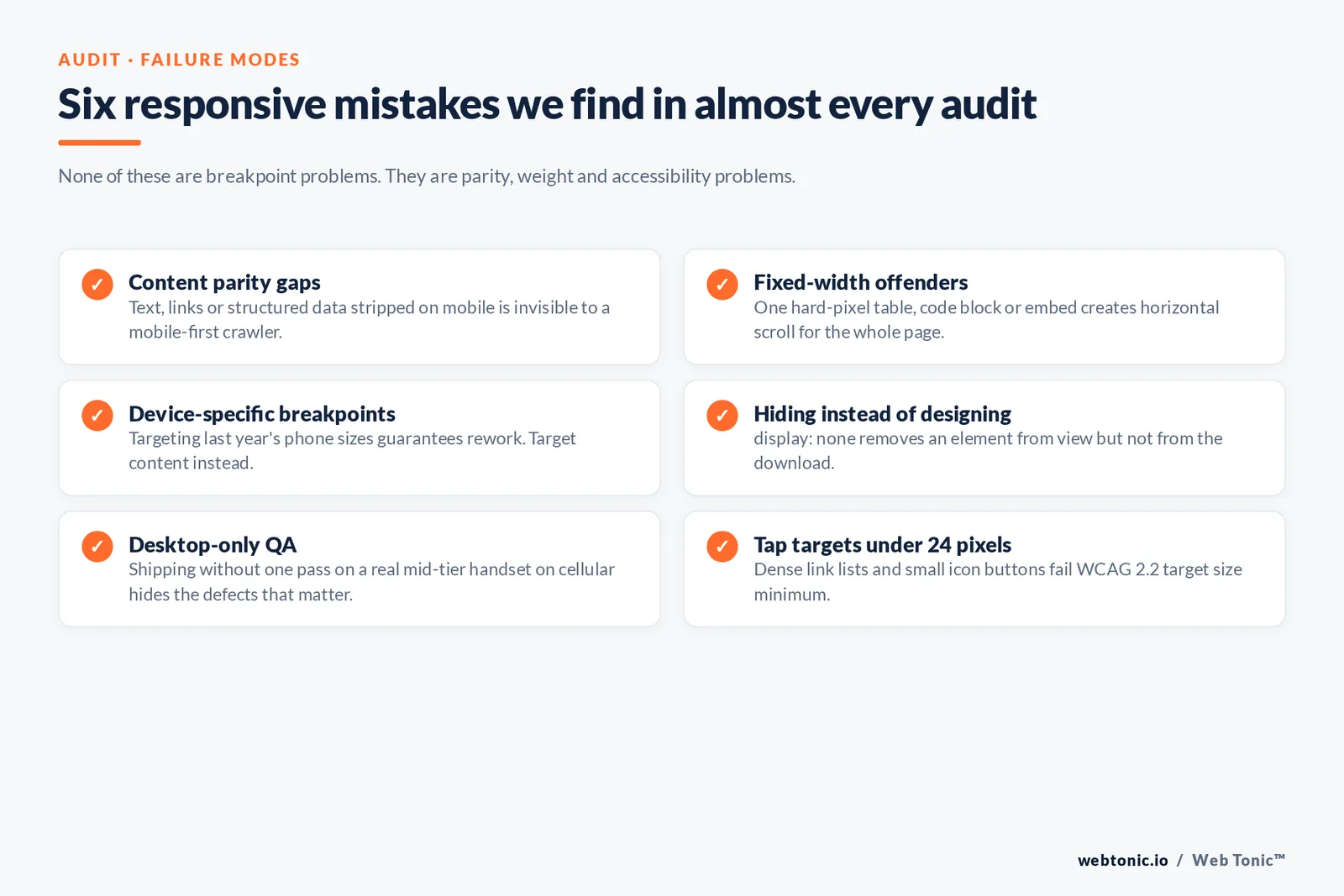
- Content parity gaps. Text, links or structured data present on desktop but stripped on mobile is invisible to a mobile-first crawler.
- Fixed-width offenders. A single element with a hard pixel width — usually a table, a code block or an embed — creates horizontal scroll for the whole page.
- Device-specific breakpoints. Targeting last year's phone sizes guarantees rework; target content instead.
- Hiding instead of designing.
display: noneremoves the element from view but not from the download. - Desktop-only QA. Shipping without one pass on a real mid-tier handset on cellular hides most of the defects that matter.
- Tap targets under 24 pixels. Dense link lists and small icon buttons fail WCAG 2.2 and frustrate real thumbs.
FAQ
What are the three components of responsive web design?
A flexible grid built in relative units, flexible images and media that scale within that grid, and CSS media queries that adjust the layout at chosen breakpoints. Ethan Marcotte set out those three in 2010 and they still describe the technique, with container queries now added as a fourth, component-level tool.
Is responsive web design still necessary in 2026?
Yes, and it is no longer optional. Mobile accounted for 51.47% of global page views in June 2026 while desktop held 47.17%, and Google indexes the mobile rendering of every page. A site that does not adapt loses both audiences and search visibility at once.
How many breakpoints should a website have?
Usually three or four. Add a breakpoint where the content itself stops working rather than where a particular device sits, define them in relative units such as rem, and test the widths between them — most layout bugs hide between breakpoints, not at them.
What is the difference between responsive and adaptive design?
Responsive design uses one fluid layout that flexes continuously across all screen sizes. Adaptive design serves one of several fixed layouts chosen by detected device class. Responsive handles unknown future devices gracefully; adaptive needs new work each time the device landscape shifts.
Does responsive design affect SEO?
Indirectly but strongly. It is the layout pattern Google recommends, it guarantees content parity under mobile-first indexing, and it removes the duplicate-URL problems of separate mobile sites. Core Web Vitals then reward the performance discipline that good responsive builds require. Our blog covers the measurement side in more depth, and you can talk to us about an audit of your own build.
Sources
Statcounter Global Stats, platform and screen resolution market share (Jan-Jun 2026) · Ethan Marcotte, "Responsive Web Design", A List Apart · MDN Web Docs, responsive design, media queries, CSS Grid, Flexbox, container queries and the picture element · Google Search Central, mobile-first indexing and page experience · web.dev, responsive web design basics and Core Web Vitals guides · W3C Web Accessibility Initiative, WCAG 2.2 reflow and target size criteria · Think with Google, mobile page speed benchmarks · Can I Use, container query support · Bootstrap 5.3 and Tailwind CSS documentation · Chrome DevTools and Lighthouse documentation. All sources accessed July 2026.