
Table of contents
The best Instagram Story ideas are the ones you can repeat. Below are 28 story ideas grouped by goal — engagement, sales, community and behind-the-scenes — plus the templates, layouts and design rules that make them look deliberate.
Every idea includes the format to shoot it in, the sticker that carries it, and why it earns a tap instead of a swipe.
Key Takeaways
- Stories are a 24-hour, full-screen, vertical surface: 1080 × 1920 px at 9:16, with each card running up to 60 seconds before it splits.
- The metric that matters is not reach, it is completion — how many people reach the last card in your sequence. Everything below is designed to protect it.
- Interactive stickers (poll, quiz, question, slider, countdown, Add Yours) turn a passive story into a reply, and replies are the strongest relationship signal Instagram gives you.
- Ship in sequences of 3–5 cards, not one-offs. A single orphan story has no narrative reason to be watched to the end.
- Build 6–8 reusable story templates once, then rotate them. Consistency is what makes an aesthetic layout look designed rather than lucky.
- Over 60% of product discovery now happens on social platforms, and short-form vertical video is the format marketers rank highest for return.
- Text on a story card should survive a muted, one-handed, moving viewer: large type, high contrast, safe margins of roughly 250 px top and bottom.
- Anything worth more than a day belongs in Highlights — that is where a story stops being ephemeral and starts being a landing page.
Why Instagram Stories still earn attention
Stories occupy a slot no other format does: the top of the app, full screen, no competing posts, and an audience that arrived expecting something unpolished. That combination is why a rough phone video often outperforms a designed post from the same account on the same day.
The context is worth keeping in mind while you plan. DataReportal's global overview puts social media use at roughly 5.66 billion people spending about 2 hours 40 minutes a day across an average of 6.75 platforms each month. Sprout Social's statistics roundup reports that more than 60% of consumers now discover products on social, and that short-form video is the format delivering the strongest reported returns. Pew Research shows Instagram concentrated among adults under 50, which matters when you decide how much explanation a story needs.
The practical read: your story ideas do not need production value. They need a reason to tap forward.
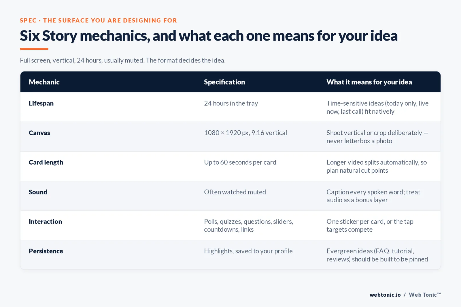
| Story mechanic | Specification | What it means for your idea |
|---|---|---|
| Lifespan | 24 hours in the tray | Time-sensitive ideas (today only, live now, last call) fit natively |
| Canvas | 1080 × 1920 px, 9:16 vertical | Shoot vertical or crop deliberately — never post a letterboxed photo |
| Card length | Up to 60 seconds per card | Longer video splits automatically, so plan natural cut points |
| Sound | Often watched muted | Caption every spoken word; treat audio as a bonus layer |
| Interaction | Polls, quizzes, questions, sliders, countdowns, links | One sticker per card maximum, or the tap target competes with itself |
| Persistence | Highlights, saved to your profile | Evergreen ideas (FAQ, tutorial, reviews) should be built to be pinned |
28 Instagram Story ideas, grouped by goal
Pick by the outcome you need this week, not by what looks fun. Each row names the format to shoot in and the sticker or layout that does the work.
| Story idea | Goal | Format | Why it works |
|---|---|---|---|
| 1. This or that poll | Engagement | Photo + poll sticker | Two options, one tap, zero thinking — the lowest-friction interaction on Instagram |
| 2. Ask me anything | Engagement | Question sticker | Generates a week of follow-up story content from your own audience |
| 3. Guess the price | Sales | Product photo + slider | Anchors value before you reveal the real number on the next card |
| 4. Two-truths quiz | Engagement | Quiz sticker | A right answer creates a reason to watch the next card for the reveal |
| 5. Behind the scenes of one task | Trust | Handheld video | Specific beats general: one packing run, one shoot, one repair |
| 6. Before and after | Sales | Split-screen photo layout | Proof without a claim — the viewer draws the conclusion |
| 7. Three-step mini tutorial | Saves | 3-card video sequence | Teaches something usable in under 90 seconds and earns a Highlight slot |
| 8. Customer message screenshot | Sales | Screenshot + caption | Social proof in the audience's own words; always ask permission first |
| 9. Countdown to a launch | Sales | Countdown sticker | Viewers opt in to a reminder, so the launch card lands in notifications |
| 10. Day in the life | Community | 6–8 card sequence | A narrative arc across the day is the single best completion driver |
| 11. Myth versus fact | Authority | Text-first template | Contradiction stops the swipe; the correction earns the follow |
| 12. Product in use, not on white | Sales | Photo or short clip | Context answers "will this fit my life" faster than a spec list |
| 13. Poll on your next post | Engagement | Poll on two draft photos | Doubles as research; the winner posts with a built-in audience |
| 14. Repost a customer's story | Community | Share to your story | Rewards the tagger and quietly recruits the next one |
| 15. One-question survey | Research | Question sticker | Better response rate than any email survey you will send this quarter |
| 16. Birthday or anniversary card | Community | Template + photo grid | A team or brand birthday gives followers something to reply to |
| 17. Tease then link | Traffic | 2 cards, link sticker on the second | Earning the tap before asking for the click lifts click quality |
| 18. Answer one FAQ | Sales | Talking-head video | Removes a real purchase objection and belongs in a pinned Highlight |
| 19. Restock or sold-out alert | Sales | Photo + link | Scarcity that is true; sold-out news is as useful as a restock |
| 20. Add Yours prompt | Reach | Add Yours sticker | Turns one story into a public chain your followers extend for you |
| 21. Tool or app you actually use | Authority | Screen recording | Utility content gets shared to DMs, the most valuable share type |
| 22. Mistake you made | Trust | Text card + video follow-up | Vulnerability outperforms polish on an unpolished surface |
| 23. Quote from your own post | Reach | Share post to story with commentary | Recirculates a feed post to people who never scrolled that far |
| 24. Poll-driven bracket | Engagement | Multi-day poll series | A knockout format across several days builds return viewing |
| 25. Team introduction | Trust | Photo + name template | Faces make a business feel answerable, which shortens sales cycles |
| 26. Live announcement | Attendance | Countdown then live badge | Two touches convert far better than a single "we're live" card |
| 27. Weekly recap | Retention | Photo collage layout | A predictable Friday slot trains the audience to look for you |
| 28. One number from your data | Authority | Big-type text template | Original numbers get screenshotted and shared beyond your following |
If you only adopt 5 of these, take numbers 1, 5, 7, 17 and 27. They cover interaction, trust, teaching, traffic and rhythm — the four jobs a story feed has to do, plus a repeatable slot.
Story templates and layouts that hold an aesthetic
An aesthetic Instagram story is not a filter choice, it is a template system. Build the templates once in whatever design tool you already pay for, save them as a reusable set, and then every idea above becomes a fifteen-minute job instead of a creative decision.
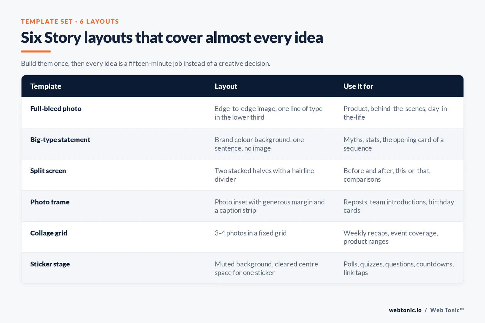
Six layouts cover almost everything:
| Template | Layout | Use it for |
|---|---|---|
| Full-bleed photo | Edge-to-edge image, one line of type in the lower third | Product, behind-the-scenes, day-in-the-life cards |
| Big-type statement | Brand colour background, 1 sentence, no image | Myths, stats, opening card of a sequence |
| Split screen | Two stacked halves with a hairline divider | Before and after, this-or-that, comparisons |
| Photo frame | Photo inset with generous margin and a caption strip | Reposts, team introductions, birthday cards |
| Collage grid | 3–4 photos in a fixed grid | Weekly recaps, event coverage, product ranges |
| Sticker stage | Muted background, cleared centre space for one sticker | Polls, quizzes, questions, countdowns, link taps |
Two rules keep a template set from drifting. First, fix the type: one display font for headlines, one plain font for body, and never more than 2 per card. Second, fix the palette to 3 colours and use the third only for the tap target — the sticker, the arrow, the link. Practical walkthroughs from Buffer, Sprout Social and Metricool are worth reading side by side before you lock your set, because each has a different bias about how designed a story should look.
Design your templates to be reused, not admired. If a template only works with one specific photo, it is a graphic, not a template.
Design and accessibility rules for story photos and video
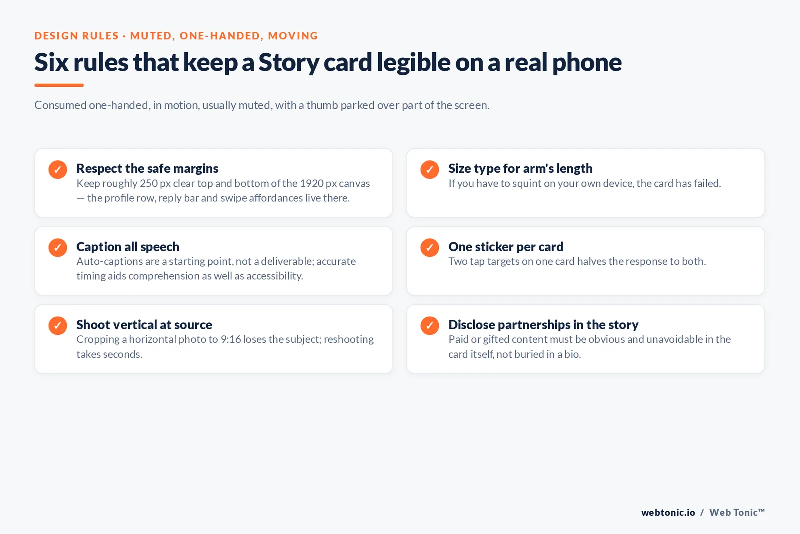
Stories are consumed one-handed, in motion, usually muted, on a screen with a thumb parked over part of it. The rules follow from that.
- Keep roughly 250 px clear at the top and bottom of the 1920 px canvas — that is where the profile row, the reply bar and the swipe affordances live.
- Set your smallest type at readable size on a phone held at arm's length. If you have to squint on your own device, the card has failed.
- Caption all speech. Auto-captions are a starting point, not a deliverable; the W3C guidance on captions explains why accurate, well-timed text matters for comprehension as well as accessibility.
- Write alt text on story photos where the platform allows it, and describe what is in the image rather than repeating your caption.
- Use 1 sticker per card. Two tap targets on one card halves the response to both.
- Shoot vertical at source. Cropping a horizontal photo to 9:16 loses the subject; reshooting takes seconds.
- Check contrast on text over photography — a dark scrim behind type costs nothing and fixes most legibility problems.
- Disclose partnerships clearly. If a story is paid or gifted, the FTC's disclosure guidance expects it to be obvious and unavoidable in the story itself, not buried in a bio.
A 7-day Instagram Story plan you can repeat
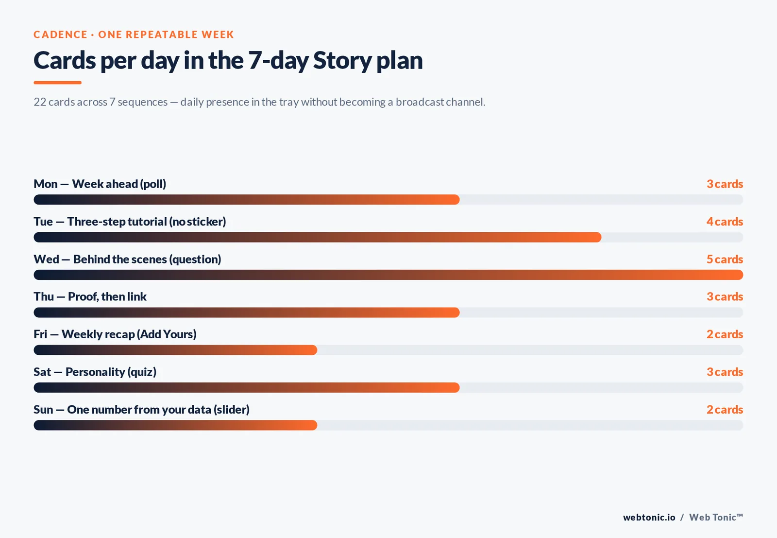
Ideas fail on cadence, not creativity. This is a week that uses each idea type once and takes well under an hour a day.
| Day | Story sequence | Cards | Primary sticker |
|---|---|---|---|
| Monday | Week ahead: what you are working on | 3 | Poll — which should we do first? |
| Tuesday | Three-step mini tutorial | 4 | None — protect completion |
| Wednesday | Behind the scenes of one task | 5 | Question — what should we show next? |
| Thursday | Proof: customer message, then before and after | 3 | Link on the final card |
| Friday | Weekly recap collage | 2 | Add Yours |
| Saturday | Personality: team, pets, playlist, mistake | 3 | Quiz |
| Sunday | One number from your own data | 2 | Slider |
That is 22 cards a week across 7 sequences — enough to stay in the tray daily without turning your account into a broadcast channel. Post at the time your own audience is actually awake and idle rather than a borrowed "best time to post"; the pattern in your own insights beats every published benchmark.
Batch production is what makes this survive a busy week. Shoot Wednesday's behind-the-scenes footage and Friday's recap photos on the same afternoon, drop them into your saved templates, and schedule what your publishing tool allows. Benchmarks from Socialinsider and Sprout Social's Instagram statistics are useful for setting expectations, but only your own completion curve tells you which sequence length works for your audience.
Turning stories into results, not just views
A story programme earns its slot when it moves something measurable. Three moves do most of the work.
Pin the evergreen ones. Every tutorial, FAQ answer and proof sequence should be added to a named Highlight the day it expires. A well-organised Highlights row functions as a second navigation bar for your profile, and it is the first thing a new visitor taps.
Recycle across formats. The best-performing story idea of the month is a Reel script, an email subject line and a landing-page section. That reuse is exactly how a growth marketing programme compounds instead of restarting every week — and the same footage often becomes paid performance creative once it proves itself organically.
Track completion and replies, not impressions. Reach tells you how many people the platform showed you to; completion and replies tell you whether the idea was any good. Read those two numbers per sequence, kill the layouts that leak viewers on card two, and repeat the ones that do not. Attribution beyond the app needs UTM parameters on your link stickers, which is where data intelligence work pays for itself.
Mistakes that quietly kill story performance
- Posting 1 orphan card. A single story has no narrative; viewers tap through it on the way to someone else's.
- Uploading a feed graphic. Letterboxed square images signal recycled content before anyone reads a word.
- Stacking 15 cards in a row. Long sequences are fine when there is a story; a dump of unrelated cards trains people to skip your circle entirely.
- Asking for the click on card 1. Earn a tap first — link stickers on opening cards convert worst.
- Ignoring replies. Story replies land in DMs and are the warmest inbound you get; unanswered, they stop coming.
- Changing the look weekly. Recognition in a full-screen feed comes from repetition, and repetition needs templates.
- Never checking exit points. If most viewers leave on the same card every time, that card is the problem, not the idea.
FAQ
How many Instagram stories should I post per day?
Aim for one sequence of 3–5 cards most days rather than a fixed card count. Sequences give viewers a reason to keep tapping, which protects completion — the number that actually predicts whether the platform keeps surfacing you near the front of the tray. Daily presence matters more than volume.
What are good Instagram story ideas when I have nothing to post?
Use the three that need no preparation: a this-or-that poll on a decision you are genuinely making, a question sticker asking what your audience wants explained, and a screen-recorded look at a tool you used today. Each takes under five minutes and produces follow-up material from the replies.
Do I need story templates, or can I design each one?
Templates win on consistency and speed. Build 6 reusable layouts — full-bleed photo, big-type statement, split screen, photo frame, collage grid, sticker stage — and every new idea becomes a layout choice instead of a design project. Designing from scratch each time is how an aesthetic drifts.
What size should an Instagram story be?
1080 × 1920 px at a 9:16 aspect ratio, with about 250 px of clear margin at the top and bottom so the interface does not cover your type or your sticker. Shoot vertical at source rather than cropping horizontal photos down.
Which story stickers get the most engagement?
Polls get the most taps because they cost the least effort, question stickers get the most substantive replies, and Add Yours has the widest reach because it chains to your followers' own audiences. Use one per card — two tap targets split attention and reduce responses to both.
If you want a story programme that ties back to pipeline rather than vanity metrics, browse our services, read more breakdowns on the Web Tonic blog, or get in touch.
Sources: DataReportal Digital 2026 Global Overview Report · Sprout Social (social media statistics, Instagram statistics, Instagram Stories guide) · Pew Research Center social media fact sheet · Buffer Instagram Stories resources · Metricool Instagram Stories guide · Socialinsider Instagram benchmarks · W3C Web Accessibility Initiative captions guidance · FTC Disclosures 101 for Social Media Influencers. Platform specifications verified against the cited pages in 2026.