

Table of contents

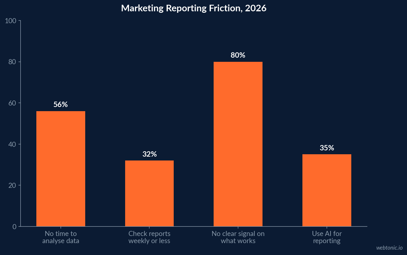
Wellness marketing teams are not short of data — they are short of the twenty minutes it takes to read it. 56% of marketers say they cannot find time to analyse their data properly and 32% check reports weekly or less, according to the Supermetrics Marketing Data Report 2026. This roundup collects the dashboard, business intelligence and reporting statistics that matter for health and wellness brands in 2026, plus the KPI benchmarks worth putting on the screen.
Key Takeaways
- 56% of marketers cannot find time to analyse their data; 32% check reports weekly or less.
- 80%+ of marketers say they lack a clear signal showing what is working.
- BI adopters see 28% faster reporting and 24% faster decisions.
- Power BI holds ~22.5% of the BI market in 2026, ahead of Tableau at 17.8%.
- 87% of healthcare marketers say first-touch discovery has shifted, straining legacy reporting.
- Strong data foundations make B2B marketers 2.4x more likely to exceed goals.
Reporting & BI Benchmarks at a Glance
Figures come from 2026 marketer surveys and BI market studies; sample sizes and definitions differ, so read them as directional.
| Metric | 2026 figure | Source |
|---|---|---|
| Marketers without time to analyse data | 56% | Supermetrics |
| Marketers checking reports weekly or less | 32% | Supermetrics |
| Marketers lacking a clear performance signal | 80%+ | Funnel Marketing Intelligence Report |
| AI used for reporting and analytics | 35% (vs 50% for content) | Supermetrics |
| Agencies citing reporting as top AI value | 42% | AgencyAnalytics |
| Organisations with BI tools deployed | 56% (48% in 2020) | Gitnux |
| Users saying BI speeds decisions | 64% | WifiTalents |
| Self-service share of BI spend | 58% | Zipdo |
| B2B marketers reallocating spend on live data | 41% | Anteriad |
1. The Bottleneck Moved from Data Access to Attention
A decade of connector tooling solved the plumbing. Supermetrics reports that average marketing-data query counts rose 50% between 2020 and 2024 while rows returned rose 230% — far more data flowing, with no matching increase in the hours available to interpret it. The result is the pair of numbers at the top of this article: 56% cannot find time to analyse, and a third of marketers open a report weekly at best.
Funnel's 2026 Marketing Intelligence Report frames the same gap from the output side: more than 80% of surveyed marketers say they do not have a clear signal that tells them what is working. For a wellness brand running paid social, search, affiliate, email and retail at once, the practical fix is subtraction — a single-screen dashboard with fewer than a dozen decision metrics, and everything else demoted to a monthly deep dive.
2. BI Adoption Pays, but Only With Governance
The upside of instrumented reporting is well documented. Gitnux reports that 56% of organisations have adopted BI tools, up from 48% in 2020, and that adopters achieve 28% faster reporting and 24% better decision-making speed. Broader compilations put 64% of users crediting BI with faster decisions and 60% of executives using self-service BI for daily reporting, with self-service accounting for 58% of BI spend and the self-service segment growing at a 15.5% compound annual rate.
The counterweight is governance. Research collated by WhatAreTheBest found that 90% of autonomous analytics initiatives lack the necessary governance structures. In wellness organisations — where clinical, e-commerce and CRM systems all define a "patient" or "customer" differently — ungoverned self-service reliably produces three dashboards with three different revenue numbers, and a leadership team that trusts none of them.
Data foundations correlate with outcomes: Anteriad research reported by MarketScale found B2B marketers with strong data foundations are 2.4x more likely to exceed goals, and 41% frequently reallocate spend based on live data.
3. Tooling: What Wellness Teams Actually Run On
Market-share estimates vary by methodology, but the trend line is consistent: Power BI has been compounding share while Tableau holds steady.
| Year | Power BI share | Tableau share |
|---|---|---|
| 2021 | 5.4% | 13.0% |
| 2022 | 7.2% | 12.5% |
| 2024 | 13.7% | 16.4% |
| 2025 | 20.1% | 16.4% |
| 2026 | 22.5% | 17.8% |
Alternative counts land in the same neighbourhood: Decision Foundry puts Power BI at 17.93%, Tableau at 13.76% and D3.js at 9.52% across 300,000+ companies using at least one visualization platform, while another 2026 comparison credits Power BI with roughly 30% of the global BI market and 97% of Fortune 500 usage. Among high-growth technology companies, Riso Group finds Looker and Tableau at ~68% adoption with Power BI at 41%, and four venture-backed challengers past 10%: Metabase 15%, Hex 13%, Sigma 13% and Mode 13%.
For wellness marketing specifically, the split we recommend is pragmatic: a marketing-owned Looker Studio or agency dashboard for channel reporting, feeding a governed warehouse layer that finance and clinical operations query in Power BI or Tableau. That keeps one definition of revenue while letting marketers iterate weekly.
4. The Healthcare & Wellness Measurement Gap
Reporting in this category is harder because the first touch has moved. Freshpaint's State of Healthcare Marketing 2026, based on 200 senior healthcare marketing leaders plus proprietary data, reports that 87% of marketers say their first touch has shifted — largely into search and AI-assisted discovery — and maps a persistent gap in ROI visibility, attribution and funnel maturity. Call-centre data, offline conversions and privacy constraints all sit between the dashboard and the truth.
That makes benchmark context valuable. CUFinder's 2026 healthcare benchmarks give reference points for the acquisition and retention rows of a wellness dashboard.
| KPI | 2026 healthcare benchmark | Dashboard placement |
|---|---|---|
| CPA, Search Network | $84.50 | Weekly acquisition view |
| CPA, Display Network | $68.20 | Weekly acquisition view |
| Patient retention rate (annual, established) | 68% | Monthly retention view |
| Patient churn rate (annual) | 22% | Monthly retention view |
| Review velocity | New Google reviews per month per location | Monthly trust view |
| NPS | Tracked continuously | Quarterly quality view |

5. AI in Reporting: Used, but Underused
AI has landed unevenly across the marketing stack. Supermetrics finds marketers mostly use AI for content creation and copywriting at 50%, while reporting and analytics sit at just 35% — the biggest gap between available leverage and actual usage in the survey. Agencies are further along: the 2026 AgencyAnalytics benchmarks report reporting and AI summaries as the leading use case at 42%, agentic AI already running workflow automation at 38% of agencies, and 58% increasing human review to protect quality. A meaningful share of agencies save five or more hours per week through AI-assisted reporting.
Vendor-side gains are real too: Power BI's Copilot for DAX rollout is credited with cutting report development time by an average of 40%. The pattern to copy is narrow automation with human sign-off — AI drafts the narrative and flags anomalies, a human decides what changes.
6. Health & Wellness vs All Industries
| Dimension | All industries | Health & wellness | Practical consequence |
|---|---|---|---|
| Primary data source | Ad platforms plus GA4 | Platforms, GA4, call tracking, CRM, clinical systems | More joins, more definition drift |
| First-touch visibility | Partially tracked | 87% report first touch has shifted | Brand and organic discovery need proxy metrics |
| Reporting constraint | Time and attention | Time, attention and privacy compliance | Aggregate reporting layers instead of raw event tables |
| Retention reporting | Optional | Core (68% retention, 22% churn benchmarks) | Retention belongs on the main dashboard |
| Dominant tool pattern | One BI platform | Marketing dashboard plus governed warehouse | Split fast iteration from single source of truth |
7. Building a Wellness Marketing Dashboard That Gets Read
Given that the scarce resource is attention, design for it:
- One screen, one decision each. Cap the top view at 8–12 metrics; every tile should have an owner and an action attached.
- Blended before granular. Lead with revenue, blended MER and contribution margin, because they survive attribution disputes.
- One definition per metric, stored in the warehouse. The 90% governance gap in autonomous analytics is exactly this failure.
- Retention on the front page. With 22% annual churn as a category reference point, acquisition-only dashboards flatter bad businesses.
- Cadence by signal. Daily pacing, weekly efficiency, monthly cohorts — not everything reviewed at the same frequency.
- Automate the narrative, not the judgement. Follow the agency pattern: AI-generated summaries with human review at 58% of agencies as the quality gate.
We build these as part of our data intelligence work, feeding the same numbers our growth marketing and Google Ads teams optimise against — the same reporting logic that underpins our guide to what Google Ads actually costs.
8. What Wellness Teams Report On, Channel by Channel
Dashboard rows are where measurement theory becomes an argument about definitions. These are the reporting conventions we hold to in wellness accounts, and why each one exists.
| Channel | Primary dashboard metric | Common reporting mistake | Fix |
|---|---|---|---|
| Paid search | Non-branded CPA and lead-to-patient rate | Blending branded and non-branded into one CPA | Split campaigns and report separately from week one |
| Paid social | Blended MER plus new-customer share | Reading platform ROAS as incremental | Pair with a periodic geo holdout |
| Organic and content | Assisted revenue and branded-search volume | Judging on last-click revenue only | Track branded search as the demand proxy |
| Email and CRM | Revenue per recipient and repeat rate | Counting all post-email revenue as earned | Report against a holdout segment |
| Retail and marketplace | Sell-through and new-to-brand share | Excluded from the marketing dashboard entirely | Import weekly, even if lagged |
The discipline that matters most is refusing to add a metric without deleting one. Reporting surfaces grow monotonically unless someone owns subtraction, and the survey data is unambiguous about the outcome: more rows returned, less time to read them, and 80%+ of marketers still unable to name what is working.
9. Where Reporting Investment Goes Next
Marketer investment intent, as collated in 2026 analytics roundups, tilts toward experimentation and prediction rather than more dashboards: 42% planned to invest in campaign experimentation, 40% listed predictive analytics as a priority and 27% expressed interest in incrementality testing. Meanwhile real-time analytics usage has been climbing toward 70% of organisations from roughly 40% in 2020, and the self-service BI market is forecast to reach $20.22 billion by 2028.
For a wellness brand the sequencing advice is unglamorous: fix definitions and cadence before buying prediction. A governed dashboard with eight trusted metrics beats a predictive model built on three conflicting revenue tables, and it is the prerequisite for every experiment on the roadmap.
Frequently Asked Questions
Do marketing dashboards actually improve decisions in wellness businesses?
The evidence says yes, with a caveat about discipline. Business intelligence adopters report roughly 28% faster reporting and 24% better decision-making speed, and 64% of users say BI improves how quickly they decide. But 56% of marketers say they cannot find time to analyse the data they already have, so speed only converts into results where dashboards are pruned to a small set of decision-ready metrics.
Which dashboard tool do health and wellness marketing teams use most?
Power BI leads on raw market share — roughly 22.5% of the BI market in 2026 against Tableau's 17.8% — while Looker and Tableau lead adoption among high-growth technology companies at around 68% each. For most wellness brands and their agencies the practical answer is Looker Studio for client-facing marketing dashboards, with Power BI or Tableau where finance, clinical and operations data must be joined.
What should a wellness marketing dashboard actually show?
Four layers: business efficiency (revenue, blended MER, contribution margin), acquisition (CPL, CPA by channel, lead-to-patient rate), retention (repeat purchase or patient retention rate — benchmarked near 68% annually with roughly 22% churn), and quality (review velocity, NPS). Anything that does not change a decision belongs in a monthly appendix, not the dashboard.
How much time do marketing teams lose to manual reporting?
Enough that automation is now the top AI use case in agencies: 42% of agencies say reporting and AI summaries are where they get the most value, and a large share save five or more hours a week. On the client side 32% of marketers check reports weekly or less often, which usually signals reports that are too slow or too dense to be useful.
How often should a health and wellness brand review its marketing dashboard?
Match the cadence to the signal. Daily views should be limited to spend pacing and delivery anomalies; weekly for channel-level efficiency; monthly for cohort, retention and contribution analysis. In categories with multi-week consideration windows, weekly reads on conversion efficiency produce noise-driven decisions, which is why 41% of B2B marketers reallocating spend on live data need guardrails, not just faster dashboards.
Sources
Supermetrics — Marketing Data Report 2026
AgencyAnalytics — 2026 Marketing Agency Benchmarks Report
Gitnux — Business Intelligence Statistics 2026
WhatAreTheBest — BI & data visualization research
Riso Group — Top 10 BI Tools by Adoption, January 2026
Freshpaint — State of Healthcare Marketing 2026
CUFinder — Healthcare Industry Marketing Benchmarks 2026
Decision Foundry — Best Data Visualization Tools 2026
MarketScale — Anteriad data foundations research
Zipdo — Business Intelligence Statistics, 2026 edition