

Table of contents
A professional email signature is a 4 to 7 line block carrying your name, job title, company, one phone number and one link — nothing more. Good email signature design keeps those contact details scannable in Gmail, Outlook and Apple Mail without a single extra graphic. Below are 20 email signature examples by role and industry, the design rules that keep them readable in Gmail, Outlook and Apple Mail, and the free generators worth using.
Key Takeaways
- Keep every email signature to 4 to 7 lines and under 320 pixels wide so it does not wrap on a phone.
- Use 1 image maximum — a company logo under 50 KB and no taller than 60 pixels. Extra graphics trigger clipping and attachment icons.
- 20 email signature examples below cover sales, marketing, real estate, healthcare, agency, legal, founder and student use cases.
- Signature CSS support is inconsistent: Gmail strips most positioning rules, so build with tables and inline styles, not flexbox.
- Only 2 or 3 social media icons should survive the edit — the ones you actually post on.
- A CTA belongs in a signature only if it is soft: 1 link, no banner stack, no countdown graphics.
What belongs in a professional email signature
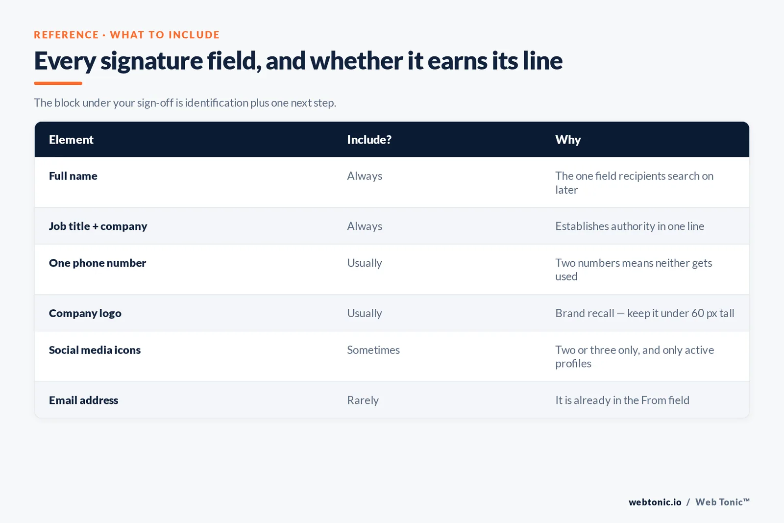
The best email signature examples share one trait: they are built from a short, fixed list of contact details. Before you copy an email signature template or open an email signature generator, agree on which of the fields below your company actually needs.
The job of the block under your sign-off is identification and one next step. Everything else competes with the message. HubSpot's signature guidance and the Exclaimer signature handbook converge on the same short list, which is a useful sign that the format is genuinely settled.
| Element | Include? | Why |
|---|---|---|
| Full name | Always | The one field recipients search on later |
| Job title + company | Always | Establishes authority in one line |
| One phone number | Usually | Two numbers means neither gets used |
| Company logo | Usually | Brand recall; keep under 60 px tall |
| Website link | Usually | The default soft CTA |
| Social media icons | Sometimes | Two or three only, and only active profiles |
| Headshot | Sometimes | Strong for agents and consultants, odd for support teams |
| Pronouns | Optional | Company norm; one short line |
| Email address | Rarely | It is already in the From field |
| Quotes and disclaimers | Only if required | Legal or regulatory obligation only |
Two constraints sit behind those choices. First, rendering: Google publishes the CSS Gmail supports, and the list is short enough that table-based layouts with inline styles remain the only safe approach. Second, accessibility: colour contrast and real alt text still apply here, and the WCAG 2.2 quick reference is the standard to check against — a mid-grey signature on white commonly fails it.
20 email signature examples by role
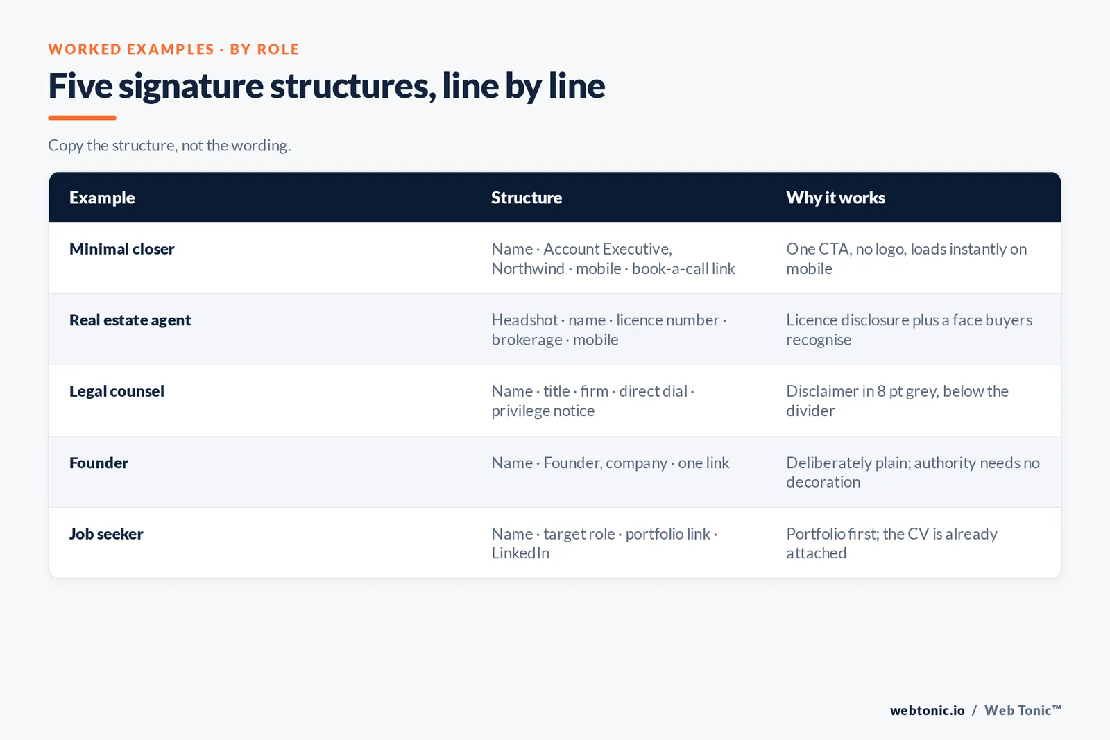
Each of these email signature examples is written as it would appear, line by line — a personal email signature for a founder, a business email signature for a sales team, a modern email signature for a marketer. Copy the structure, not the wording. Every one of them can be rebuilt as an email signature template in a generator or by hand in under ten minutes.
Sales and business development
| Example | Structure | Why it works |
|---|---|---|
| 1. Minimal closer | Name · Account Executive, Northwind · mobile · book a call link | One CTA, no logo, loads instantly on mobile |
| 2. Calendar-first | Name · title · "15 min? → calendar link" | Removes the scheduling reply entirely |
| 3. Territory line | Name · title · "Serving TX, OK, NM" · phone | Pre-qualifies inbound replies |
| 4. Proof point | Name · title · logo · "Rated 4.8 on G2" | One credibility signal, no banner |
| 5. SDR two-line | Name · "Sales Development, Northwind" · phone | Highest-volume senders need the lightest block |
Marketing, agency and founder
| Example | Structure | Why it works |
|---|---|---|
| 6. Brand-led marketer | Logo left · name, title · website · 2 social icons | Vertical divider keeps two columns readable |
| 7. Content promoter | Name · title · "Latest: [one article link]" | Rotating link that is genuinely useful |
| 8. Agency account manager | Name · title · client-hours line · phone | Sets response expectations up front |
| 9. Founder signature | Name · Founder, company · one link | Deliberately plain; authority needs no decoration |
| 10. Podcast or event host | Name · title · "Speaking at [event], March" | Time-boxed line, removed after the date |
Real estate, healthcare and legal
| Example | Structure | Why it works |
|---|---|---|
| 11. Real estate agent | Headshot · name · licence number · brokerage · mobile | Licence disclosure plus a face buyers recognise |
| 12. Property team | Name · team name · office address · listings link | Address doubles as a local trust signal |
| 13. Clinic administrator | Name · role · clinic · phone · confidentiality notice | Notice is required, so keep it to two small lines |
| 14. Practitioner | Name, credentials · specialty · booking line | Credentials after the name do the qualifying |
| 15. Legal counsel | Name · title · firm · direct dial · privilege notice | Disclaimer in 8 pt grey, below the divider |
Regulated senders carry an extra constraint. Confidentiality and privilege notices belong in the smallest readable size beneath a divider so they never compete with the identification block, and commercial senders should check obligations against the FTC's CAN-SPAM compliance guide before adding promotional links.
Support, students and job seekers
| Example | Structure | Why it works |
|---|---|---|
| 16. Support agent | First name · "Support, Northwind" · help centre link | Deflects the next ticket before it opens |
| 17. Ticket follow-up | Name · team · "Rate this reply" link | One measurable action, no branding clutter |
| 18. Student | Name · degree, university · graduation year · phone | Graduation year answers the recruiter's first question |
| 19. Job seeker | Name · target role · portfolio link · LinkedIn | Portfolio first; the CV is already attached |
| 20. Freelancer | Name · discipline · availability line · rate-card link | Availability line filters unusable enquiries |
How to design an email signature that reflects your brand
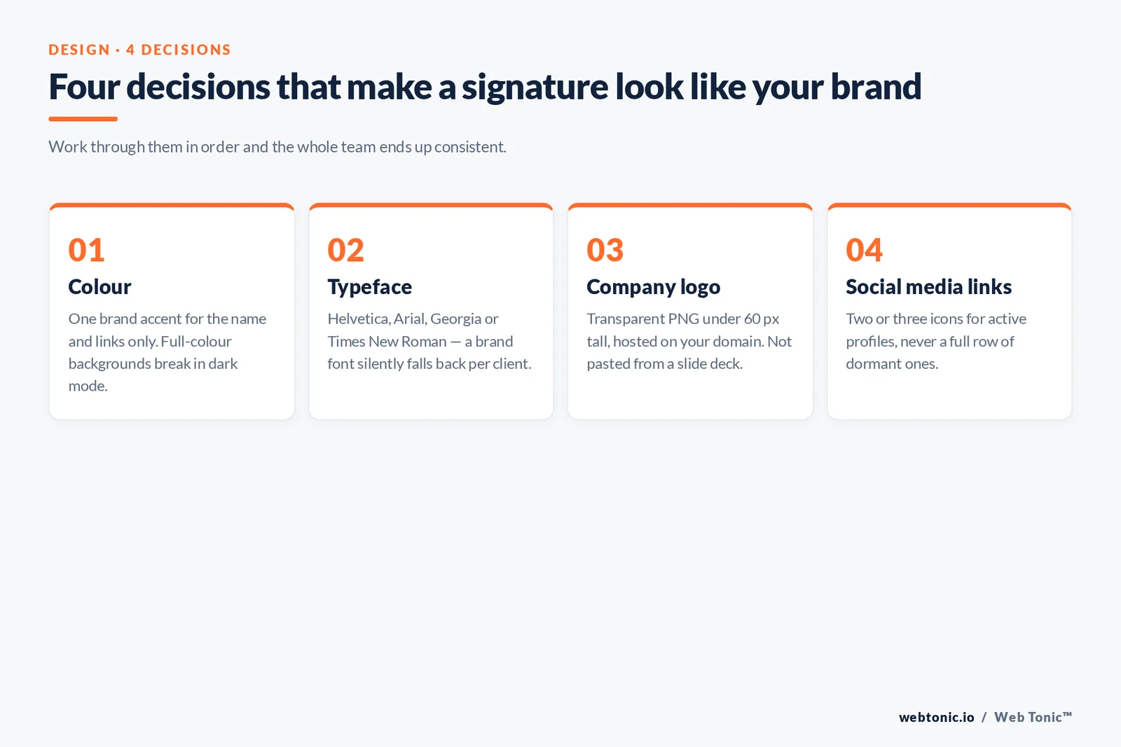
Brand fit is the difference between a generic email signature template and one that looks like it belongs to your company. Work through four decisions in order, and every email signature across the team ends up consistent.
| Decision | Rule | Common error |
|---|---|---|
| Colour | One brand accent for the name and links only | Full-colour backgrounds that break in dark mode |
| Typeface | Helvetica, Arial, Georgia or Times New Roman | A brand font that silently falls back per email client |
| Company logo | Transparent PNG, under 60 px tall, hosted on your domain | A logo pasted from a slide deck at 900 px wide |
| Social media links | Two or three icons, active profiles only | A full row of social media icons, half of them dormant |
Then write the copy for the smallest screen. A mobile email signature has room for a name, a job title, a phone number and one link — so draft that version first and treat the desktop block as the expanded variant, not the other way round. The best email signature design work happens in this order because it forces you to decide what is essential before you decide what is decorative.
One more brand note: a modern email signature does not need to look designed. Some of the strongest professional email signatures are three lines of plain text in the company typeface.
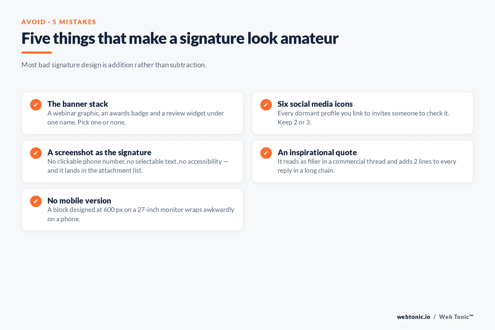
Five mistakes that make an email signature look amateur
Most bad signature design is addition rather than subtraction. These five appear in almost every audit we run across a client's team.
- Mistake 1 — the banner stack. A webinar graphic, an awards badge and a review widget under one name. Pick 1 promotional element or none at all.
- Mistake 2 — six social media icons. Every dormant profile you link to invites someone to check it. Keep 2 or 3 active ones.
- Mistake 3 — a screenshot as the signature. One flat image means no clickable phone number, no selectable text and no accessibility. It also lands in the recipient's attachment list.
- Mistake 4 — an inspirational quote. It reads as filler in a commercial thread and adds 2 lines to every reply in a long chain.
- Mistake 5 — no mobile version. A signature designed on a 27-inch monitor at 600 px wide will wrap awkwardly on a phone, where a large share of business email is now opened.
A quick way to test all five: send the signature to yourself, open it on a phone with images turned off, and read only what remains. If the block still identifies you and offers one next step, it is finished. If it does not, the design was carrying the information rather than the text.
Consistency across a team matters as much as any single design choice. When 20 people write their own blocks you end up with 20 variants of the company name, three logo versions and a mix of fonts — which is why one central template, updated once a quarter, beats individual creativity here.
Email signature design rules that survive every email client
Inbox share shifts constantly — Litmus tracks email client market share across Apple Mail, Gmail and Outlook — so the practical goal is a block that degrades gracefully everywhere rather than one that is pixel-perfect in a single client.
- Width under 320 px. Above that, mobile clients wrap lines mid-sentence.
- 2 fonts maximum, both web-safe: Helvetica, Arial, Georgia or Times New Roman. Custom fonts silently fall back.
- Font size 12 to 14 px for the name block, 10 to 11 px for disclaimers.
- Logo under 50 KB and hosted on your domain. Never paste an image copied from a document.
- PNG or JPG only. SVG is blocked by most clients, so keep vector files for print.
- Real alt text on every image — around 40% of the block disappears when images are blocked by default.
- Dark mode check: a logo on a white background becomes a white slab. Use a transparent PNG and test.
- One divider — a 1 px rule, not a coloured bar.
- No tracking pixels in personal signatures. Consent rules apply to the signature block too.
How to add an email signature in Gmail, Outlook and Apple Mail
Every email client stores the signature in a different place, and each one treats pasted HTML slightly differently. The Gmail, Outlook, Apple Mail and mobile paths below cover the vast majority of business email clients in use.
| Client | Path | Watch out for |
|---|---|---|
| Gmail | Settings → See all settings → General → Signature | Pasted HTML is sanitised; unsupported CSS is dropped |
| Outlook (web + desktop) | Settings → Mail → Compose and reply → Signatures | Word-based rendering changes image spacing |
| Apple Mail | Settings → Signatures → drag into the list | "Match message font" strips your styling |
| Mobile apps | Per-account signature setting | Default "Sent from…" text stays unless replaced |
| Company-wide | Admin console or a signature management tool | Central control is the only way to keep 50+ users consistent |
Google's signature help page and Microsoft's Outlook instructions cover the exact clicks and are updated when the interfaces change.
Free email signature generators and templates
A free email signature generator is the fastest path to a valid block if you do not want to hand-code one. Each email signature generator below outputs a professional email signature you can paste straight into Gmail or Outlook.
| Generator | Best for | Note |
|---|---|---|
| HubSpot signature generator | Fast, clean single-user blocks | Six templates, direct HTML copy-out |
| WiseStamp examples library | Browsing by industry | Strong for real estate and consultants |
| Exclaimer | Company-wide rollout | Central templates and disclaimer control |
| Hand-coded table | Brand-strict teams | Most reliable rendering; needs a developer once |
The HubSpot generator is the quickest route to a valid block, and WiseStamp's example library is useful for seeing how each industry handles headshots and licence lines.
Does the signature block move any numbers?
Modestly, and only when it is measured. Email remains one of the highest-volume channels in existence — Statista tracks daily worldwide volume in the hundreds of billions — so a link sent by 30 employees compounds even at a low click rate. Compare any signature CTA against your own channel baselines rather than a blog average; Mailchimp's benchmark data is a reasonable reference point for campaign email, not for one-to-one sends.
Two practical rules follow. Tag the signature link with its own campaign parameters so the traffic separates cleanly in analytics — the same discipline we apply in data intelligence engagements. And change the link, not the layout: rotating one destination per quarter tells you far more than redesigning the block. If the destination is a landing page, make sure it is built to convert before you point 10,000 monthly emails at it, which is where web development and growth marketing earn their keep.
FAQ
What should a professional email signature include?
A professional email signature should include your full name, job title and company, one phone number, and one link — usually your website or a booking page. A small company logo and two or three social media icons are optional. Skip your email address, quotes and stacked promotional banners.
How many lines should a professional email signature be?
Four to seven lines, under 320 pixels wide. High-volume senders such as sales development reps and support agents should sit at the low end, because a long block repeats on every reply in a thread.
Should I put a headshot or company logo in my email signature?
It helps in relationship-led roles such as real estate, consulting and recruiting, where recognition matters. It adds little for support, engineering or internal-facing roles. If you use one, keep it under 100 pixels square with real alt text.
What is the best free email signature generator or template?
HubSpot's free generator is the fastest for a single clean block, WiseStamp's library is best for browsing industry examples, and Exclaimer is the practical choice for rolling out consistent templates across a whole company.
Why does my email signature look broken in Outlook or Apple Mail?
Outlook's desktop rendering handles images and spacing differently from Gmail and Apple Mail, so flexbox and modern positioning break. Rebuild the block as a simple table with inline styles, keep images as PNG or JPG, and test in each client before rolling it out.
Do business email signatures need a legal disclaimer?
Only if your industry or jurisdiction requires one — healthcare, legal and financial services commonly do. When required, set it in 10 to 11 pixel grey text beneath a divider, and check promotional links against CAN-SPAM guidance.
Sources: HubSpot — Professional Email Signatures · HubSpot Email Signature Generator · Exclaimer Signature Handbook · WiseStamp examples · Google Workspace Help · Microsoft Support · Gmail supported CSS · Litmus email client market share · W3C WCAG 2.2 · FTC CAN-SPAM guide · Statista · Mailchimp benchmarks. Questions on rollout? Get in touch or read more on the Web Tonic blog.