
Table of contents
The right call to action turns passive visitors into paying customers, and the wrong one bleeds money from every campaign you run. Below you will find proven CTA examples across websites, emails, social media, and landing pages — backed by conversion data that shows exactly why they work.
Key Takeaways
- Personalized CTAs convert 202% better than generic default versions, according to a HubSpot study analyzing over 330,000 calls to action.
- Single-CTA landing pages convert at 13.5%, while pages with three or more CTAs drop to 10.5% — a gap that costs roughly $10 extra per lead at $10 CPC.
- Changing CTA button copy from second-person to first-person (e.g., "Start my free trial" vs. "Start your free trial") increased CTR by 90% in controlled A/B tests.
- Inline CTAs produce 121% more clicks than sidebar CTAs, making placement within the body of your content critical for engagement.
- Social media posts with specific, action-oriented CTAs outperform posts without CTAs by 2–3x in engagement rate across Instagram, LinkedIn, and Facebook.
A call to action is the bridge between a visitor's interest and a measurable business outcome — a click, a sign-up, a purchase, a download. Yet most marketing teams still default to "Submit" or "Learn More" without testing whether those generic phrases actually drive the behavior they want. At Web Tonic, we have tested thousands of CTA variations across 750+ client campaigns, and the data consistently shows that specific, benefit-driven CTAs outperform vague ones by wide margins. This guide breaks down the best call to action examples by channel, with the numbers behind each approach. For more marketing insights like this, explore the Web Tonic blog.
What Makes a Great Call to Action
Before diving into examples, it helps to understand the anatomy of a high-converting CTA. The best calls to action share three characteristics: they use an action verb that tells the user exactly what to do, they communicate a clear benefit the user will receive, and they reduce friction by addressing the biggest objection (time, cost, or commitment).
The data backs this up. According to KISSmetrics, a single word change in CTA button copy can swing conversion rates by 10–30%. ContentVerve documented a 38% lift in clicks just by changing "Order Information" to "Get Your Free Quote" — the second version focused on what the user receives rather than what they have to do.
Here is a quick framework for writing CTAs that convert:
| Element | Weak Example | Strong Example | Why It Works |
|---|---|---|---|
| Action Verb | Submit | Get My Free Report | Focuses on the outcome, not the effort |
| Benefit-Led | Click Here | Start Saving Today | Tells users what they gain from clicking |
| Friction Reducer | Sign Up | Start Free — No Credit Card | Removes the biggest objection (cost/commitment) |
| First-Person | Start Your Trial | Start My Free Trial | First-person "my" increased CTR by 90% in A/B tests |
| Urgency | Learn More | Claim Your Spot — 12 Left | Scarcity triggers faster decision-making |
The average high-converting CTA button copy is just 3.4 words long, according to an analysis of 90 high-performing buttons by Foundry CRO. Brevity matters — users scan, they do not read. Every extra word adds cognitive load that reduces the likelihood of a click.
Website CTA Examples That Drive Conversions
Your website is the highest-stakes environment for CTAs because every visitor arrived with some level of intent. The challenge is matching your call to action to where the user sits in the buying journey — a first-time visitor needs a different CTA than someone returning for the third time.
PartnerStack increased conversions by 111.55% by changing their primary CTA from "Book a Demo" to "Get Started," according to HubSpot. The original CTA implied a time commitment and a sales call. The new one implied immediate access and low friction.
Here are the website CTA examples that consistently perform best across different page types:
| Page Type | CTA Example | Why It Converts |
|---|---|---|
| Homepage | See How It Works — 2 Min Demo | Low commitment, specific time frame |
| Pricing Page | Start Free for 14 Days | Eliminates cost objection with trial period |
| Blog Post | Download the Full Checklist | Offers tangible value beyond the article |
| Product Page | Add to Cart — Free Shipping Over $50 | Combines action with incentive |
| About Page | Talk to Our Team — No Strings Attached | Humanizes the brand, reduces fear |
| Exit Intent Popup | Wait — Grab 15% Off Before You Go | Urgency + discount at the point of abandonment |
One pattern that consistently underperforms is the generic "Learn More" button. It tells the user nothing about what happens after they click. Replace it with a specific benefit — "See Our Results," "Get Your Custom Plan," or "Watch the Case Study" — and you give visitors a reason to take the next step.
Landing Page CTA Examples
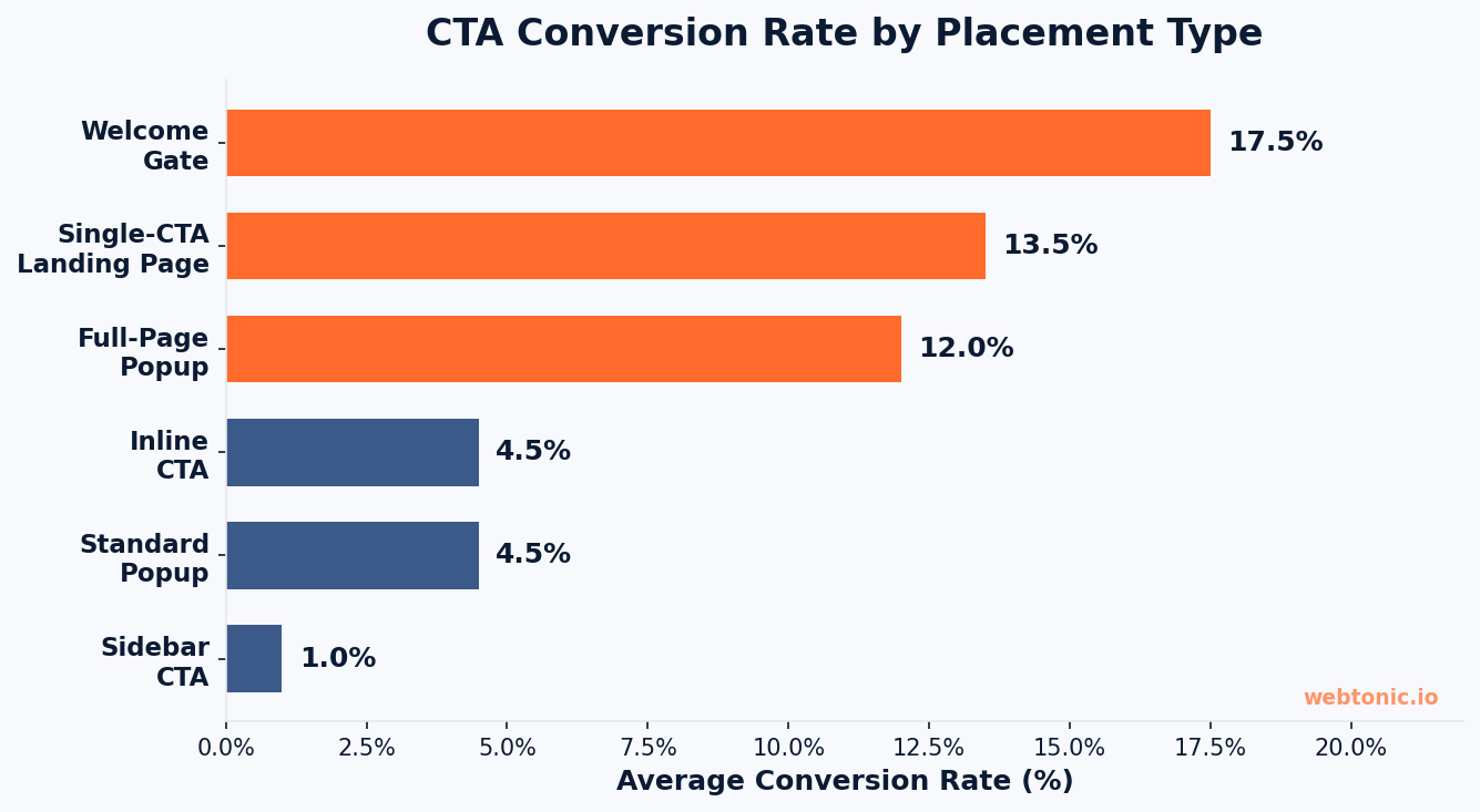
Landing pages exist for one purpose: to convert a single audience toward a single action. Every element on the page either supports the CTA or distracts from it. That is why single-CTA landing pages convert at 13.5% while pages with three or more calls to action drop to 10.5%, according to Unbounce's analysis of 18,639 landing pages.
The most effective landing page CTAs match the friction level of the offer. A high-friction ask like booking a demo needs a benefit-led CTA button that reduces anxiety. A low-friction ask like downloading a free guide can use more direct language.
Mailmodo lifted conversions by 110.35% by changing "Book a Demo" to "Talk to a Human." The new CTA addressed the core objection — that demos feel like sales pitches — and reframed the interaction as a genuine conversation.
Proven landing page CTA phrases that drive sign-ups and conversions include: "Build My Free Account," "Calculate My ROI," "Get a Custom Quote," "Show Me a Sample," and "See It In Action." Each of these tells the visitor exactly what they will receive and emphasizes ownership with first-person language. According to Popupsmart, naming the product and the price in three words (e.g., "Get Popupsmart Free") is one of the highest-converting patterns for freemium SaaS landing pages.
Email CTA Examples That Boost Click-Through Rates
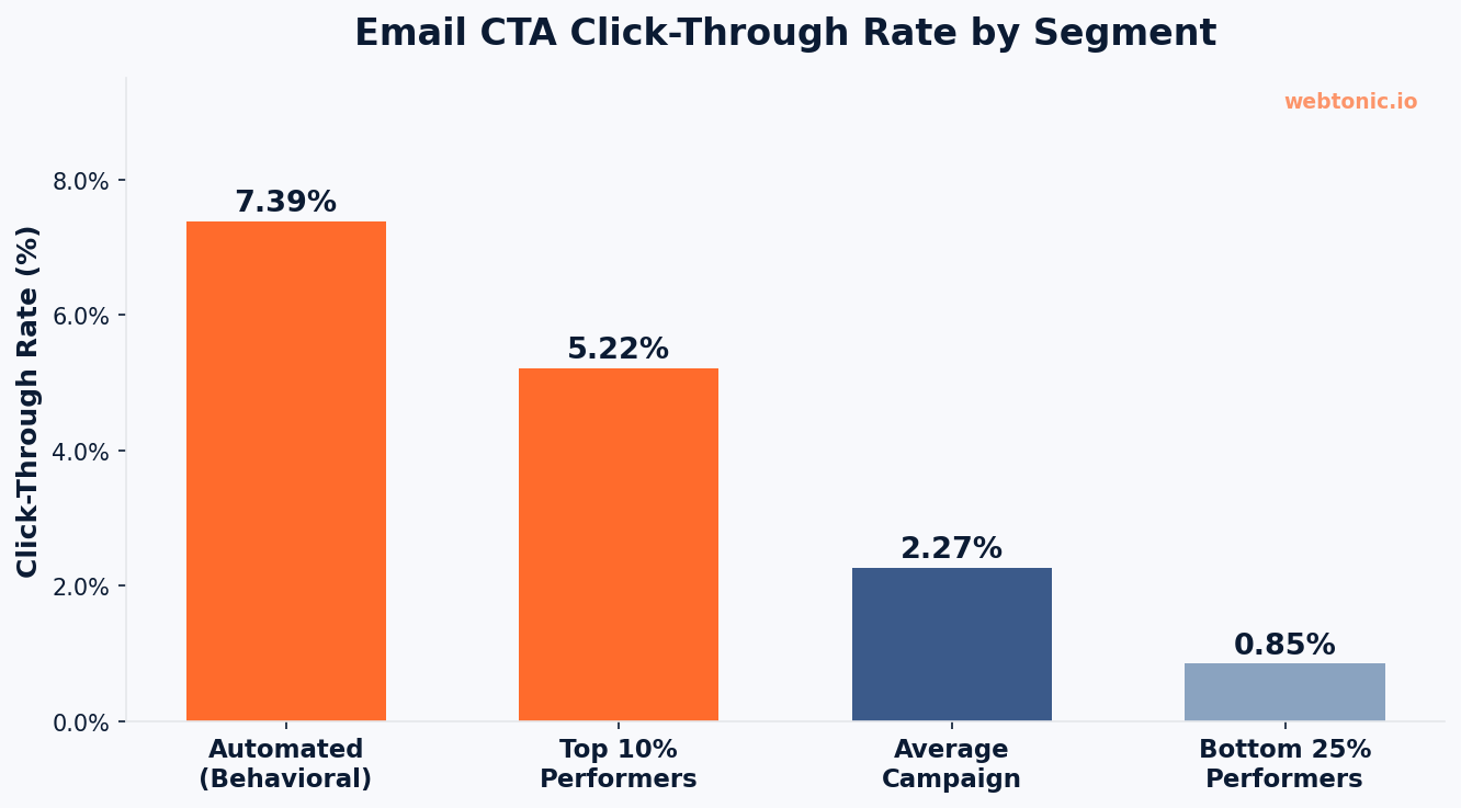
Email marketing is one of the few channels where the CTA carries almost the entire weight of the conversion. Your open rate gets the user's attention, but your call to action determines whether they actually do something about it. The average email click-through rate is 2.27% for marketing campaigns, but the top 10% of performers reach 5.22% — over double the average — according to Brevo's 2026 Marketing Orchestration Benchmark.
The gap between average and top-performing email CTAs comes down to three factors: relevance (behavioral triggers convert better than blast campaigns), specificity (telling users exactly what they get), and visual prominence (making the CTA button impossible to miss).
Automation-triggered emails achieve a 30.63% open rate and 7.39% CTR compared to the 20.73% open rate and 2.27% CTR of standard marketing campaigns. The lesson is clear: CTAs that arrive at the right moment — when the user has just taken an action — convert at 3x the rate of generic broadcast emails.
Here are email CTA examples segmented by campaign type:
- Welcome email: "Explore Your Dashboard" — guides new users to immediate value instead of selling
- Abandoned cart: "Complete My Order — Items Selling Fast" — combines urgency with first-person ownership
- Newsletter: "Read the Full Breakdown" — promises deeper value beyond the preview
- Re-engagement: "I'm Still Here — Claim My 20% Off" — uses first-person voice and incentive
- Product launch: "Be First to Try It" — exclusivity appeal for early adopters
- Webinar invite: "Save My Seat — Only 50 Spots" — scarcity drives faster registration
Social Media Call to Action Examples
Social media CTAs operate under different rules than website or email CTAs. The user is not on your platform — they are scrolling through a feed full of competing content. Your call to action has to feel native to the platform, match the content format, and ask for an action that makes sense in that context.
Posts with specific, action-oriented CTAs outperform posts without CTAs by 2–3x in engagement rate, according to Aibrify's analysis of Hootsuite Social Trends 2026 data. But the type of CTA needs to match the platform's engagement model.
Instagram CTA examples that drive meaningful engagement:
- "Save this post — you will need it when you plan your next campaign" (save CTAs produce the highest-quality engagement signal)
- "Drop a ✋ in the comments if you have made this mistake too" (specific micro-commitments drive the highest comment volume)
- "DM me 'GUIDE' and I will send you the full template for free" (DM CTAs convert at the highest rate for real interactions)
LinkedIn CTA examples for B2B audiences:
- "What is the most counterintuitive thing you have learned about [topic]? I will start: [your example]. Your turn ↓"
- "Repost this to share with your network — someone in your connections needs this today"
- "We help [target audience] with [specific problem]. DM me 'STRATEGY' and I will share what has worked"
Facebook CTA examples that work for both organic and paid:
- "Click the link in comments to grab the free download" (drives comment engagement alongside conversions)
- "Tag someone who needs to see this" (leverages existing audience for organic reach expansion)
- "Shop Now — Free Returns on Every Order" (removes purchase friction in ad placements)
CTA Button Design and Placement Best Practices
The most common question marketers ask about CTA buttons is "what color should my button be?" According to Poper's review of 12 years of A/B testing data, the color debate misses the point entirely. The famous HubSpot test showing red beating green by 21% was measuring contrast, not color psychology. A red button on a blue page outperforms a blue button on the same page because it stands out — not because red has special conversion properties.
What actually matters for CTA button design:
- Contrast: Your CTA button should be the most visually prominent element on the page. Whatever color achieves maximum contrast with your design is the right color.
- Size: Buttons need to be large enough to tap easily on mobile (minimum 44×44 pixels, per Apple's Human Interface Guidelines) but not so large they feel like banner ads.
- White space: Surround your CTA with breathing room. Cluttered designs reduce click rates because users cannot visually isolate the action.
- Placement: Inline CTAs produce 121% more clicks than sidebar CTAs. Place your primary call to action in the natural reading flow, not pushed to the margins.
Welcome gates (full-page CTAs) convert at 10–25%, popups at 1–8%, and sidebar CTAs at just 0.5–1.5%, based on data from First Page Sage. The hierarchy is clear: the more prominently you place your call to action, the higher the conversion rate.
CTA Conversion Rate Benchmarks by Channel
Understanding how your CTAs stack up against industry averages helps you set realistic targets and identify where the biggest improvement opportunities exist. The following table compiles the most current benchmarks from authoritative sources.
| Channel / CTA Type | Average Conversion Rate | Top Performers | Source |
|---|---|---|---|
| Single-CTA Landing Page | 13.5% | Up to 27.4% | Unbounce (18,639 pages) |
| Email Marketing CTR | 2.27% | 5.22% (top 10%) | Brevo 2026 Benchmark |
| Automated Email CTR | 7.39% | 12%+ | Brevo 2026 Benchmark |
| Welcome Gate / Full-Page | 10–25% | 30%+ | First Page Sage |
| Popup CTA | 1–8% | Up to 15% | First Page Sage |
| Sidebar CTA | 0.5–1.5% | 3% | First Page Sage / HubSpot |
| Personalized CTA | 202% above default | Up to 5x default | HubSpot (330,000 CTAs) |
| Social Media CTA Posts | 2–3x no-CTA posts | 5x+ with micro-commitments | Hootsuite 2026 |
The most striking number in this table is the 202% improvement from personalized CTAs. Personalization does not require complex technology — it can be as simple as dynamically changing the CTA text based on the traffic source, the visitor's industry, or whether they are a first-time or returning user. At Web Tonic, we use dynamic CTA personalization for our growth marketing clients and consistently see conversion lifts of 40–80% over static CTAs.
Common CTA Mistakes That Kill Conversions
Even experienced marketers fall into patterns that silently reduce the effectiveness of their calls to action. Here are the most costly mistakes we see during data intelligence audits of client campaigns:
- Using "Submit" as button text: This is the single worst CTA in digital marketing. It describes effort, not benefit. Replace it with what the user actually receives.
- Competing CTAs on the same page: Every additional CTA above one costs roughly $10 per lead in B2B SaaS at $10 CPC. If your page has three CTAs asking for different actions, you are creating decision paralysis.
- Hiding the CTA below the fold: If users have to scroll to find your call to action, you are losing the most motivated segment of your audience. Place a CTA above the fold and repeat it at natural break points.
- Ignoring mobile: Over 60% of web traffic comes from mobile devices. CTA buttons that are too small, text links that are hard to tap, and forms that require too much typing all destroy mobile conversion rates.
- No A/B testing: A single word change can swing conversions by 10–30%. If you are not testing your CTAs, you are leaving the easiest conversion gains on the table. Our performance creative team runs structured CTA tests for every client campaign.
- Mismatched CTA and ad copy: When your ad says "Get a Free Quote" and your landing page CTA says "Contact Us," the disconnect reduces trust and increases bounce rates.
Fill-In CTA Templates You Can Copy Today
Most teams do not need more CTA theory — they need templates. Swap the bracketed words for your own offer and you have a working call to action in under a minute.
| Goal | Fill-In Template | Worked Example | Why It Works Well |
|---|---|---|---|
| Lead capture | Get my free [deliverable] — no [objection] | Get my free site audit — no credit card | Names the deliverable and kills the top objection people have |
| Demo booking | See [product] in action in [time] | See the dashboard in action in 15 minutes | A good time cost makes the commitment feel small |
| Newsletter sign-up | Join [number] [people] getting [benefit] weekly | Join 12,000 marketers getting one growth teardown weekly | Social proof plus a defined cadence |
| Ecommerce | Shop [category] — [shipping or guarantee] | Shop winter boots — free returns for 60 days | Removes purchase risk at the click |
| Download | Download the [asset] your [role] will actually use | Download the CTA checklist your designer will actually use | Speaks to the person who will open the file |
| Consultation | Talk to a [specialist] about [problem] | Talk to a paid media specialist about wasted ad spend | Positions a person, not a form |
Rule 1 — keep button copy to 2–5 words and push the risk-reducing detail into microcopy under the button rather than inside it.
CTA Examples by Industry
The best call to action language changes with the buying cycle. A company selling a $40 product and a company selling a $40,000 service should never use the same button.
| Industry | Primary CTA | Secondary CTA | Buying Cycle Note |
|---|---|---|---|
| SaaS | Start free trial | Book a 15-minute demo | Self-serve first, sales-assist for larger seats |
| Home services | Get my free quote | Call now | Urgency is high — phone CTAs often beat forms |
| Ecommerce | Add to cart | Save for later | Short cycle; secondary CTA rescues undecided visitors |
| Professional services | Request a proposal | Download the pricing guide | Long cycle — give people a no-contact option |
| Healthcare | Book an appointment | Check insurance coverage | Trust and eligibility questions come before booking |
| Education | Apply now | Download the course brochure | Deadline-driven; add the date beside the button |
Rule 2 — every page should carry one primary CTA and at most one secondary CTA. Adding a third option reliably flattens click-through because visitors stop choosing. Our web development team builds this hierarchy into every template.
Rule 3 — test 1 variable at a time — verb, colour, or placement — and let each test run to at least 100 conversions per variant before you call a winner.
FAQ
What is a call to action and why does it matter?
A call to action (CTA) is a prompt that tells users to take a specific next step — click a button, fill out a form, make a purchase, or sign up for a free trial. CTAs matter because they are the primary conversion mechanism on any digital property. Without a clear call to action, visitors consume content but take no measurable action. According to HubSpot, personalized CTAs convert 202% better than default versions, which means the specific words and design of your CTA directly determine how much revenue your website generates.
How many CTAs should a landing page have?
One. Unbounce's analysis of 18,639 landing pages found that single-CTA pages convert at 13.5%, while pages with three or more CTAs convert at just 10.5%. Multiple CTAs create decision paralysis and dilute the user's attention. If your landing page has one clear objective — a sign-up, a download, a demo booking — use one CTA and repeat it at multiple scroll points rather than introducing competing actions.
What are the best CTA phrases for social media?
The best social media CTA phrases are platform-native and ask for a specific action aligned with the platform's engagement model. On Instagram, save CTAs ("Bookmark this post") produce the highest-quality engagement signals. On LinkedIn, comment CTAs with open-ended questions drive meaningful professional discussions. On Facebook, "Shop Now" with a friction reducer like "Free Returns" performs best for e-commerce. Posts with strong CTAs consistently outperform posts without CTAs by 2–3x in engagement rate.
Does CTA button color affect conversions?
Not the way most marketers think. The famous A/B test showing red beating green by 21% was measuring contrast, not color psychology. What matters is that your CTA button has maximum visual contrast with the surrounding page elements. A red button on a blue page outperforms a blue button — and vice versa on a red page. Focus on making your call to action button the most visually prominent element rather than searching for a "magic" color.
How do I write a CTA that converts?
Start with a strong action verb, communicate the specific benefit the user receives (not what they have to do), and reduce friction by addressing the biggest objection. Use first-person language ("Start My Free Trial" vs. "Start Your Free Trial") for a proven 90% CTR lift. Keep it under 3.4 words on average, and always A/B test your CTA copy — even small wording changes can swing conversions by 10–30%. Match the friction level of your CTA to the offer: high-value asks need more reassurance, while low-commitment offers can use direct language.
Sources
Foundry CRO — CTA Button Conversion Rate Benchmarks 2026
HubSpot — Call to Action Examples
Unbounce — Conversion Benchmark Report
Brevo — Email Marketing Benchmarks 2026
KISSmetrics — CTA Button Best Practices
Popupsmart — 100+ CTA Examples That Convert
Poper — CTA Button Color and Conversion
Aibrify — 100 CTA Formulas for Social Media
AdLibrary — Call to Action: What Works in 2026