
Table of contents
A call to action button has one job: get users to click one desired action. This is the CTA design, wording, placement and accessibility spec that separates a button users click from a coloured rectangle.
Key Takeaways
- Nielsen Norman Group found 79% of users scan a page and only 16% read word by word, so a call to action button has to survive a scan, not an argument.
- Button labels work best at 2–5 words, starting with a verb and describing the outcome the user gets.
- Accessibility sets the floor: 24×24 CSS pixels minimum target size under WCAG 2.2, 44×44 for the enhanced criterion, and 48×48 as the practical mobile recommendation.
- Contrast minimums are 4.5:1 for button text and 3:1 for the button's own boundary against its background.
- One primary CTA per screen, and one clear desired action, with any alternative demoted to a secondary or text style — competing primaries split attention.
- Documented cart abandonment averages around 70% across Baymard's study list, and a large share of that is checkout friction the button copy can partly defuse.
- Interaction feedback should land inside the 200 ms INP threshold, or users tap the button twice.
What a Call to Action Button Is (and What It Is Not)
A call to action button is an interactive control, styled to look pressable, that commits the user to one specific next action — buy, book, download, subscribe, start a free trial. It is not a banner, not a headline, and not a link buried in a paragraph. Users scan in predictable F-shaped patterns, so the distinction matters: they have learned a visual grammar for each of these, and breaking it costs clicks.
| Element | Signals | User expectation | Use for |
|---|---|---|---|
| Primary button | Solid fill, brand accent colour, generous padding | This is the main thing to do | The one action you want most |
| Secondary button | Outline or muted fill | A real alternative, lower priority | "Book a call" next to "Buy now" |
| Tertiary / text link | Underlined text, no container | Information, not commitment | "Compare plans", "See details" |
| Destructive button | Red fill or red outline | Something irreversible | Cancel, delete, close account |
| Disabled state | Reduced contrast, no hover | Not available yet | Incomplete forms — with a reason shown |
The Six Mechanics of an Effective Call to Action Button
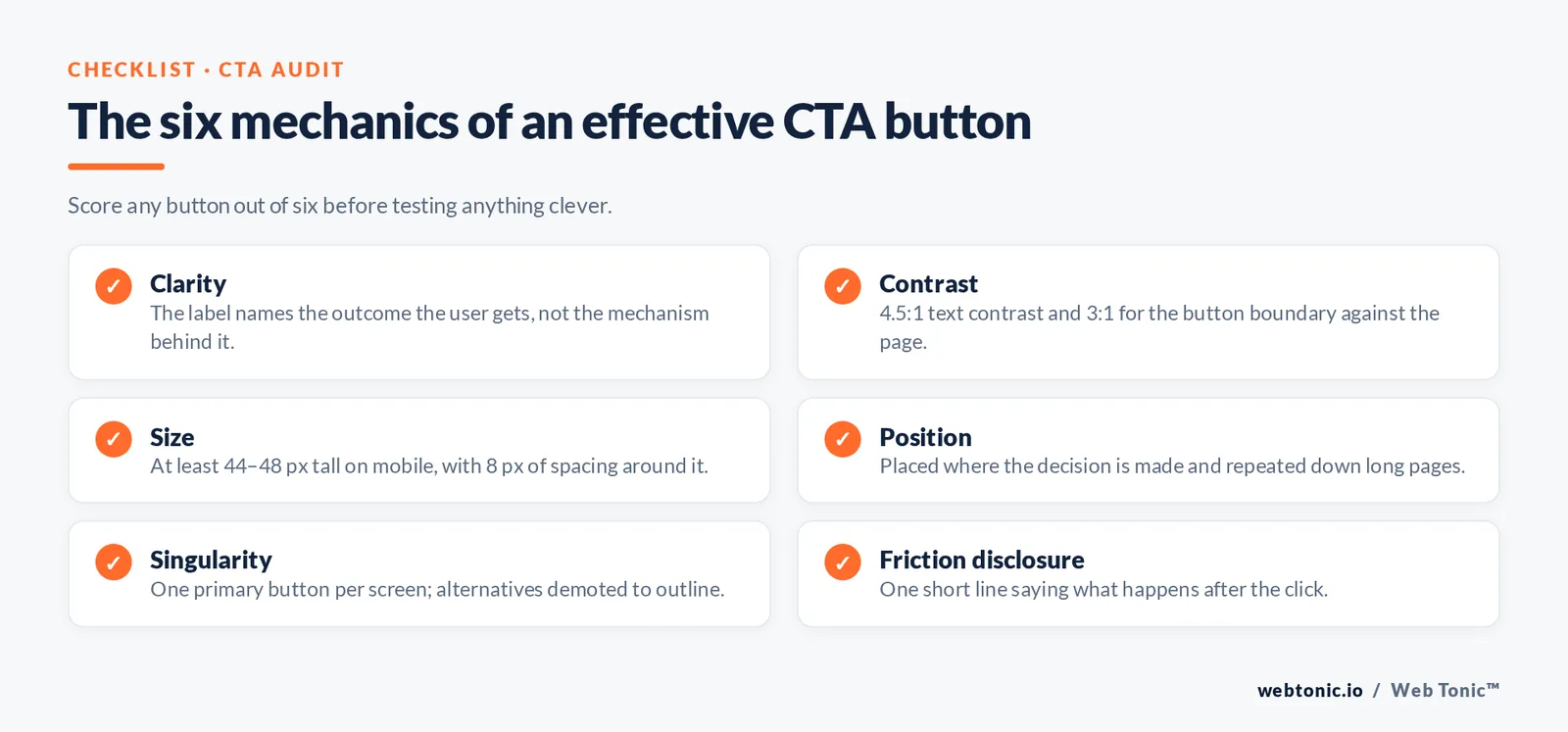
Every high-performing CTA button we audit gets the same six variables right. Score your own CTA out of six before you test anything clever.
| Mechanic | The rule | Fast test |
|---|---|---|
| Rule 1 — clarity | The label names the outcome, not the mechanism | Cover the page; does the label still make sense? |
| Rule 2 — contrast | 4.5:1 text contrast, 3:1 boundary contrast | Run a contrast checker on the exact hex values |
| Rule 3 — size | At least 44–48 px tall on mobile | Tap it with a thumb, not a mouse |
| Rule 4 — position | Where the decision is made, repeated down long pages | Screenshot at 3 scroll depths |
| Rule 5 — singularity | One primary per screen | Count solid-filled buttons above the fold |
| Rule 6 — friction disclosure | Say what happens next, in 1 short line | "No card required" beats a bigger button |
25 Call to Action Button Examples by Goal
CTA labels are not interchangeable. These call to action examples are grouped by the commitment level they ask for; matching commitment to traffic temperature is worth more than any colour test.
| Goal | Button examples | Why it works | Traffic it suits |
|---|---|---|---|
| Ecommerce purchase | Add to Bag · Buy Now · Shop the Sale | Names the exact commerce action | Warm, product-aware |
| Free trial | Start Free Trial · Try It Free for 14 Days · Start Building | Trial length removes the price question | Cold to warm SaaS |
| Lead capture | Get My Quote · Send Me the Plan · Check Availability | First person makes the value the user's | Local and service pages |
| Booking | Book a Free Call · Reserve My Spot · See Open Times | Implies a calendar, not a sales pitch | High-consideration offers |
| Download | Download the Checklist · Get the Template · Grab the Guide | Object noun sets expectations | Content and blog traffic |
| Subscribe | Join 12,000 Readers · Send Me Weekly Tips | Social proof inside the label | Blog, newsletter pages |
| App install | Get the App · Install Free | Matches store-page language | Paid social |
| Low-commitment next step | See How It Works · Watch the 2-Minute Demo | Time cost is disclosed | Cold traffic |
| Urgency-led | Claim My Discount · Lock In Today's Price | Creates a sense of urgency without a fake timer | Promotions, retargeting |
CTA Wording Patterns That Outperform "Submit"
Plain-language guidance is unambiguous here: use short, common words and start with the verb. "Submit" describes what your database does; "Get my quote" describes what the user gets.
| Weak label | Stronger label | Pattern applied |
|---|---|---|
| Submit | Get My Quote | Verb + first-person outcome |
| Learn More | See the 3-Step Process | Specificity + scope |
| Sign Up | Create My Free Account | Price objection removed |
| Contact Us | Talk to a Strategist | Names who answers |
| Click Here | Download the Pricing Sheet | Destination described (also better for screen readers) |
| Continue | Continue to Payment | Next screen disclosed |
| Register | Save My Seat | Scarcity implied honestly |
Primary CTA vs secondary CTA: how to split them
Most pages need two CTAs, not one: a primary CTA for the desired action and a secondary CTA for the user who is not ready. The mistake is giving both the same visual weight, which draws user attention in two directions at once.
| Page | Primary CTA | Secondary CTA | Visual split |
|---|---|---|---|
| SaaS home page | Start Free Trial | Book a Demo | Solid vs outline |
| Ecommerce product page | Add to Bag | Shop the Full Range | Solid vs text CTA |
| Local service page | Get My Free Quote | Call Now | Solid vs phone chip |
| Pricing page | Choose This Plan | Compare All Plans | Solid vs link |
| Blog article | Download the Template | Subscribe for Weekly Tips | Inline card vs footer CTA |
| Checkout | Place My Order | Keep Shopping | Solid vs muted, 2 sizes apart |
Good and bad website CTA examples by site type
What counts as a good call to action button depends on what the site sells and how much the visitor already knows. These are the CTA patterns that lift conversion rates per website type, and the ones that flatten them.
| Website type | Effective CTA | Weak CTA | Why the difference |
|---|---|---|---|
| Ecommerce store | Shop New Arrivals · Add to Bag | View Products | Commerce verbs match shopping intent |
| SaaS product | Start Free Trial · Create My Free Account | Request Information | Free trial removes the price objection |
| Local service brand | Check Availability · Book My Visit | Submit Enquiry | The user wants a slot, not a form |
| Lead-gen site | Get My 2-Minute Estimate | Contact Us | Time cost disclosed up front |
| Media / blog | Download the Checklist | Sign Up | The object of value is named |
| Nonprofit | Fund 5 Meals Today | Donate | Impact per click is concrete |
| Marketplace | Browse Free Listings | Register Now | Value before commitment |
CTA buttons on Instagram, Meta and other social platforms
On social you do not design the CTA button, you pick it from a list — so the skill is matching the preset label to the first action on the landing page. A Shop Now CTA that lands on a blog post breaks the promise and burns the click.
| Preset CTA | Best use | Landing page must open with | Common mismatch |
|---|---|---|---|
| Shop Now | Ecommerce promotions | Product grid or product page | Home page with no offer |
| Learn More | Cold prospecting, complex offers | A short explainer plus one CTA | Immediate checkout |
| Sign Up | Free trials, newsletters, webinars | A 3-field form | A 12-field form |
| Download | Apps, guides, templates | The file or store listing | A gate the ad never mentioned |
| Book Now | Appointments, travel, services | A calendar | A contact form |
| Get Quote | High-ticket services | A qualifying question first | A price list |
| Send Message | Conversational selling | A staffed inbox | Nobody replying for 48 hours |
Urgency, scarcity and limited-time offers without the sleaze
A sense of urgency raises click-through when it is true and depresses trust when it is invented. The honest versions below all reference a real constraint, which is what makes the CTA credible.
| Urgency device | CTA wording | Requires | Risk if faked |
|---|---|---|---|
| Limited-time offer | Claim My 20% Before Friday | A real end date enforced in the cart | Repeat visitors stop believing any offer |
| Limited stock | Reserve the Last 6 | Live inventory count | Consumer-protection exposure |
| Capacity limit | Take One of 10 Seats | Genuine capacity cap | Refund requests |
| Price change | Lock In Today's Price | A scheduled increase | Churn after the reveal |
| Seasonal window | Book Before Peak Season | Seasonal calendar | Low, but weak if year-round |
CTA Design Specification: Colour, Size, Shape, Spacing
Benchmarks such as the Unbounce Conversion Benchmark Report show conversion rates vary far more by industry and offer than by styling: there is no universally best button colour. There is a best contrast relationship: the primary CTA should be the highest-contrast interactive element on the screen, and nothing else should borrow that treatment.
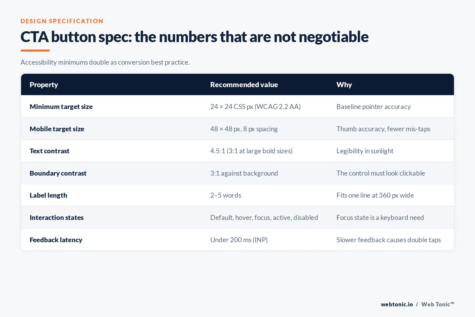
| Property | Recommended value | Why |
|---|---|---|
| Minimum target size | 24×24 CSS px (WCAG 2.2 AA) | Baseline pointer accuracy requirement |
| Mobile target size | 48×48 px with 8 px spacing | Thumb accuracy, mis-tap prevention |
| Text contrast | 4.5:1 (3:1 at 18.66 px bold or larger) | Legibility in sunlight and low vision |
| Boundary contrast | 3:1 against the page background | The control must look like a control |
| Label length | 2–5 words | Fits one line at mobile widths |
| Corner radius | Consistent across the design system | Consistency is the affordance, not the shape |
| States | 5: default, hover, focus, active, disabled | Focus state is a keyboard requirement |
| Feedback latency | Under 200 ms | Beyond it, users tap again and double-submit |
Placement: Where the CTA Button Goes on Each Page Type
"Above the fold" is not a rule, it is a shorthand. Put the button where the user finishes deciding — which is early on a simple offer and late on a complex one.
| Page type | Primary placement | Repeats | Mobile note |
|---|---|---|---|
| Short landing page | Hero, immediately under the subhead | 1 at the end | Keep hero copy to 3 lines so the button stays visible |
| Long-form sales page | After the proof section | Every 2–3 sections | Consider a sticky bar |
| Product detail page | Beside price and variant picker | Sticky add-to-cart | Never below the review block only |
| Blog article | After the first useful answer | 1 mid-article, 1 at the end | Inline card beats a floating overlay |
| Pricing page | Inside each plan card | Below the comparison table | One recommended plan highlighted |
| After the first paragraph | 1 in the footer | Bulletproof button with a text fallback |

Channel-Specific Call to Action Buttons
The same offer needs different button treatment per channel because the surrounding interface already sets expectations.
| Channel | Control you get | Best practice | Constraint |
|---|---|---|---|
| Website | Full control of copy and design | Design-system primary button | Must pass accessibility checks |
| HTML or image button | HTML button per email benchmarks guidance, 44 px tall | Images blocked by default in some clients | |
| Google Ads | No button; headline does the work | Put the action verb in headline 1 | Character limits |
| Meta and Instagram ads | Preset call to action button list | Match the button to the landing page's first action | Fixed label options only |
| YouTube | Overlay and end-card CTAs | Say the action out loud too | Small tap area on TV screens |
| In-app / product UI | Full control | One primary per view, destructive in red | Platform conventions differ |
Accessibility and Markup: the Part That Quietly Breaks Conversion Rates
A styled div is not a CTA button. The native button element is focusable, keyboard-activatable and announced correctly by screen readers, and the ARIA button pattern spells out the states it must expose; recreating that with divs and click handlers means rebuilding focus, Enter and Space handling by hand.
| Requirement | Do this | Not this |
|---|---|---|
| Semantics | <button> for actions, <a> for navigation | <div onclick=…> |
| Keyboard | Reachable by Tab, fires on Enter and Space | Mouse-only handlers |
| Focus visibility | Visible focus ring, 3:1 contrast | outline: none |
| Accessible name | Text label, or aria-label on icon buttons | An icon with no name |
| Loading state | Disable and announce progress | Silent 3-second wait |
| Form association | Labelled inputs above the button | Placeholder-only fields |
How to Design a CTA That Draws User Attention
Drawing user attention to a CTA button is a hierarchy problem: you are not making the button louder, you are making everything around it quieter. These are the seven techniques that grab user attention without shouting.
| Technique | How to apply it | Effect on clicks | Risk |
|---|---|---|---|
| Isolation | Give the CTA 2x the whitespace of nearby elements | Strong | Page feels sparse if overdone |
| Colour reservation | Use the accent colour for CTAs only | Strong | Breaks if marketing reuses the accent |
| Size step | Primary CTA at least 1.25x the secondary | Moderate | Oversized CTAs read as ads |
| Directional cue | Product shot or gaze pointing toward the CTA | Moderate | Arrows can feel dated |
| Micro-copy support | One line under the CTA: free, fast or reversible | Strong on paid traffic | None if it is true |
| Sticky repetition | Sticky bar CTA after 50% scroll | Strong on mobile | Obscures content if tall |
| Motion restraint | Subtle hover or press animation only | Small | Pulsing CTAs trigger banner blindness |
CTA Metrics: What to Measure After the Click
A CTA button that lifts clicks and drops sales is a losing test. Measure the whole chain so a wording change that inflates curiosity clicks does not get shipped as a win.
| Metric | What it tells you | Read it against | If it worsens |
|---|---|---|---|
| CTA click rate | Whether users notice and want the action | Your own 30-day baseline | Revisit label clarity and contrast |
| Click-to-form-start | Whether the CTA promise matched the next screen | Previous variant | Align the CTA with the form's first field |
| Conversion rate | Whether the extra clicks were qualified | Same traffic source only | Roll back; the CTA over-promised |
| Scroll-depth-to-click | Whether the CTA sits where users decide | Mobile and desktop separately | Move or repeat the CTA |
| Rage taps | Target size and feedback latency problems | Zero is the target | Raise size to 48 px, add a loading state |
| Revenue per session | Whether the CTA change paid for itself | 2 full business cycles | Keep the old CTA and retest the offer |
Seven Traps That Kill CTA Button Performance
- Trap 1 — two primaries. Two solid buttons side by side split attention; demote one to an outline style.
- Trap 2 — colour without contrast. A brand-accurate button that fails the 3:1 boundary check reads as decoration.
- Trap 3 — mystery labels. "Get started" with no context leaves the user guessing what the next 2 screens hold.
- Trap 4 — hidden cost reveals. Shipping or price surprises after the click feed the roughly 70% abandonment average.
- Trap 5 — tiny tap targets. Anything under 44 px tall on mobile produces mis-taps and rage taps.
- Trap 6 — no focus state. Removing the focus ring makes the button unusable for keyboard and switch users.
- Trap 7 — testing colour before copy. Label and offer changes move results far more than a hue swap; test them in that order.

How to Test a Call to Action Button Properly
| Step | What to change | Metric | Minimum to trust it |
|---|---|---|---|
| Step 1 | Label wording (outcome vs action) | Click-through on the button | 200+ conversions per variant |
| Step 2 | Friction disclosure line under the button | Form starts | 2 full business cycles |
| Step 3 | Placement and repeat count | Scroll-depth-to-click ratio | Segment mobile separately |
| Step 4 | Size and spacing on mobile | Mis-tap and rage-tap rate | Session recordings, 50+ |
| Step 5 | Colour and style | Conversion rate | Only after steps 1–4 |
If you would rather have this specified once, across every template, our web development and growth marketing teams build CTA systems as part of a site build — see the full services list or browse more conversion breakdowns on the blog.
FAQ
What is the best colour for a call to action button?
The one with the highest contrast against its surroundings that is not already used for non-clickable elements. Orange, green and blue all "win" in different case studies because in each case they were the highest-contrast option on that page. Test contrast, not hue.
How many words should a CTA button contain?
Two to five. That is long enough to include a verb and an outcome ("Download the checklist") and short enough to stay on one line at 360 px wide. Anything longer belongs in a supporting line under the button.
How many CTA buttons should a page have?
One primary action, repeated as often as the page length requires. A long sales page can carry the same button five times; what it cannot carry is five different primary actions, because every extra choice delays the decision.
Should CTA buttons be above the fold?
Only if the user can decide that early. For a simple, familiar offer, yes. For an expensive or unfamiliar one, the button performs better after the proof — but always place at least one within the first screen for returning visitors who already decided.
Do CTA buttons need to pass accessibility rules?
Yes, and the rules double as conversion best practice: minimum target size, 4.5:1 text contrast, a visible focus state and a real button element. Every fix in that list also reduces mis-taps for sighted mouse users.
Sources: Nielsen Norman Group research on how users read on the web and the F-shaped reading pattern; W3C WAI Understanding WCAG 2.2 target size and contrast criteria plus the ARIA Authoring Practices button pattern; web.dev guidance on accessible tap targets and Interaction to Next Paint; MDN Web Docs button element reference; plainlanguage.gov word guidelines; Baymard Institute cart abandonment research; Unbounce Conversion Benchmark Report; Mailchimp email marketing benchmarks.