
Table of contents
The banner ads that still earn clicks share a structure, not a style: one recognisable brand cue, one offer, one verb. Below are 18 banner ad example patterns, the sizes they belong in and the technical limits they must respect.
Key Takeaways
- Google reports its highest-performing display sizes as 300x250, 336x280, 728x90, 300x600 and 320x100 — four of the five are vertical or square.
- Uploaded display creative is capped at 150KB, and animation must stop after 30 seconds with a frame rate of 5fps or slower.
- Banner blindness is 20-plus years old as a documented behaviour: users learn to ignore anything shaped like an ad, so the design job is to look like content, not chrome.
- The Better Ads Standards list 12 ad experiences users find most intrusive — breaking them risks filtering in Chrome, not just poor click rate.
- A workable banner set is 5–8 sizes per concept, with the offer readable at 320px wide.
- Every pattern here can be verified against live advertisers using the Google Ads Transparency Center rather than a swipe file of dead creative.
Display advertising has an image problem: everyone can name a bad banner, almost nobody can name a good one. That is partly survivor bias and partly craft — the strong examples do their work in about a second and then get out of the way. This guide breaks the format down into repeatable patterns you can brief, and pairs each with the mechanic that makes it work. Our performance creative team uses the same list as a briefing checklist.
The rules banner examples have to obey
Before the creative discussion, the constraints. Display is the most rule-bound format in digital advertising, and most weak banners are simply the result of a designer discovering the limits after the layout was approved. Google publishes the exact requirements for uploaded display ad specifications.
| Constraint | Limit | Design consequence |
|---|---|---|
| File size | Max 150KB | Flat colour and vector shapes beat photography in small sizes |
| File types | GIF, JPG, PNG, plus HTML5 packages | Animation without HTML5 means GIF, so keep palettes small |
| Animation length | Stops after 30 seconds | Front-load the offer in the first 3 seconds and end on the CTA frame |
| Frame rate | 5fps or slower | Use held frames and wipes rather than smooth motion |
| Looping | Must not loop indefinitely | The final frame is the ad — it must stand alone |
| Intrusiveness | Better Ads Standards, 12 experiences | No auto-sound, no countdown blockers, no fake close buttons |
Sizes: where each example pattern lives
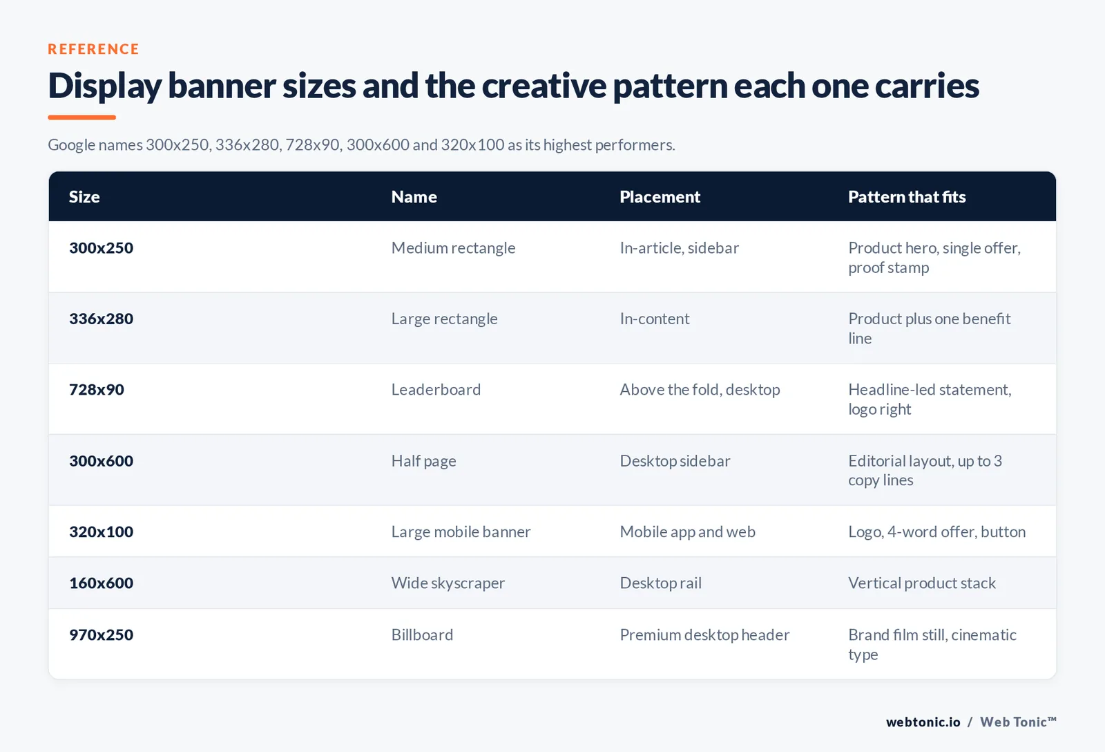
Size dictates pattern. A skyscraper can carry a product shot and three lines of copy; a mobile banner can carry a logo and four words. Google's guide to ad sizes and its notes on common responsive display sizes name the inventory that actually gets filled.
| Size | Name | Placement | Pattern that fits |
|---|---|---|---|
| 300x250 | Medium rectangle | In-article and sidebar, desktop and mobile | Product hero, single offer, social proof stamp |
| 336x280 | Large rectangle | In-content | Product plus 1 benefit line |
| 728x90 | Leaderboard | Above the fold, desktop | Headline-led statement, logo right |
| 300x600 | Half page | Desktop sidebar | Editorial layout, up to 3 copy lines |
| 320x100 | Large mobile banner | Mobile app and web | Logo, 4-word offer, button |
| 160x600 | Wide skyscraper | Desktop rail | Vertical product stack or scale illustration |
| 970x250 | Billboard | Premium desktop header | Brand film still, cinematic type |
Limit 1: a concept is not a design until it survives 320x100. Brief the mobile banner first. If the idea needs three lines to land, it is a landing page headline, not a banner.
18 banner ad examples, grouped into six patterns
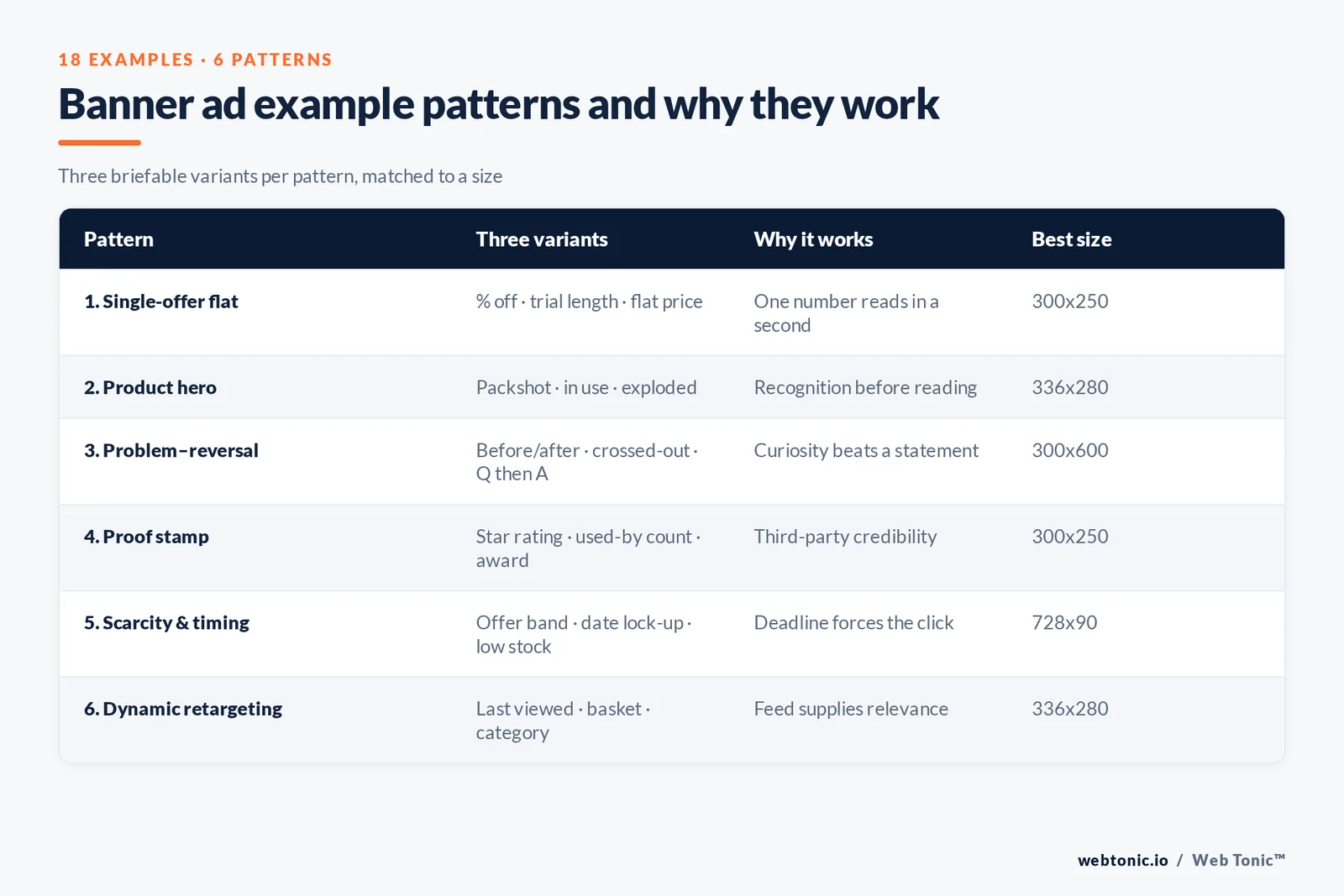
Each pattern below is a repeatable structure, followed by three example variants you can brief today. Where a claim needs a number, use your own account data — not the invented "482% lift" figures that circulate in swipe files.
| Pattern | Three example variants | Why it works | Best size |
|---|---|---|---|
| 1. Single-offer flat | Percentage-off badge · free-trial length · flat-rate price tag | One number carries the whole message, readable in under a second | 300x250, 320x100 |
| 2. Product hero | Packshot on colour · product in use · product exploded into parts | Category recognition happens before reading, which suits retail and hardware | 336x280, 160x600 |
| 3. Problem–reversal | Before/after split · crossed-out old way · question then answer frame | Curiosity gap survives banner blindness better than a statement | 300x600, 728x90 |
| 4. Proof stamp | Star rating · "used by N teams" · award or certification mark | Third-party credibility does the persuasion the copy cannot fit | 300x250, 970x250 |
| 5. Scarcity and timing | Limited-time offer band · seasonal date lock-up · low-stock cue | A deadline converts passive interest into a click now | 728x90, 320x100 |
| 6. Dynamic retargeting | Last-viewed product · abandoned basket total · category carousel | Relevance is supplied by the feed, so the creative can stay minimal | 300x250, 336x280 |
Rule 1 — one job per banner. The single reliable predictor of a weak banner is a second message crammed into the corner. If two offers matter, run two banners and let the auction decide.
Anatomy: the six elements every strong example contains
| Element | Budget | Common mistake |
|---|---|---|
| Brand cue | Logo at 10–15% of the canvas | Full lock-up with tagline, illegible at small sizes |
| Headline | 3–7 words | A sentence with a subordinate clause |
| Visual | One subject, high contrast | Busy lifestyle photo cropped to 320px |
| Offer | One number or one noun | Two competing discounts |
| CTA | 2–3 words in a solid button | "Learn more" on a purchase-intent campaign |
| Whitespace | Around 20% of the canvas | Edge-to-edge content that reads as clutter |
Static, animated, HTML5 and rich media
Format choice changes both cost and reach. Rich media formats defined in the IAB New Ad Portfolio unlock more creative range, but need more inventory-side support and more build time.
| Format | Build effort | Reach | When to choose it |
|---|---|---|---|
| Static JPG/PNG | Lowest — hours | Widest | Always build this set first as the control |
| Animated GIF | Low — 1 day | Wide | Offer needs a reveal, budget is small |
| HTML5 banner | Medium — 2–4 days | Wide on GDN | Multiple frames, crisp type, feed-driven text |
| Responsive display | Low, asset-based | Widest, machine-assembled | Coverage of long-tail placements at scale |
| Rich media / expandable | High — 1–2 weeks | Narrow, premium | Brand campaigns with guaranteed inventory |
Banner examples by campaign goal
The same product needs different banners at different funnel stages, and mixing them is how display gets its bad reputation for wasted spend. Match pattern to goal instead.
| Goal | Pattern to use | Copy angle | Primary metric |
|---|---|---|---|
| Brand awareness | Product hero, brand film still | Category claim, no offer | Reach and branded search lift |
| Consideration | Problem–reversal | One benefit versus the old way | Engaged visits, view-through |
| Lead generation | Single-offer flat | The asset, its length, its price (free) | Cost per qualified lead |
| Ecommerce sales | Dynamic retargeting | The exact product plus delivery promise | ROAS |
| Event or launch | Scarcity and timing | Date, place, deadline | Registrations |
| Win-back | Proof stamp | What changed since they left | Reactivation rate |
Animated and HTML5 banner design ideas that keep attention
Animation is where most banner design goes wrong: motion attracts attention for a moment and then costs you the message. These are simple, clear animated banner ideas that work inside the 5fps and 30-second limits, whether you build them as GIF banners or as HTML5 banner ads.
| Animated banner idea | Frames | How the animation carries the offer | Best format |
|---|---|---|---|
| Offer reveal | 3 | Brand frame, then problem text, then the discount and CTA button | GIF banner ads |
| Product rotation | 4 | One product image per frame, price held constant | HTML banners |
| Counter or price drop | 2 | Old price struck through, new price snaps in | HTML5 banner ads |
| Text wipe | 3 | Short headline lines wipe through one at a time | GIF or HTML |
| Video loop banner | Short video | Muted 6-second product video with a static CTA overlay | Rich media banner |
| Feed-driven text swap | Dynamic | HTML pulls live price or stock text from the feed | HTML5 banner ads |
Rule 2 — the last frame must sell alone. Because looping is capped, the frame the ad rests on is the one most people see. Put the brand, the offer and the CTA button in it every single time, and design every earlier frame as a bonus.
CTA text: banner examples that get the click
The call to action is the smallest and most tested element of any banner design. Low-pressure CTA text usually beats hard commands on cold display audiences, because the click is a browsing decision, not a buying one.
| CTA text | Pressure | Use it when | Pair it with |
|---|---|---|---|
| "Start free trial" | Medium | Software with genuinely free access | Trial length stated in 1 line |
| "See the range" | Low | Cold retail prospecting | A single product image, no discount |
| "Get the price" | Low | Considered services with variable cost | A proof stamp or rating |
| "Book now" | High | Retargeting with a deadline | A date or a 48-hour offer band |
| "Compare plans" | Low | Buyer is mid-consideration | Two plan names, no feature list |
| "Claim 20% off" | High | Basket abandoners inside 7 days | The exact product they viewed |
Keep the button visually solid, keep the label under 3 words, and never let the animation cover it. Brands like Amazon and Apple make the same choice on their display creative: a plain, high-contrast button doing one job.
Banner examples by industry
Industry changes which pattern lands, because it changes what the buyer needs to see before clicking. These are the pairings we brief most often, with the visual asset each one lives or dies on.
| Industry | Pattern that performs | Visual asset it needs | Copy to avoid |
|---|---|---|---|
| Ecommerce and retail | Product hero plus dynamic retargeting | Clean packshots on a brand colour, 1 per SKU | "Shop our range" with no product named |
| B2B software | Problem–reversal | UI fragment cropped to 1 screen element | Category jargon the buyer would never type |
| Financial services | Single-offer flat with rate or fee | Typographic layout, minimal imagery | Any claim that cannot fit its compliance disclaimer |
| Home and trade services | Proof stamp plus scarcity | Real crew or completed-job photo, not stock | "Best in town" with no rating to support it |
| Travel and hospitality | Scarcity and timing | One destination frame with a price lock-up | Three destinations in 300x250 |
| Health and wellness | Problem–reversal, softened | Calm single-subject photography | Outcome promises that trip ad policy review |
| Education and courses | Single-offer flat (start date, length) | Credential or partner mark | "Transform your future" with no programme detail |
| Events and ticketing | Scarcity and timing | Date, city and headline act in one lock-up | Line-ups too long to read at 90px tall |
Trap 1 — reusing the social creative unchanged. A 4:5 social asset cropped into a leaderboard loses its text and its subject. Rebuild the layout per aspect ratio; only the visual language should carry across, which is the point Google's own creative guidance keeps making about cross-format consistency.
How banner performance is measured — and what to ignore
Display is bought on impressions, so the metric set differs from search. Standards for what counts as a viewable impression come from the industry bodies, including the IAB Europe framework work, and the technical serving stack is documented in the Google Publisher Tag guides.
| Metric | What it really tells you | Weight it |
|---|---|---|
| Viewable impressions | Whether the ad had any chance of being seen | High — check before judging creative |
| Click-through rate | Curiosity, and a share of accidental mobile taps | Medium — compare only within the same 1 placement type |
| Cost per thousand impressions | Inventory quality and competition | High for awareness goals |
| Engaged sessions after click | Whether the promise matched the page | High — the best creative diagnostic |
| View-through conversions | Assisted impact, easily over-credited | Low — report separately, never blended |
| Branded search lift | Real awareness movement during the flight | High for brand campaigns |
Trap 2 — optimising a display campaign purely on click-through rate. Chasing clicks pushes creative toward misleading layouts and cheap, low-quality placements. Judge the set on cost per engaged session and on branded search movement instead, then let media strategy decide the budget split.
Why most banners fail: banner blindness and its workarounds
Nielsen Norman Group has documented banner blindness across two decades of eye-tracking: people skip regions that look like advertising, even when the ad contains the answer they are hunting for. The same research programme catalogues the advertising techniques users hate most, which map closely onto the experiences Chrome filters.
| Failure | What users do | Workaround that works |
|---|---|---|
| Looks like an ad slot | Skip the region entirely | Borrow the host page's type scale and restraint, not its logo |
| Too much copy | Read nothing | Cut to 7 words maximum and test the cut version |
| Aggressive motion | Actively avoid, sometimes install a blocker | Two or 3 held frames, no bouncing elements |
| Generic stock imagery | Fail to encode the brand | One owned visual asset repeated across all 7 sizes |
| Mismatched landing page | Bounce within seconds | Repeat the banner headline verbatim above the fold |
| Slow creative | Never see the ad | Stay well under 150KB and test against Core Web Vitals |
How to find real banner ad examples from any advertiser
Swipe files go stale. These sources show creative that is running now, which is a far better brief input than a 2018 listicle.
| Source | What you can see | Best for |
|---|---|---|
| Google Ads Transparency Center | Live display and video ads by advertiser and region | Competitive teardown of a named brand |
| Publisher spot checks | Real placements in context at real sizes | Judging legibility rather than aesthetics |
| Industry revenue reporting | Format-level spend shifts, via the IAB revenue report | Arguing budget mix internally |
| Category coverage | Trend commentary from display advertising analysts | Spotting format shifts early |
| Your own account | Asset-level performance in Google Ads | The only evidence that matters for your brand |
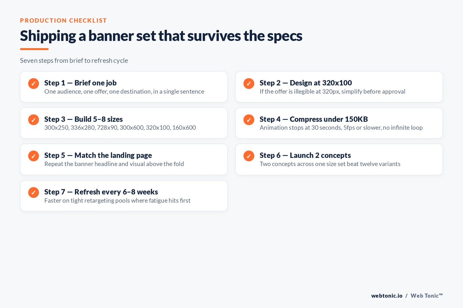
A production checklist for a banner set
Step 1 — brief one job. One audience, one offer, one destination, written in a single sentence before design starts.
Step 2 — design at 320x100 first. If the offer is not legible at 320px, simplify now rather than after approval.
Step 3 — build 5–8 sizes. Cover 300x250, 336x280, 728x90, 300x600, 320x100 and 160x600 as the core set.
Step 4 — compress under 150KB. Export twice, once flat and once animated, and check both against the platform limit.
Step 5 — match the landing page. Repeat the headline and the visual so the click feels continuous; our web development team treats this as a launch blocker.
Step 6 — launch 2 concepts, not 12. Two concepts across the same sizes produce a readable test; twelve produce noise at typical display budgets.
Step 7 — refresh on a 6–8 week cycle. Display fatigues faster than search creative, especially on tight retargeting pools.
Get those seven steps right and display stops being the line item nobody defends. If you would like the set built and tested for you, get in touch — or keep reading the Web Tonic blog for the rest of the paid media playbook.

FAQ
What makes a good banner ad?
One recognisable brand cue, one offer expressed as a number or a noun, one two-to-three-word call to action, and enough whitespace that all three read in about a second. Everything else — animation, photography, rich media — is optional decoration on top of that structure.
What are the best banner ad sizes?
Google names 300x250, 336x280, 728x90, 300x600 and 320x100 as its top performers, and 160x600 is worth adding for desktop rails. Building five to eight sizes per concept gives near-complete inventory coverage without multiplying design cost.
Are banner ads still effective in 2026?
Yes, for specific jobs: retargeting warm audiences, sustaining awareness cheaply, and supporting launches with cheap reach. They are weak as a standalone acquisition channel for considered purchases, which is why display usually works best budgeted alongside search rather than against it.
How big can a banner ad file be?
Uploaded display creative in Google Ads must stay at or under 150KB, in GIF, JPG, PNG or an HTML5 package. Animation stops after 30 seconds, must not loop indefinitely, and must run at 5 frames per second or slower.
How many banner ad concepts should I test at once?
Two strong concepts across the same size set. Display budgets rarely support more than that without splitting impressions so thinly that no variant reaches significance, so change one variable — headline, offer or visual — per round instead.
Sources
Google Ads Help — uploaded display ads specifications; common sizes for responsive display ads · Google AdSense Help — guide to ad sizes · Coalition for Better Ads — Better Ads Standards · IAB — New Ad Portfolio; internet advertising revenue report · Nielsen Norman Group — banner blindness findings; most hated advertising techniques · eMarketer — display advertising insights · IAB Europe · Google Publisher Tag developer guides · Think with Google — search creative guidance · web.dev — Core Web Vitals · Google Ads Transparency Center (cited, not linked). All URLs checked August 2026.