BreakoutLabs
One page, one argument
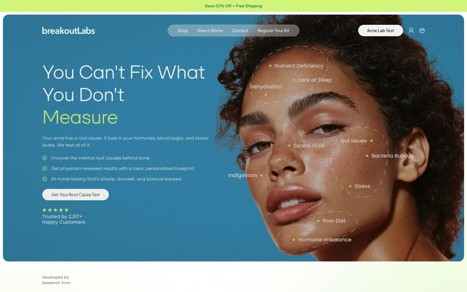
BreakoutLabs sells a digestive-enzyme and probiotic formula to people who have already tried every cream on the shelf. The product page is where that whole case has to be made, so that is where the work went.


01 — The challenge
Buyers arrive sceptical, and a standard PDP gives them nothing to change their mind with.
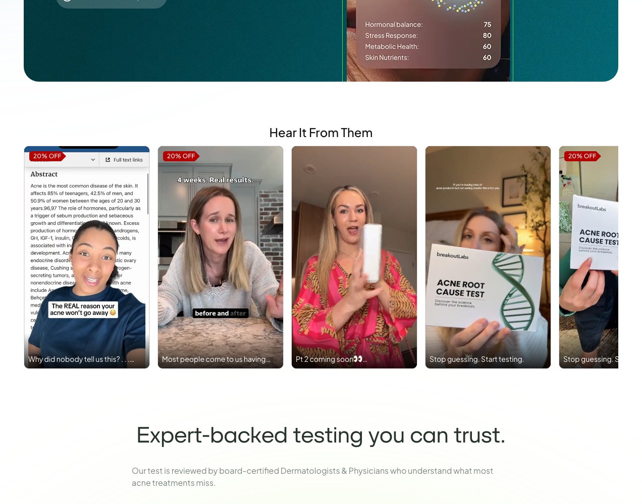
The audience for Calm & Clear has spent years and real money on cleansers, serums and prescriptions that did not work. They do not need another product card with three bullet points; they need the mechanism explained, the ingredients shown, the timeline made explicit and the risk removed before they will spend on yet another bottle.
The scope here was deliberately narrow — the product page and the conversion path around it — so every decision had to earn its place on a single scroll.
The hardest part of selling this product is not the price. It is convincing someone that the cause of their acne is somewhere they have never looked.
*
1
Product page carrying the entire mechanism, proof and offer
*
90
Day guarantee surfaced directly in the buy block
*
3
Bundle tiers with subscription and one-time pricing side by side
02 — Our approach
Turn the product page into an argument, then remove every reason to stall.
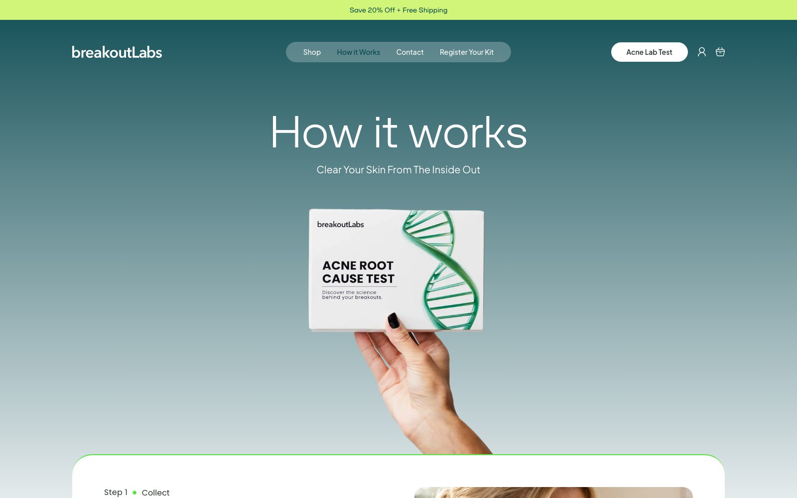
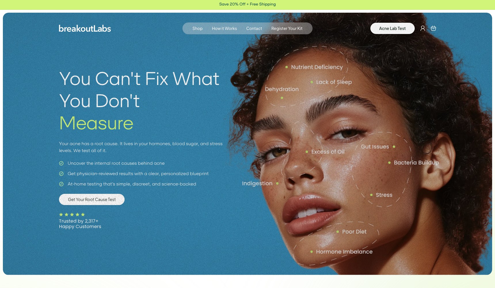
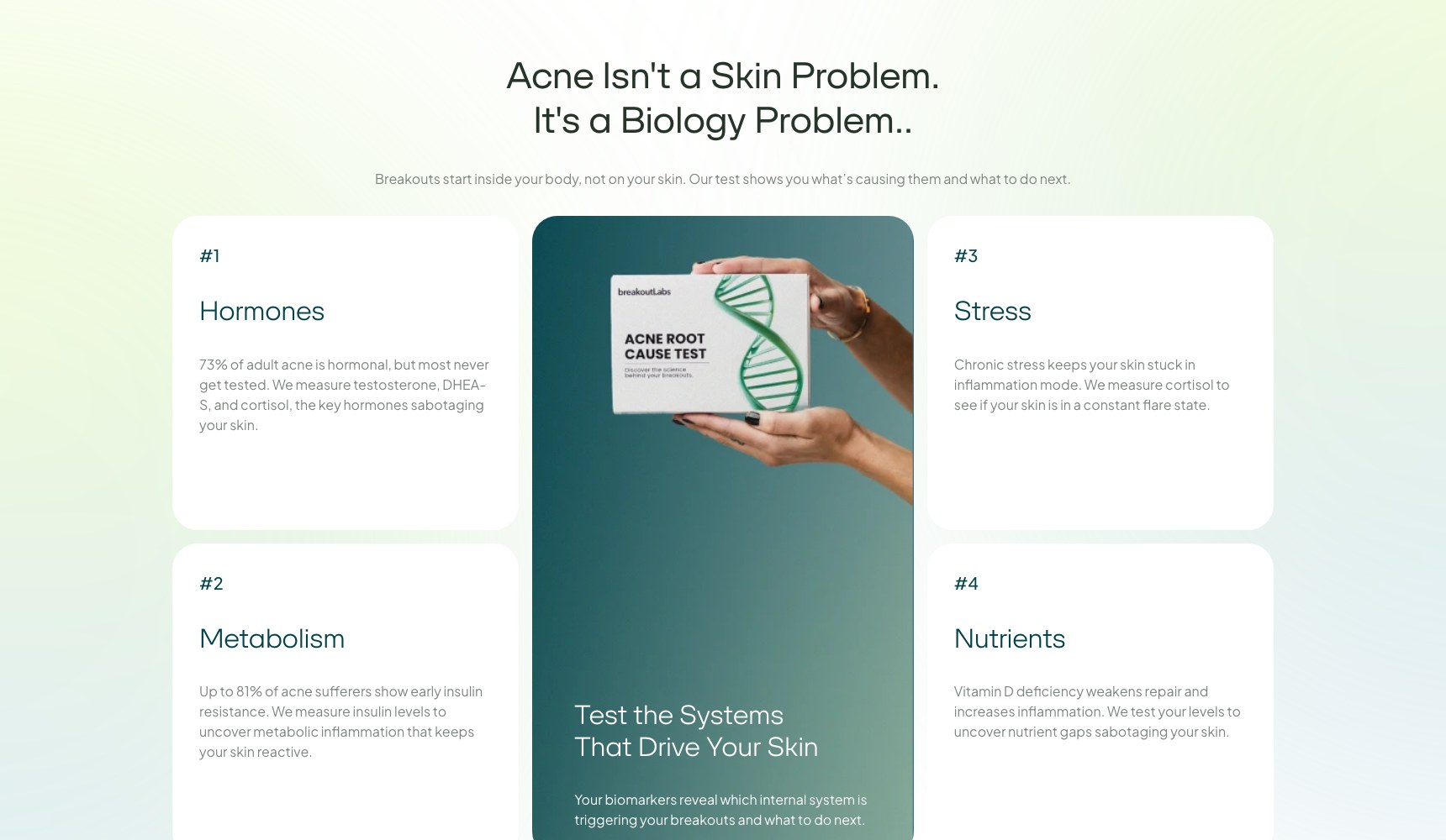
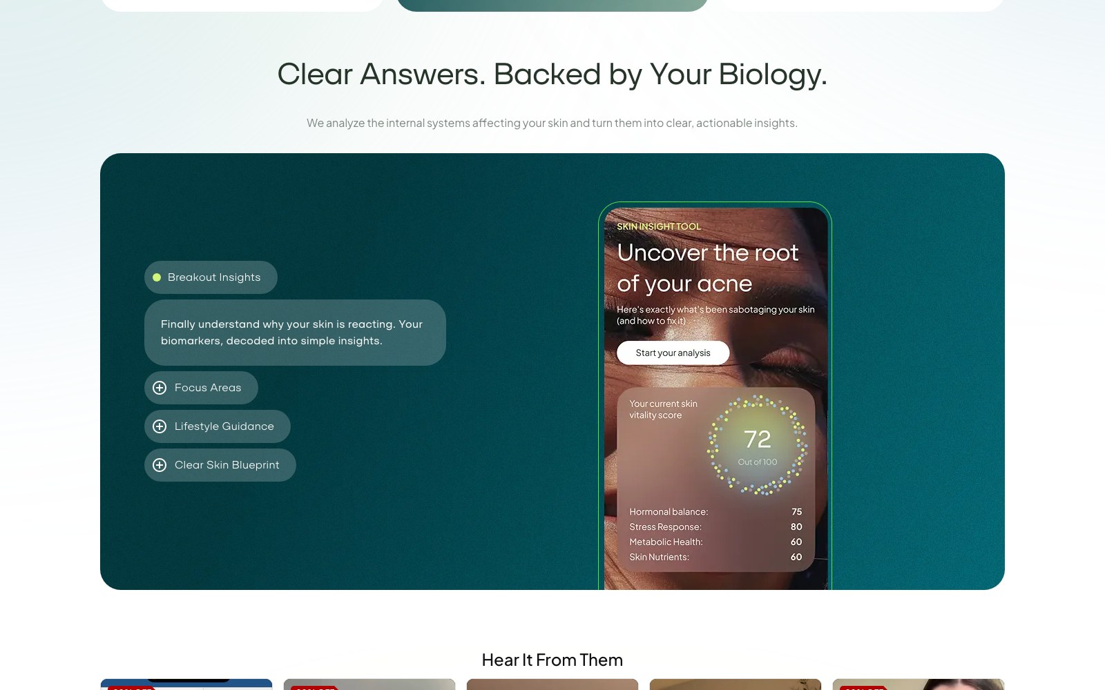
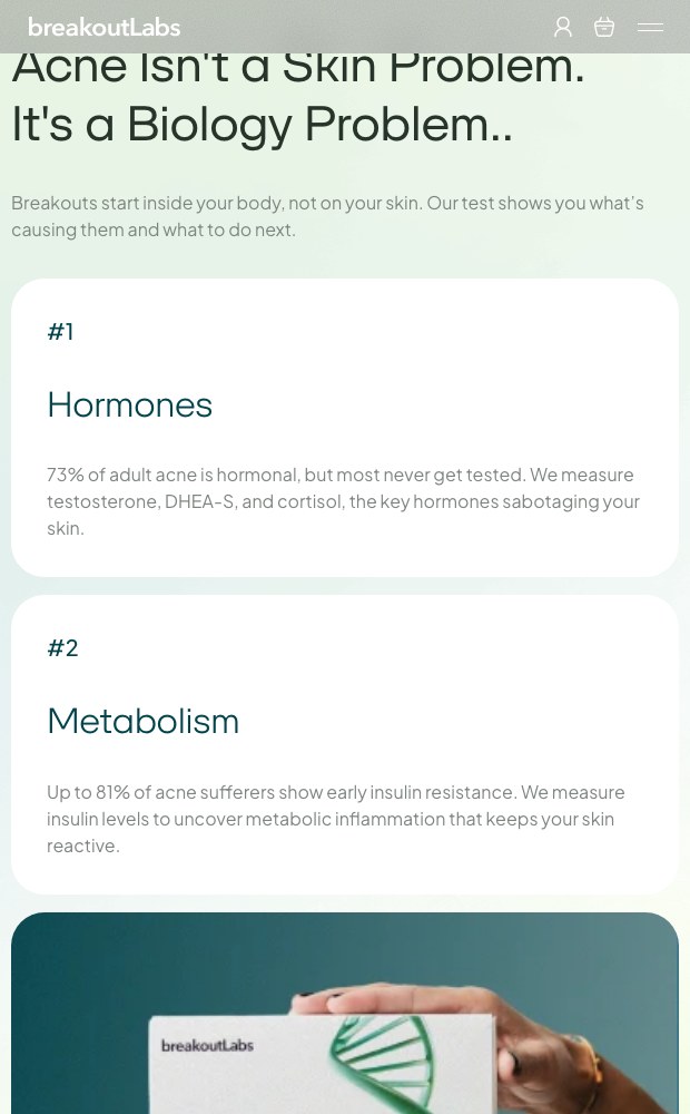
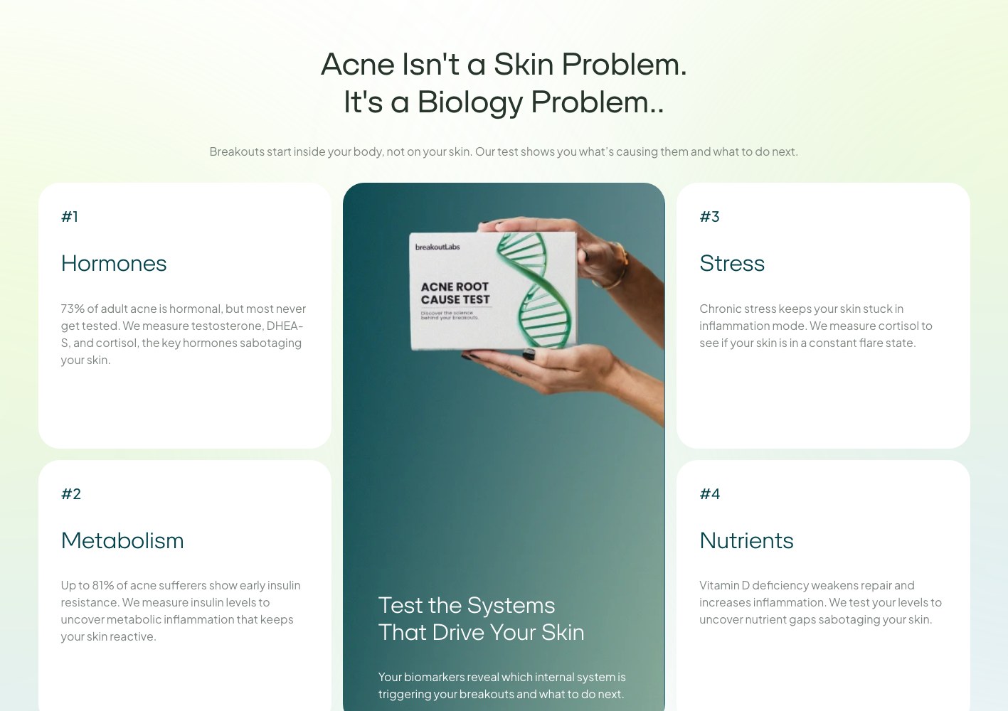
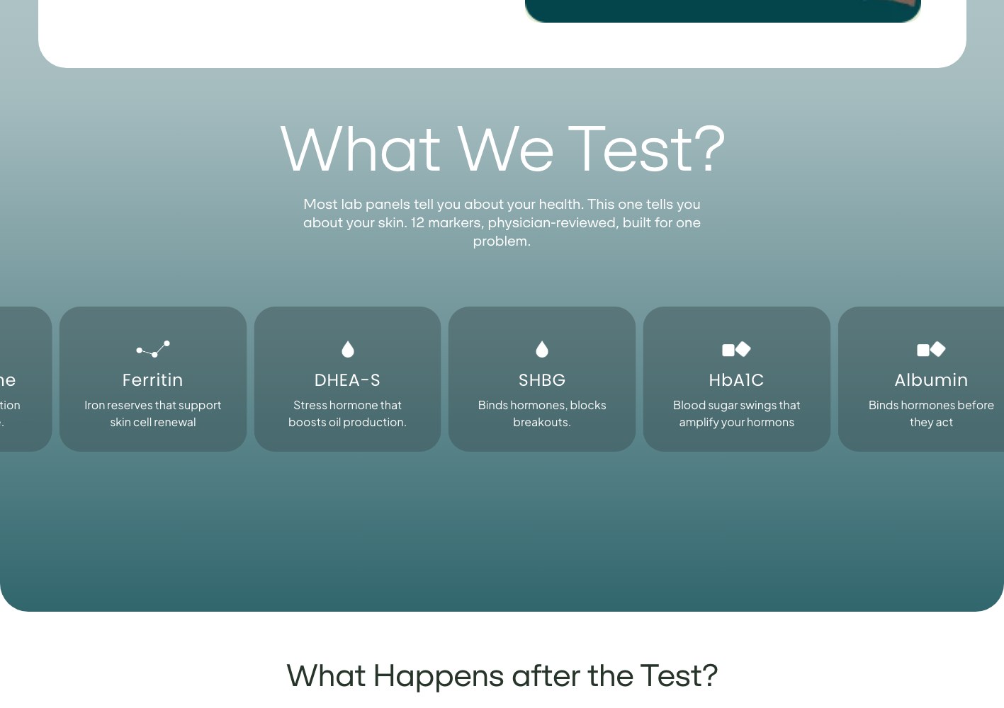
We rebuilt the page in the order a sceptical buyer actually reasons: what this is, why it works where topicals do not, what is literally inside it, when results show up, and what happens if it fails. The gut-versus-skin explanation sits high on the page with the enzyme, probiotic and inflammation mechanisms broken into expandable blocks, so a skimmer gets the headline and a researcher gets the detail without either being punished.
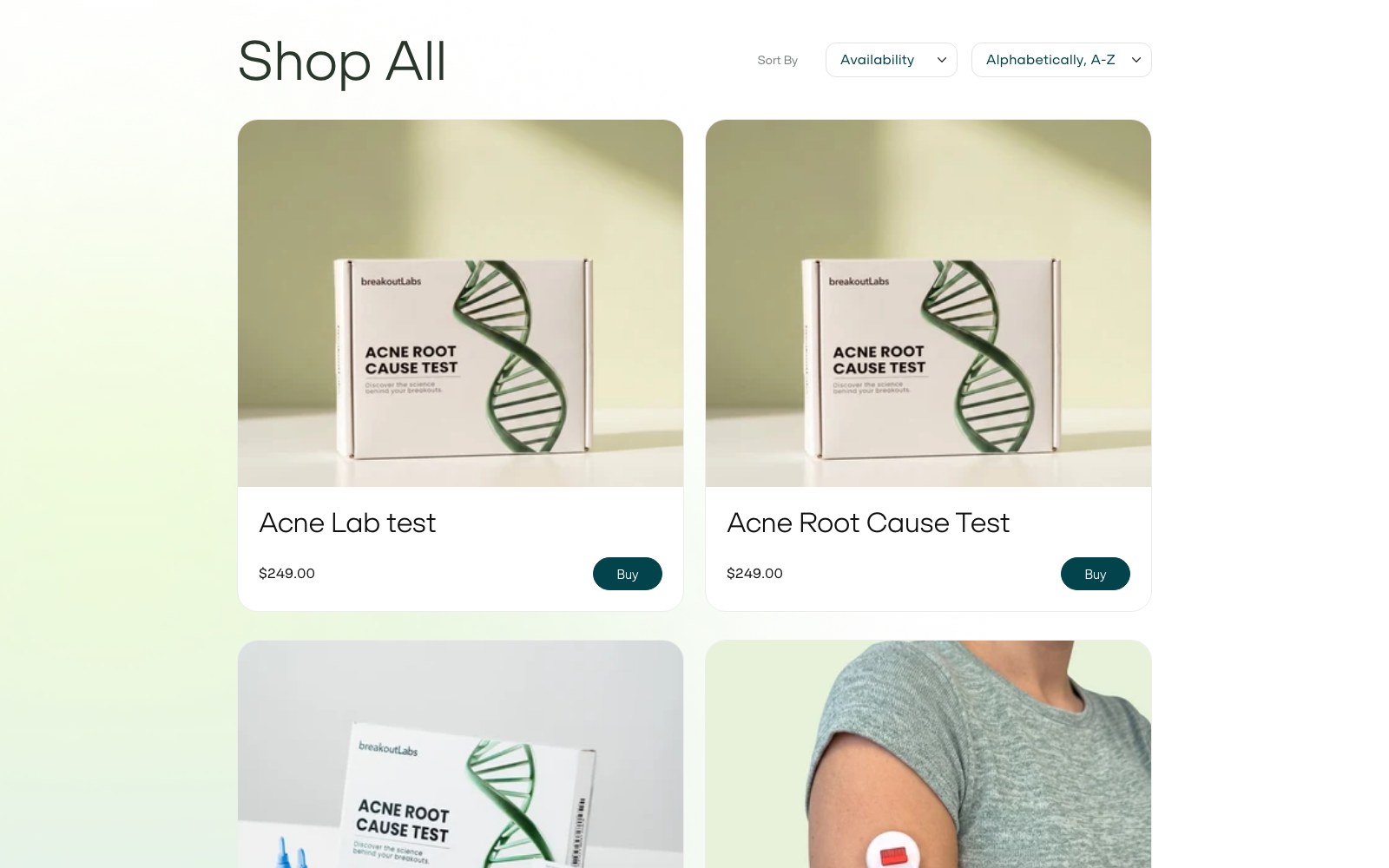
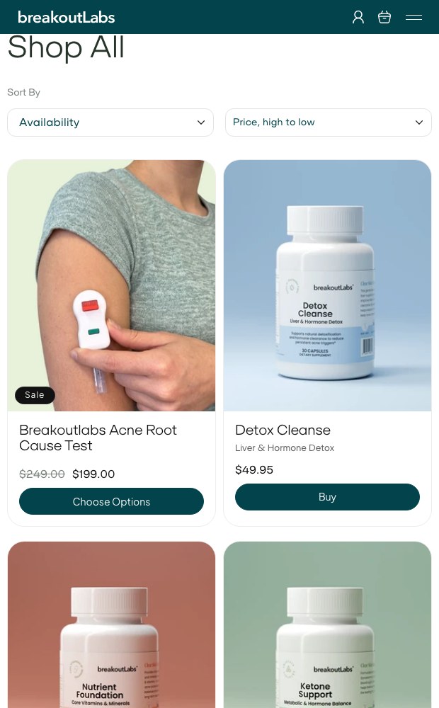
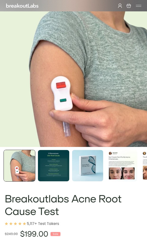
The buy block does the commercial work: three bundle tiers with the per-unit price shown, subscription against one-time purchase in the same view, stock and delivery expectations stated, third-party testing and manufacturing badges attached, and the 90-day guarantee written where the hesitation happens rather than buried in a policy page.
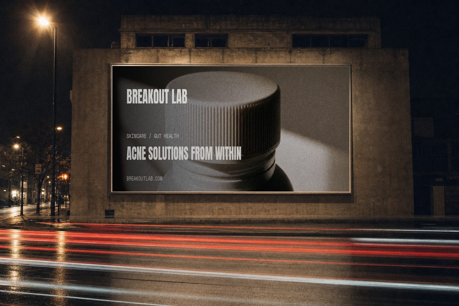
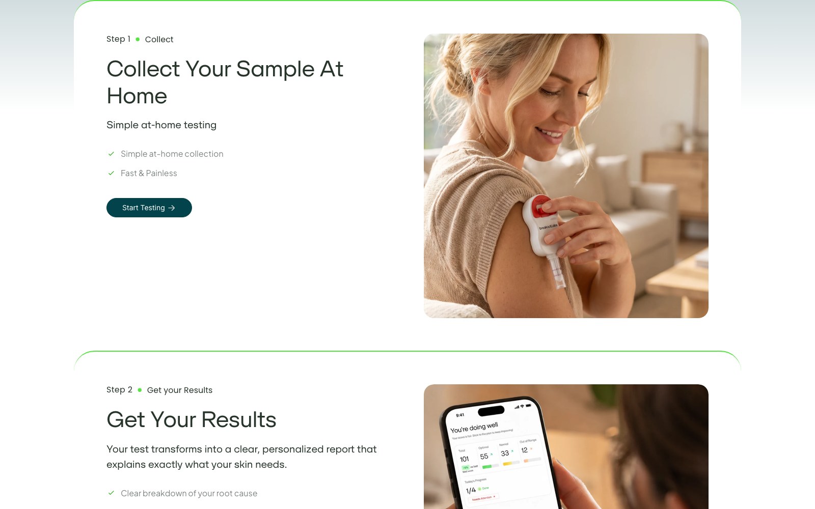
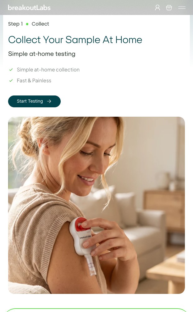
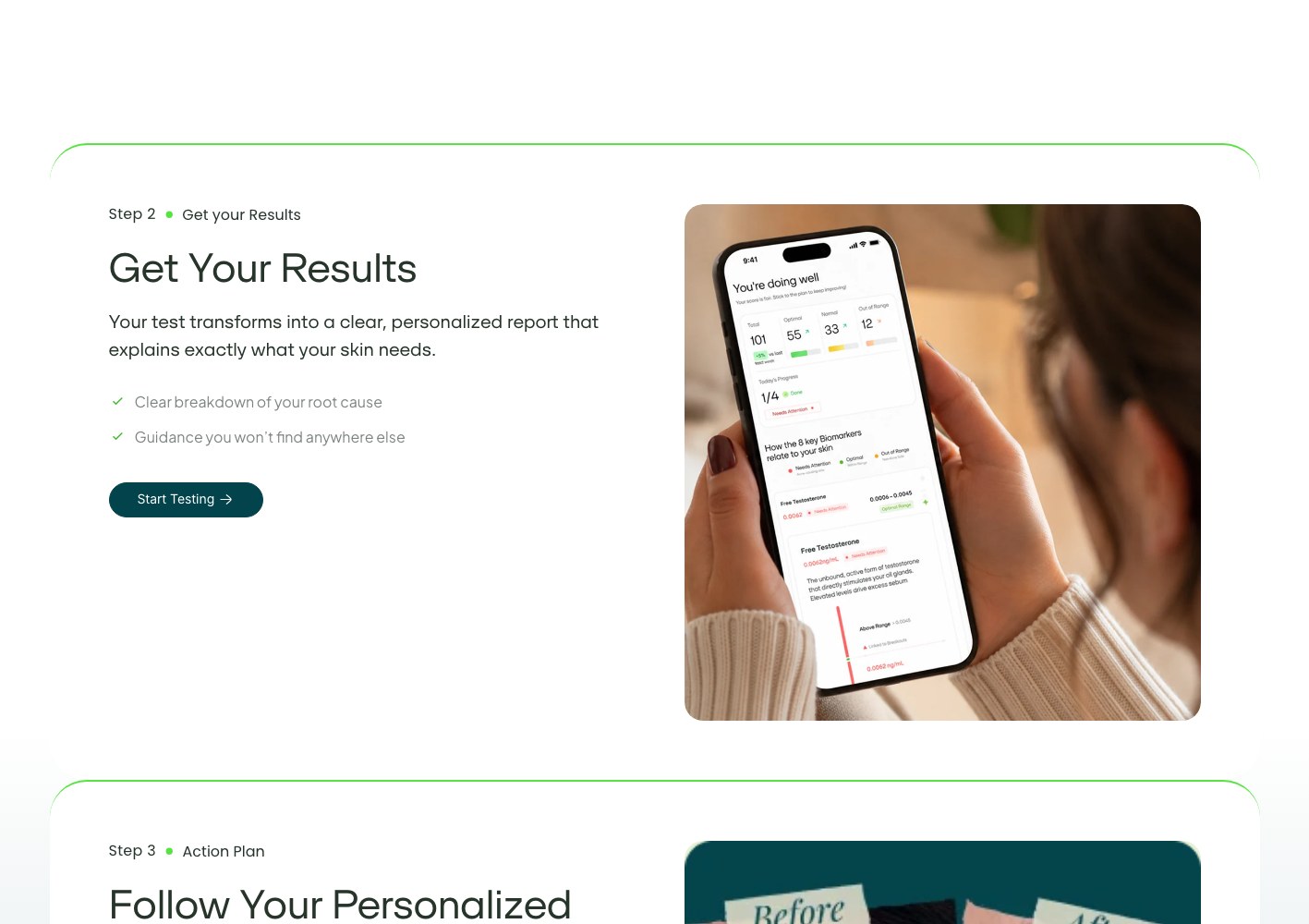
Below that, a week-by-week results timeline sets an honest expectation (calmer skin at four to six weeks, not overnight), and a long-form advertorial route gives cold traffic a narrative entry point into the same offer.
More on this work: Shopify Development · Web Design · Web Development.
one scroll, one case
The product page rebuilt as
a persuasion sequence.
We ordered the page the way a sceptical buyer reasons through it: mechanism first, ingredients second, timeline third, guarantee last. Gut-versus-skin explanation sits high. Enzyme, probiotic and inflammation detail lives in expandable blocks so skimmers get the thesis and researchers get the chemistry without either losing the thread.



03 — The results
The buy block now handles the objection and the offer together.
Three bundle tiers show per-unit pricing, subscription sits beside one-time purchase in the same view, stock and delivery are stated plainly, and the 90-day guarantee appears where the hesitation happens instead of three clicks away in a policy footer.
A week-by-week results timeline sets the honest expectation — calmer skin at four to six weeks, not overnight — and the long-form advertorial route gives cold traffic a narrative path into the same conversion block.
CASE STUDIES
Case studies
Website Portfolio
Video Ads
Static Ads

























































.webp)
.webp)