


Table of contents
Key Takeaways
- GUI design directly impacts business outcomes, with design-focused companies achieving significantly higher revenue growth and shareholder returns compared to competitors that underinvest in user experience
- The eight-step design process from user research through iterative improvement provides a structured framework for creating effective interfaces, with each phase building on insights from previous work
- Consistency and adherence to established patterns typically outperforms creative departures in enterprise contexts, reducing cognitive load and enabling users to focus on their tasks rather than learning new interface behaviours
- Mobile-first design and accessibility are no longer optional considerations but baseline expectations that influence user perception of quality and brand trustworthiness
- Measurement and testing transform GUI design from subjective opinion into evidence-based practice, with even small-scale usability testing revealing the majority of significant interface problems
- Organizations seeking to maximize return on GUI design investments should consider partnering with experienced design professionals who can accelerate the process while avoiding common pitfalls
What Is GUI Design?
Graphical user interface design is the discipline of creating visual interfaces that enable users to interact with digital products through graphic elements rather than text-based commands. GUIs replaced the command-line interfaces of early computing with icons, buttons, menu bars, and other visual components that make software accessible regardless of technical background. Today, UI designers work across every operating system and platform, shaping how billions of people interact with technology daily.
A PMC study synthesizing existing UI design recommendations identified 174 distinct design guidelines divided into 12 categories. The research organized these recommendations according to usability principles and structured them into hierarchical levels of specificity, which demonstrates just how much depth exists beneath what seems like straightforward visual work. Jakob Nielsen and Rolf Molich's foundational research on the explanatory power of usability heuristics established many of the rules of thumb that UI designers still follow today.
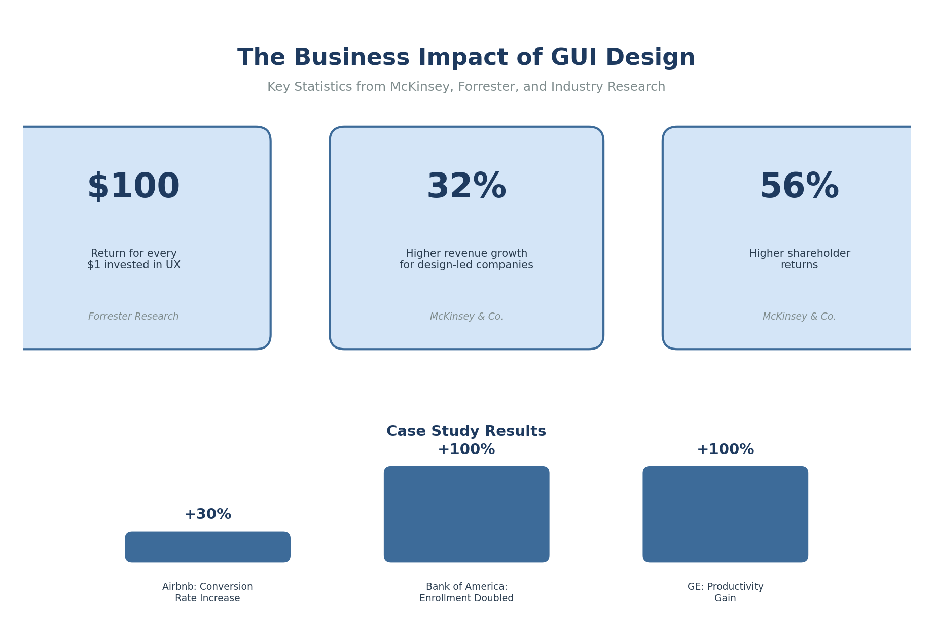
The business case for investing in GUI design is substantial. McKinsey's research on design value found that companies prioritizing design achieve 32% higher revenue growth and 56% higher total shareholder returns compared to competitors. For mid-market and enterprise organizations, these numbers transform GUI design from a polish-at-the-end activity into a core business function.
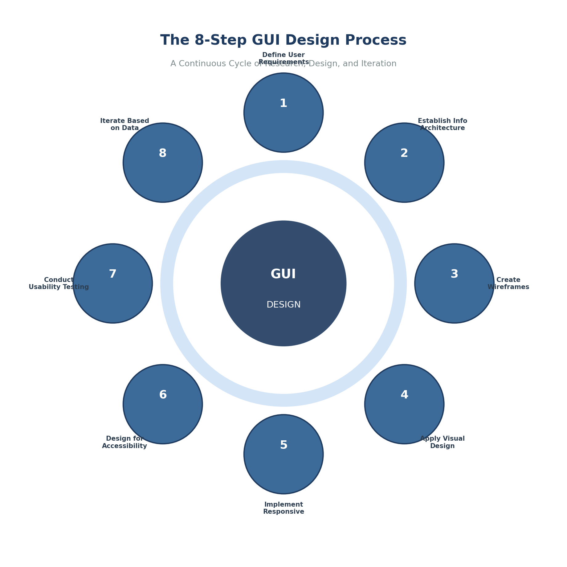
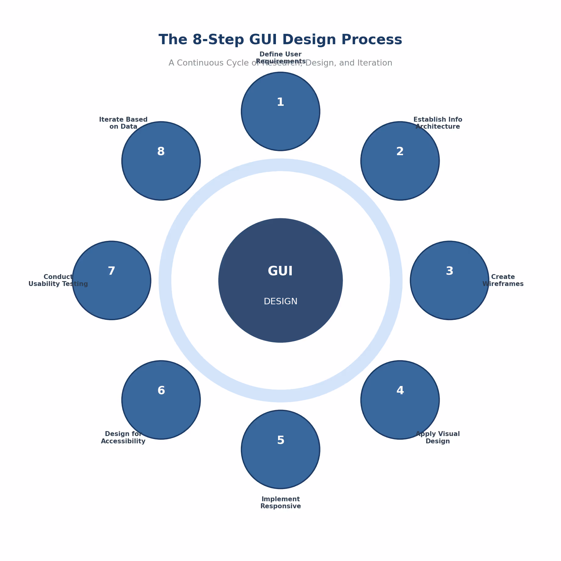
Effective graphical interface design follows a structured methodology that balances user needs with business objectives. Understanding the principles of UI design helps teams navigate each phase with clarity.
Step 1: Define User Requirements and Goals
Successful GUI design starts with understanding your target audience and what they need to accomplish. This means conducting user experience design research through interviews, surveys, and behavioural analysis to identify primary user personas and their specific needs. Teams typically begin with stakeholder interviews to align business objectives, then develop personas based on demographic and behavioural data. From there, mapping user journeys identifies touchpoints requiring interface design, and documenting functional requirements establishes clear success criteria.
Step 2: Establish Information Architecture
Information architecture determines how content and functionality are organized within the interface in logical order. This foundational work ensures users can navigate efficiently and find what they need without frustration.
Four components require attention here. Navigation structure organizes primary pathways through content, balancing depth against breadth while considering labelling conventions and mobile constraints. Content hierarchy prioritizes information by importance based on user mental models, task frequency, and business goals. Interaction design patterns define how users accomplish tasks, maintaining consistency with platform conventions while ensuring learnability. Taxonomy categorizes content and features using plain language that matches how users actually think and search.
Step 3: Create Wireframes and Low-Fidelity Prototypes
Wireframes translate information architecture into visual layouts without the distraction of colour schemes, typography, or imagery. These skeletal frameworks allow teams to evaluate structure and flow before investing in high-fidelity design work. UX designers often use this phase to test text fields, button placement, and overall layout before adding visual polish.
Starting with wireframes enables rapid iteration because nobody gets attached to visual details that don't exist yet. Feedback stays focused on usability rather than whether someone likes the shade of blue. Structural issues surface early when they're cheap to fix rather than after development begins. And collaboration improves because designers, developers, and stakeholders can all contribute to something that doesn't require advanced design skills to evaluate.
The tradeoff is that abstract representations confuse some stakeholders who struggle to envision the final product. Wireframes also can't reveal problems related to visual hierarchy or emphasis. And the translation to high-fidelity designs adds another step to the process, though online courses and modern tools have reduced this steep learning curve considerably.
Step 4: Apply Visual Design Principles
Visual design transforms wireframes into polished interfaces by applying UI design principles that draw attention to important elements and create aesthetic appeal. The Nielsen Norman Group's ten usability heuristics provide foundational guidance, emphasizing visibility of system status, consistency and standards, and user control and freedom. Ben Shneiderman's golden rules offer complementary guidance that many product design teams reference alongside Nielsen's work.
Core considerations include establishing a colour palette that supports brand identity while meeting accessibility requirements. Typography needs to balance readability with personality. Spacing and layout systems create visual rhythm and hierarchy that guides users through content without conscious effort. Good UI design makes these design elements feel invisible while doing heavy lifting in the background.
Step 5: Implement Responsive and Adaptive Layouts
Modern GUI design must accommodate devices ranging from phones to ultra-wide monitors. Mobile-first design approaches have become standard because mobile traffic exceeds desktop usage across most industries. Starting with mobile constraints and scaling up tends to produce cleaner results than cramming desktop designs onto smaller screens.
ISO 9241 principles for user-centred design apply across all device contexts. Design should be based on explicit understanding of users, tasks, and environments. That understanding doesn't change based on screen size, but its application certainly does. Tools like Adobe Photoshop and other Adobe Systems Incorporated products help designers create assets that scale across platforms, though many teams now prefer vector-based tools for greater flexibility.
Step 6: Design for Accessibility
Accessibility ensures interfaces work for users with visual, auditory, motor, or cognitive disabilities. The Web Content Accessibility Guidelines, adopted as international standard ISO/IEC 40500, provide comprehensive guidance for creating a good user interface that serves everyone.
Colour contrast ratios need to meet WCAG AA or AAA standards. All UI elements require keyboard navigation support. Screen reader compatibility depends on proper semantic markup. Focus indicators must be clear with logical tab order. And non-text content needs text alternatives. These requirements benefit all users, not just those with disabilities. Keyboard navigation helps power users. High contrast helps everyone in bright sunlight. Clear focus indicators help users who simply lost track of where they were. Error prevention through thoughtful design reduces frustration for all users, and clear error messages help people recover quickly when mistakes happen.
Step 7: Conduct Usability Testing
Testing with real users in real world conditions reveals problems that designers cannot anticipate no matter how experienced they are. Nielsen Norman Group research indicates that testing with five users identifies approximately 85% of usability problems. This makes meaningful testing accessible even for teams with limited research budgets.
Effective testing combines qualitative and quantitative methods. Task completion rates, time on task, and error frequency provide measurable data. Think-aloud protocols and post-test interviews reveal why users behaved the way they did. Both types of insight matter. Knowing that 60% of users failed a task tells you something is wrong. Watching them struggle and hearing their frustration tells you what to fix. Testing your own work with fresh eyes is valuable, but watching actual users interact with the interface reveals blind spots that internal review cannot catch.
Step 8: Iterate Based on Data and Feedback
GUI design is never finished. Continuous improvement based on user feedback, analytics data, and changing requirements keeps interfaces effective over time. This aligns with the ISO 9241-210 standard for human-centred design, which emphasizes that design should be driven and refined by user-centred evaluation.
Organizations that embed continuous testing into their design processes reduce development rework time by 33-50% according to research from the Massachusetts Innovation and Technology eXchange. Fixing problems after launch costs dramatically more than catching them during design. The iteration mindset pays for itself and represents a great way to build efficiency of use into the development process.
Common Misconceptions
Misconception 1: Beautiful Interfaces Are Automatically Usable
Visually stunning interfaces do not guarantee good user experience. Studies examining the relationship between graphic design and user experience found that beauty influences overall perception, but pragmatic attributes like usability carry significant weight in how users evaluate interface quality.
Resources devoted exclusively to visual polish deliver diminishing returns when fundamental usability problems remain unaddressed. A gorgeous interface that confuses users still fails. An average-looking interface that helps users accomplish their goals still succeeds. Great UI requires more than attractive design elements arranged pleasingly on screen.
Misconception 2: More Features Mean Better Interfaces
Feature bloat causes more interface failures than feature scarcity. Research on users with varying computer literacy, published in the Journal of Computer Science, identified that reducing features available at any given time improves usability across all user groups.
Progressive disclosure reveals complexity gradually as users need it. This approach serves both novice and expert users without overwhelming either group. Novices see simple interfaces they can learn. Experts discover advanced capabilities when they go looking for them. This is a great example of how constraints can improve rather than limit design outcomes.
Misconception 3: GUI Design Is Purely Subjective
Personal preferences influence design decisions, but effective GUI design is grounded in measurable outcomes and empirical research. The field draws on cognitive psychology, human factors engineering, and decades of usability studies to establish evidence-based practices.
Forrester research indicates that every dollar invested in UX design yields an average return of $100. Capturing this value requires treating design decisions as hypotheses to be tested rather than matters of opinion. Organizations that skip measurement often wonder why their redesigns don't improve business results.
Why Consistency Beats Novelty in Enterprise Applications
Conventional wisdom positions creativity and consistency as opposing forces. Research tells a different story. Consistency delivers benefits that creative departures rarely match, especially in enterprise contexts where users interact with multiple applications daily.
A PLOS One study examined how user interface design influences task performance and situation awareness. The findings showed that interface design should reflect human cognitive processes and account for cognitive processing limits. When users encounter consistent design patterns, they allocate mental resources to their actual tasks rather than figuring out unfamiliar interface behaviours. Feedback should arrive within a reasonable amount of time to keep users informed of system status.
Microsoft's Office Suite maintains consistent interface patterns across Word, Excel, and PowerPoint. Users transfer knowledge between applications without relearning basic interactions. Training time drops. Error rates fall. Productivity rises.
GE's implementation of an Industrial Internet Design System generated a 100% productivity gain in development teams and saved an estimated $30 million in the first year. Standardized components meant developers stopped rebuilding the same elements for every project. Designers stopped debating basic patterns that had already been resolved. Everyone moved faster.
What Happens When Organizations Ignore Mobile-First Design
Many organizations still treat mobile as an afterthought, adapting desktop interfaces for smaller screens rather than designing for mobile contexts from the start. This approach creates compounding problems.
User expectations have shifted. Features like dark mode, accessibility support, and responsive layouts are baseline requirements rather than premium features. Organizations that lag in mobile experience face user abandonment and brand perception damage that extends beyond the mobile context. Virtual reality and emerging platforms add further complexity for teams already struggling with responsive design.
Dark mode alone has reached mainstream adoption. Over 80% of smartphone users actively use dark mode according to WiFiTalents research. Interfaces without dark mode support signal that user preferences weren't considered. Users notice.
Mobile-first design forces beneficial constraints. Limited screen real estate demands ruthless prioritization of content and features. The result tends to be cleaner interfaces that perform better on larger screens too. Desktop designs crammed onto mobile screens feel cluttered. Mobile designs scaled up to desktop feel focused.
Real-World Examples and Case Studies
Airbnb: Building Trust Through Design Decisions
Airbnb faced an unusual challenge: convincing strangers to stay in each other's homes. Trust had to come from somewhere, and interface design carried much of that burden.
Early user research revealed that poor-quality listing photos undermined user confidence. The founders personally photographed listings with professional equipment. This investment in visual quality increased booking rates substantially. By 2023, Airbnb had served over 1.4 billion guests globally.
The company later developed a comprehensive design system ensuring consistency across platforms and products. Following a redesign focused on mobile experience and transparent pricing, Airbnb achieved a 30% increase in booking conversion rates within the first quarter. User complaints about navigation dropped significantly.
Bank of America: Doubling Enrollment Completion
Bank of America's online banking enrollment process was losing potential customers. Many abandoned registration before completion, representing both lost revenue and frustrated users who wanted to become customers but gave up.
The design team focused on yield (the percentage of users completing enrollment) as their primary metric. Through iterative prototyping and testing, they identified and removed usability barriers one by one. When the redesigned form launched, the yield metric nearly doubled and exceeded ROI benchmarks.
The lesson is straightforward. Focused attention on specific user tasks, supported by clear metrics and iterative testing, delivers measurable results. The bank didn't need a revolutionary new approach. They needed to watch users struggle and fix what they found.
Frequently Asked Questions
What is the difference between UI design and GUI design?
GUI design specifically refers to graphical user interfaces where users interact through icons, buttons, menu bars, and other visual elements. UI design is broader, encompassing command-line interfaces, voice interfaces, and gestural interfaces alongside graphical ones. Most modern UI work involves graphical interfaces, so the terms are often used interchangeably in practice.
How long does it take to design a GUI for a typical enterprise application?
Enterprise GUI design projects typically range from three to nine months depending on complexity. This includes discovery and research, iterative design work, usability testing, and refinement. Organizations frequently underestimate time needed for user research and testing. Skipping these phases doesn't save time overall because problems discovered after development begins cost far more to fix.
What tools do professional GUI designers use?
Figma, Sketch, and Adobe XD dominate interface design and prototyping. Wireframing and information architecture work often happens in Axure, Balsamiq, or Whimsical. Design systems increasingly incorporate Storybook for component documentation and Zeroheight for design system management. The specific tools matter less than the process and principles guiding their use.
How do you measure the success of GUI design?
Measurement combines behavioural metrics with attitudinal indicators. Behavioural metrics include task success rate, time on task, error rate, and conversion rate. Attitudinal metrics capture user satisfaction through surveys, Net Promoter Score, and qualitative feedback. Business impact metrics like customer retention, support ticket volume, and revenue per user connect design quality to organizational outcomes. Tracking changes over time reveals whether specific design decisions improved results.
Should GUI design prioritize aesthetics or functionality?
The question assumes a tradeoff that doesn't hold up under scrutiny. Research shows users perceive attractive interfaces as more usable even when objective usability is equivalent. But visual appeal cannot compensate for fundamental usability problems. The practical approach addresses functional requirements first, then applies visual design to enhance rather than obscure purpose. When real constraints force real tradeoffs, functionality wins. Users tolerate plain interfaces that work. They abandon beautiful interfaces that frustrate.


