


Table of contents
What Is Graphic Design in the Tech Industry? A Primer
Graphic design in the tech industry covers visual communication strategies, user interface elements, brand identities, and digital experiences that technology companies build to reach their audiences. Tech-focused design sits at the intersection of aesthetics and functionality. Every visual element must serve both brand storytelling and user experience objectives.
Design has become foundational to technology development itself. Research published in the Proceedings of the Design Society found that AI's influence in design shows up most in early-stage ideation, conceptualization, and decision-making, where it supports inspiration, iteration, and refinement (Cambridge University Press, 2025).
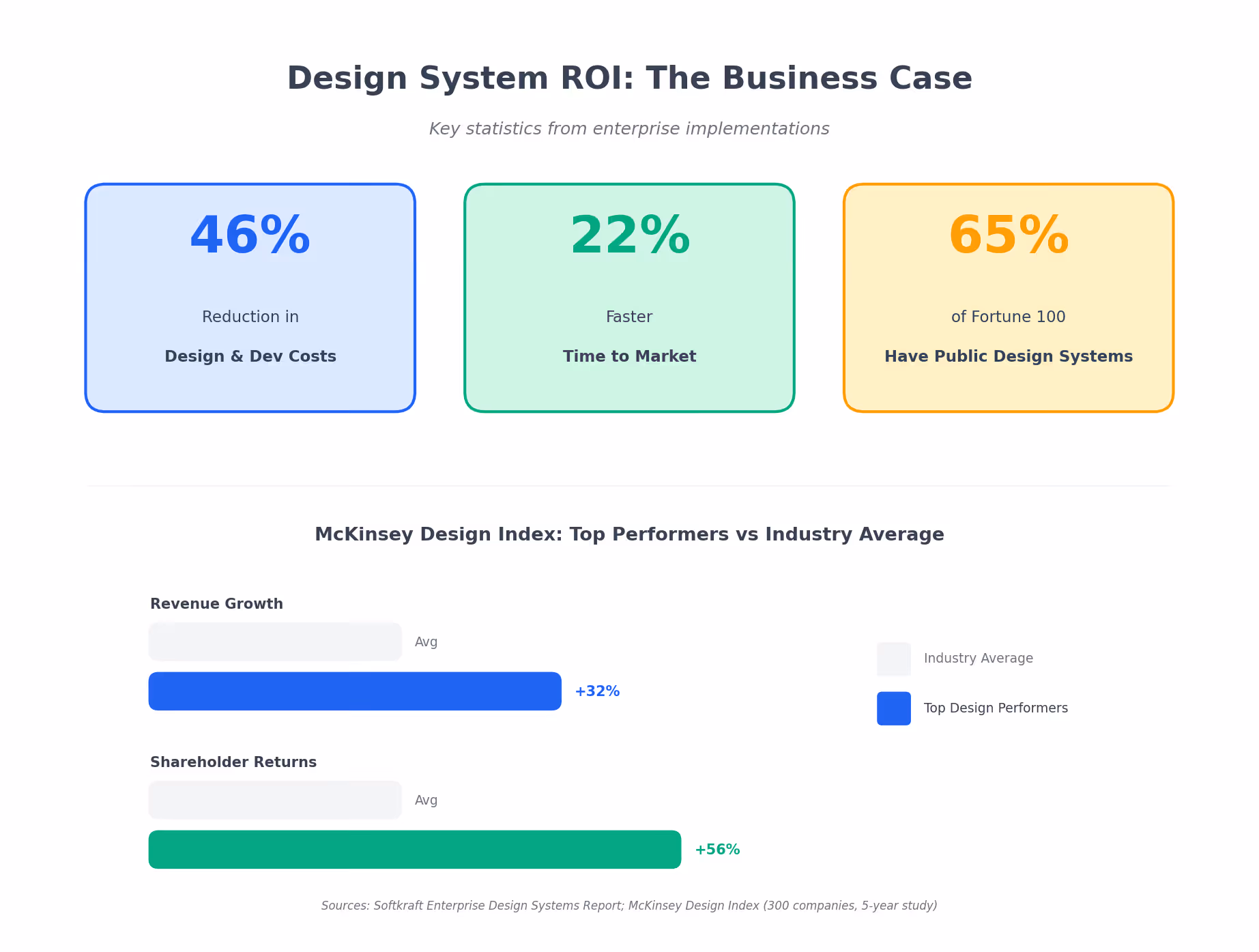
Why does this matter for mid-market and enterprise businesses? Because design now drives measurable business outcomes. McKinsey's research analyzed 300 public companies over five years and found that organizations with the strongest commitment to design had 32% more revenue and 56% higher total returns to shareholders compared to industry counterparts (McKinsey & Company). The market reflects this value: graphic design market size in 2026 is estimated at $59.29 billion, projected to reach $85.53 billion by 2031 at a 7.60% CAGR (Mordor Intelligence).
Building Effective Design Systems for Technology Brands
Robust design systems form the foundation of successful graphic design in the tech industry. These frameworks ensure visual consistency while supporting rapid product development across platforms.
Essential Components of Tech Design Systems
| Component | Function | Business Impact |
|---|---|---|
| Design Tokens | Store visual attributes (color, spacing, typography) applied across platforms | Consistent updates system-wide |
| Component Libraries | Reusable UI elements standardized across digital properties | 20-30% reduction in development time |
| Pattern Libraries | Solutions to common design problems using multiple components | Better cross-team collaboration |
| Style Guides | Brand guidelines covering logos, colours, typography, iconography | Brand integrity at scale |
| Documentation | Usage guidelines for all elements | Faster onboarding for new team members |
Companies with over 100 employees report a 46% reduction in design and development costs and 22% faster time to market after implementing a design system (Softkraft). McKinsey's research supports this finding. The firms that outperformed were those that resisted cutting spending on research, prototyping, or concept generation. Design flourishes in environments that encourage learning, testing, and iterating with users (McKinsey & Company). Over 65% of Fortune 100 companies now maintain public design systems.

Worth noting: these statistics come primarily from companies that succeeded with their implementations. The failure rate for design system rollouts rarely gets published, but anecdotal evidence from design communities suggests roughly 40% of design system initiatives stall within the first 18 months due to lack of executive sponsorship or inadequate governance structures.
Design System Success Factors
Design systems deliver clear benefits when implemented well. Teams get unified user experiences across products and platforms. Product launches happen faster because components are reusable. "Design debt" (the inconsistencies that erode brand trust) decreases. Designer-developer handoff becomes smoother with shared component language. And global consistency becomes achievable with rapid localized updates.
The challenges are real, though. Upfront investment in architecture and documentation is significant. Designers accustomed to starting from scratch may feel restricted. Governance and maintenance demand ongoing attention. And adoption friction can derail the whole effort if teams don't build the system collaboratively.
Salesforce pioneered the use of design tokens, which store visual design attributes that can be applied and updated across components and platforms. Design tokens ensure that changes reflect across the entire product experience without hard-coding individual values (Wix Studio).
Common Misconceptions About Tech Industry Graphic Design
Misconception 1: AI Will Replace Human Designers
The most pervasive myth in 2026? That generative AI will eliminate the need for human designers.
The reality is more nuanced. A systematic review published in Management Review Quarterly analyzed 64 articles on generative AI and creativity. The findings: AI-generated artworks can be highly photorealistic, yet human direction, curation, and verification remain essential for turning insights into good products (Springer, 2025). Adobe's 2024 Creative Frontier study reinforces this point. Ninety percent of creators said generative AI saves time on menial tasks while helping them generate new ideas (Techclass).
AI functions as a collaborative partner. It handles production work. Humans focus on strategic creativity and emotional resonance. The 71% of UX professionals who believe AI and Machine Learning will shape the future of UX are developing complementary skills, not fearing obsolescence (Motiongility).
Misconception 2: Minimalism Has Run Its Course
Many believe flat, minimalist design has reached saturation in tech. But minimalism isn't dying. It's evolving.
In 2026, minimalism incorporates purposeful details and microinteractions that make interfaces more responsive without abandoning clean aesthetics (UX Studio). Google's Material Expressive design language focuses on dynamic motion and tactile response. The shift is toward design that feels more sensory while maintaining clarity.
That said, the "minimalism vs. maximalism" debate oversimplifies what's actually happening. Most successful tech brands in 2026 aren't choosing one or the other. They're building flexible systems that can dial up or down depending on context, audience, and platform.
Misconception 3: Design Systems Limit Creativity
A common resistance to design systems stems from the belief they constrain creative freedom.
The opposite proves true in practice. A well-implemented design system frees designers from repetitive production tasks, which lets them focus on solving complex problems that demand creative thinking (SitePoint). Foundational elements get established once. Designers then innovate at higher levels of the user experience. No more reinventing buttons and form fields.
Why Human-Centered Design Outperforms Tech-Forward Aesthetics

The shift from 2025's AI-driven perfection toward 2026's "tactile rebellion" reveals something counterintuitive: in an era of technological sophistication, deliberately imperfect and human-centred design creates stronger emotional connections with users.
Research from the Frontiers in Psychology journal found that participants who co-created with AI reported significantly higher levels of creative self-efficacy compared to those who merely edited AI-generated content (M = 4.62 vs. M = 3.74, p = 0.003). This increased self-efficacy translated into higher expert evaluations of creativity (Frontiers, 2025). Hybrid human-AI approaches yield superior creative outcomes.
Adobe's 2024 "Creativity in the Age of AI" study found that 64% of designers said their creative work is directly influenced by social and cultural shifts. Over half are consciously seeking out more "human" visual elements to balance digital fatigue (Kittl).
The implication for tech brands is clear. Authenticity and emotional resonance differentiate in ways that technical polish cannot. In 2026, designers aren't just reacting to AI. They're reclaiming craft. Raw imperfection sits beside AI-assisted precision. Nostalgia merges with new technology. Emotion returns to the center of digital design.
The Hidden Cost of Inconsistent Visual Identity
Companies often focus on acquisition-focused design. But the cost of visual inconsistency across digital touchpoints proves far more damaging to long-term business performance than most executives realize.
A McKinsey study (2024) found companies with mature design systems save 20-30% in design and development costs annually (Medium). Users notice inconsistency. A button that behaves differently on two screens. A mismatch in tone. Unclear labels. Inconsistent UX erodes trust and directly impacts engagement and conversions.
The financial implications extend beyond efficiency. According to Deloitte research, brands with clearly defined values and vision have a 3.1 times higher likelihood of excellent customer satisfaction. Companies taking a holistic approach to customer experience see a 25% higher customer loyalty rate (BBdirector citing Deloitte). For technology brands managing multiple product lines, this consistency becomes exponentially more challenging. And more critical.
The solution? Treat design systems as strategic infrastructure. Companies that invest in comprehensive visual frameworks create compounding returns through faster development cycles, reduced design debt, and stronger brand equity.
Real-World Examples and Case Studies
Airbnb: Transforming Brand Through Belonging
When Airbnb approached global design agency DesignStudio, the brand had outgrown its original identity. The company needed a complete brand transformation that could express its founders' vision and support exponential growth.
The result was the "Bélo" symbol, designed to represent four things: people, place, love, and the "a" of Airbnb. The marque was intentionally simple enough that anyone could draw it. It transcends language barriers and forms the foundation of a community-owned visual identity (DesignStudio).
The rebrand went beyond the logo. It encompassed a complete redesign of Airbnb's website and mobile apps with immersive photography, bold colours, and clearer listing information. The brand shifted its messaging from location and price to warmth, welcome, and belonging. The rebrand trended on Twitter, won multiple awards, and remains globally recognized as a benchmark for tech company visual identity transformation.
Linear: The Anti-SaaS Aesthetic
While Airbnb and Spotify dominate rebrand case studies, Linear offers a more instructive example for B2B tech companies. The project management tool launched in 2019 with a visual identity that deliberately rejected the friendly, rounded, colourful aesthetic that had become default for SaaS products.
Linear's design system uses sharp edges, high contrast, dark mode as default, and typography that feels closer to a code editor than a consumer app. The company bet that its target audience (developers and technical product teams) would respond to an interface that looked like it was built by people who actually use developer tools.
The gamble paid off. Linear reached a $400 million valuation by 2022 without the brand warmth that conventional wisdom says B2B products need. The lesson: design systems should reflect actual user preferences, not industry assumptions about what "professional" or "approachable" looks like.
Stripe: Documentation as Brand
Stripe built its reputation partly on visual design, but the more interesting story is how the company turned technical documentation into a brand differentiator. Stripe's API docs became famous for their clarity, code examples that actually work, and visual design that makes complex information scannable.
This wasn't accidental. Stripe invested in documentation design at the same level as product design, treating docs as a core part of the user experience. The result: developers who evaluated multiple payment processors often chose Stripe partly because the integration felt easier, even when the underlying technical complexity was similar to competitors.
The takeaway for tech companies: brand extends beyond marketing materials. Every touchpoint where users interact with your product, including documentation, error messages, and onboarding flows, either reinforces or undermines your visual identity.
Frequently Asked Questions
What are the most important graphic design trends for tech companies in 2026?
AI-augmented creative workflows, human-centred design emphasizing authenticity, robust design systems for cross-platform consistency, accessibility-first approaches (WCAG 2.2, European Accessibility Act), and motion design that makes static interfaces feel dynamic. The overarching theme: balancing technological capability with emotional resonance.
How does AI impact graphic design in the technology industry?
AI functions as a generative collaborator. A 2025 survey found 83% of content creators use AI somewhere in their production process, mostly for brainstorming, drafting, and automating repetitive tasks. The best work uses AI to surface unexpected forms and compositions, then refines through human creative direction. How much AI involvement is "too much" remains an open question that different teams answer differently.
Why are design systems critical for tech companies?
Design systems provide infrastructure for consistent brand experiences across products, platforms, and markets. Companies with mature systems save 20-30% in design and development costs annually while achieving 22% faster time to market. They reduce "design debt," improve designer-developer collaboration, and enable rapid global updates while maintaining brand integrity. That said, implementation costs vary wildly depending on team size, existing tech stack, and how many legacy products need retrofitting.
How should tech companies approach accessibility in design?
A 2024 scan of nearly two million web pages found only about 3% of the web is considered accessible, with the average page containing 37 separate WCAG failures. Companies must comply with WCAG 2.2 Level AA standards. The European Accessibility Act (effective June 2025) requires digital products to meet EN 301 549 standards. Beyond compliance, accessible design improves usability for all users by up to 30% according to Microsoft research.
What makes a successful tech company rebrand?
Successful rebrands share common elements: deep customer research informing strategic direction, visual identities simple enough to work across all contexts, emotional resonance connecting brand values to user aspirations, and comprehensive systems ensuring consistency. The key is maintaining brand equity while evolving. But timing matters too. Rebrands during periods of company instability often backfire, while rebrands tied to genuine product or market evolution tend to land better.


