


Table of contents
Key Takeaways
- The median landing page conversion rate is 6.6% across industries, but systematic optimization can push results to 10% or higher—representing substantial revenue opportunity for businesses at scale.
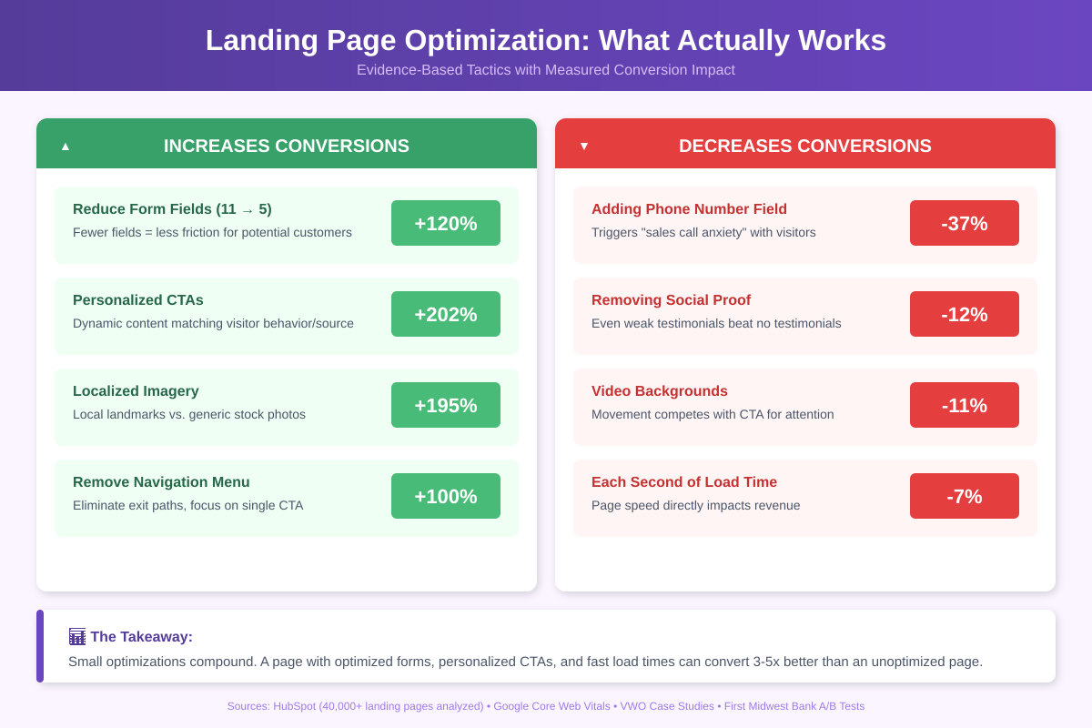
- Form optimization delivers among the highest ROI of any landing page change: reducing fields to 5 or fewer can improve conversions by 120%, while multi-step forms allow collecting more information without the same friction penalty.
- Page speed directly impacts revenue: every second of load time costs approximately 7% in conversions, making speed optimization one of the fastest paths to improved performance.
- Mobile traffic dominates but converts significantly lower than desktop, creating opportunity for businesses that optimize cross-device experiences and implement smart remarketing strategies.
- A/B testing remains essential—even experienced marketers are often surprised by test results, and assumptions about "best practices" frequently fail to hold in specific contexts.
- For complex conversion decisions, working with experienced landing page specialists can accelerate optimization and avoid costly trial-and-error that delays results.
What Is a Landing Page?
A landing page is a standalone web page created specifically for marketing or advertising campaigns. Unlike general website design with multiple navigation options and objectives, landing pages are designed with a single, focused goal: conversion. This could mean capturing email addresses for an email list, generating demo requests, encouraging free trial sign-ups, or driving purchases from potential customers.
The Stanford Web Credibility Project found that users form credibility judgments about websites within seconds of arrival. Visual design was the primary factor in nearly half of all credibility assessments. Your page must establish trust immediately while guiding visitors toward action.
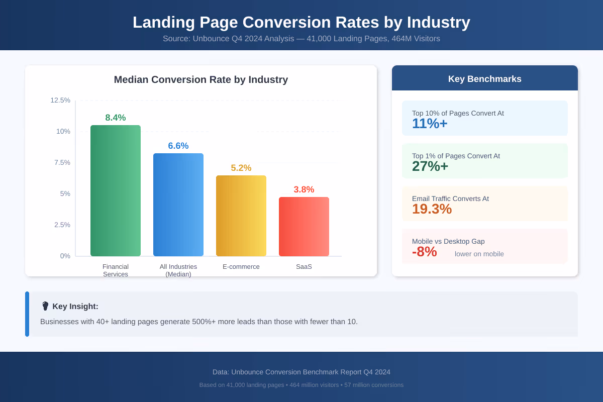
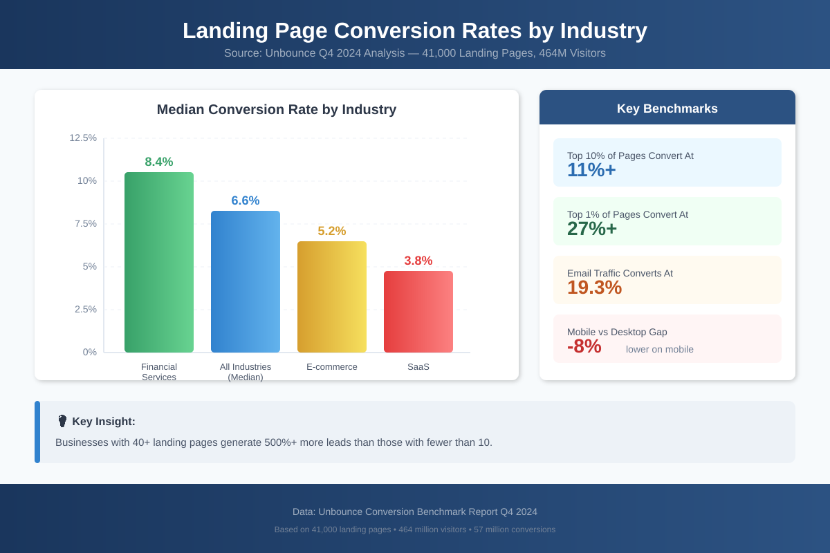
For mid-market and enterprise businesses, high-converting landing pages can translate to millions in additional revenue. Unbounce's Q4 2024 analysis of 41,000 landing pages with 464 million visitors established that the median conversion rate across all industries is 6.6%. Top performers achieve higher conversion rates of 10% or more. The difference between a 3% and 10% conversion rate is massive for organizations running paid media campaigns at scale.
Essential Elements of High-Converting Landing Pages
Creating a great landing page that converts requires understanding which design elements drive action and which create friction. Several key elements separate high-performing pages from underperforming ones.
What Actually Moves the Needle
| Element | What It Does | Measured Impact |
|---|---|---|
| Strong Headline | Answers "what's in it for me" in under 5 seconds | 27-104% lift in tested variations |
| Visual Hierarchy | Controls eye movement from hero section to CTA buttons | Reduces time-to-conversion by guiding scan patterns |
| Forms of Social Proof | Logos, testimonials, review counts | 60% engagement increase when placed in the right place near forms |
| Form Design | Balances data collection with friction | 120% better conversion at 5 fields vs. 11 fields |
| Clear CTA | Button copy, color, placement | Personalized CTA buttons outperform generic by 202% |
| Page Speed | Sub-3-second loads | 7% conversion loss per additional second |
Value Proposition Best Practices
The most effective landing page examples communicate their core value within five seconds of arrival. Your target audience quickly scans pages to determine whether the offering matches their pain points before committing attention. A powerful headline in the hero section is the first thing people see, and it needs to address the subject matter immediately.
Pros of Clear Value Propositions:
- Immediately qualifies or disqualifies visitors, reducing wasted time for both parties
- Sets expectations that align with the rest of the content
- Creates a framework for all supporting persuasive copy and visuals
- Differentiates from competitors who may offer similar solutions
Cons of Vague or Clever Headlines:
- Forces visitors to work to understand the offering
- Increases bounce rates as confused visitors leave
- Misaligns expectations with actual product capabilities
- Wastes advertising spend on unqualified traffic
Form Optimization for Lead Generation Landing Pages
Form design is one of the highest-impact areas for conversion optimization. HubSpot's analysis of over 40,000 landing pages found that as form fields increase, conversion rates decrease. But the relationship is more nuanced than simply "fewer is better."
Lead gen pages with 5 or fewer fields convert approximately 120% better than longer forms. Context matters, though. High-value B2B offerings can successfully use 7-10 fields when the additional information helps generate qualified leads or personalizes the subsequent experience.
Multi-step forms have emerged as a powerful alternative for collecting much information without overwhelming visitors. Breaking longer forms into progressive stages reduces perceived friction while gathering the data businesses need. Documented tests show conversion increases of 35% to over 200% with multi-step approaches, depending on the offer complexity and target market.
Common Misconceptions
Misconception 1: Shorter Pages Always Convert Better
Many marketers believe landing pages should be as brief as possible to prevent visitor drop-off. The relationship between page length and conversion is far more nuanced. A case study from Data36 documented a 96% increase in conversions after expanding a landing page from a concise format to approximately 4,000 words with multiple embedded videos.
The determining factor is not length. It's the complexity of the decision being requested.
Simple, low-commitment actions like newsletter sign-ups work well with shorter pages. Expensive products, complex services, or high-stakes decisions? Visitors often need much more information to feel confident converting. Too much information is rarely the problem when the context of use demands it.
Misconception 2: Beautiful Design Equals High Conversions
Professional web design is essential for establishing credibility. But aesthetically pleasing pages do not automatically convert better. Some of the best landing page design examples deliberately use simple design that prioritizes clarity over visual sophistication.
The Stanford Web Credibility Research found that design affects credibility perceptions. Credibility alone does not drive action, though. Clear messaging, compelling offers, and friction-free forms often matter more than visual polish. A great example: Craigslist's famously ugly design still generates billions in transactions.
Misconception 3: One Landing Page Fits All Traffic Sources
Different traffic sources bring visitors with different levels of awareness, intent, and expectations. Unbounce research shows dramatic differences in conversion rates by traffic source: email list traffic converts at 19.3% (nearly double paid search results performance) while social media typically converts lower.
Effective landing page strategies include creating variations tailored to specific sources, matching messaging to the ad or email that drove the click, and adjusting the depth of information based on visitor familiarity with your brand.
Why Mobile-First Design Determines Success or Failure
The gap between mobile traffic and mobile conversions is one of the largest revenue leaks in digital marketing. Mobile devices drive over 80% of landing page traffic. Yet industry data shows mobile converts approximately 8% lower than desktop.
Why the paradox?
Mobile users often research on-the-go with lower immediate purchase intent. Desktop users typically convert during focused sessions. Technical friction compounds this behavioural gap: form completion difficulty, payment friction, and screen size limitations all contribute.
Google's official guidance specifies that buttons and form fields should be at least 48x48 density-independent pixels with appropriate white space between interactive elements. Many landing pages still fail these basic accessibility standards on mobile devices.
Smart marketers now design mobile experiences primarily for research and capture, then use remarketing to reach these same users on desktop when they're ready to complete higher-friction conversions. This is one of the best ways to acknowledge natural cross-device behaviour patterns rather than fighting against them.
The Hidden Revenue Impact of Page Speed
Page load time has a direct, measurable relationship with conversion rates. Google's Core Web Vitals documentation establishes that Largest Contentful Paint (LCP) should occur within 2.5 seconds of page load.
Every second of load time costs approximately 7% in conversions.
For a business generating $100,000 monthly through landing pages, reducing load time from 5 to 2 seconds could add $21,000 in monthly revenue. Most businesses see positive ROI from speed optimization within 2-3 months, making it one of the highest-return conversion investments available. Search engine rankings also benefit from faster pages.
The three Core Web Vitals metrics that matter most for landing pages:
- Largest Contentful Paint (LCP): Measures loading performance. Target under 2.5 seconds.
- Interaction to Next Paint (INP): Measures responsiveness. Target under 200 milliseconds.
- Cumulative Layout Shift (CLS): Measures visual stability. Target under 0.1.
Google has clarified that Core Web Vitals are one of many ranking factors rather than dominant signals. But the user experience benefits translate directly to conversion improvements regardless of SEO impact.
Real-World Examples and Case Studies
SaaS Landing Page Inspiration That Works (And Why)
Slack keeps its landing page copy under 50 words above the fold. The headline focuses on outcome ("Made for people. Built for productivity.") rather than features. What's notable: Slack removes all navigation except a single "Get Started Free" button, reducing exit paths to near zero. Their mobile version strips even more, showing only headline, subhead, and clear CTA.
Dropbox targets a specific anxiety: losing files. Their headline "Keep life organized and work moving—all in one place" addresses both personal and professional use cases in one line. The page uses illustration over photography, which tests have shown reduces load time by 40-60% compared to high-res images while maintaining engagement. A great way to balance aesthetics with performance.
Notion breaks a common rule and wins. Their landing page is long, really long. But they segment it with use-case tabs (Engineering, Design, Product, etc.) so visitors self-select into relevant content. Bounce rates reportedly dropped 23% after adding this segmentation versus their previous single-narrative approach. This landing page inspiration shows that design principles aren't always rigid.
Figma does something most SaaS pages avoid: they let you use the product without signing up. A free trial button opens a functional design canvas. This "try before you buy" approach reportedly converts 3x better than their previous "Sign up to get started" flow.
Calendly wins on simplicity. White space dominates. One powerful headline. One subhead. One CTA. One product screenshot. That's it. Their A/B tests showed that adding testimonials, feature lists, or additional CTA buttons all decreased conversions. Sometimes simple design really is the clear solution.
E-commerce Landing Pages: Patterns and Counterexamples
Shopify runs different landing pages for different audience segments, and the differences are stark. Their "Start your business" page for beginners emphasizes the $1/month trial and shows simple store templates. Their enterprise page leads with "Shopify Plus powers 10% of US e-commerce" and requires a sales call. Same product, completely different approach to the purpose of the page.
Netflix reduced their landing page to essentially one field: email address. No pricing shown. No plan comparison. Just "Ready to watch? Enter your email to create or restart your membership." This ultra-minimal approach works because brand awareness does the heavy lifting. Limited time offers aren't even necessary.
Spotify takes the opposite approach for premium upgrades. They show a detailed comparison table: Free vs. Premium features side-by-side. For users already familiar with the free product, specific feature differences matter more than broad promises. This is a great example of matching the page to the target audience's awareness level.
B2B Landing Pages: What Converts Enterprise Buyers
Salesforce landing pages are content-heavy by design. Their target buyers (enterprise decision-makers) need ROI data, implementation details, and integration information before even considering a demo. Pages often run 2,000+ words with embedded case studies. The landing page builder they use supports this depth.
HubSpot discovered that 55% of their top-converting landing pages offered ebooks or guides rather than product demos. The insight: early-stage potential customers want education, not sales conversations. They now segment landing pages by buyer journey stage. Content marketing assets drive their lead generation landing pages.
Zendesk tested showing customer logos versus showing customer results. Results won. "Mailchimp reduced response time by 75%" outperformed the Mailchimp logo alone by 34% in click-through to demo request. Specific forms of social proof beats generic trust badges.
Real Estate Landing Page Approaches
Zillow and similar real estate landing page examples use location-based personalization heavily. Pages dynamically show local listings, neighbourhood data, and market prices. The sense of urgency comes from showing "X people viewed this today" rather than countdown timers. This is one of the best ways to create urgency without feeling manipulative.
Tactics That Backfired
Not every test produces a win. These documented failures offer useful lessons:
Removing social proof hurt conversions by 12% for a B2B software company, even though the testimonials seemed generic. The lesson: even weak forms of social proof beat no social proof.
Adding a phone number field dropped form completions by 37% for a SaaS free trial page. Phone numbers trigger "I'm going to get sales calls" anxiety that email alone doesn't.
Video backgrounds decreased conversions by 11% for an e-commerce brand despite looking more "premium." The movement competed with the CTA for attention. Bullet points with static images performed better.
Adding too much information above the fold hurt a B2B page by 18%. The hero section became cluttered, and visitors couldn't identify the primary action.
Documented A/B Testing Results
Obama 2008 Campaign: The campaign team tested 24 combinations of headlines, images, and button text. The winning combination improved signup rates by 40.6% over the original. That translated into an additional $57 million in donations. The surprise: a simple family photo beat professional campaign imagery, and "Learn More" beat "Sign Up Now" as button text. A fantastic job of letting data drive decisions.
First Midwest Bank: A regional bank tested localized imagery (local landmarks vs. generic stock photos) across 26 state-specific landing pages. Localized imagery increased conversions by 195%. They also tested form placement: below-the-fold forms outperformed above-the-fold by 52%, contradicting standard best practices. Their hypothesis: visitors needed to read the offer before feeling ready to commit.
Ubisoft: The gaming company simplified their "Buy Now" page from a 5-step process to 2 steps. Conversions increased from 38% to 50%, a 32% relative improvement. They also removed the "compare editions" table that seemed helpful but actually created decision paralysis.
Campaign Monitor: ConversionLab tested dynamic text replacement, swapping landing page headlines to match the exact search query. "Email marketing software" searches saw headlines reading "Email Marketing Software" rather than the generic "Send Better Email." Result: 31.4% increase in trial sign-ups over 77 days with 99% statistical confidence. A great way to improve relevance.
Frequently Asked Questions
What is a good landing page conversion rate?
The median is 6.6% across industries as of late 2024. But that number hides massive variation. Financial services averages 8.4%. SaaS sits at 3.8%. E-commerce product pages often hit 2-3%. The top 10% of landing pages convert above 11%, and the top 1% exceed 27%. Your benchmark should be your own performance last quarter, not an industry average.
How many landing pages should a business have?
More than you probably have now. Businesses with 31-40 landing pages generate 7x more leads than those with 1-5 pages. But quantity without purpose backfires. Each page should target a specific target audience, offer, or traffic source. Ten focused landing pages outperform fifty generic ones.
Do landing pages need navigation menus?
Usually no. Removing navigation increased conversions by 100% in one widely-cited VWO study. Navigation provides exit paths that distract from the purpose of the page. The optimal approach depends on your page purpose, though. For cold paid traffic with a single intent, strip navigation completely. For organic visitors exploring your brand, a minimal header with logo and one secondary link can reduce bounce rates without killing conversions.
How long should a landing page be?
Match length to decision complexity. Newsletter signup? Keep it under 300 words. $50 product? 500-800 words with reviews. $5,000+ B2B software? 2,000+ words with case studies, ROI calculators, and implementation details. The only reliable answer comes from testing both versions with your specific target market.
What makes a landing page template effective?
Templates fail when they prioritize aesthetics over conversion architecture. An effective landing page builder template has: clear visual hierarchy (headline → subhead → CTA visible without scrolling), a form with 3-5 fields maximum, mobile-responsive layout that doesn't just shrink but restructures for thumb navigation, and fast load time under 3 seconds. Skip templates with sliders, carousels, or auto-playing video, as these consistently hurt conversions in testing.


