


Table of contents

Key Takeaways
- Implement mobile-first design as your foundation, with 55% of emails now opened on mobile devices and responsive design delivering 15% higher click rates.
- Simplify your approach by using single-column layouts and limiting CTAs to one primary action—reducing CTAs increases clicks significantly and eliminates analysis paralysis.
- Prioritize visual hierarchy using proven patterns (inverted pyramid, Z-pattern, F-pattern) to guide subscribers naturally toward your conversion goal.
- Optimize for dark mode by using transparent images, appropriate color contrasts, and testing across display settings to reach the 80% of users who prefer this view.
- Test continuously across devices and email clients, as rendering inconsistencies between platforms can undermine even carefully designed campaigns—partnering with experienced email marketing specialists can help navigate these complexities efficiently.
What is email design?
Email design encompasses the strategic arrangement of visual elements, typography, imagery, and interactive components that transform a marketing message into an engaging, action-driving communication. It guides subscribers through a carefully crafted visual journey that culminates in a desired action. That action might be making a purchase, signing up for a webinar, or downloading a resource.
According to research published in the International Journal of Scientific Research in Science, Engineering and Technology, effective email marketing design requires balancing personalization, behavioural triggers, responsive design, and content strategy to maximize customer engagement. The study emphasizes that AI-enhanced personalization, behaviorally triggered emails, and CRM integration substantially improve key performance indicators such as open rate, click-through rate, and conversions (Jayanna et al., 2025).
For mid-market and enterprise businesses, email design directly impacts revenue. Email marketing generates an average return of $36-$42 for every dollar spent (Shopify, 2024), so the visual and structural decisions made in email template design matter more than most marketers realize. And when 87% of marketing leaders say email marketing is critical to their company's success, getting design right becomes a competitive advantage.
Email design essentials: building blocks that convert
Successful email marketing design relies on several foundational elements working in harmony. Understanding these components allows marketers to create newsletter designs and email layout examples that consistently drive engagement.
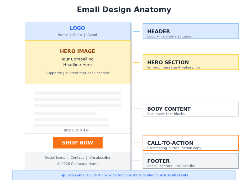
The anatomy of high-converting email templates
| Design Element | Purpose | Best Practice |
|---|---|---|
| Header | Brand recognition, navigation | Keep minimal with logo and 1-2 navigation links |
| Hero Section | Primary message delivery | Single-column, clear value proposition above the fold |
| Body Content | Information and engagement | Scannable text blocks with strategic white space |
| Call-to-Action | Conversion driver | Contrasting button colours, action-oriented copy |
| Footer | Compliance and contact info | Unsubscribe link, social icons, company details |
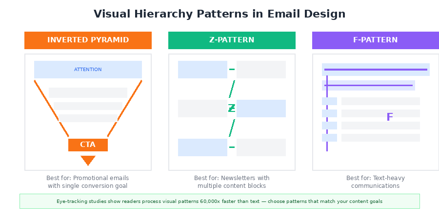
Visual hierarchy patterns that work
How subscribers scan and process email content comes down to visual hierarchy. Research indicates that the human brain processes visual data 60,000 times faster than textual information, which makes strategic element placement essential for engagement (Wunderkind, 2025).
The Inverted Pyramid Pattern
This layout catches the reader's attention at the top and narrows focus toward a primary call-to-action. Works well for promotional emails where a single conversion goal exists. Apple Arcade uses this pattern effectively by placing hero images at the top and positioning the CTA button at the pyramid's tip.
The Z-Pattern Layout
When presented with multiple content blocks, readers naturally scan content in a zigzag motion. Spreading eye-catching content throughout the message keeps subscribers engaged through the entire email, which is why this pattern excels in newsletter design where multiple stories or products require attention.
The F-Pattern Structure
Ideal for text-heavy communications. This pattern acknowledges that readers scan the first lines fully, then increasingly skim as they move down the page. The takeaway? Place the most important information in the first paragraph and along the left margin.
Mobile-first design requirements
With mobile devices accounting for 55% of all email opens globally (Genesys Growth, 2025), mobile-responsive email design is foundational to campaign success. Responsive design increases unique mobile clicks by 15% (G2, 2024).
What does that look like in practice? Single-column layouts for seamless scrolling. A minimum font size of 16px for body text. Tappable CTA buttons at least 44px in height. Touch-friendly link spacing with at least 10px between clickable elements. And image optimization to reduce load times on cellular networks.
Mobile-first design reaches the 59% of Millennials who primarily check email on mobile devices and reduces email deletion rates, since 50% of users delete non-optimized emails. It also improves accessibility across all device types and future-proofs campaigns as mobile usage continues to grow. But there are tradeoffs. Complex visual layouts become harder to execute, testing requirements increase across devices, and some interactive features simply don't translate to smaller screens.
25 email design examples by category
Which email layout examples work for specific use cases? That depends on the campaign type.
Welcome Email Designs
Welcome emails achieve an impressive 68.6% open rate. The most effective welcome designs use clean hero images that communicate brand personality right away. They include a concise value proposition explaining what subscribers will receive, a single clear CTA directing new subscribers to their next action, and social proof elements like customer counts or testimonials.
Promotional Email Designs
Promotional emails need to drive immediate action, yet the design can't overwhelm recipients. Bold hero imagery featuring the promoted product works well here. Prominent discount details should sit above the fold, countdown timers create urgency, and product displays should stay limited to 3-5 items maximum.
Newsletter Designs
Balancing multiple content pieces while maintaining readability is the challenge with newsletters. Modular content blocks that can be rearranged help here, along with consistent header and footer treatments for brand recognition. Clear section dividers using white space keep things scannable, and featured story placement at the top anchors the layout.
Abandoned Cart Email Designs
These emails punch above their weight. Abandoned cart emails achieve a 50.50% open rate with an average of $3.45 in revenue per recipient (OptinMonster, 2025). Product imagery displayed prominently with pricing is essential. Add clear "Complete Your Purchase" CTAs, trust signals like security badges, and personalized product recommendations.
Transactional Email Designs
Order confirmations, shipping notifications, and account updates require designs that prioritize clarity while maintaining brand consistency. Clear order details should be prominently displayed, though brand-consistent headers shouldn't overwhelm the functional content. Keep layouts easy to scan and add subtle cross-sell opportunities after the essential information.
Common misconceptions
Misconception 1: More images mean better engagement
Many marketers assume image-heavy emails perform better because they're visually striking. Reality tells a different story. Image-only emails tend to trigger spam filters, and without alt text, the message becomes meaningless when images fail to load. Industry best practice recommends a 60:40 text-to-image ratio to maintain deliverability while retaining visual appeal (InsiderOne, 2024).
Misconception 2: Multiple CTAs increase conversions
The "more options, more clicks" mentality actually creates analysis paralysis. Research shows that reducing the number of CTAs to just one increased clicks by 371% and sales by 1617% (ActiveCampaign, 2025). High-CTR emails are designed around one primary action that is visually dominant and directly aligned with user intent. Supporting links can be included, yet they shouldn't compete with the message's primary goal.
Misconception 3: Design templates are one-size-fits-all
Enterprise marketers sometimes apply the same email template design across all campaign types, assuming consistency equals efficiency. Triggered emails, newsletters, and promotional campaigns require different structural approaches, though. Triggered emails achieve an average click-through rate of 21.32% compared to standard campaigns, partly because their design matches user context and intent (Opensend, 2025).
Why single-column layouts outperform complex grids
The shift toward minimalist, single-column email layouts reflects evolving user behaviour and technical realities. Multi-column designs may seem more sophisticated, but they frequently underperform in real-world conditions.
Here's the core issue: single-column designs render consistently across email clients, from Gmail to Outlook to Apple Mail, each of which interprets HTML and CSS differently. Complex grid layouts often break in Outlook specifically, which uses Word's rendering engine rather than a browser-based one. A beautiful multi-column design viewed in one client may appear entirely broken in another.
When 41% of customers open emails on their phones (Omnisend, 2026), designs must accommodate smaller screens without requiring complex responsive breakpoints. Single-column layouts align with these mobile consumption patterns. The minimalist approach reduces cognitive load too, helping subscribers identify the primary message and action quickly.
Data supports this. Emails with clean, simple designs and clear visual hierarchy consistently outperform cluttered alternatives. Organizations like The Sunday Collective use generous white space to guide attention and create a polished, readable layout.
The hidden value of dark mode optimization
Dark mode has evolved from a niche preference to a mainstream default. As many as 80% of users switch to dark mode when available (GetResponse, 2026), which makes optimization essential.
When dark mode activates, email clients shift the color palette so dark fonts appear light on dark backgrounds. Without proper optimization, emails can become illegible. White text on white backgrounds. Images with transparent backgrounds creating jarring visual effects. These aren't edge cases.
So what does proper dark mode optimization look like? Use transparent PNG images with appropriate backgrounds. Avoid pure black (#000000) backgrounds in favor of dark grays. Test color contrast ratios in both modes. Add white or light-colored borders around logos with transparent backgrounds.
Recipients who can easily read emails regardless of their display preferences are more likely to engage, click, and convert. Interactive elements benefit from dark mode consideration too: AMP emails generated 520% more survey responses than traditional HTML emails in controlled tests (Dyspatch, 2026), but only when properly rendered across display modes.
Real-world examples and case studies
SUIHE Jewelry: 435% revenue increase in 30 days
When jewelry brand SUIHE partnered with Blue Drop Studio, they were starting from scratch. Just a basic welcome email. No segmentation. No personalized flows. The overhaul involved responsive templates and automated lifecycle sequences across the entire email program. The result? Email revenue increased by 435% in just 30 days, with the new welcome flow alone generating $6,400 in sales (Omnisend, 2026). Mobile responsiveness, clear visual hierarchy, and targeted content delivery drove those gains.
Astana Hub's 63% open rate
Astana Hub, a technology hub organization, took a different approach. Rather than overhauling everything at once, they focused on segmentation and newsletter design adjustments. They pulled their contact list from CRM, segmented it based on industries, events, and lead status, then redesigned their newsletters with cleaner layouts and optimized sending schedules. The outcome: a 63% email open rate and a 26% click-through rate, which helped drive 28,000 downloads of their mobile app (Selzy, 2025).
How Turn Me Royal went from 5% to 30% email revenue
Before their redesign, email marketing contributed only 5% of Turn Me Royal's total income. That's a rounding error for most businesses. After redesigning campaigns to feature personalized portraits and targeted offers with clean visual layouts, email revenue jumped to an average of 30% per month. Their email list also grew to over 25,000 subscribers, and those design improvements compounded over time (Selzy, 2025).
Frequently asked questions
What is the ideal width for email templates?
Email templates should be designed at 600-700 pixels wide to ensure proper rendering across email clients. Header graphics typically work best at 600-700 pixels wide with a proportional height of 100-200 pixels. For images within the body content, 480x480 pixels or smaller is recommended. This width accommodates most desktop and mobile displays without requiring horizontal scrolling.
How many images should I include in a marketing email?
Stick to a 60:40 text-to-image ratio for optimal deliverability and engagement. That means 3-5 high-impact images per email to avoid triggering spam filters. More than 5 images significantly increases the risk of being flagged by AI filters as "image-only" spam. Every image should serve a clear purpose.
What font sizes work best for email design?
Use a minimum of 16px for body text to ensure readability, especially on mobile devices. Headlines typically range from 22-28px, with subheadings at 18-20px. Anything smaller than 14px becomes difficult to read on smaller screens. Stick to web-safe fonts like Arial, Georgia, or Helvetica to ensure consistent rendering across email clients.
How do I design effective CTA buttons?
Contrasting colours that stand out from surrounding content are essential, along with action-oriented copy like "Shop Now" or "Download Guide" and sufficient size for easy tapping (minimum 44px height). Button-based CTAs typically perform better than text links, especially on mobile devices. Position your primary CTA above the fold so subscribers see it without scrolling, and ensure adequate padding around the button for easy finger targeting.
Should I use animated GIFs in email campaigns?
Animated GIFs can enhance engagement when used strategically. They add movement and visual interest that static images cannot provide. Keep file sizes under 1MB to ensure fast loading times, though, and always include a compelling first frame as the fallback for email clients that don't support animation. Research shows animated GIFs can increase click-through rates by up to 26%, but overuse can slow load times and distract from your primary message.


